Domo Charts
Use Domo to empower your teams with cutting-edge AI solutions designed for security, scalability, and trust. Reimagine what’s possible with your data.

chart
No items found.
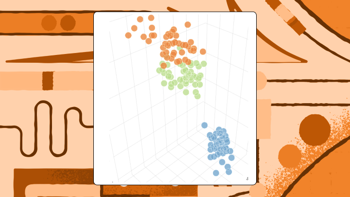
3D Charts: When to Use Them and When to Avoid Them
This is some text inside of a div block.
Data Visualization
Chart Concepts & Guides
3D Charts: When to Use Them and When to Avoid Them
3d-charts
chart
No items found.
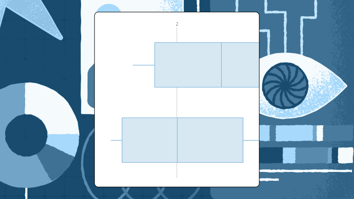
Box Plot: What It Is and When to Use It
This is some text inside of a div block.
Data Visualization
Distribution & Statistics
Box Plot (Box and Whisker): What It Is and When to Use It
box-plot

chart
No items found.
Point and Figure Chart: What It Is and How to Build One
This is some text inside of a div block.
Data Visualization
Trends Over Time
Point and Figure Chart: What It Is and How to Build One
point-and-figure-chart
chart
No items found.
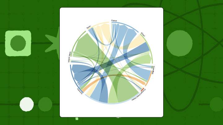
Chord Diagram: Definition, Uses, and Examples
This is some text inside of a div block.
Data Visualization
Relationships & Correlations
Chord Diagram: Definition, Uses, Examples and Guide
chord-diagram
chart
No items found.
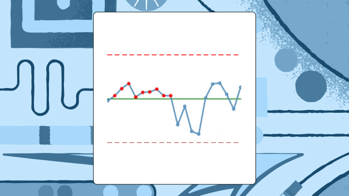
Statistical Process Control (SPC) Charts: Types, Rules & Examples
This is some text inside of a div block.
BI & Analytics
Project & Performance
SPC Charts: Types, Rules and Examples Explained
spc-chart
chart
No items found.
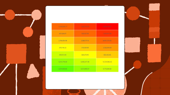
Heat Map Charts: When and How to Use Them
This is some text inside of a div block.
Data Visualization
Specialized & Niche
Heatmap chart: A Complete Guide on When and How to Use Them
heatmap-chart
chart
No items found.
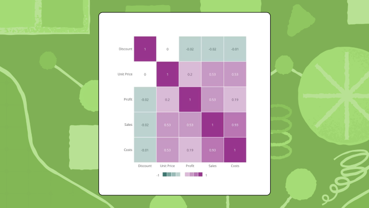
Correlation Charts: What They Are and When to Use Them
This is some text inside of a div block.
Data Visualization
Relationships & Correlations
Correlation Chart: Definition, Types, and How to Create One
correlation-chart
chart
No items found.
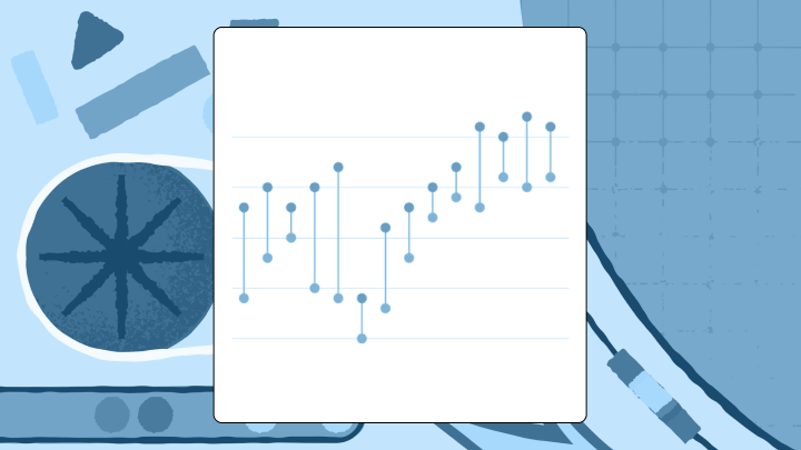
Dumbbell Chart: Definition, Examples, and Best Practices
This is some text inside of a div block.
Data Visualization
Comparison
Dumbbell Chart: Definition, Examples, and Best Practices
dumbbell-plot-chart
chart
No items found.
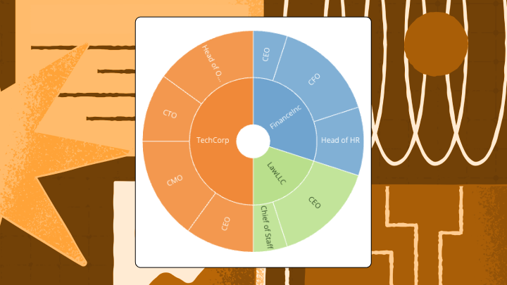
Sunburst Chart: What It Is and When to Use It
This is some text inside of a div block.
Data Visualization
Part-to-Whole
Sunburst Chart: What It Is and When to Use It
sunburst-chart

chart
No items found.
Cartogram Chart: Definition, Types, and Best Practices
This is some text inside of a div block.
Data Visualization
Geospatial & Maps
Cartogram Chart: Definition, Types, and Best Practices
cartogram-chart

We couldn’t find any content matching your search.
Try adjusting your search terms or reset your search to start over
Reset Search