Heat Map Charts: When and How to Use Them

Heat map charts answer one question fast: "Where's the pattern?" They do it by encoding values as color across a two-dimensional grid. But the downsides are just as real. Precision drops, scales can shift, and some audiences trust the darkest cell too much.
This guide walks through when a heat map chart earns its spot, how to build one, and how to avoid the quiet mistakes that make stakeholders doubt the story.
What is a heat map chart?
Picture a pivot table (a cross-tabulation) with dozens (or hundreds) of intersections. Someone squints at it and asks, "So…where are the hot spots?" That's the heat map chart's moment.
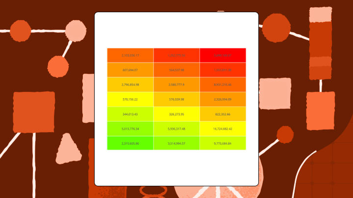
A heat map is a grid-based visualization that uses color to show the size of values across two categories. Rows represent one category (like products), columns represent another (like regions), and each cell's color tells you how high or low the value is at that intersection. Think of it as a weather map for your data. Darker colors typically mean higher values, lighter colors mean lower ones, and your eye can scan hundreds of cells in seconds to spot the "hot" and "cold" zones without reading every number.
This is not the same as a website heatmap that shows where people click. It's also different from a choropleth, which colors geographic regions on a map. The heat map we're talking about here is a matrix for comparing categories, not tracking behavior or mapping locations (although some teams also use the phrase "geographic heat map" for point-density maps, which is a different chart family entirely).
Every heat map needs three things: labeled axes, colored cells, and a legend. Without the legend, nobody knows what the colors mean. They'll guess, and they'll usually guess wrong.
Data requirements for a heat map chat
Start with shape, not styling. A heat map chart only works when the data fits the grid.
You need:
- Two categorical dimensions (your row and column headers), such as product and region, or day of week and hour
- One numeric measure at each intersection (sales, ticket volume, conversion rate, error count)
- A single value per cell, which usually means you aggregate raw event data (sum, average, count)
In BI work, a few details decide whether the chart is helpful or misleading:
- Define the metric once, then reuse it, so teams aren't comparing "revenue" to a slightly different "revenue" on another dashboard (this is where a semantic layer and governed metrics help).
- Decide how you'll handle missing intersections (blank, zero, or "no data"), because each one tells a different story, and people will infer intent from whatever you choose.
- If the chart will refresh over time, decide whether the legend range stays fixed, so people can compare yesterday to today without getting tricked by a shifting scale.
If your source data is raw, row-level log data, someone has to reshape it into that two-dimensional matrix. Data engineers often do this with a pivot or grouped aggregation, and in Domo that can happen in Magic ETL (no-code) or Structured Query Language (SQL), depending on how hands-on you want to be.
Heat map chart decision summary
Before you build a heat map chart, try this quick gut-check.
- Use this chart when: You have two categorical dimensions and a numeric value for each intersection (often density, frequency, or intensity), and you want to spot patterns across many combinations rather than read exact values.
- Avoid this chart when: You need precise comparisons, your grid has fewer than nine cells, or your audience might confuse similar colors for similar values.
- Primary decision it supports: Identifying which category combinations need attention, like which product-region pairs are underperforming, or which hours and days concentrate the most activity.
- Most common misuse: Treating color similarity as numeric similarity. Two cells that look alike might differ by amounts that actually matter.
- If you remember one risk: Heat maps flatten precision. They show "hotter" and "cooler," not "how much hotter."
- Best alternative: A grouped bar chart for precise comparison across fewer categories, or a table with conditional formatting when you need both pattern and precision.
When to use a heat map chart
A heat map chart is a pattern-finder. They shine when you have more than a handful of categories on each axis and want to spot clusters or outliers without reading every value. They work well when the question is "where are the hot spots?" rather than "what is the exact value of X."
Time-based grids are a natural fit. Put days of the week on one axis and hours on the other, and staffing patterns or traffic spikes jump out immediately. This is the view line-of-business managers use to catch workload bottlenecks before they turn into a Friday-night fire drill. And, it's one of the cleaner use cases for this chart type, because the grid structure maps directly onto something people already think about intuitively.
But there are times when this chart type does you no favors. Fewer than nine cells? A simple table is clearer. If decisions depend on knowing that Region A is twelve percent higher than Region B, a heat map rarely communicates that reliably. You'll end up explaining the numbers anyway, which defeats the point.
Outliers can also wreck the view. One cell vastly larger than the others compresses the color scale, and mid-range variation disappears into similar shades.
And if your stakeholders constantly ask for "the same matrix, just broken out one more way," an interactive BI heat map chart can reduce the back-and-forth. In tools like Domo, people can filter and drill down in a dynamic dashboard instead of requesting another exported pivot.
Heat map chart types
"Heat map" isn't one thing. It's a family of chart types, and choosing the wrong variant changes the pattern you think you're seeing.
| Type | Data Shape | Best Use | Key Risk |
|---|---|---|---|
| Numeric Heat Map | Two categorical axes, continuous values | Spotting magnitude patterns | Color compression hides mid-range variation |
| Category-Based Heat Map | Two categorical axes, discrete status values | Showing status grids (pass/fail, priority) | Ordinal vs nominal confusion |
| Clustered Heat Map | Numeric matrix with row/column reordering | Revealing natural groupings | Clustering method changes visible patterns |
| Correlogram | Correlation coefficients between variables | Identifying variable relationships | Spurious correlations from multiple comparisons |
| Geographic Heat Map (Density Map) | Latitude/longitude points or binned locations | Finding location-based concentration | Bin size and scale choices can hide local variation |
Numeric heat map
This is the default heat map with two categorical axes, a continuous numeric value in each cell, and a color scale mapping low to high.
Use a sequential palette (light to dark) when all values are positive. Use a diverging palette (two colors meeting at a midpoint) when there's a meaningful center point like zero or a target. A frequent slip is picking a diverging palette and letting the tool auto-pick the midpoint, which can make "above target" look neutral, or flip it entirely.
Scale stability matters here. If the chart refreshes over time, keep the legend range fixed so yesterday and today stay comparable.
This also comes up when you let people swap metrics. A marketing manager might flip between conversion rate and click-through rate in the same heat map chart (Domo Variables supports this), but only if the legend behavior stays clear. Otherwise, the story changes mid-click, and nobody trusts what they just saw.
Category-based heat map
Think status grids, not gradients. These encode discrete values like priority tiers or pass/fail states.
The key decision is ordinal versus nominal. If categories have a natural order (low/medium/high), use a palette that reflects progression. If they don't (type A/type B/type C), use distinct colors without implying ranking. Also, don't cram too many categories into a single heat map. Once you're past a handful of colors, people stop reading the legend and start guessing.
Clustered heat map
Clustered heat maps reorder rows and columns based on similarity, grouping like with like. This reveals natural clusters that alphabetical order would hide.
Different distance metrics and linkage methods produce different clusterings from the same data. If you don't document your choices, nobody can reproduce your result. Another easy misread is assuming adjacency means causation. Clustering only says "these look similar by the rule you chose." That's it. Nothing more.
Skip clustering when the axis order has inherent meaning (like time or geography) that reordering would destroy.
Correlogram
A correlogram displays correlation coefficients between variables in a symmetric matrix. Each cell shows how strongly two variables move together.
With many variables, some correlations will appear strong by chance. A correlogram doesn't show statistical significance. If you have 20 variables, you have hundreds of pairwise comparisons, and some will look meaningful when they're not.
This is exactly why teams overreact to one bright square. You'll want to pair the correlogram with significance testing or an analysis workflow that flags likely false positives. Some BI tools include AI-guided statistical analysis that helps you validate what the color pattern suggests before you act on it.
Heat map chart best practices
Heat map mistakes rarely look like mistakes. A bioRxiv analysis of over 6,000 scientific articles found widespread colormap misuse including rainbow palettes, uncentered diverging scales, and missing legends. That matters because the same visual shortcuts show up in business dashboards, and they lead to the same bad reads. This isn't just an academic problem, though. It will show up in Monday morning reviews, too.
These features help a heatmap hold up:
- Use perceptually uniform palettes: Rainbow palettes create false boundaries. Viewers see bands where the data is continuous. Stick with sequential palettes like Viridis or Blues.
- Choose colorblind-safe colors: Roughly one in 12 men have some form of color vision deficiency, so a red-green scale will hide patterns for part of your audience.
- Lock the legend range: If the scale recalculates with each filter, comparisons across time become meaningless.
- Sort axes meaningfully: Alphabetical order is arbitrary. Sort by total, average, or cluster similarity to surface patterns. If you let people filter the view, make sure the sort doesn't silently change with each filter, or the "same row" won't be in the same place from one meeting to the next.
- Show values in cells when precision matters: If stakeholders will ask "but what's the actual number?", add labels.
- Handle outliers** explicitly:** One extreme value compresses the rest of the scale. Cap it, use a log scale, or call it out separately.
- Standardize metric definitions: If multiple teams publish heat map charts, use shared, governed metrics so "gross margin" and "gross margin" mean the same thing everywhere.
- Respect data permissions: If the heat map chart includes HR, finance, or customer data, use row-level access controls (like Personalized Data Permissions in Domo) so each person sees only what they're allowed to see.
Heat map chart examples
Here's what a heat map chart looks like in practice: A retail company tracks monthly sales for 15 products across eight regions. Leadership wants to know where to focus Q4 marketing spend. The heat map shows two regions with consistently low sales across most products, but one product performs unusually well in those regions. Your eye goes straight to that bright cell in an otherwise dim row. A grouped bar chart with over 100 bars would bury that outlier completely.
A support team wants to optimize staffing. Ticket counts by hour for each day of the week go into the grid. The heat map reveals a clear band of high volume on Tuesday and Wednesday afternoons, plus an unexpected spike on Friday mornings. Seven overlapping lines on a line chart would make cross-day comparison much harder.
An HR team runs an employee engagement survey with 12 questions. The correlogram shows two clusters of questions that correlate strongly within each cluster but weakly across them. This suggests two underlying factors, not 12 independent measures. A quick caveat: A scatter plot matrix for 12 variables would produce over 60 plots, which is effectively unreadable for most audiences.
How to create a heat map chart in Excel
Excel doesn't have a native heat map chart type, but conditional formatting on a matrix gets you most of the way there. It works well for grids up to a few hundred cells.
Structure your data as a matrix. Rows are one category, columns are another, and cell values are the numeric measure.
| Product | East | West | Central |
|---|---|---|---|
| Widget A | 120 | 95 | 110 |
| Widget B | 80 | 130 | 75 |
| Widget C | 150 | 140 | 160 |
Use this sequence to apply the color scale cleanly:
- Select the data range containing only numeric values. Exclude row and column headers.
- Go to Home → Conditional Formatting → Color Scales.
- Choose a two-color scale for sequential data or a three-color scale for diverging data.
- To set a custom midpoint, select More Rules → 3-Color Scale → set Midpoint Type to Number.
- To lock the scale range, set Minimum and Maximum to Number and enter fixed values.
After applying formatting, verify that the darkest cell corresponds to the highest value. If they don't match, the scale is inverted or the data contains errors. Also check for text-stored numbers (like "120" as a string), because Excel will quietly skip them and your heat map will have unexplained gaps.
Excel's conditional formatting doesn't produce a standalone chart object. You can't add a legend automatically. For grids larger than a few hundred cells, formatting slows down and filtering becomes cumbersome.
If you need automatic legends, interactive filtering, or real-time data refresh, BI tools can handle these without manual workarounds. In Domo's BI, heat map charts are a native visualization type in a library of more than 150 chart types, which helps when a dashboard needs multiple chart styles without switching tools or rebuilding datasets. You can filter, drill down, and share the same view in a live dashboard. You can also schedule report delivery, so an executive team gets the heat map on a cadence (say, every Monday at 9:00 am) instead of waiting for an exported spreadsheet.
Heat map chart limitations and alternatives
Human color perception is imprecise, and that's not a design problem you can engineer around. It's just how the visual system works. Two cells that differ by a meaningful amount might look identical to the person making the call.
The color scale is relative to the data range. Add one outlier, and the rest of the grid flattens into similar shades. Large grids require small fonts or truncated labels. If people can't read the axes, they can't interpret the chart, regardless of how nice the palette looks.
Heat maps can also raise trust questions at scale. If different departments build the same chart off slightly different metric definitions or data extracts, people stop believing the picture. McKinsey research found that 70 percent of organizations report difficulties developing data governance processes. So if your heat map debates start sounding like "whose numbers are right?," you are not alone. A governed BI setup, plus consistent data pipelines, helps the chart stay credible.
When to choose something else:
- Grouped bar chart: Better when you have fewer categories and need precise comparison.
- Table with conditional formatting: Gives you both numbers and color cues when stakeholders need exact values.
- Scatter plot: Shows relationships between two continuous variables, which is a different question entirely.
- Treemap: Shows hierarchical part-to-whole relationships. Use it when hierarchy matters; use heat maps when grid structure matters.
Key takeaways about heat map charts
Heat maps earn their place when you have a dense grid of values and need to surface patterns fast. They fall apart when precision matters more than pattern, when the audience is unfamiliar, or when outliers distort the scale.
Before building one, ask: Will color-coded cells answer the question better than a table or bar chart? If the answer isn't clearly yes, go simpler.
Ready to build heat maps that stay trustworthy as your data refreshes (locked scales, governed metrics, and all) and let stakeholders filter and drill without another spreadsheet export, start a free trial with Domo.


