Dumbbell Chart: Definition, Examples, and Best Practices

Dumbbell charts (also called barbell charts) make change obvious. They show the distance between two data points for each category, with dots marking the endpoints and a connecting line putting the delta front and center. This guide covers when to use them, how to build them in Excel and BI platforms, and the best practices that keep your dashboards clear and actionable.
Key takeaways for dumbbell charts
A dumbbell chart is built for comparing two numbers per category, not telling a full story across time. Also called a dumbbell plot, barbell chart, or barbell graph, it shows the gap between two values for each category. Two dots mark the endpoints, and a connecting line shows the distance between them. The visual emphasis falls on the delta, not the absolute values.
If you build dashboards for busy executives who spend almost 40 percent of their time making decisions and don't want to decode a table in a leadership review, this is the chart that makes change impossible to miss. That time pressure is exactly why a "gap-first" visual can beat a dense table in that room.
Here's when this chart earns its place in your dashboard:
- Use it when: You have exactly two data points per category and the audience needs to see the size and direction of change (before/after, actual vs. target, this year vs last year). This comes up constantly in key performance indicator (KPI) gap analysis: target vs actual, quota vs attainment, budget vs spend.
- Avoid it when: You need to compare more than two time periods, show cumulative totals, or emphasize absolute magnitude over relative change.
- Primary decision it supports: Identifying which categories have the largest gaps and whether those gaps represent gains or losses.
- Most common misuse: Using a dumbbell chart when the audience needs to understand the absolute values, not just the difference between them.
- Best alternative if this fails: Use a slope chart if direction matters more than gap size, or a grouped bar chart if absolute values are the focus.
What is a dumbbell chart?
Picture two dots on the same row, connected by a line. That's the whole idea.
A dumbbell chart encodes data using position and length. Each row represents a category. On that row, two dots represent two distinct values, and a line connects them. For it to read cleanly, both dots need to share the same unit and the same axis. Mixing scales (like dollars vs percent) turns the "gap" into a visual trick, and not the useful kind.
The connector is the analytical payload. While the dots show where values sit on the scale, the line draws the eye to the gap between them. This distinguishes it from a dot plot, which typically shows a single value per category, or a lollipop chart, which connects a single dot to a zero baseline.
You might hear this called a "dumbbell plot," "barbell chart," or "barbell graph." These terms are interchangeable, and tool documentation varies.
In BI, people reach for dumbbell charts when generic chart types make the story too easy to miss. Usually the story is some version of "we moved," "we missed target," or "we improved," and you want the distance to land immediately.
Data requirements for dumbbell charts
You'll need at least two values per category. If your data set involves three or more comparison points per category, stop here. A dumbbell chart can't handle three points without becoming unreadable. Consider a slope chart or small multiples instead.
Your data needs these fields:
- Category identifier: The dimension you are comparing, such as region, product line, or department
- Value 1: The starting point, such as previous period sales, budget, or baseline score
- Value 2: The ending point, such as current period sales, actual spend, or target score
A calculated difference (delta) column (Value 2 minus Value 1) helps with sorting. Decide up front whether you will sort by signed delta (direction) or absolute delta (size), because teams often mix the two and then wonder why the ranking feels off. A grouping variable helps if you plan to facet by segment.
For data engineers supporting BI teams, the big win is that the data set stays simple: two distinct measures per category, consistently defined and governed. When the definition of "actual" or "target" changes between teams, the chart doesn't fail politely. It can start arguments. You will also want a plan for missing values, because a blank endpoint can look like "no change" when the reality is really "no data."
You need at least five categories to justify using this chart at all. Fewer than five? A simple table works better. More than 20 and the chart turns into a busy striped view that usually requires scrolling.
Also, be wary of extreme outliers. If 19 categories have values between 100 and 200, and one category has a value of 5,000, the scale will compress everything else into invisible dots. If that outlier has to stay, splitting it into its own view is often cleaner than pretending one axis can serve everyone.
When to use a dumbbell chart
The core question this chart answers: "Which categories changed the most, and in which direction?"
If stakeholders are asking that specific question, the dumbbell chart is a strong candidate. If they're asking "What are the absolute sales numbers?" or "How has this trended over the last five years?", choose something else.
Use this chart when you are comparing exactly two data points per category, when the audience needs to quickly identify which categories have the largest variances, and when you have between five and 20 categories.
This is why analysts and BI specialists like it for before-and-after reporting and target vs actual dashboards. It cuts down on the "wait, so what changed?" part of the meeting, which means fewer ad hoc requests and more time to turn results into actionable data. Honestly, that alone is reason enough to keep it in your toolkit.
Avoid this chart when you need a true time series (use a line chart), when absolute magnitude matters more than the gap (use a bar chart), or when categories have mixed units.
There's also a subtler problem. If you have "lower is better" metrics like customer churn and cannot add visual cues, viewers will naturally interpret movement to the right as positive. That's a real risk in live dashboard reviews.
How to read a dumbbell chart
Connector length hits your brain before the labels do. That's by design.
In a dumbbell chart, the length of the connector draws attention before the viewer reads the endpoint values or category labels. Intentional, yes, but it creates a real risk when longer connectors represent negative outcomes.
Here's a reading sequence that keeps people out of trouble:
- Scan connector lengths to identify which categories have the largest gaps.
- Check endpoint positions to determine which value is higher.
- Confirm direction by checking whether the "current" or "target" value is the one you want to be higher.
- Read delta labels if present, or estimate the gap size from the axis.
- Check for outliers that may compress the scale.
A few interpretation pitfalls show up repeatedly:
- Assuming longer is worse: In "Customer Support Ticket Volume," a long connector showing a massive increase is bad. In "Sales Revenue," it's good. If your metric is "lower is better," add color coding to clarify.
- Ignoring scale compression: One outlier category can make all other gaps look insignificant. Consider filtering the outlier or breaking it into a separate view.
- Confusing orientation: Horizontal dumbbell charts read left-to-right. Vertical charts read bottom-to-top. Mislabeling the endpoints causes viewers to draw the opposite conclusion.
Dumbbell chart best practices
Small formatting choices decide whether this chart feels instantly clear or oddly confusing.
Sort categories by delta, not alphabetically. Alphabetical sorting forces viewers to scan every row to find the largest changes. Sorting by delta puts the most significant gaps at the top.
Direct-label endpoints when space allows. Forcing viewers to trace lines back to the axis introduces read errors, especially with many categories. And if you truncate the axis to "zoom in," the connectors can look more dramatic than the underlying values justify. Neither outcome is great when you're presenting to a skeptical chief financial officer (CFO).
Add delta labels selectively. Labeling every gap creates clutter. Label only the top three and bottom three, or categories where the gap is too small to estimate visually.
Use color to encode direction, not just category. If some gaps represent gains and others represent losses, color the connectors or dots to distinguish them. Without this, viewers must mentally calculate direction for each row.
Choose horizontal orientation for long labels or more than 10 categories. Vertical orientation works for short labels and fewer categories.
Avoid dual-axis dumbbell charts. Plotting two different metrics on the same chart with different scales invites misinterpretation. Use side-by-side charts instead.
There's a subtle but frequent issue worth calling out: using the same color for both dots. If the "Start" dot and the "End" dot are both blue, the viewer can't always tell which direction the change moved without checking the axis. Make the "Start" dot a neutral color like gray and the "End" dot a bold color. It sounds obvious until you see a room full of people arguing over a chart where both dots are teal.
If you need to standardize dashboards across teams, treat these settings like shared conventions, not personal preferences. BI and IT managers care about this for a reason: with poor data literacy a top-five roadblock to analytics success according to Gartner, consistency cuts down on "wait, what am I looking at?" moments and keeps performance reviews focused on decisions instead of decoding.
Dumbbell chart examples
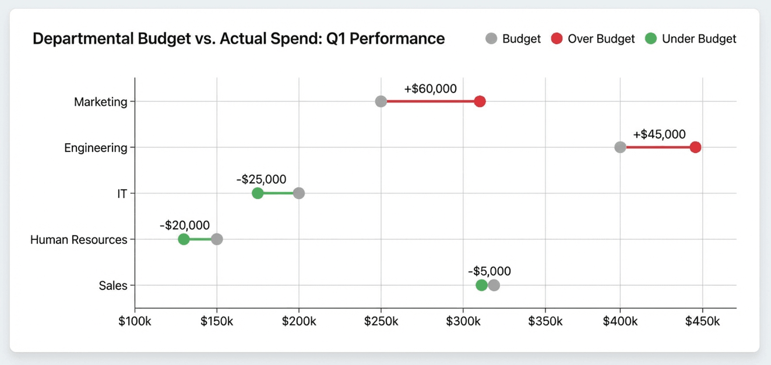
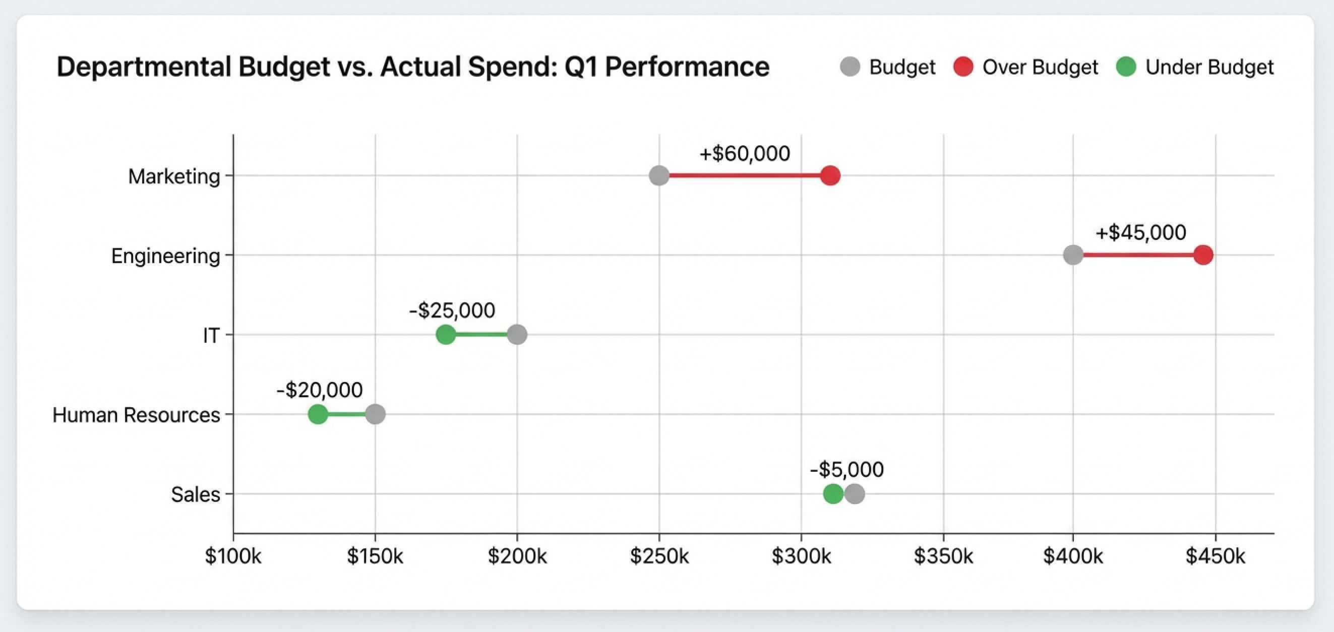
Budget versus actual is where dumbbell charts really earn their keep.
A finance team reviewing quarterly spending uses a dumbbell chart to compare budgeted amounts against actual spend for each department. The chart immediately reveals that the marketing overspent significantly while IT underspent. A grouped bar chart would show the same data, but the dumbbell chart makes the gap the focal point. The conversation starts with "Why did Marketing exceed budget?" rather than "What were the exact numbers?"
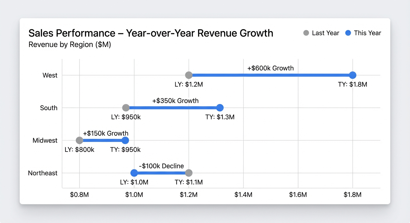
Now switch to performance across regions. Same structure, different story.
A sales operations team compares this year's revenue to last year's for each region. The dumbbell chart shows that the West region had the largest gain, while the Northeast had a small decline. A slope chart would emphasize the direction of change, but the dumbbell chart makes it easier to compare the size of changes across regions in a single view.
Managers also use dumbbell charts for quick team check-ins, like quota attainment by rep (quota vs. actual) or campaign goal vs results. Stack Overflow's Developer Survey has used a similar format to compare "desired" vs "admired" technologies. It is hard to hide from the gap, which is kind of the point.
How to explain a dumbbell chart in 30 seconds
When a chart is unfamiliar, people will guess what it means. Give them a script they can follow.
When presenting this chart to stakeholders who may not be familiar with it, use this talk track:
- "This chart shows the gap between last year's sales and this year's sales for each region."
- "The key comparison is the length of the connector, which shows how much each region changed."
- "The main takeaway is that West had the largest gain, while Northeast had the smallest."
- "Do not conclude what the actual revenue numbers are from this chart."
- "If we need to answer how sales changed quarter by quarter, we should use a line chart instead."
How to create a dumbbell chart in Excel
Yes, you can build this in Excel. No, it is not fun. Excel does not have a native dumbbell chart type. You have to build it using a scatter plot with error bars, which is exactly as tedious as it sounds.
Set up your data with these columns: Category, Value 1, Value 2, Delta, and Height (a sequential number to position categories vertically).
- Select the columns for Value 1 and Height. Go to Insert, then Charts, then Scatter, then Scatter with Only Markers.
- Right-click the chart and choose Select Data. Click Add. For Series X values, select the Value 2 column. For Series Y values, select the Height column again.
- Click on the Value 1 series. Click the plus icon (Chart Elements) and check Error Bars.
- Select the error bars. In the Format Error Bars pane, choose Direction: Plus, End Style: No Cap, and under Error Amount, select Custom.
- For the Positive Error Value, select your Delta column. Leave the Negative Error Value empty.
- Format the error bars to appear as lines connecting the two dots.
Look closely at the connectors. Do they visually match the calculated delta? A common error is selecting the wrong column for the custom error value, causing the lines to overshoot or undershoot the second dot. Another easy miss is sorting the table after the fact and forgetting that the Height values now need to follow the new order.
This method is tedious. If you add a new region, you have to manually update the Height column and re-select the data ranges. Sorting the chart requires physically sorting the cells in the spreadsheet.
If you need to update this chart weekly, filter it by different customer segments, or share it with a team, building it in a BI tool like Domo's is significantly more efficient. Domo has native support for dumbbell charts, meaning you simply drag your Category, Value 1, and Value 2 fields into the visualizer, and the platform handles the geometry, sorting, and filtering automatically.
That native support also matters for BI and IT teams. When a dumbbell chart lives inside the same governed environment as the data, you can keep access controls consistent across dashboards, without asking someone to maintain custom chart components or third-party plugins.
Dumbbell chart limitations and alternatives
Dumbbell charts are picky, and that's part of why they work.
The dumbbell chart's utility breaks down immediately if your comparison involves three or more values. You cannot show trends over multiple time periods or compare three scenarios without clutter. That's not a design flaw so much as a deliberate constraint, and violating it usually produces a chart nobody can parse.
Viewers see the gap, not the absolute values. If the total volume of sales is the most important metric, this chart obscures it. A single outlier can compress the scale so much that meaningful gaps in other categories become invisible. Without explicit color coding or arrows, viewers may not intuitively know which dot represents the "current" state.
Slope charts emphasize the direction of change and work well for three or more time points. Dumbbell charts emphasize gap size and are strictly limited to two points. If your audience needs to see "which direction" more than "how much," use a slope chart.
Grouped bar charts show absolute values side by side, making magnitude comparison easy. Dumbbell charts de-emphasize magnitude in favor of the gap. If stakeholders will ask "What were the actual numbers?", a grouped bar chart may be more appropriate.
If you want to swap spreadsheet gymnastics for a governed, refreshable dumbbell chart that makes target vs. actual gaps jump off the page, start a Domo free trial and build one in minutes.


