Statistical Process Control (SPC) Charts: Types, Rules & Examples

Statistical process control (SPC) charts plot process measurements over time and surround them with control limits so teams can distinguish normal variation from a real process shift. The practical payoff is straightforward: investigate the right moments instead of reacting to noise. Pick the right chart for your data, apply the rules with some discipline, and you stop wasting time on problems that don't exist while catching the ones that do.
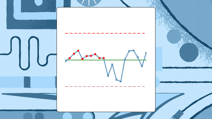
What Is an SPC Chart?
An SPC chart is a time-ordered plot that separates routine variation from signals that the process has actually changed. It lays down three reference lines: a center line (the process average) plus upper and lower control limits, typically set three standard deviations from that average. Three sigma is not magic, but it is practical: with normally distributed data, roughly 0.3 percent of points land outside the limits by chance, so a breach is a legitimate reason to investigate rather than guess.
Data quality can make liars out of good charts. If timestamps drift, your sampling cadence changes, or data arrives late from systems like a manufacturing execution system (MES), enterprise resource planning (ERP), a lab information system, or an electronic health record (EHR), the chart can signal "out of control" while the process is behaving just fine. Teams burn weeks on "root causes" that turn out to be pipeline hiccups and backfills, which is a genuinely expensive mistake to make repeatedly.
Control limits and specification limits are not the same thing. Specs come from customers and requirements. Control limits come from the process as it actually runs, which is why a process can be stable and still fail spec, or vice versa.
A quick example, because this distinction is easier to see than to define: a plastics manufacturer tracked injection molding cycle time with an X-bar chart. For three weeks, subgroup averages sat near the center line, then eight consecutive points appeared below it. Cycle times had dropped. Seemed positive, until the timing lined up with a new material batch; the "improvement" also nudged part dimensions. The chart made the when of the shift obvious enough to catch the trade before it became a quality fire drill. A histogram would have blurred that moment into a single, slightly shifted blob, with no indication of when the change occurred or how abruptly it happened.
Why SPC Charts Matter for Process Stability
Tampering is the quiet killer. Monday runs a touch high, someone dials the machine down. Tuesday swings low, they dial it back up. By Friday the process is rocking and everyone is blaming everyone else.
SPC charts function as a referee. They keep teams from chasing every bump and from missing the bumps that matter.
The payoff is unglamorous and significant. SPC charts catch process shifts early, before they become defects, downtime, or customer complaints. They also prevent false reactions, so teams don't waste labor and credibility fixing what's just background variation. Traditional inspection finds defects after they've already been made. SPC is about catching the drift while there's still time to prevent the defect. McKinsey found one biopharma facility reduced deviations by over 50 percent and waste by 75 percent by making that shift.
Types of SPC Charts and When to Use Each
Start with a blunt question: are you measuring a continuous value, or counting and classifying outcomes?
If it is continuous data, the next question is whether you have multiple measurements per time period or only one. That single detail decides whether you can form rational subgroups and how quickly your chart will notice small shifts. Teams get themselves into trouble when they subgroup by convenience, for example whatever happens to be in the same database extract, rather than observations collected under the same conditions.
Below is the decision logic most teams end up using anyway, once they stop arguing about it:
Chart familyBest forData shape in practiceX-bar + R (or S)Multiple measurements per time period (small subgroups)Subgrouped continuous data, 2 to 10 items per intervalI-MROnly one measurement per time periodContinuous data without subgroups (batch, low volume, destructive tests)Attribute (p/np/c/u)Defects/defectives rather than measurementsCounts or proportions, sometimes with variable sample sizes
X-bar and R charts
Use X-bar and R when you measure multiple items in each subgroup, typically two to 10 items at regular intervals. The X-bar chart follows subgroup averages. The R chart follows the within-subgroup range, so you see both center and spread. If subgroup size climbs beyond 10, swap the R chart for an S chart (standard deviation), because range stops behaving as a reliable estimator as n grows.
A failure mode that shows up regularly in practice is mixing parts from different machines or shifts into a single subgroup because it makes the query easier. You end up inflating within-subgroup variation, dulling the chart, and then acting surprised when changes are detected late.
I-MR charts
Sometimes you get one number per period and that is it. No subgroup, no do-over.
Individuals and moving range charts fit that world: batch processes, chemical manufacturing, low-volume production, destructive testing. The I chart plots the individual values; the MR chart plots the absolute difference between consecutive values. These tend to be less sensitive to small shifts than subgroup charts, which can be either a useful property or a genuine limitation depending on what's being tracked.
Skew matters here. If the distribution is heavily lopsided, control limits can become misleading and you'll either chase false alarms or miss real shifts. Teams sometimes respond by clipping outliers before charting, which usually removes the exact signal the chart was built to detect. The analyst's first sign of trouble is often a cluster of alerts that don't match any known process event, which points back to distributional assumptions rather than actual process problems.
Attribute charts (p, np, c, u)
ChartWhat it tracksSample size requirementpProportion defectiveVariable OKnpCount of defective unitsMust be constantcCount of defects per unitMust be constantuDefects per unitVariable OK
Use p or np when each unit is either defective or not. Use c or u when a single unit can carry multiple defects, like scratches on a panel or errors on a form.
Very low defect rates break the usual attribute charts. In that case, g-charts or t-charts are often a better fit for rare events. Also watch the "opportunities" for defects: if a form gets longer over time, defect counts can rise even if the underlying process hasn't changed, which will produce false signals that are surprisingly easy to misinterpret as a real quality decline.
Data requirements for trustworthy SPC charts
Most "SPC issues" are data problems with a statistics mask on.
Gartner pegs the average cost of poor data quality at $12.9 million per year for organizations. In SPC work, that cost shows up as wasted investigations, arguments about definitions, and charts that get ignored the moment anything important is on the line.
This is why data engineering ends up in the room. Control charts depend on always-on process feeds, not one-off extracts, and tiny inconsistencies (late loads, silent definition changes, duplicate records) can make a stable process look unstable. What operations and quality teams actually need to trust the chart comes down to a consistent set of data properties.
- Time-ordered records with stable timestamps
- A consistent metric definition (same numerator, denominator, units, and filters every time)
- Rational subgroup fields (line, machine, product, shift, operator) so you don't mix streams accidentally
- Clear handling for missing data, late-arriving data, and backfills, otherwise your "special cause" is the pipeline
- A documented baseline period used to set the center line and control limits
- Traceability and auditability (who changed the calculation, who changed the limits, and when)
When data is coming from multiple sources, automated ingestion and transformation reduces drift. Domo connects to over 1,000 data sources and can keep process feeds current, and Magic ETL (no-code) plus SQL DataFlows can standardize units, parse timestamps, and shape raw tables into the subgroup format control limit calculations expect. The point isn't the connector count; it's that SPC collapses the minute the feed quietly changes.
How Control Limits and Center Lines Work
Two analysts can build "the same" control chart and end up with different limits. It happens more often than it should.
The center line is the process average from a stable baseline period. In an X-bar chart, it is the grand mean of subgroup averages. In an individuals chart, it is the mean of the individual measurements.
Control limits are derived from the process's own variability. The formulas rely on constants (A2, D3, D4, d2) tied to subgroup size, because small samples require corrections that reflect their statistical behavior. Those constants are doing real work; they're not decoration. When one analyst calculates limits one way and another team copies a slightly different formula into a separate dashboard, the result is a debate about spreadsheets instead of attention on the process.
A governed semantic layer (like Domo's) lets teams define center line and control limit logic once and reuse it across dashboards, so the question "which chart is the real one?" stops coming up. (The limits will be labeled as upper control limit (UCL) and lower control limit (LCL).)
Calculating limits for X-bar and R charts typically goes like this:
- Calculate the mean of each subgroup
- Calculate the grand mean (average of subgroup means) for the X-bar center line
- Calculate the range of each subgroup
- Calculate the average range (R-bar)
- Upper control limit (UCL) for X-bar = Grand mean + (A2 × R-bar)
- Lower control limit (LCL) for X-bar = Grand mean - (A2 × R-bar)
- UCL for R = D4 × R-bar
- LCL for R = D3 × R-bar
Standard tables provide the constants based on subgroup size.
One practical rule that's easy to overlook: freeze the baseline logic. If limits are quietly recomputed every time new data lands, the chart can absorb a genuine shift and stop signaling at the exact moment it needs to.
Common Cause Versus Special Cause Variation
When a chart looks chaotic, the human impulse is to adjust something. That impulse is expensive.
Common cause variation is the background noise built into the system, even when everything is operating as designed. Special cause variation comes from something specific and identifiable: a worn tool, a new operator, a material change, or an equipment setting that drifted. SPC exists to prevent teams from treating the system like a pinball machine, tweaking it when they should be redesigning it, and shrugging when they should be investigating.
In practice, this distinction matters most in meetings. Someone points at a jagged line and wants to act on it. The chart is what lets a quality manager say, calmly and with evidence, that the variation is expected given the baseline, and that intervention would likely make things worse. That's often the most valuable contribution in the room.
Rules for Detecting Special Causes
A point outside the control limits is the most direct signal. Treat it as time-sensitive and investigate while the context is still intact.
Pattern rules give the chart additional sensitivity, but teams often apply too many of them. Western Electric and Nelson rules divide the space between the center line and each limit into three zones (A, B, C, with A nearest the limit) and look for runs and clusters. Turning on every rule generates a flood of alerts, so the right approach is to match rules to the cost of a false alarm versus the cost of missing a real shift.
Signals that often justify investigation:
- Two of three consecutive points in Zone A or beyond (same side): Suggests a shift in process average
- Four of five consecutive points in Zone B or beyond (same side): Smaller shift, still statistically meaningful
- Eight consecutive points on one side of the center line: A shift, even if no single point is dramatic
- Six consecutive points steadily increasing or decreasing: A trend that is gathering momentum
Some tools also surface cycles (regular up-and-down patterns tied to tool wear or temperature), stratification (points hugging the center line too tightly), and mixture (clusters near both limits with a suspiciously empty middle).
Language matters more than most dashboards acknowledge. "Out of control: 8 points below center line" gets acted on. "Rule 2 violation" gets ignored.
When SPC Charts Work and When They Don't
SPC charts answer a specific question: is the process behaving the way it behaved during the baseline period?
They work well when you're monitoring an ongoing process over time, you have baseline data from a stable stretch, and someone needs to decide quickly whether the latest blip is noise or signal. They don't fit well when points aren't time-ordered, when the process changes intentionally between measurements, or when you're trying to explain why a change happened rather than detect that it did.
Comparing distributions across groups belongs to box plots or histograms; relationships between variables belong to scatter plots. For autocorrelated data, where each point leans on the previous one, consider exponentially weighted moving average (EWMA) charts or other time-series methods. Don't run capability indices (Cp, Cpk) on a process that isn't in statistical control. Those indices assume stability, and applying them to an unstable process produces numbers that look authoritative but don't reflect reality.
Best Practices for Accurate SPC Charts
Rational subgrouping is not optional.
Subgroups should be collected close together in time and under the same conditions. Once a subgroup spans a shift change or a material batch change, you've mixed sources of variation and blurred the signals the chart is supposed to reveal. This is one of the most common structural errors in SPC implementations, and it's often invisible until someone asks why the chart missed an obvious process change.
Look at the paired charts together. Staring only at averages means you can miss a process whose variability is quietly growing. A process that looks centered and calm on the X-bar chart can still be producing increasing spread that the R or S chart would catch immediately.
Specification limits are not control limits. Drawing lines at spec tells you whether a requirement is being met, not whether the process is stable. Running both on the same chart is a common shortcut that makes it harder to answer either question cleanly.
Autocorrelation is another quiet trap. When consecutive points are correlated, standard control limits can become too narrow and you'll get persistent false alarms. This shows up in chemical processes and continuous flow systems. EWMA charts are often a better fit in those environments.
Don't mix process streams. Combining data from multiple machines, shifts, or operators inflates estimated common cause variation and hides signals that belong to a single stream.
Governance matters at scale. For teams supporting multiple plants or business units, consistent calculations, role-based access, and audit trails aren't preferences; they're what keeps a deviation review from turning into an argument about which dashboard is correct.
SPC Chart Examples Across Industries
A hospital tracks surgical site infection rates using a p-chart. Monthly data shows the proportion of procedures with infections. For six months, all points fall within control limits. Then two consecutive points appear in Zone A. Investigation found a new sterilization protocol had been implemented incorrectly in one operating room. The p-chart made the timing of the shift clear; a simple run chart without control limits would have made it much harder to distinguish that cluster from normal monthly variation.
A contact center monitors average handle time with an I-MR chart. The chart runs stable for months, then shows a clear upward trend over two weeks. Investigation found a software update had added steps to the agent workflow. Without control limits, it would have been hard to know whether high days were noise or signal, and the trend might have been attributed to seasonal call patterns or staffing rather than the actual cause.
The same pattern plays out at different levels of the organization. A line of business executive typically wants a consolidated view of process health across sites, early warning signals rather than a statistics lesson. A quality manager or plant manager wants the chart filtered to their line, shift, or product family.
SPC Software and Tool Options
Excel can calculate control limits and plot charts, but it won't flag signals automatically or update in real time. For learning and low-volume applications, that can be enough.
Dedicated SPC software typically adds automatic rule checking, historical analysis, and audit-ready documentation. The tradeoff is separation: it often sits outside the operational metrics stack, and teams end up context-switching to connect an alert back to what changed upstream.
Building SPC charts in a BI platform keeps quality signals alongside the rest of the operational picture, under the same governed metric definitions. Data connectivity to production systems, dashboard updates, configurable alerts, and centralized governance are usually the reasons teams go this route.
Different roles care about different layers of the stack:
- Data engineers tend to care about automated ingestion, transformation, and scalable pipelines, so the data feeding SPC charts stays consistent and up to date (Domo supports over 1,000 connectors, and Magic ETL helps standardize and prep process data).
- BI analysts tend to care about defining control limit logic once and reusing it everywhere, so teams stop arguing over metric definitions (Domo BI includes a semantic layer to govern reusable calculations).
- Operations and quality leaders tend to care about real-time process health and organization-wide visibility, so they can respond before defects and rework pile up (Domo dashboards and role-specific Domo Apps support that style of monitoring).
- Frontline teams tend to care about clarity. If someone can ask, "Why is this point flagged?" and get a plain-language answer, adoption goes way up (Domo's AI chat and natural language query tools can help here).
SPC Chart Limitations and Alternatives
SPC charts assume points are independent, the baseline is stable, and variation follows a predictable pattern. When those assumptions break down, the chart becomes unreliable in ways that aren't always obvious. A process that looks "in control" on a standard Shewhart chart can still be producing autocorrelated output that the chart isn't designed to detect, which means real shifts go unnoticed while the limits suggest everything is fine.
SituationBetter alternativeHighly autocorrelated dataEWMA, cumulative sum (CUSUM), or time-series modelsVery rare eventsg-chart or t-chartComparing groups rather than monitoring over timeBox plots, histograms, analysis of variance (ANOVA)Diagnosing root causesPareto charts, fishbone diagrams, scatter plots
SPC charts will tell you something changed. They won't tell you why, and they don't forecast.


