Domo Charts
Use Domo to empower your teams with cutting-edge AI solutions designed for security, scalability, and trust. Reimagine what’s possible with your data.


chart
No items found.
Faceted Bar Charts Explained: When and How to Use Them
This is some text inside of a div block.
Data Visualization
Faceted Bar Charts Explained: When and How to Use Them
faceted-bar-chart

chart
No items found.
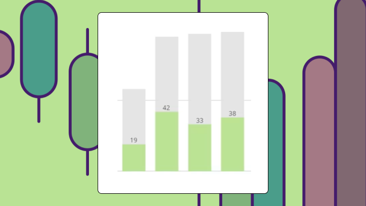
Stacked and Grouped Bar Chart Explained
This is some text inside of a div block.
Data Visualization
Grouped and Stacked Bar Chart Explained
grouped-and-stacked-bar-chart

chart
No items found.
Flex Table Chart
This is some text inside of a div block.
Data Visualization
Flex Table Chart: Definition, Data Requirements, and Use Cases
flex-table-chart
chart
No items found.
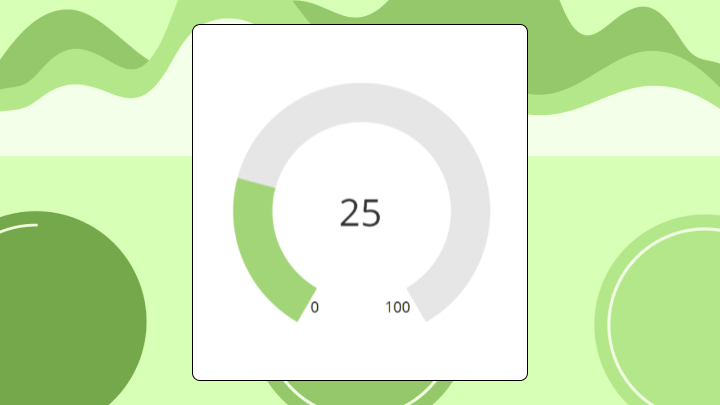
Filled Gauge Charts: A Complete Guide
This is some text inside of a div block.
Data Visualization
Filled Gauge Charts: A Complete Guide
filled-gauge-chart

chart
No items found.
Shape Gauge Chart: What It Is and When to Use It
This is some text inside of a div block.
Data Visualization
Shape Gauge Chart: What It Is and When to Use It
shape-gauge-chart
chart
No items found.
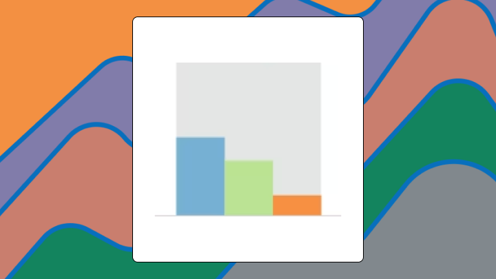
Overlay Bar Chart: Definition, Use Cases, and Examples
This is some text inside of a div block.
Data Visualization
Overlay Bar Chart: Definition, Use Cases, and Examples
overlay-bar-chart
chart
No items found.
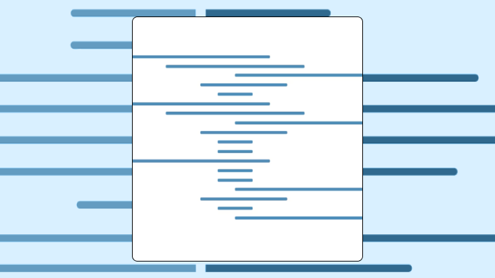
Nested Bar Charts Explained: When and How to Use Them
This is some text inside of a div block.
Data Visualization
Nested Bar Charts Explained: When and How to Use Them
nested-bar-chart
chart
No items found.
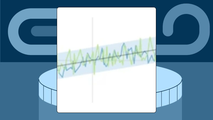
Outliers Chart for Detecting Data Anomalies
This is some text inside of a div block.
Data Quality
Outliers Chart: Spot Data Anomalies Before Analysis
outliers-chart
chart
No items found.
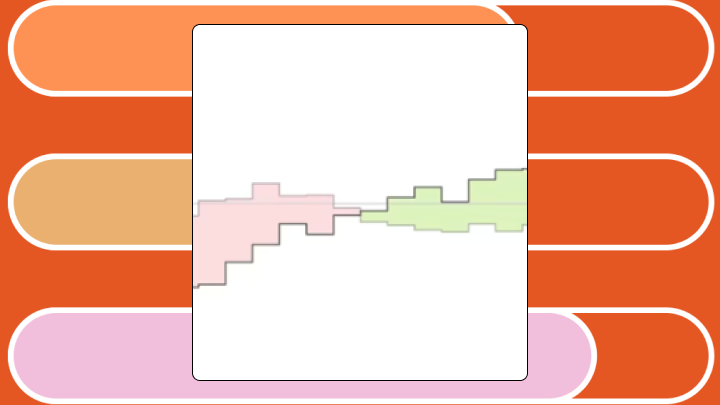
High-Low Chart: Definition and Examples
This is some text inside of a div block.
Data Visualization
High Low Chart: Definition, Examples, and Best Practices
high-low-chart
chart
No items found.
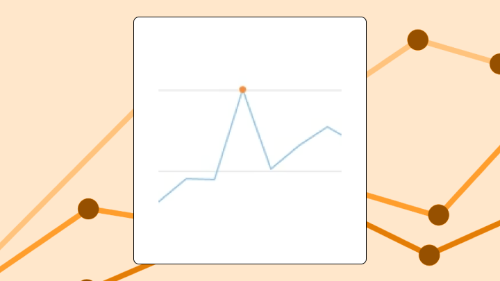
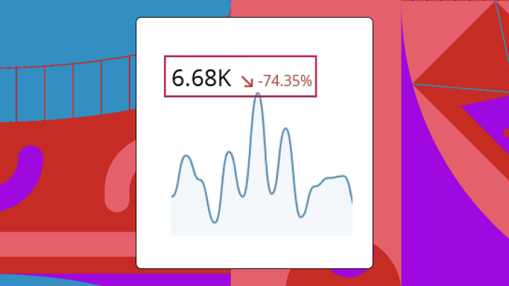
Spark Line Chart: What It Is and When To Use It
This is some text inside of a div block.
Data Visualization
Spark Line Chart: What It Is and When to Use It
sparkline-chart
We couldn’t find any content matching your search.
Try adjusting your search terms or reset your search to start over
Reset Search