Chord Diagram: Definition, Uses, and Examples

A chord diagram is a circular visualization that shows relationships between categories, where ribbon width encodes the volume of each connection and arc length reflects each category's total flow. When the data fits, these charts can surface which pairs dominate a relationship matrix in a way that pivot tables simply can't match. When the data doesn't fit, they collapse into a tangle of overlapping ribbons that nobody can trace.
What decides it's fit: the question, the shape of the data, and whether the audience can interpret a circular layout without needing it explained. Below is what chord diagrams are, what the data has to look like, when they're worth using (and when they're not), plus practical guidance on reading and building them.
Key takeaways for chord diagram selection
- Use this chart when: You have fewer than 12 categories with meaningful connections between them, and you need to see both total volume per category and the strength of individual relationships.
- Avoid this chart when: You have more than 12 categories, most pairs have zero or near-zero connections, or your audience hasn't seen a circular layout before.
- Primary decision supported: Identifying which category pairs have the strongest connections and whether flows are balanced or lopsided.
- Most frequent misuse: Treating ribbon width as precise measurement rather than approximate comparison.
- Best alternative: Use a heatmap when you have many categories, or a Sankey diagram when sequence matters.
For cross-team budget flows, customer journey interdependencies, or revenue moving between business units, this chart is one of the rare times the visual format actually matches the analytical question. Teams that have switched from a relationship matrix to a chord diagram mid-meeting have gone from "what does this table mean?" to "so what are we changing?" in under a minute.
Data requirements
Data issues are what sink chord diagrams, not color palettes. A clean design built on poorly shaped data still produces nonsense.
Most tools want one of two inputs: an adjacency matrix (same categories on rows and columns, each cell holds the flow), or an edge list (Source, Target, Value). These get mixed up regularly, and the result is ribbons that look "off" in ways that are hard to diagnose visually. With directed chord diagrams, Source and Target order is the whole point, so be careful during joins, pivots, and spreadsheet cleanup operations that quietly flip direction. A transposed edge list won't throw an error; it'll just reverse every flow in the chart.
Too few categories is also a signal worth heeding. If there are fewer than four, the circle is a costume change for something a bar chart or a table handles more directly.
Sparse data is the quieter failure mode. When more than half of the category pairs are zero, the remaining ribbons start to look significant simply because they exist. An analyst scanning such a chart might conclude that a particular pairing is a dominant relationship when it's actually just the only one visible. In that scenario, a network graph usually reads better because it clusters related nodes instead of spacing everything evenly around a ring.
Inside a governed BI environment, lock the metric before anyone starts charting. Value should come from an approved semantic layer or a standardized definition, not a one-off workbook formula that can't be audited later. Gartner expects 75 percent of new data integration flowsto come from nontechnical people by 2026, and chord diagrams have a tendency to expose definition drift because everything sits next to everything else in a way that makes inconsistencies hard to hide.
What is a chord diagram
Picture a scenario: Someone asks "who is handing work to whom?" and the answer is a matrix that looks like a tax form. That's the niche chord diagrams fill.
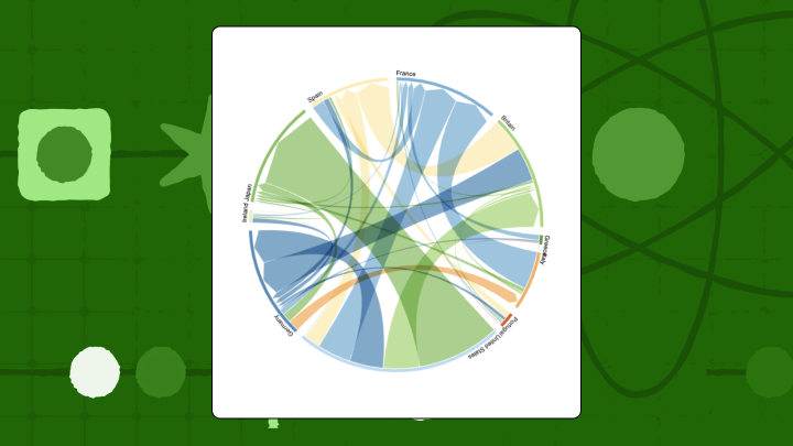
A chord diagram places categories around a circle as arcs, then draws curved ribbons between them to show relationships. Ribbon width carries the magnitude. Arc length reflects the total volume moving in and out of each category, which is why both "big players" and "big pairings" are visible in one glance. The mental model is simple enough to use in a meeting without explanation: Arcs are departments, ribbons are the volume of requests moving between them. Compact, still quantitative, and visual enough that people stop pretending the spreadsheet is readable.
A few terms you'll encounter:
- Arc: The outer-ring segment for each category. Longer arc, bigger total volume.
- Ribbon: The band between two arcs. Wider band, bigger relationship.
- Directionality: Whether the flow is balanced or favors one side. Some charts show this with gradients or tapered ribbons.
Here's a quick summary of what the format changes, keeps, and loses:
- Changes: The relationship matrix becomes a circular layout where the eye follows ribbons, not rows and columns.
- Preserves: Pairwise relationships and category totals (the same facts, different shape).
- Loses: Easy precision for small differences, especially when ribbons are close in width.
Chord diagram use cases and examples
These charts earn their keep when the story lives in the movement between categories, not just the totals.
A SaaS company tracking quarterly movement between Free, Basic, Pro, and Enterprise tiers is a clean example. A bar chart shows net growth per tier, but a chord diagram can reveal that Basic growth comes mostly from Pro downgrades rather than Free upgrades. That's a very different product conversation, and a bar chart buries it entirely by collapsing both sources of inflow into a single column.
Content teams use chord diagrams to map navigation between site sections (Blog, Product, Pricing, Support) without forcing a linear funnel. When Blog visitors frequently move to Product before Pricing, a standard funnel chart makes that path invisible because it assumes a fixed sequence.
Economics teams use chord diagrams to make bilateral trade concentration obvious across five regions, where a thick center ribbon tells the story faster than a dense table. Retail analysts apply the same approach to co-purchase patterns, spotting bundling opportunities (Electronics and Accessories) or gaps (Clothing and Home Goods).
Finance and operations teams use the format for internal flows like budget allocations, chargebacks, and supply chain handoffs, where relationships are genuinely multidirectional.
When to use a chord diagram (and when not to)
The right question to start with: are you trying to understand pairwise balance, or step-by-step progression? If it's balance, the circle helps.
Chord diagrams are strong for bidirectional flows. The textbook example is trade between countries, because exports from Country A to Country B sit right alongside whatever returns the other way, and asymmetry becomes obvious. Inside a company you'll see the same dynamic with chargebacks between business units, requests between teams, or work moving across functions.
They also work when you need a compact "all at once" picture. A pivot table makes people cross-reference rows and columns in their heads, and that cognitive overhead slows discussions down in ways that are easy to underestimate. Put the same matrix in a chord diagram and people start pointing at the thick ribbons instead of squinting at the grid.
Where the chart really earns its place is when a few relationships account for most of the volume. The eye goes straight to the thick connections, which is exactly the behavior you want when you're trying to keep a discussion focused.
The cases where it doesn't work: when the category count climbs, the middle turns into overlapping ribbons and tracing any single connection becomes a finger-on-the-screen exercise.
If the question is "what happens after step two," a chord diagram doesn't encode order and will imply structure it doesn't actually show. Use a Sankey instead. And audiences vary.
If the people in the room haven't seen a circular relationship chart before, the first five minutes of the meeting get spent on a visual tutorial, which defeats the purpose of picking something compact.
How to read a chord diagram
The first glance is biased. The loudest colors and fattest ribbons grab attention first, which is useful, but it can also pull readers into over-interpreting small differences. A ribbon that looks twice as wide might be feeding a conclusion that the actual values don't support.
A structured approach, especially when a dashboard is new to a team:
- Start at the outer ring. Arc length gives you total volume by category.
- Then find the widest ribbons across the center; those are the dominant pairwise relationships.
- Look at how each ribbon meets the arcs. If it's wide at one end and narrow at the other, the flow is lopsided.
- Finally, notice arcs with few or thin ribbons; those categories are relatively isolated.
Precision is where people get burned. Slight width differences can come from rounding, binning, or an aggregation change upstream, not a real shift in the underlying process. If you need to defend a claim, hover for the exact value or go back to the source table.
Direction is also not automatic. Without arrows, gradients, or tapered ends, plenty of chord diagrams read as symmetric even when the data isn't. A stakeholder might confidently describe a relationship as mutual when one direction accounts for three times the volume of the other. If the chart provides no directional cue, treat it as a relationship map first, and a flow map only after you've verified the encoding.
Chord diagram variants and related techniques
Small design choices change what people think the chart is saying. Same dataset, different conclusion, just because direction or color rules changed.
Directed vs undirected chord diagrams
Undirected diagrams collapse A-to-B and B-to-A into one combined relationship. Directed diagrams split those flows, often using gradients or split ribbons to distinguish them.
Directed is the right call when asymmetry is the story. Employee transfers between departments are a good example, because it matters whether people move from Sales to Marketing or the other way around. Undirected behaves better when the relationship is inherently mutual, like keyword co-occurrence.
A pattern that shows up more often than it should: A diagram gets labeled "directed," but the underlying data was already aggregated into a single undirected pair. At that point the gradient is just decoration, and anyone reading directionality from it is drawing a conclusion the data doesn't support.
Hierarchical edge bundling
When categories belong to larger groups (cities within countries, for example), hierarchical edge bundling routes ribbons through the hierarchy to reduce clutter and make group-level patterns easier to spot. The tradeoff is that tracing a specific City X to City Y connection becomes harder, which is a real problem when a stakeholder needs to verify one exact path. Teams often discover this limitation mid-review when someone points at the chart and asks where a specific connection went.
Link color rules
Color isn't just a design decision here; it's how people infer direction. Common approaches:
- Source-dominant: Ribbons take the source category's color. Best for answering "where does volume from Category A go?"
- Target-dominant: Ribbons take the target category's color. Best for answering "where does volume for Category A come from?"
- Gradient: Ribbons transition from source to target color. Makes directionality explicit but can create a rainbow effect with many categories.
Pick one rule and apply it consistently across dashboards. Switching between source-dominant and target-dominant across similar charts is a reliable way to get a well-informed person to say something incorrect in a presentation.
How to create a chord diagram in Excel
Excel won't give you a true chord diagram out of the box. A radar chart can produce something vaguely circular, but it can't vary ribbon width by volume, which is the core mechanism the chart relies on.
Start from an adjacency matrix: the same categories down the rows and across the columns, with flow magnitude in the cells. Before plotting anything, sum your rows. Those totals should match outbound volume for each category. When they don't, it's usually a duplicate mapping, a missing filter, or an aggregation mistake that the chart will display without complaint.
If an Excel-only approximation is still needed:
- Enter your adjacency matrix with categories in Row 1 and Column A.
- Select the entire data range including headers.
- Navigate to Insert, then Chart, then Radar, then Filled Radar.
- Format fill transparency to roughly 40 percent so overlaps are visible.
The result is a radar chart. Connections are straight lines, not ribbons, and width can't encode volume.
For teams that use chord diagrams regularly, BI environments like Domo (which offers 150+ native chart types, chord diagrams included) or visualization libraries like D3.js handle the geometry properly and support hover tooltips for exact values.
For BI managers and IT teams, native support is also a governance decision. In many stacks, chord diagrams arrive as extensions, marketplace visuals, or custom builds, which can mean version conflicts, maintenance overhead, and additional review steps when the data is sensitive.
If you're building embedded analytics into a SaaS product, build-versus-buy becomes a real conversation quickly. The embedded analytics market is projected to reach $74.98 billion by 2032 according to Fortune Business Insights, which helps explain why product teams try to ship advanced visuals without signing up for years of custom visualization maintenance. Domo Embed and Domo Everywhere let product teams ship chord diagrams as an embeddable chart type without owning a custom visualization codebase long-term.
Chord diagram limitations and alternatives
Past roughly 12 categories, the middle becomes a block of overlapping ribbons and no amount of color adjustment fixes traceability. The chart stops being a relationship tool and becomes a pattern that looks like it contains information without surfacing any.
Ribbon width is also an approximation problem: Comparing curved widths at different angles is hard for the human eye, and area judgments rank among the least accurate perceptual tasks. A stakeholder might confidently report that one flow is significantly larger than another when the actual difference is within rounding. If stakeholders need confidence that Sales were $1.2M versus $1.3M, this is the wrong instrument.
Chord diagrams are static snapshots. They don't encode time or order.
| Comparison | What the Alternative Does Better | What Chord Diagram Does Better |
|---|---|---|
| Chord vs Sankey | Sankey shows sequence, stages, and drop-offs | Chord shows bidirectional flows compactly |
| Chord vs Heatmap | Heatmap scales to dozens of categories | Chord highlights dominant connections visually |
| Chord vs Network Graph | Network graph shows clustering and communities | Chord emphasizes flow magnitude over topology |
Final thoughts on chord diagram selection
Not every relationship problem deserves a circle. Chord diagrams work when there's a small set of categories, flows that matter in both directions, and an audience that won't need a tutorial. They fall apart with sparse connections, overloaded category counts, or any question that depends on sequence.
If the goal is for people to explore the relationships without narration, interactivity is usually the difference between "nice visual" and "useful tool." Filters, drill-down, and metric swaps (for example, toggling revenue flow versus margin flow) let people test a claim instead of arguing about it. If you're ready to move from static charts to interactive relationship visuals, join the Domo community.


