Correlation Charts: What They Are and When to Use Them

Correlation charts can save you hours of exploratory analysis. They can also send you confidently toward the wrong conclusion. This article breaks down the two main types of correlation charts, shows you how to read and create them in Excel, and lays out the data requirements and best practices that separate useful insights from misleading ones.
What is a correlation chart?
Sometimes a correlation chart is a shortcut, but sometimes it's a trap. Before you trust the pretty dots or the colorful squares, get clear on what the chart can and can't say.
A correlation chart is a visualization that shows whether two or more numeric variables move together. It answers a tight question: When one variable goes up, does the other tend to go up too, go down, or do nothing predictable at all?
That relationship gets summarized by the correlation coefficient, usually written as "r." The value ranges from -1 to +1. A value of +1 means both variables move in perfect lockstep. A value of -1 means they move in perfect opposition. Zero means there's no linear pattern connecting them.
Here's where teams routinely slip up: A high r can come from a shared trend (two lines both rising over time) even when there's no real relationship underneath. If you're correlating time series, you often need to de-trend or look at changes (like week-over-week deltas) so you're not just measuring "time passing." That's the part most guides skip over entirely.
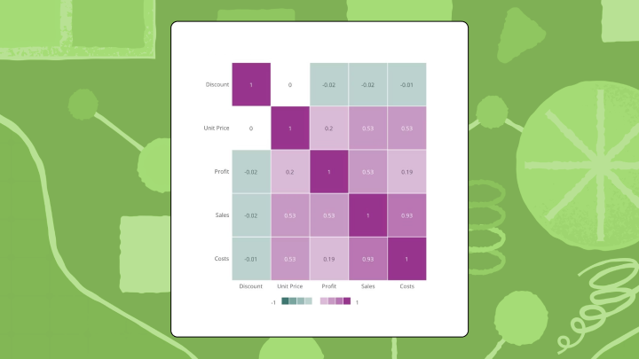
"Correlation chart" is really an umbrella term for two different visualizations. A scatter plot with trendline works best when you're examining exactly two variables. You plot one variable on the horizontal axis, the other on the vertical, and the slope of the line signals direction. A correlation matrix (sometimes called a heatmap) is better when you need to compare many variable pairs at once. Each cell shows the r value between two variables, and color intensity makes stronger relationships pop visually.
Here's a rough rule of thumb for interpreting r values:
Correlation charts can't tell you whether one variable causes the other. They only measure association.
When to use a correlation chart
You'll run into correlation charts in more places than you'd think.
Analysts and BI specialists use them for exploratory analysis and feature selection. Line of business managers use them to sanity-check whether two team key performance indicators (KPIs) really move together. Executives use them as a quick confidence check when they need to validate an assumption fast (such as whether marketing spend and revenue actually track week to week).
Two numeric columns and a question about whether they trend together? A scatter plot with a trendline earns its keep before you build a model or shift budget. Five or more variables that all need scanning at once? A correlation matrix saves you from plotting dozens of separate charts.
Comparing two variables
Start with the dots.
A scatter plot shows you the shape of the relationship, not just a single number. You can spot outliers, clusters, and curves that a coefficient alone would hide. It's a strong fit for exploratory work before you commit to a decision, or before you put a chart in front of a nontechnical stakeholder who will (reasonably) ask, "Wait, what's actually happening here?"
One mistake that shows up constantly: mixing apples and oranges on the axes, such as monthly spend against daily signups. Even if Excel gives you an r, the relationship is hard to interpret because the grain does not match.
Comparing many variables at once
A correlation matrix lets you sweep a data set for interesting pairs. Data scientists use this constantly during feature selection for machine learning, a practice growing in relevance as 78 percent of organizations now use AI in at least one business function, according to McKinsey. Feature selection often hinges on quickly spotting variables that move together, so you can reduce redundancy before a model bakes it in.
The matrix also helps you catch multicollinearity before running a regression, which happens when two of your independent variables are so similar they shouldn't both be in the model. People often misread multicollinearity as "a really good predictor," when it's more like two predictors telling you the same story twice.
Consistency is where teams get into real trouble. If different dashboards calculate "revenue" or "retention" differently, you end up debating chart versions instead of debating the relationship. Precisely's research found 67 percent of data professionals don't fully trust their organization's data for decision-making. In correlation work, that distrust shows up as endless second-guessing of whether the chart is wrong or the data is.
When to skip correlation charts entirely
Correlation charts are not always the right move.
They break down under certain conditions:
- Fewer than 30 data points: The coefficient becomes unreliable. One weird value can flip the sign.
- Nonlinear relationships: If the pattern curves, r will miss it or understate it badly.
- Categorical data: Correlation coefficients need numbers. For text categories, use chi-square or Cramér's V instead.
- Cause-and-effect questions: Use experiments or causal methods. Correlation only shows association.
- Inconsistent metric definitions across dashboards: If the same KPI has multiple formulas floating around, the chart turns into a trust problem, not an analysis.
Data requirements for correlation charts
When a correlation chart feels "off," the math is often innocent.
The real suspects are usually upstream: the data plumbing, the joins, and the definition of the metrics in the first place. Poor data quality alone costs organizations $12.9 million per year, according to Gartner. Correlation charts are extremely sensitive to small data issues, so that cost shows up as wasted analysis time and decisions that look "data-backed" but aren't.
Here's what you want in place before you interpret a single r value:
- Numeric variables with aligned grain: Make sure both columns represent the same unit of analysis (for example, weekly spend paired with weekly revenue, not weekly spend paired with daily revenue).
- Clean joins and stable keys: If you're combining sources, a messy join can create phantom relationships. This is where data engineers earn their keep by making sure datasets are joined correctly and refreshed consistently.
- **A clear **missing-data strategy: Decide whether you'll use pairwise deletion or listwise deletion (and stick to it), especially if you'll publish a correlation matrix that lots of people will reference.
- Governed metric definitions: If multiple teams define the same metric differently, you don't get one version of the relationship. You get confusion.
- Access controls that match your data policy: Correlation charts often involve sensitive measures (finance, human resources, operations). Row-level access controls help you share the right view with the right people without creating a dozen exported copies.
How a correlation chart works
Your eye is fast. Too fast, sometimes. In a scatter plot, most people register the slope first. Upward means positive, downward means negative. Then they notice how tightly the dots cluster around the line. Tight clustering usually signals a stronger relationship, and a scattered cloud signals a weaker one. Simple enough in theory.
In a matrix, you scan for color intensity. The most saturated cells grab attention first. The diagonal (where each variable correlates with itself) always shows 1.0, so ignore it.
Reading a scatter plot correctly
If you want a simple routine that holds up under pressure, use this sequence:
- Check the trendline direction
- Assess how far the dots spread from the line
- Look for outliers pulling the line in a suspicious direction
- Check for curvature that the linear coefficient would miss
A quick reality check: if you see a strong r but the points form two separate clusters, you might be looking at two different populations—like small and midsize businesses (SMB) and enterprise—rather than one relationship. The coefficient won't tell you that. The plot will.
Reading a correlation matrix correctly
This is the scan pattern that tends to work:
- Find the most saturated cells first
- Skip the diagonal
- Look for surprising correlations between variables that shouldn't be related
- Verify the color scale treats positive and negative values symmetrically
One more practical pitfall: if your matrix includes derived metrics (such as conversion rate) alongside the raw counts (like clicks and sessions), you'll often "discover" correlations that are baked in by the formula itself.
Where interpretation goes wrong
A single extreme value can inflate r dramatically. A U-shaped relationship produces an r near zero even though a real pattern exists. Two variables might correlate only because a third variable drives both of them. Small samples produce high r values by pure chance. None of these are edge cases. They come up constantly in real analysis.
Types of correlation coefficients
Pearson r is the default. But it's not the only option. Pearson r assumes your data is continuous and the relationship is linear. It's also sensitive to outliers, so a single odd point can do more damage than you'd expect.
Spearman rho ranks your data before calculating, which makes it work for ordinal data (like survey responses) and monotonic relationships that aren't strictly linear. It can still be misleading if your relationship changes direction (rising at first and then falling), because "monotonic" is the key requirement.
Kendall tau handles small samples and data with many tied values better than Spearman. More conservative, which is sometimes exactly what you want when people are tempted to over-interpret a modest data set.
If your data violates Pearson's assumptions and you use it anyway, expect coefficients that misrepresent what's actually happening.
How to create a correlation chart in Excel
Excel can get you a correlation chart quickly. The "quickly" part is the upside. The downside is that it's easy to produce something that looks official while quietly doing the wrong math.
Prepare your data
Start with the backend setup. It saves you later.
Put your data in two adjacent columns with headers in the first row. Remove blank rows. Both columns need numeric values only.
If your values are stored as text (a classic Excel issue), =CORREL() will happily return an error or a misleading result. Converting the column to a true numeric format before you start avoids a lot of head-scratching later.
Create a scatter plot with trendline
- Select both columns including headers
- Go to Insert → Charts → Scatter → Scatter with Only Markers
- Click any data point in the chart to select the series
- Right-click and choose Add Trendline
- In the Format Trendline pane, check "Display R-squared value on chart"
The chart shows R², which is r squared. Take the square root to get the correlation coefficient. If the line slopes downward, r is negative.
People mix up R² and r more often than you'd expect. R² tells you strength in terms of variance explained, but it will not show direction, so you still need the slope (or the sign of r) to interpret what "strong" actually means.
Calculate the coefficient directly
In an empty cell, type =CORREL(A2:A100, B2:B100) and adjust the ranges to match your data. Press Enter. That's your Pearson r.
If your ranges include different row counts (say one column has extra blanks at the bottom), you can end up correlating misaligned periods without realizing it. Matching the row boundaries is unglamorous, but it is the work.
Build a correlation matrix
- Go to File → Options → Add-ins
- Select "Analysis ToolPak" and click Go, then check the box and click OK
- Go to Data → Data Analysis → Correlation
- Select your input range (all numeric columns with headers)
- Check "Labels in first row" and choose an output location
- Click OK
Excel generates a matrix of pairwise r values.
Add color to make it readable
Select the matrix numbers (not the headers), go to Home → Conditional Formatting → Color Scales, and pick a three-color scale. Red for negative, white for zero, green for positive works well.
Make sure your colors are centered on zero. If Excel auto-scales from the minimum to maximum values in your matrix, one extreme cell can compress everything else into "barely colored," and your readers will miss meaningful differences.
Validation check
The diagonal of your matrix should show 1.0 for every variable. If any diagonal value differs, your range selection was wrong.
Excel's ToolPak only calculates Pearson r. For Spearman or Kendall, you'd need to rank the data manually first. And for data that refreshes daily, Excel requires manual updates each time. That adds up fast if correlation is something your team checks regularly.
In Domo's BI capabilities, teams can keep correlation charts live inside dashboards instead of emailing static exports around. Domo can also help teams build a correlation chart once and use it consistently by using governed metrics (through a semantic layer) and security controls like row-level access. For business teams, AI Chat and natural language query can help people ask correlation questions in plain language, without turning it into a stats homework assignment.
Best practices for correlation charts
We've seen this movie.
A product team once reported strong correlation between feature usage and retention. The analysis looked solid until someone noticed it excluded churned people who never logged in. The correlation was real only for people who stuck around, which made it useless for understanding churn. The coefficient was technically correct. The framing was completely wrong.
These guidelines help you avoid similar problems:
- Plot the data** before trusting the number:** A scatter plot reveals outliers and nonlinearity that r alone hides.
- Report sample size alongside r: A correlation of 0.8 from 15 observations means far less than 0.5 from 500.
- Handle missing data explicitly: Pairwise deletion uses all available pairs but can create inconsistent sample sizes across your matrix. Listwise deletion drops any row with missing values but can bias results.
- Check for outliers: A single extreme value can flip a weak negative into a moderate positive.
- Use symmetric color scales: If your heatmap emphasizes positive values more than negative, readers will underestimate inverse relationships.
- Standardize definitions before you standardize visuals: If teams argue about whose revenue is correct, your correlation chart becomes a meeting agenda item instead of a decision tool.
Same warning as above: don't treat correlation as causation. Ice cream sales and drowning deaths both rise in summer, but one doesn't cause the other.
Correlation chart examples
Marketing media mix
Picture a marketing leader trying to make sense of budget moves from last quarter.
A marketing team plots ad spend across five channels against weekly revenue. The correlation matrix shows paid search has a strong positive r with revenue while display ads show near zero. A bar chart of spend by channel would show how much went where but wouldn't reveal which channels actually track with results.
This is exactly the kind of question executives and marketing leaders want to explore interactively. If the chart lives in an up-to-date dashboard, they can ask follow-up questions right away instead of waiting for a new export.
Portfolio risk assessment
In investing, "diversified" can be a comforting story. Correlation tells you when the story is wrong.
An analyst builds a correlation matrix of asset returns. Two stocks from different sectors show an r of 0.85, meaning they move together and offer less diversification than expected. A line chart of prices would show parallel trends but wouldn't quantify the relationship.
Product engagement and retention
Here's a case where the picture matters more than the coefficient.
A product team correlates feature engagement with 90-day retention. The scatter plot reveals something unexpected: moderate engagement correlates with the best retention. Both low and high engagement correlate with churn. A simple r value would have shown weak correlation and hidden this pattern entirely. The coefficient would have sent the team in the wrong direction.
Limitations and alternatives to correlation charts
Correlation charts answer one question well and several questions poorly.
What they do well:
- Quantify strength and direction of linear relationships
- Scan many variable pairs quickly
- Identify candidates for deeper investigation
However, they can't establish causation, detect nonlinear relationships, handle categorical variables, or account for confounding variables.
If You Need To...Use InsteadDetect nonlinear patternsScatter plot with a locally estimated scatterplot smoothing (LOESS) curveCompare categoriesChi-square or Cramér's VControl for confoundersPartial correlation or regressionShow change over timeLine chart
How correlation charts change decisions
A correlation chart changes the conversation, sometimes for the better, sometimes just by making people overconfident.
- Easier decision: Which variables to include in a predictive model or which channels deserve more investigation
- Harder decision: Determining root cause, since correlation tempts you to act on association without testing causation
- Common overcorrection: Teams see a strong correlation and shift resources immediately, then discover the relationship was driven by a third variable
- Question the chart cannot answer: "If we increase X, will Y improve?" Only experimentation can answer that.
For analysts and BI specialists, workflow matters here in ways that don't get discussed enough. If correlation charts require manual chart-building every time, or get rebuilt differently across dashboards, people spend more time reconciling versions than doing analysis. Governed, reusable correlation chart components help teams keep the conversation on decisions, not dashboard archaeology.
Takeaways about correlation charts
Correlation charts are a fast way to check whether variables move together. Consider a scatter plot for two variables when you need to see the shape. Use a matrix when you need to scan many pairs. Plot the data before trusting the coefficient, and report your sample size.
If your team monitors correlations across live data, a BI tool removes the manual refresh cycle. Domo can automate recalculation and help you set up alerts when relationships shift. It also helps BI and IT managers standardize correlation chart creation in one platform, so the organization isn't stuck with five different versions of the same relationship.


