Sunburst Chart: What It Is and When to Use It

Nested data gets confusing fast. But with a sunburst chart, you can turn hierarchical data into an easily digestible, layered circular view where each ring represents a level in your data’ structure.
This article explains how sunburst charts work, walks through the data requirements and anatomy, and covers when to use them vs alternatives like treemaps or icicle charts.
You’ll also find step-by-step instructions for building sunburst charts in Excel and tips for scaling them across dashboards.
What is a sunburst chart?
A sunburst chart is a circular visualization that displays hierarchical data using concentric rings. The center circle represents the top-level category. Moving outward, each ring shows the next level of detail, while the arc size indicates proportion, so bigger slices mean bigger values.
It's like a pie chart with layers. A standard pie chart shows one level of data. A sunburst adds depth by letting you see how each slice breaks down into smaller pieces, and how those pieces break down further still.
Value gets encoded through angular position and arc length, not height or rectangular area. It's useful for showing parent–child structure at a glance; but people do tend to overestimate differences between similar-looking arcs. If comparison is the primary job and hierarchy is secondary, this limitation will become apparent.
Most tools offer two common options: percent of parent (each arc is a share of its immediate parent) and percent of whole (each arc is a share of the full chart). Pick one and label it clearly. Mixing mental models is where meetings tend to go sideways.
Be aware that there are practical limits. Two to four hierarchy levels is the sweet spot. Past that, the outer rings turn into slivers. The same goes for overcrowded rings: If the categories start blending together, simplify the hierarchy or group smaller segments.
When to use a sunburst chart
Use it when hierarchy and part-to-whole need to live in the same frame.
A sunburst makes sense when you want stakeholders to see the whole picture and its nested parts at the same time: Budget breakdowns across divisions and departments. Organizational structures. Content taxonomies. Website navigation paths with two or three levels of depth.
It also helps when you’re tired of the follow-up questions. A BI analyst can walk into a meeting with revenue broken down by region, country, and product line and let the chart do most of the talking. An executive can see exactly where revenue is coming from, down to the product level, without flipping through tabs. A sales or marketing manager can spot which sub-team or segment is dragging the total, then drill into the next ring for detail. In practice, the win is that people stop asking, “Where is this number coming from?” and start asking, “Why is that slice growing?”
When a sunburst is the wrong tool, it tends to be wrong in predictable ways:
- Deep hierarchies: Past five levels, outer rings compress into illegible slivers. An icicle chart preserves depth without radial compression.
- Precise comparisons: Arc length is harder for the eye to judge than bar length. If you're trying to compare sibling values accurately, use a treemap or a bar chart.
- Too many segments: More than 12 to 15 categories per ring creates visual clutter. Aggregate small categories or switch to a hierarchical bar chart.
- Flat data: If your data has no hierarchy, you’re adding complexity for no reason. A pie chart or bar chart is simpler.
Ignore these constraints and expect stakeholders to misread small arcs as insignificant even when they represent meaningful values. Labels will overlap or vanish on narrow segments. Comparisons across nonadjacent arcs will be imprecise at best. And someone will assume the colors mean “good vs bad” if you don’t define what color is doing.
Sunburst chart data requirements
This chart type is picky, in a good way. With 61 percent of organizations citing “data quality as a top challenge,” a sunburst will surface messy hierarchical data immediately because every missing node turns into a visual gap people notice.
Start with a clean hierarchy path. Each row should represent one complete path from the first level to the deepest level you want to show (for example: Region → Country → Product line → Product). Blank cells cause problems. Most tools treat an incomplete path as “missing hierarchy,” which often looks like missing slices. Duplicated paths are the other easy-to-miss issue. The same branch repeated across multiple rows can quietly inflate a slice if you haven’t aggregated to the leaf level.
Your values need to roll up cleanly. That means:
- No subtotal rows mixed into the same table you chart.
- One value per leaf node (the outermost level you chart).
- Consistent definitions for calculated fields, so “Revenue” means the same thing in every dashboard.
Sunburst charts also assume nonnegative measures. If you have refunds, margin deltas, or other values that go negative, split that analysis out or convert to absolute values and use color to show direction. Otherwise the chart will either fail to render or, worse, communicate a “missing” slice that's actually a negative.
Governance becomes part of the data requirements if you’re building charts for a lot of teams. IT and data leaders usually want sunburst charts anchored to certified data sets and standardized metrics. McKinsey reports 70 percent of organizations struggle with data governance processes, and sunburst charts amplify that pain because a small definition mismatch gets repeated across every ring. For customer-facing products, row-level security and programmatic filtering matter too, because each customer should only see their own hierarchy.
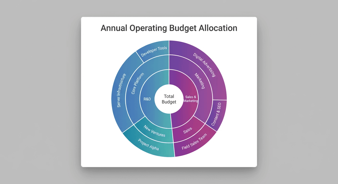
Sunburst chart anatomy
Start at the center. Everything else hangs off it.
The center circle is called the root node. It represents the top-level total or category, and everything else in the chart is a child of this root.
Each concentric ring represents one level of the hierarchy. The first ring outside the center contains direct children of the root. The second ring contains grandchildren. And so on.
Segments (the individual arcs) represent categories at each level. The arc angle is proportional to the segment’s value relative to its parent. Siblings are segments that share the same parent arc, and their arcs always sum to the parent’s total arc.
Here’s how the math works: A segment’s arc angle equals (segment value ÷ parent value) × parent arc angle. For the first ring, the parent is the root, so each arc spans (segment value ÷ total) × 360 degrees.
Most tools render segments clockwise starting from twelve o’clock, sorted by value descending or alphabetically by label. If you’re comparing the same chart over time, lock that sorting choice. Changing sort order between versions makes growth look like movement, and people will absolutely notice that in a quarterly review.
To read the chart correctly, start at the center and move outward. Follow a single branch by tracing from root through successive rings. When segments get small, use tooltips or breadcrumbs to confirm your path.
How to create a sunburst chart in Excel
Excel can do it, but it isn’t the friendliest environment for hierarchies.
Excel 2016 and later versions support sunburst charts natively. Earlier versions require workarounds.
Arrange your data in adjacent columns representing hierarchy levels from left to right, with the value column on the far right. If your table includes headers, include them in your selection so Excel can use them as labels.
The steps are straightforward:
- Select the entire data range including all hierarchy columns and the value column.
- Navigate to Insert → Charts → Hierarchy → Sunburst.
- Excel generates the chart with the leftmost column as the root level.
- Right-click any segment to access Format Data Point for color adjustments.
- Click Chart Elements (the plus icon) to toggle data labels.
Missing segments usually mean blank cells in your hierarchy columns. Fill blanks with a consistent placeholder (like “Unknown”) or repeat the parent label consistently so the path remains intact. Double counting happens when your data includes subtotal rows. Remove them before charting. Unreadable labels result from narrow arcs. Reduce hierarchy depth or aggregate small categories.
For validation, sum the value column manually. The root segment’s implied value should match this total exactly. If it doesn’t, the culprit is almost always an extra subtotal row or a duplicated leaf.
Excel’s sunburst lacks interactivity. No drill-down on click. Limited label formatting. With 38 percent of executives citing poor analytics tools as a barrier to data literacy, this matters because a static sunburst often triggers, “Can you slice it another way?” requests, which spreadsheets handle poorly. And honestly, that’s the part most guides about Excel charts skip over entirely.
For quick one-off visuals with nonsensitive data, an open-source tool like RAWGraphs can help, but double-check privacy and export requirements.
Sunburst chart best practices
Start by trimming the ambition. Sunbursts reward restraint.
Limit hierarchy depth to four or five levels. Past that, labels and clicks start to fail, and it gets harder to trace a branch back to the root.
Cap segments per ring at 12 to 15. More segments create visual noise, and viewers can’t distinguish arcs that differ by only a few degrees. Aggregate low-value categories into an “Other” segment or filter before charting. If you do use “Other,” keep it consistent across reports. Otherwise “Other” becomes a moving target that people don’t trust, and once they stop trusting one label, they start questioning all of them.
Use consistent color encoding by level or category, not by individual segment. Random colors per segment force viewers to rely on legends or tooltips for every comparison. Assign a color palette to hierarchy levels or use a single hue with saturation variation. Decide what color means (category identity, grouping, or performance) and stick to one job per chart.
Arcs narrower than 5 to 10 degrees can’t display readable labels. Either hide labels on small arcs and rely on tooltips, or aggregate small segments before building the chart.
When people drill into a branch, they lose context of where they are in the hierarchy. Display a breadcrumb trail to maintain orientation. If your tool supports it, showing the parent total alongside the drilled view keeps the part-to-whole promise intact.
Low-contrast color pairs fail accessibility guidelines and exclude colorblind viewers. Use a contrast checker and consider patterns or textures for critical segments.
Reusing the same metric definitions and hierarchy logic reduces maintenance when the underlying data model or calculated fields change. If your sunburst chart is going on multiple dashboards, consistency matters more than one-off perfection.
Sunburst chart examples
Picture a finance team trying to explain spending without flipping between five tabs.
Finance team spending
A finance team visualizes departmental spending across three levels: Division → Department → Cost Center. The sunburst immediately shows that Marketing (a single department) consumes a larger arc than the entire Operations division. A flat bar chart would require viewers to mentally sum subcategories. A treemap would show the same insight but lose the clear parent-child nesting.
Now swap in a different kind of hierarchy: content.
Content strategy
A content strategist maps page views across Site Section → Category → Article. The sunburst reveals the “Resources” section drives more traffic than “Products,” even though “Products” appears first in the navigation. A pie chart would flatten the hierarchy. A table would require scrolling and mental aggregation.
What not to do
And then there’s what not to do. This particular mistake has happened more than once, and it’s always the same setup.
An IT team attempts to visualize server log events across six hierarchy levels. The outer rings collapse into unreadable slivers. The chart technically renders, but no one can identify which error types dominate. An icicle chart or filtered treemap would preserve legibility.
Sunburst chart limitations and alternatives
Sunbursts are great at structure but mediocre at precision. That tension is worth sitting with for a moment, because it shapes every decision about when to use one.
Arc length is harder to compare than bar length. Viewers struggle to judge whether two nonadjacent arcs differ by 5 percent or 15 percent. After four or five levels, outer rings become illegible. Too many segments per ring create visual clutter where small arcs blend together.
If you're running into these issues, here are some alternatives:
Note that treemaps use rectangular area, which is easier to compare than arc angle, and they handle deeper hierarchies better. But sunburst charts show parent-child nesting more explicitly and are often more intuitive for nontechnical audiences.
And while icicle charts preserve depth without radial compression, which makes them better for deep taxonomies, sunburst charts are more compact and visually distinctive, which makes them a better choice for presentations where space is limited.
Build sunburst charts in Domo
Dashboards are where sunbursts tend to earn their keep.
For teams managing hierarchical data across departments, regions, or product lines, building sunburst charts in a BI platform offers real advantages over spreadsheet tools: Real-time data connections, including application programming interface (API) connectors. Role-based access. Consistent formatting across dashboards.
Domo’s Analyzer supports sunburst charts with drag-and-drop configuration. Connect your data source, map hierarchy columns to the chart’s levels, and publish to a dashboard where stakeholders can interact with the visualization without accessing raw data.
Benefits of using Domo
If you’re building sunburst charts at scale, Domo’s semantic layer and reusable metrics help you keep “Revenue” and other key performance indicators (KPIs) consistent across dashboards, so people stop debating definitions and start debating decisions. IT teams can also control who can build or edit charts tied to sensitive hierarchies.
When your data changes, the chart updates automatically. No manual re-export. No version control headaches.
If your audience wants answers, not just slices, Domo’s AI chat and natural language query options can help managers and other data-minded people ask follow-up questions about what they’re seeing (like why one segment is so large) without sending another ticket to the analytics team. Domo’s AI-driven insights layer can also surface anomalies or trends inside a hierarchy, so the chart comes with context.
For teams embedding analytics into a customer portal or software as a service (SaaS) product, Domo Everywhere (Domo Embed) supports embedding interactive charts, with row-level security and programmatic filtering to help each customer see only their own hierarchy.
Other BI platforms can visualize hierarchies, but the path to a sunburst chart varies. Some rely on third-party custom visuals, while others require extra configuration to support a true multi-level radial hierarchy. Native chart support plus governed metrics is usually the difference between “nice demo” and “trusted dashboard.”
Ready to understand your data with interactive charts?
If you’re ready to turn your hierarchy into a chart people can actually explore (and trust), watch a demo and see how interactive sunburst visuals, governed metrics, and real-time data work together in one place.


