Speech bubble icon

Domo Charts

Use Domo to empower your teams with cutting-edge AI solutions designed for security, scalability, and trust. Reimagine what’s possible with your data.

Gradient background fading from dark navy blue at the bottom to black at the top.
Category :
All
Newest First
Clear All
Filters icon
Marimekko chart with vertical segmented bars in orange, green, and blue shades representing different categories.DOMO brand logo in white on a light blue background.
chart
No items found.

Marimekko Charts: Examples, Best Practices, and How to Create

This is some text inside of a div block.
Part-to-Whole
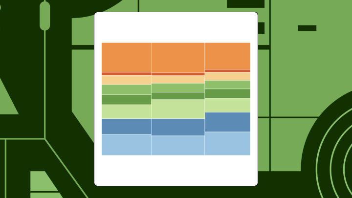
What Is a Marimekko Chart? Uses & Examples
marimekko-chart
Bar chart with four vertical bars of varying heights in a light gray and blue color scheme.DOMO brand logo in white on a light blue background.
chart
No items found.

Bullet Graphs: Examples, Best Practices, How to Create

This is some text inside of a div block.
Project & Performance
What Is a Bullet Graph? Definition, Uses & Examples
bullet-graphs
A table showing tally marks and frequency counts for four categories: Price Check with 16 tally marks, Return with 2 tally marks, Payment Issue with 6 tally marks, and Standard Transaction with 20 tally marks.DOMO brand logo in white on a light blue background.
chart
No items found.

Tally Charts: Examples, Best Practices, and How to Create

This is some text inside of a div block.
Part-to-Whole
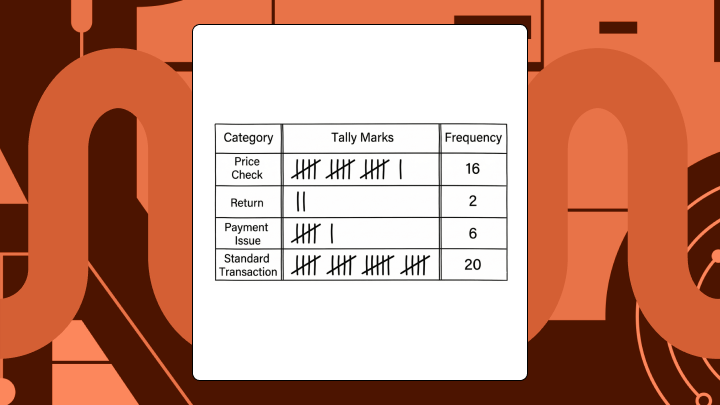
What Is a Tally Chart? Definition, Uses & Examples
tally-charts
Simple flowchart with one diamond shape at the top connected by arrows to two rectangles, which lead to an oval on the left and a rectangle on the right, all connected by arrows.DOMO brand logo in white on a light blue background.
chart
No items found.

Flow Map Guide: Examples, Best Practices, and How to Create

This is some text inside of a div block.
Geospatial & Maps
What Is a Flow Map? Definition, Uses & Examples
flow-map
Radial bar chart with a total value of $9,149,600 displayed at the center, featuring segments in shades of blue, green, and orange.DOMO brand logo in white on a light blue background.
chart
No items found.

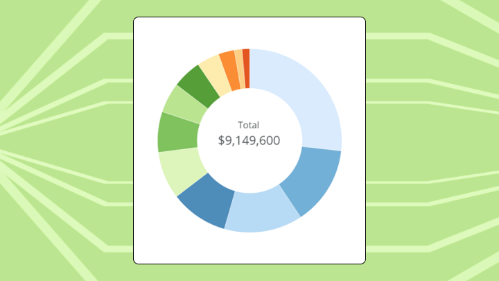
Radial Bar Charts: Examples, Best Practices, and How to Create

This is some text inside of a div block.
Specialized & Niche
Radial Bar Charts: What They Are, When to Use Them, and Best Practices
radial-bar-chart
Table showing sales and profit for product categories Furniture, Office Supplies, and Technology in Central Illinois, listing detailed sub-categories with respective values.DOMO brand logo in white on a light blue background.
chart
No items found.

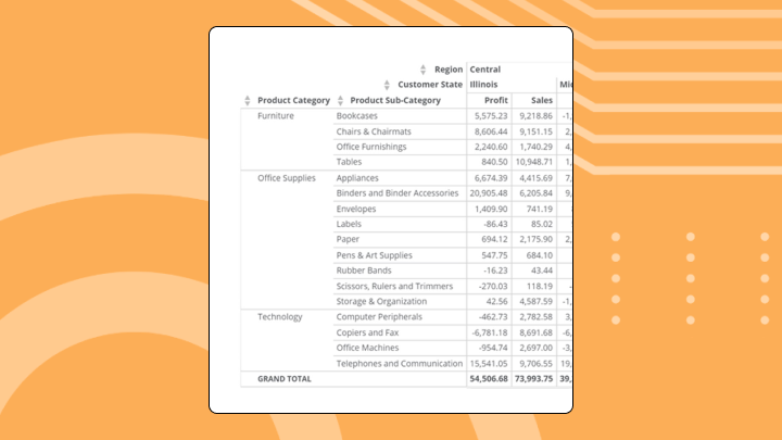
Charts vs Tables: Which One to Use?

This is some text inside of a div block.
Chart Concepts & Guides
Charts vs Tables: How to Choose the Right Data Visualization
charts-vs-tables-which-one-to-use
Violin plot showing data distribution for categories A, B, C, and D with similar median values around 50.DOMO brand logo in white on a light blue background.
chart
No items found.

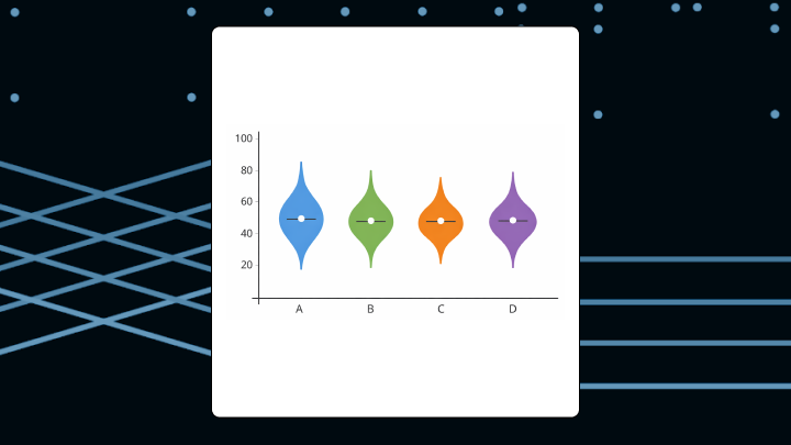
Violin Plots: Examples, Best Practices, and How to Create

This is some text inside of a div block.
Distribution & Statistics
Violin Plots Explained: How They Work and When to Use
violin-plots
Choropleth map of the United States showing varying shades of orange by county, indicating different data intensities.DOMO brand logo in white on a light blue background.
chart
No items found.

Choropleth Maps: Examples, Best Practices, and How to Build

This is some text inside of a div block.
Geospatial & Maps
Choropleth Maps Explained: Examples, Uses, and Tips
choropleth-maps
Network diagram with interconnected colored nodes in blue, green, orange, and purple against a white square background.DOMO brand logo in white on a light blue background.
chart
No items found.

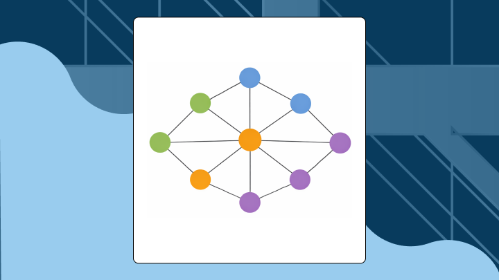
Network Diagrams: Examples, Best Practices, and How to Create

This is some text inside of a div block.
Network & Hierarchy
Network Diagram Explained: Examples, Uses, and Tips
network-diagrams
Sankey diagram showing flow connections from Portugal, Spain, and England to multiple destinations with different colored flow lines.DOMO brand logo in white on a light blue background.
chart
No items found.

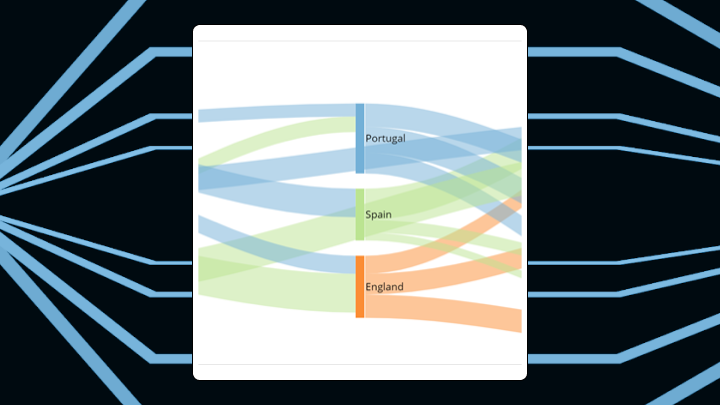
Sankey Diagrams: Examples, Best Practices and How to Create (Including Excel)

This is some text inside of a div block.
Relationships & Correlations
Sankey Diagram Explained: Examples, Uses, and How It Works
sankey-diagrams
Square infographic with four colored blocks in orange, red, green, and blue on a white background, set against an abstract orange and teal circuit design.DOMO brand logo in white on a light blue background.
chart
No items found.

Tree Diagrams: Examples, Uses, and How to Create One

This is some text inside of a div block.
Network & Hierarchy
Tree Diagram Explained: Definition, Examples, and Uses
tree-diagram
Pareto chart with light green bars decreasing from left to right and a blue cumulative percentage line that rises and levels off.DOMO brand logo in white on a light blue background.
chart
No items found.

Pareto Charts: Examples, Best Practices and How to Create One

This is some text inside of a div block.
Comparison
Pareto Charts Explained: Examples, Best Practices, and How to Create One
pareto-charts
We couldn’t find any content matching your search.
Try adjusting your search terms or reset your search to start over
Reset Search