3D Charts: When to Use Them and When to Avoid Them

Adding a third dimension to your charts can reveal hidden patterns in multivariable data or completely obscure the story your numbers are trying to tell. This article breaks down the two types of 3D visualizations, explains why pseudo-3D formats mislead viewers, and provides clear guidelines for when true 3D charts earn their place in your dashboards.
What is a 3D chart
3D charts look fancy. Sometimes, they even help.
A 3D chart takes advantage of three-dimensional geometry and uses it to display information. This can mean plotting a third variable along the z-axis, or it can mean adding decorative depth to a standard 2D chart.
Whether you're a BI analyst building dashboards for a line-of-business (LOB) executive or a manager trying to explain performance without another round of follow-up questions, you'll should ask: Are you adding a true third dimension that helps people explore multivariable data? Or are you adding perspective that makes the data harder to read?
Dashboard builders often confuse these two approaches to dashboard visualizations. A 3D bar chart tilted for aesthetics serves a completely different purpose than a 3D scatter plot mapping three distinct variables. One adds visual noise. The other encodes actual data.
These visualizations fall into two categories:
People use terms like "3D graph," "3D chart," and "3D plot" interchangeably, but surface plots behave very differently than extruded bar charts. If you're building executive dashboards or embedded analytics, you need to know which category you're working with before deciding whether that extra dimension helps or hurts.
Before you pick a 3D chart type, check the data requirements. True 3D charts only earn their place when:
Many presenters gravitate toward pseudo-3D designs because the added depth feels impressive on a slide deck. The extra dimension gives flat numbers a physical presence. But that physical presence comes at a steep cost to clarity. A 2025 study classifies 3D effects as a distinct category of misleading design among 70-plus misleading visualization patterns.
Why 3D charts mislead viewers
Picture a sales leader reviewing quarterly performance. She's looking at a 3D column chart where bars in the back row appear shorter than bars in the front, even though the underlying values are identical. She allocates budget away from a perfectly healthy region because its data points were in the background of the visualization.
Perspective distortion changes how people estimate magnitude. That's the core problem.
If that chart lives in an executive dashboard, the risk scales fast. 70 percent of employees now work heavily with data, according to DataVersity (citing Forrester). That means executives want views that require no technical interpretation, and managers want to act without waiting on an analyst. A misleading 3D chart does the opposite. It creates confusion, then triggers the exact back-and-forth everyone was trying to avoid.
Three primary perception failures emerge when you force data into three dimensions:
William Cleveland and Robert McGill proved this through foundational research on graphical perception. Human eyes judge position along a common scale much more accurately than they judge angles or areas. 3D charts force viewers into those weaker comparison modes.
Consider the data-to-ink ratio. Good visualizations use most of their ink to display data, not decoration. Pseudo-3D charts use massive amounts of ink to draw side panels, floor grids, and shadows that represent zero data. This extra visual noise forces the brain to work harder to extract actual insight.
When a chart tilts backward, the grid lines that help viewers estimate values also tilt. A column reaching the 500 mark might visually align with 400 depending on the camera angle. You're forcing viewers to draw imaginary diagonal lines in their heads.
Your visualization is actively misleading when:
Common 3D chart types and their interpretation errors
Not all 3D visualizations fail the same way. Knowing what breaks for each format helps you avoid the worst offenders.
3D pie charts
Slices tilted toward the viewer appear larger than slices of equal size tilted away. The perspective stretches the front edge, making a 20 percent share look like 35 percent.
Imagine a marketing team reviewing lead sources where organic search sits at the front of the pie while paid social sits at the back. Even if paid social brought in more leads, organic search will look physically larger because it occupies more pixels. The team might incorrectly conclude organic performed better. If you must show parts of a whole, use a bar chart (often horizontal) instead.
3D column and bar charts
Bars in the back row appear shorter due to foreshortening. The depth adds no actual data dimension, only visual noise. Viewers struggle to trace the top of a back-row bar to the y-axis because grid lines sit at an angle.
Use a grouped or stacked 2D bar chart, or break the data into small multiples.
3D line charts
Multiple series create a ribbon effect where lines occlude each other. Trend comparisons become impossible without manual rotation because a spike in a front ribbon blocks a corresponding dip in a back ribbon.
Faceted line charts or overlaid 2D lines with slight transparency work better.
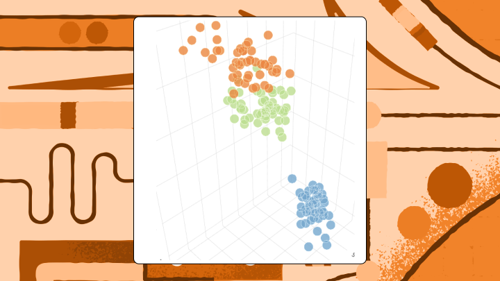
3D scatter plots
When three continuous variables exist, this format can actually work. The chart still requires interactivity or rotation controls because points naturally cluster and block each other. Treating a categorical variable as a third axis? That's where things go wrong. Categories create distinct walls rather than a continuous cloud, defeating the purpose of the 3D space. For static reports, pair plots or bubble charts encoding the third variable as size handle this better.
This is also where self-service exploration matters. If a manager can rotate, filter, and then ask a quick follow-up question (for example, through AI chat or a natural language query experience), a true 3D scatter plot can reduce the "can you slice it one more way?" loop that eats analyst time.
When 3D charts are worth the tradeoff
The advice to never use 3D charts mostly holds, but it ignores legitimate use cases.
Teams working with spatial data, scientific visualization, or topological analysis sometimes genuinely need a third axis. It also comes up in business performance reviews when people are trying to see layered metrics in one view (like revenue by region by product line). Executives and LOB leaders often ask for exactly that kind of "show me every dimension" picture. The trick is making sure the third dimension carries analytical weight, not just visual drama.
These visualizations earn their complexity under specific conditions:
A strict constraint applies here. If the dashboard will be viewed on a static slide, printed, or embedded without rotation controls, these charts lose almost all their value.
Run this test before publishing: If removing the third dimension loses no information, the chart should be 2D.
How to build 3D charts that don't mislead
Sometimes a stakeholder insists on a specific aesthetic, or the data genuinely requires a third axis.
To build a true 3D scatter plot, you need three columns of continuous numeric data representing x, y, and z coordinates. Categorical data doesn't work well on the z-axis because it creates distinct walls rather than a continuous cloud. If your data set has only two numeric columns and one categorical column, use a 2D scatter plot with categories assigned to colors.
If you're supporting an executive team or multiple departments, this is also where governed metrics matter. A semantic layer (a shared set of metric definitions) helps keep teams aligned so the conversation stays on performance, not on which version of revenue someone pulled.
Protect your audience with these rules:
Before sharing, validate:
Most spreadsheet tools offer 3D options but few provide controls to mitigate perception errors. Teams with high accuracy requirements usually need specialized libraries like Plotly or Three.js, or they should default to flat designs. Building a 3D chart maker environment from scratch requires significant coding expertise to handle lighting, camera angles, and Web Graphics Library (WebGL) rendering.
If you're building dashboards in Domo, the benefit is keeping 3D charts in the same place you already prep, govern, and share the data. Analysts can iterate through self-service exploration instead of handing every visualization request to IT or a developer.
For embedding 3D charts into a customer-facing product, governance gets even more serious. Row-level security and programmatic filtering help ensure each person sees only the data they're authorized to see, especially in multi-tenant embedded analytics scenarios. If you're embedding analytics with Domo Everywhere, you can apply row-level security and programmatic filters in the embedding workflow, so you aren't rebuilding custom permission logic for every tenant.
And you'll notice this pattern if you've been building dashboards long enough: if you find yourself adjusting the tilt just so a specific data point becomes visible, you have already proven the format is working against you.
Key takeaways
Want a second set of eyes on a 3D vs 2D decision (or a better alternative chart type entirely)? Swap notes with folks who build dashboards for a living, join the Domo community and bring your trickiest visualization challenge.


