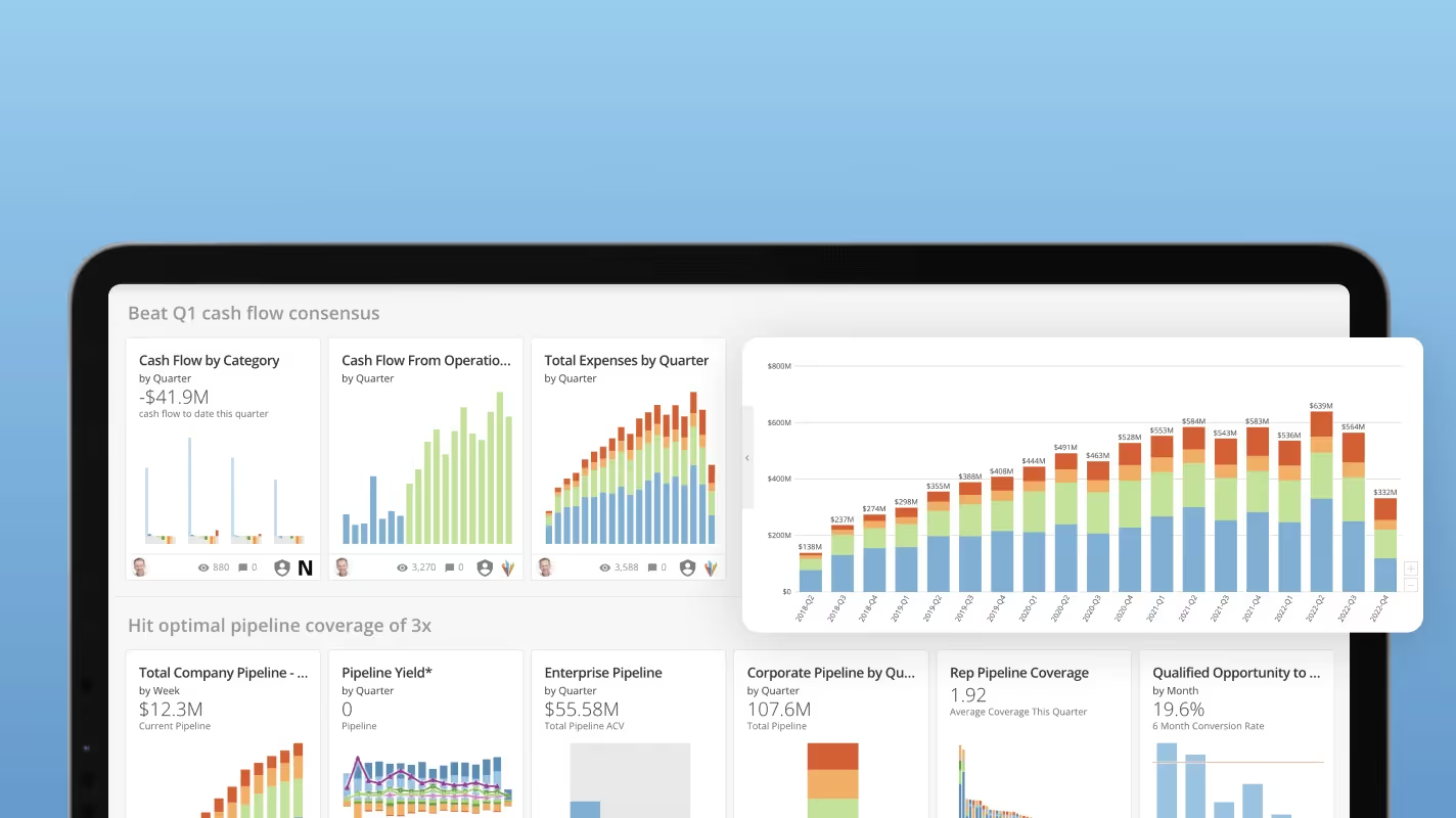
Embedded charts bring data into workflows where decisions happen, removing the friction of context-switching between tools. This guide explains what embedded charts are, walks through the most common chart types for different data relationships, and outlines what to look for when choosing an embedded analytics tool. Along the way, you'll learn design principles that help charts communicate quickly and implementation approaches that keep your data secure.
Key takeaways
Here are the main points to keep in mind.
- Embedded charts bring data directly into workflows where decisions happen, eliminating context-switching between tools
- Choosing the right chart type depends on your data relationship: comparison, trend, proportion, or correlation
- Effective embedded charts prioritize clarity and quick comprehension over complexity
- When evaluating tools, prioritize ease of use, white-label capabilities, security, and data connectivity
- Unlike chart sheets that occupy entire pages, embedded charts live within your existing applications and update automatically
What is an embedded chart?
The term "embedded chart" means different things depending on context. Worth clarifying both uses upfront.
In the embedded analytics sense, an embedded chart is an automatically updating visualization that lives inside an application, website, customer relationship management (CRM) tool, mobile app, or anywhere your team does work and needs data. These charts are highly customized to their specific context. They often provide exactly the data a single team or person needs to make data-driven decisions without opening another window or tool.
In the Excel or spreadsheet sense, an embedded chart is a chart object that sits within a worksheet alongside your data, as opposed to a chart sheet that occupies its own tab.
Here's a quick way to think about it:
- This is embedded: A sales performance chart inside your CRM that updates as deals close
- This is embedded: A line chart sitting next to your data table in an Excel worksheet
- This is not embedded: A standalone dashboard you have to open in a separate browser tab
- This is not embedded: A static image of a chart pasted into a presentation
With these two characteristics in mind, embedded charts become extremely useful across industries and use cases.
Embedded chart vs chart sheet
If you work in Excel or Google Sheets, you've likely encountered both. The distinction matters because each behaves differently when you're printing, filtering, or referencing data.
| Feature | Embedded Chart | Chart Sheet |
|---|
| Location | Floats within a worksheet alongside data | Occupies its own dedicated tab |
| Print behavior | Prints with surrounding data and content | Prints as a standalone, full-page chart |
| Resize and anchor | Can be anchored to cells or set to float freely; may move when rows are filtered or inserted | Fixed size; unaffected by worksheet changes |
| Cell references | Can be referenced in formulas or Visual Basic for Applications (VBA) from the same sheet | Requires cross-sheet references |
| Best for | Quick visual context next to source data | Formal reports or presentations requiring a full-page chart |
One common frustration: embedded charts that unexpectedly move or resize when you filter rows or insert columns. If this happens, right-click the chart, select "Format Chart Area," and adjust the object positioning settings to control whether the chart moves with cells or stays fixed.
What are embedded charts used for?
Decisions need to happen in the flow of work. Not after a detour to a separate analytics tool. That's where embedded charts shine.
Internal team use cases
Internal teams benefit most when the data they need appears exactly where they're already working.
- Marketing: Your marketing team can have a dashboard showing their current campaign performance across platforms and outlets right where they're building their next campaign.
- Sales: With embedded charts showing current sales trends, market performance, and territory data embedded into a CRM tool, your sales team has all the data it needs to develop data-driven plans.
- Customer support: Embedded charts can be used within ticket management platforms to track historical averages on customer support key performance indicators (KPIs), helping agents understand response time trends without leaving their queue.
- Retail operations: With embeddable charts included in mobile apps for checking floor inventory, store managers can make restocking decisions on the spot.
- Finance: Embedded charts in Excel or other tools help your finance teams see exactly what data will help keep the company growing.
- Logistics: Warehouse managers can monitor shipment status and delivery exceptions directly within their order management system.
- Healthcare administration: Clinic managers can track patient wait times and appointment throughput without switching to a separate reporting tool.
Customer-facing use cases
Embedded charts also power the analytics experiences you deliver to customers, partners, or external stakeholders through your own products and portals.
- SaaS products: Product teams embed usage dashboards directly into their applications so customers can see adoption metrics, feature engagement, and account health without requesting reports.
- Client portals: Agencies and service providers embed performance charts into client-facing portals, giving stakeholders visibility into campaign results or project progress.
- Partner dashboards: Channel partners can access sales performance and inventory data through embedded charts in a shared portal, reducing the need for manual report distribution.
One important note: customer-facing embedded charts require authenticated access, not open iframes. Public or anonymous embedding is inappropriate for sensitive stakeholder data. The recommended pattern is portal-based embedding where people log in before seeing their data.
{{custom-cta-1}}
Core elements of an embedded chart
Embedded charts are visual tools that simplify the process of analyzing data by presenting it right in your viewers' workflows in a clear, graphical format.
- Title: The title of the chart helps provide context for the data. A clear, specific title tells viewers exactly what they're looking at without requiring them to study the axes first.
- Axes: The x-axis and y-axis display the variables being measured. Properly labeled axes with appropriate scales prevent misinterpretation.
- Legends: The legend identifies what different colors, shapes, lines, or line styles represent in the chart. Position legends where they don't obscure data points.
- Labels: Labels provide context by describing what the axes, data points, or sections of the chart represent. Use them strategically to highlight key values without cluttering the visualization.
- Data source connection: The link between your chart and its underlying data determines whether the visualization stays current. Live connections enable automatic refresh; static connections require manual updates.
- Interactivity: Features like tooltips, drill-downs, and filters let viewers explore the data rather than just observe it. The right level of interactivity depends on your audience's needs.
- Responsiveness: Charts embedded in web applications or mobile apps need to adapt to different screen sizes without losing readability.
- Authentication and access control: For any embedded chart displaying sensitive data, access control is a foundational element, not an afterthought.
Common embedded chart types
What question are you trying to answer? Start there.
Comparison charts
Comparison charts help viewers evaluate differences between categories or groups.
- Bar charts: Horizontal bars work well when category names are long or when you have many categories to compare. They're easy to read and rank naturally from top to bottom.
- Column charts: Vertical columns suit time-based comparisons or when you have fewer categories. They feel intuitive for showing "more" as "taller."
- Grouped bar or column charts: When you need to compare multiple measures across categories, grouped charts let viewers see patterns within and across groups.
Use comparison charts when someone asks "How does X compare to Y?"
Trend charts
Trend charts reveal patterns over time, helping viewers spot direction, seasonality, or anomalies.
- Line charts: The go-to choice for continuous time-series data. Lines emphasize the direction and rate of change, making them ideal for tracking metrics like revenue, traffic, or temperature over time. Using line charts for categorical data that has no inherent order creates misleading visual connections between unrelated points (and this mistake shows up more often than you'd expect, even in professional reports).
- Area charts: Similar to line charts but with the space below the line filled in. Stacked area charts show how component parts contribute to a total over time.
- Sparklines: Miniature line charts that fit within a single cell or small space. They're perfect for embedding trend context alongside other data without taking up much room.
Proportion charts
Proportion charts show how parts relate to a whole.
- Pie charts: Best used when you have a small number of categories (ideally five or fewer) and want to emphasize one dominant segment. Avoid pie charts when categories are similar in size or when precision matters. Human eyes struggle to compare slice angles accurately, so viewers may misread the relative sizes of segments that are close in value.
- Donut charts: A variation of pie charts with a hollow center, often used to display a key metric in the middle while showing composition around it.
- Treemaps: Rectangular visualizations that show hierarchical data as nested boxes. They handle more categories than pie charts and reveal both size and structure.
Relationship charts
Relationship charts reveal correlations, clusters, or outliers in your data.
- Scatter plots: Plot two variables against each other to reveal correlation patterns. Each point represents one observation, making it easy to spot trends, clusters, or outliers.
- Bubble charts: Extend scatter plots by adding a third variable represented by bubble size. They're useful when you want to show three dimensions of data in a single view.
Design principles for effective embedded charts
A chart that looks impressive but takes 30 seconds to understand defeats the purpose of embedding it in a workflow.
- Prioritize clarity over complexity: Every element on the chart should earn its place. Remove gridlines, borders, and decorations that don't help viewers understand the data. If you can remove something without losing meaning, remove it.
- Match data density to context: A chart embedded in a mobile app needs to communicate with a glance. A chart in a detailed analyst report can support more complexity. Design for where the chart will live.
- Use color intentionally: Color should highlight what matters, not decorate. Use a consistent color palette, reserve bright or contrasting colors for emphasis, and ensure sufficient contrast for accessibility.
- Label directly when possible: Instead of forcing viewers to look back and forth between a legend and the data, label data series directly on the chart when space allows.
- Design for your actual viewers: Consider whether your audience will view the chart on desktop or mobile, whether they're data-literate or only check it occasionally, and whether they need to take action or just stay informed.
- Test with actual data: Charts that look great with sample data can break down with production values. Test with edge cases: very large numbers, very small numbers, negative values, and missing data.
How to choose the right chart type
Context matters more than aesthetics when you're embedding a chart in someone's workflow.
Here's the thing about embedded charts: the employee isn't necessarily visiting a page or application to view, explore, and engage with the data. The beauty of embedded charts is that they can do that as part of their work process, but they're usually in a tool or application to do another task related to their job. The chart is supposed to help them complete that task with the right data and information to make an informed decision.
Start by identifying the question the chart needs to answer.
| Question Type | Recommended Chart | Example |
|---|
| How do categories compare? | Bar or column chart | Sales by region |
| How has this changed over time? | Line or area chart | Monthly revenue trend |
| What's the breakdown of a total? | Pie, donut, or treemap | Budget allocation by department |
| Is there a relationship between variables? | Scatter or bubble chart | Ad spend vs conversion rate |
| What's the current status? | Gauge or single-value card | Quota attainment percentage |
Select chart types that are easily digested and understood. Don't make people dig for critical information. Don't make the chart so complex and full of data that it takes a long time to load. Find the critical information employees need to make the best decisions based on the data and display it in the simplest way possible. That way, your embedded charts feel like a natural part of improving their decision-making rather than adding another complicated step.
How to implement embedded charts
Moving from "the team should embed charts" to actually doing it requires choosing an implementation approach that fits your technical resources and requirements.
Implementation approaches
3 primary approaches exist for embedding charts, each with different tradeoffs.
| Approach | Security | Customization | Time to Market | Maintenance |
|---|
| Iframe | Moderate (depends on token handling) | Limited to what the source platform allows | Fast | Low |
| Software development kit (SDK)/JavaScript library | High (full control over authentication) | Extensive theming and interactivity | Medium | Medium |
| Application programming interface (API) with native components | Highest (complete control) | Complete (build exactly what you need) | Slow | High |
Some practical guidance for common scenarios:
- Use iframe embedding when speed matters and customization needs are minimal. Works well for internal tools where you control the viewing environment.
- Use SDK embedding when theming, interactivity, and tighter integration are priorities. Most embedded analytics platforms offer SDKs that handle authentication and rendering.
- Use API with native components when you need complete control over the visualization, offline capability, or are building a highly customized product experience.
A few things to avoid:
- Public or anonymous iframes for sensitive data: If the data shouldn't be publicly accessible, the embed shouldn't be either.
- Exposing signing secrets in browser code: Token generation should happen server-side, not in JavaScript that anyone can inspect.
- Frontend-only filtering as a security control: Filtering data in the browser doesn't prevent someone from accessing the underlying data. Security must be enforced at the data layer.
Getting started with your first embedded chart
Before writing any code, make a decision about your authentication approach.
- Authenticated portal embedding: People log into your application, and the embed inherits their session. Best for customer-facing portals where people already have accounts.
- Signed token embedding: Your server generates a short-lived token that grants access to specific data. Best for scenarios where you need fine-grained control over what each viewer sees.
- Static export: Generate a chart image or PDF and deliver it via email or download. Best when interactivity is not needed and you want to avoid embedding complexity entirely.
Once you've chosen your approach, the typical steps are:
- Connect your data source to your BI or embedded analytics platform
- Build the chart or dashboard you want to embed
- Configure access controls and row-level security if needed
- Generate the embed code (iframe, SDK initialization, or API call)
- Integrate the embed into your application
- Test with different roles to verify security works as expected
What to look for in an embedded chart tool
If your team keeps leaving core tools to check reports, the next step is choosing an embed approach that fits your stack and security needs.
You're most likely not going to find a reliable, standalone tool for embedding charts in other tools. For most companies, your best option will be a data or BI platform with embedded analytics as an important feature. For example, if you already use Power BI, activating embedded charts in Excel may be straightforward because both are Microsoft products, but teams that need broader embedded analytics options across workflows should compare those limits against Domo.
Other data tools, like Domo, support the entire data lifecycle and have many features for data sharing. When considering current or future data needs, make sure you understand your current or prospective tool's embedded analytics capabilities.
Here are some specific things to consider:
- Ease of use: If you have enough programming knowledge, you probably have someone who could embed a chart in a lot of different places with enough time and effort. But most of your people likely aren't technical geniuses and just need the data where they can see it. So, look for tools that make it easy for non-technical people to deploy, such as copy-and-paste options for embedded charts and easy ways to connect data sources to the applications or portals where the charts will appear.
- White label: Make sure your embedded analytics fit in wherever you share them. Ensure you can customize your charts to match style and branding guidelines.
- Cost: Look at the current cost of deploying embedded analytics and the future costs of maintaining your embedded charts. If you're sharing analytics outside of the BI tool, it can reduce your costs because you do not need to buy individual seats or licenses for every person benefiting from the data. But make sure you understand what it will cost to regularly keep these embedded charts updated and functional across platforms.
- Flexibility: Not every tool will allow your team to customize what data can be shared in embedded charts. Look at the pre-built functionality for embedded analytics and how much your team will need to customize the embedded charts to ensure they're actually helpful and engaging for your viewers.
- Connection: While not directly related to embedding charts in other platforms, consider what your tool will offer in terms of data connectivity. Your embeddable charts will only be helpful if they're able to share the right data at the right moments, so make sure you can bring in all the data sources you need to give viewers the comprehensive view they need to make informed decisions.
- Security: Your data is still your data and you need to make sure it's protected no matter where you share it. Look for tools that have security features that will give your team visibility into how and where data is shared, no matter where you're using embedded charts.
Security and access control for embedded charts
Security deserves special attention because it's often the deciding factor for enterprise deployments. Especially when external stakeholders will view the embedded charts.
The core pattern for secure embedding involves several layers:
- Authenticate people before loading embeds: Whether through single sign-on (SSO), Open Authorization (OAuth), or a login portal, verify who's viewing the data before rendering anything. Anonymous or public embedding should never be used for sensitive business data.
- Use short-lived, server-minted tokens: Rather than permanent public links, generate tokens on your server that expire after a short period (minutes to hours, depending on your use case). This limits exposure if a link is shared inappropriately.
- Enforce row-level security: In multi-tenant scenarios, each viewer should see only the data they're authorized to access. This filtering must happen at the data layer, not just in the UI.
- Maintain revocation capability: You should be able to invalidate access immediately when an employee leaves, a client relationship ends, or a security concern arises.
- Consider audit logging: For compliance-sensitive environments, tracking who viewed what data and when provides accountability and supports incident investigation.
When evaluating tools, ask specifically about these capabilities.
{{custom-cta-2}}
Embedded charts drive data-informed workflows
When charts appear inside daily tools, teams can act on current metrics without stopping work to hunt for a separate report. Choosing the right tool to support that journey will ensure everyone in your company is empowered to build on data in their roles.
The shift from "go find the data" to "the data is already here" changes how quickly teams can act. Marketing adjusts campaigns mid-flight. Sales reps prioritize outreach based on current pipeline health. Support managers spot emerging issues before they become crises.
Domo, an agentic platform for the intelligent enterprise, can deliver governed charts and analytics into the tools where your teams already make decisions. Utilizing Domo's suite of tools supporting the entire data lifecycle, your company can ensure you're bringing in the right data and sharing it with the right people to make informed decisions at every stage of your business.
Learn more about Domo and see how it can deliver governed analytics into the applications your teams already use.