Embedded Charts: Types, Examples, and Tools


No matter how often you tell your team members that data is important and they need to use it daily in their jobs, it’s hard to change habits and workflows. Getting data is one of those tasks that adds multiple steps and 30-minute delays. Even though it can be useful, why would your team want to stop their work to look at it?
They shouldn’t have to. They don’t have to. That’s the beauty of embedded charts: You’re embedding a critical piece of your business intelligence (BI) right into their workflow. This way, team members and stakeholders have access to the data they need to drive their daily tasks right when they’re doing them.
What is an embedded chart?
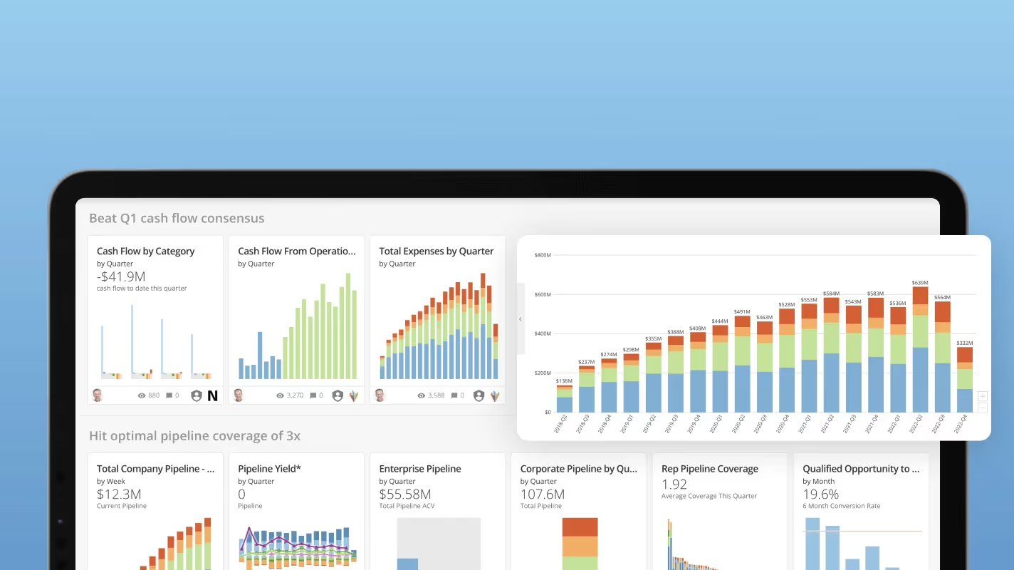
An embedded chart is an automatically updating-and-refreshing chart that’s embedded into an application like a website, CRM tool, cloud application, mobile app, or anywhere your team does work and needs data. These embedded charts are highly customized to their specific context and often provide the data a single team or person needs to make data-driven decisions without opening another window or tool.
With these two characteristics in mind, embedded charts become extremely useful across industries and use cases.
What are embedded charts used for?
Here are a few common ways teams use embedded charts to further data-driven decision-making at all organizational levels.
- Marketing. Your marketing team can have a dashboard showing their current campaign performance across platforms and outlets right where they’re building their next campaign.
- Sales. With embedded charts showing current sales trends, market performance, and territory data embedded into a CRM tool, your sales team has all the data it needs to develop data-driven plans.
- Customer support. Embedded charts can be used within ticket management platforms to track historical averages on customer support KPI.
- Retail sales. With embeddable charts included in mobile apps for checking floor inventory.
- Finance. Embedded charts in Excel or other tools help your finance teams see exactly what data will help keep the company growing.
These examples show how embedded charts can benefit your teams across job functions, industries, and roles.
What are the elements of an embedded chart?
Embedded charts are visual tools that simplify the process of analyzing data by presenting it right in your viewers’ workflows in a clear, graphical format.
Components of an embedded chart:
- Title: The title of the chart helps provide context for the data.
- Axes: The x-axis and y-axis display the variables being measured.
- Legends: The legend identifies what different colors, shapes, lines, or line styles represent in the chart.
- Labels: Labels provide context by describing what the axes, data points, or sections of the chart represent.
Choosing the right chart type
When you’re choosing to embed a chart in a user’s workflow, it’s important to think about context. Embedded charts help employees complete tasks with the right data and information.
Select chart types that are easily digested and understood.


