Vous avez économisé des centaines d'heures de processus manuels lors de la prévision de l'audience d'un jeu à l'aide du moteur de flux de données automatisé de Domo.
Regardez la vidéo

No matter how often you tell your team members that data is important and they need to use it daily in their jobs, it’s hard to change habits and workflows. Getting data is one of those tasks that adds multiple steps and 30-minute delays. Even though it can be useful, why would your team want to stop their work to look at it?
They shouldn’t have to. They don’t have to. That’s the beauty of embedded charts: You’re embedding a critical piece of your business intelligence (BI) right into their workflow. This way, team members and stakeholders have access to the data they need to drive their daily tasks right when they’re doing them.
An embedded chart is an automatically updating-and-refreshing chart that’s embedded into an application like a website, CRM tool, cloud application, mobile app, or anywhere your team does work and needs data. These embedded charts are highly customized to their specific context and often provide the data a single team or person needs to make data-driven decisions without opening another window or tool.
With these two characteristics in mind, embedded charts become extremely useful across industries and use cases.
Here are a few common ways teams use embedded charts to further data-driven decision-making at all organizational levels.
These examples show how embedded charts can benefit your teams across job functions, industries, and roles.
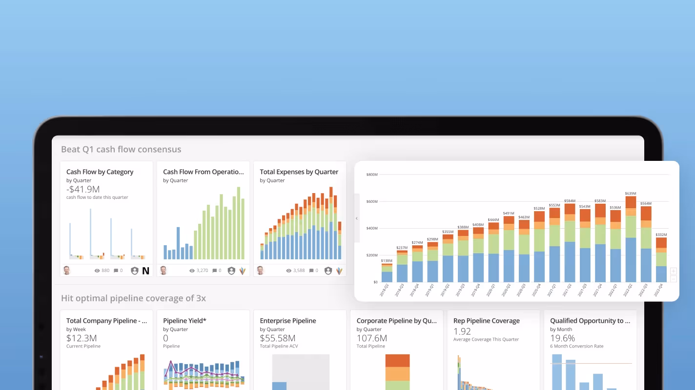
Embedded charts are visual tools that simplify the process of analyzing data by presenting it right in your viewers’ workflows in a clear, graphical format.
Components of an embedded chart:
When you’re choosing to embed a chart in a user’s workflow, it’s important to think about context. Embedded charts help employees complete tasks with the right data and information.
Embedded charts are put directly into an employee’s workflow. This means the employee isn’t necessarily visiting a page or application to view, explore, and engage with the data. The beauty of embedded charts is that they can do that as part of their work process, but they’re usually in a tool or application to do another task related to their job. The chart is supposed to help employees complete the task with the right data and information to make an informed decision. Choosing which chart type to embed should help enable the decision-making process.
Select chart types that are easily digested and understood. Don’t make users dig for critical information or make the chart so complex and full of data that it takes a long time to load. Find the critical information employees need to make the best decisions based on the data and display it as the simplest and easiest way to consume it. That way, your embedded charts feel like a natural process to improve their decision-making rather than adding another complicated step or creating so much additional work that users ignore it.
If you feel that embedded charts will improve your current workflows and enhance data-driven decision-making across your organization, a natural next step is to consider how best to implement them.
You’re most likely not going to find a reliable, standalone tool for embedding charts in other tools. For most companies, your best option will be a data or BI platform with embedded analytics as an important feature. For example, if you already use Power BI, you’ll likely have easy options for activating embedded charts in Excel, since both are owned by Microsoft.
Other data tools, like Domo, support the entire data lifecycle and have many features for seamless data sharing. When considering current or future data needs, make sure you understand your current or prospective tool’s embedded analytics capabilities and what your company needs from them.
Here are some specific things to consider about embedded charts when you’re evaluating tools:
Moving forward, your teams will be able to transform their roles and your business to one that uses data to make the best decisions every time a decision is made. Choosing the right tool to support that journey will ensure everyone in your company is empowered to build on data in their roles.
Domo will help your company achieve these goals. Utilizing Domo’s suite of tools supporting the entire data lifecycle, your company can ensure you’re bringing in the right data and sharing it with the right people to make informed decisions at every stage of your business.
Learn more about Domo and how it can help you create embedded charts that will drive your business forward.


.png)

.png)