What is a Trendline Chart? A Complete Visual Guide

Trendline charts help analysts and business leaders see the direction of a metric over time. Fast. But choosing the wrong trendline type or treating the fitted line as a forecast? It's going to lead to costly mistakes. With this guide, we'll walk through the data requirements, the differences between linear, exponential, and polynomial trendlines, step-by-step Excel instructions, and when to reach for alternatives like moving averages or seasonal decomposition.
Key takeaways
Here are the key points to carry into the rest of the guide:
- Use this chart when: You need to show directional movement over time or summarize a relationship between two continuous variables, and your data has enough points to support a fitted line.
- Avoid this chart when: Data is sparse, contains strong seasonality, or your audience might mistake the trendline for a forecast.
- Primary decision this chart supports: Determine whether a metric is improving, declining, or stable so you can decide whether to act now or wait.
- Most common misuse: Treating the trendline as a prediction rather than a summary of a historical pattern.
- Best alternative if this fails: Use a moving average for noisy data or a seasonal decomposition chart if periodicity dominates.
Data requirements for a trendline chart
It might look like a simple chart. The data setup, though, drives whether people trust it. Gartner estimates poor data quality costs organizations about $12.9 million per year on average. An important number because a trendline built on inconsistent or poorly defined data will point your team in the wrong direction. If your sales manager sees one slope and your finance leader sees a different slope for "the same metric," you don't have a trendline problem. You have a definition problem.
Before you fit any line, sanity-check these inputs:
- Enough observations: More points beat more complicated math. A handful of points can make almost any line look convincing.
- Consistent time grain: Don't mix daily and monthly points in the same series and expect a meaningful slope.
- **Stable **metric definition: Use the same filters, time zone, and inclusion rules every time you calculate the metric. This is how you get one trendline, one truth across dashboards.
- Clear scope: If different teams need different cuts (region, territory, account), decide whether the trendline is global or segmented, then keep it consistent.
Building trendline charts for executives, line-of-business (LOB) leaders, and frontline teams? Governed definitions matter even more than the trendline type. Even 70 percent of high-performing organizations report difficulties developing data governance processes, according to McKinsey.
What's a trendline chart
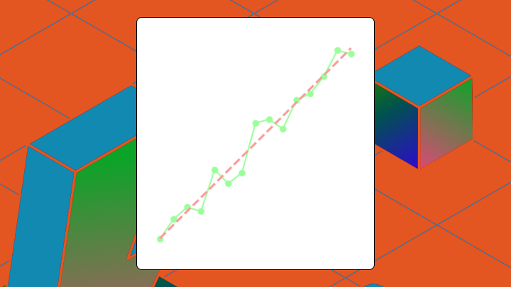
A trendline chart overlays a calculated line across a scatter plot or time series graph to reveal the overall direction of your data. The line answers one question quickly: is this going up, down, or staying flat?
That quick answer explains why trendlines show up everywhere in data visualization. Executive readouts. Weekly KPI check-ins for sales, marketing, finance, and operations. For a lot of teams, the trendline becomes a performance compass.
Most people searching for this term fall into one of two camps. The search results often blur the distinction, which creates confusion:
- Statistical trendline: A calculated line fitted to data points using a mathematical algorithm. This is what BI tools and Excel produce when you click "Add Trendline."
- Technical analysis trendline: A manually drawn line connecting price highs or lows on a stock chart. Traders use this to identify breakout zones.
This article focuses on the statistical meaning.
The chart plots points on X and Y axes, then adds a fitted line whose slope summarizes the central tendency. Your eye naturally gravitates toward that solid line, often ignoring the scattered points around it. This cognitive pull is exactly why choosing the right trendline matters so much (and why stakeholders sometimes trust the line more than they should).
A plain line chart connects actual values point by point. A trendline chart adds a mathematical model over it. The trendline itself isn't data. It's a model applied to data.
Types of trendlines and when to use each
Picture this: an analyst applies a polynomial trendline to quarterly revenue. The model achieves a high R-squared value, making it look accurate. Finance uses it to project next year's budget. The polynomial was overfitting noise. The projection misses by double digits.
Choosing the right regression type depends on the shape of your data and your tolerance for risk. It also depends on who is consuming the chart. An analyst may want diagnostic detail, while an LOB manager may need a simple directional read before their next team meeting.
Here are the main trendline types and when each makes sense:
- Linear trendline: Use when data shows a consistent rate of change. It's a straight line formula (y = mx + b). Best for steady growth or decline without acceleration.
- Exponential trendline: Use when growth compounds, like customer adoption curves. Avoid if your data contains zero or negative values as the math completely breaks down.
- Logarithmic trendline: Use when growth slows over time, showing diminishing returns. Requires positive X values.
- Polynomial trendline: Use sparingly. Higher degrees fit the data more closely but risk overfitting. If you need a polynomial above degree two, question whether a trendline is the right tool at all.
- Moving average: Not a regression. It smooths volatility by averaging a rolling window. Use when you want to see underlying direction without fitting a formula.
Moving averages appear in the same Excel menu as trendlines. They don't model a relationship. They smooth. Conflating the two is one of the common interpretation errors in client dashboards.
| Trendline Type | Best Use Case | Primary Risk |
|---|---|---|
| Linear | Steady, consistent change | Oversimplifies complex patterns |
| Exponential | Compounding growth | Fails with zero or negative values |
| Logarithmic | Diminishing returns | Requires positive X values |
| Polynomial | Fluctuating data | High risk of overfitting |
| Moving Average | Noisy, volatile data | Lags behind sudden changes |
For steady historical reporting, choose linear. It's the easiest to explain and carries the lowest overfitting risk. For highly volatile daily metrics, choose a moving average. For early-stage product adoption, exponential often reflects compounding growth accurately, provided you have no zero values.
One more practical point: trendline consistency breaks when different teams fit different models to the same metric. Sales picks linear, marketing picks polynomial, the executive dashboard ends up with a third version.
How to add a trendline in Excel
Excel will gray out the trendline option if your chart uses a category axis instead of a numeric one. Before clicking through any menus, confirm your X-axis contains numbers or dates formatted as values.
Your data needs specific preparation before fitting a line:
- X-axis: Must be numeric or date-as-number, not text labels.
- Data layout: Two adjacent columns representing X and Y pairs.
- Clean data: Remove or handle blank cells and outliers before fitting.
Follow these steps to build the chart:
- Select your scatter or line chart with a numeric X-axis.
- Click the plus icon next to the chart to open Chart Elements.
- Check the box for Trendline.
- Click the arrow next to Trendline and select More Options.
- In the Format Trendline pane, choose your trendline type.
- Check boxes to display the equation and R-squared value if needed.
- Adjust forecast periods to extend the line past your current data.
Why might the trendline option be disabled entirely? Excel doesn't support trendlines for pie, doughnut, radar, surface, or 3D charts (and some stacked chart types). Excel can add trendlines to column or bar charts, but they're only meaningful when the X-axis represents an ordered numeric sequence. You also need to select a specific data series before looking for the option.
If you need trendline values directly in cells for dashboards, use SLOPE, INTERCEPT, and FORECAST.LINEAR functions instead of the chart feature. This gives you control and transparency over the math.
After adding the trendline, compare the equation's slope to a manual calculation using SLOPE. If they don't match, you likely have hidden data points or filtered rows skewing the visual.
Excel trendlines update when the chart data updates, but they can fail to include new rows if your chart is tied to a static range (instead of an Excel Table). No native confidence intervals. One trendline type per series.
Limits of trendline charts and better alternatives
A trendline with R-squared of 0.95 looks authoritative. That metric only measures how well the line fits historical data. It says nothing (nothing at all) about whether the pattern will continue. Teams routinely over-trust high R-squared values and under-trust their own judgment about changing conditions.
Trendlines mislead under several specific conditions:
- Seasonality: A linear trendline on monthly retail sales cuts through seasonal peaks and valleys, hiding the cyclical pattern that actually drives the business.
- Outliers: A single extreme value can pull the trendline dramatically. One bad quarter distorts the entire slope.
- Extrapolation: Extending the trendline outside the data range is speculation. The further you project, the less reliable the line.
- Autocorrelation: Time series data often violates the independence assumption underlying least-squares regression. The trendline may look clean but rest on shaky statistical ground.
I've watched analysts extend a linear trendline six months into the future based on three months of data. This creates false confidence that almost always results in missed targets. Almost always.
When these risks appear, pivot to other visualizations:
- Moving average: Smooths volatility without implying a formula-based relationship.
- Seasonal decomposition: Use when periodicity is the story, not a nuisance to smooth over.
- Control charts: Distinguish signal from noise with statistical rigor.
- Confidence bands: Communicate uncertainty ranges rather than just direction.
| Scenario | Trendline Works | Better Alternative |
|---|---|---|
| Steady growth, low noise | Yes | None needed |
| Strong seasonality | No | Seasonal decomposition |
| High volatility | Risky | Moving average |
| Need to forecast | No | Time-series model |
Build trendline charts faster in Domo
Trendlines are just one layer of the analysis. When your data lives across dozens of sources and flows through extract, transform, load (ETL) pipelines, and your dashboards need to refresh automatically, manually adding trendlines in spreadsheets becomes a bottleneck.
Domo helps in a few concrete ways that map to how teams actually work:
- Analysts and BI specialists can define reusable metrics in a semantic layer, so trendline chart calculations stay consistent across dashboards.
- IT and BI managers can govern those definitions centrally, then apply them everywhere, so every team sees the same directional signal.
- LOB managers and executives can explore trends through interactive dashboards that stay up to date, so they're not waiting on scheduled reports.
- Business teams can answer routine "what's my trend?" questions with guided self-service (including natural language query), so analysts get fewer ad hoc requests.
- Product developers and data engineers can embed trendline charts into customer-facing experiences with Domo Embed, and control what each external person can see with row-level security in Domo Everywhere.
If you're ready to stop babysitting spreadsheet trendlines and start sharing one trusted direction across dashboards, try for free.