Calendar Chart: Definition, Examples, and Use Cases

Calendar charts turn daily metrics into a scannable grid that mirrors your wall calendar. With them, weekly patterns and outliers become obvious without any learning curve. This article explains what calendar charts are, walks through data requirements and common pitfalls, and shows you how to create them in Excel. You will also learn when this format helps decisions and when a line chart or standard heatmap may serve you better.
Key takeaways for calendar charts
A calendar chart is a grid-based visualization that displays daily values arranged like a wall calendar, using color intensity to show magnitude. You scan it the same way you'd scan your own calendar, which makes weekly patterns and date-specific outliers jump out immediately.
Here's when this format works and when it doesn't:
- Use this chart when: You need to spot day-of-week patterns, identify outliers on specific dates, or show seasonality to stakeholders who naturally think in calendar terms (like sales, marketing, finance, and operations leaders).
- Avoid this chart when: You need precise trend lines, exact value comparisons, or analysis at hourly granularity.
- Primary decision it supports: Figuring out which specific days need investigation or action, so teams can stop debating the month and start talking about Tuesday.
- Most common misuse: Treating color differences as precise measurements, which leads teams to overreact to minor variations.
- Best alternative: A line chart with weekly aggregation for trends or a standard heatmap for category comparisons.
What is a calendar chart?
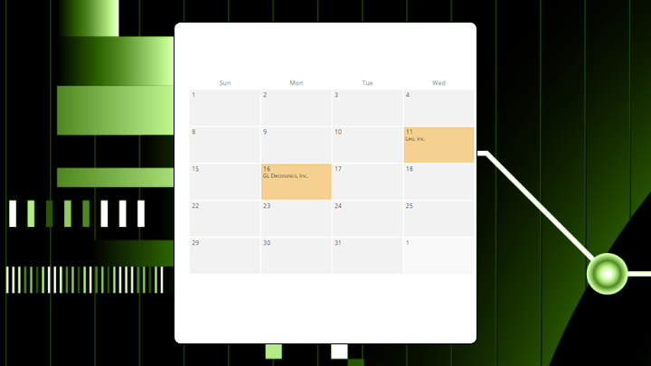
Columns in a calendar chart represent days of the week. Rows represent weeks within each month. A calendar chart arranges data in a grid that resembles a physical calendar, but the color intensity on each cell showing the value for that date. So, what you get is a heatmap on top of a structure you already understand.
The visual encoding relies on two things: position (where the day falls in the week and month) and color saturation (how dark or light the cell appears). This differs from a line chart, where your eye traces slope to understand change. Here, you scan for color clusters and gaps across a two-dimensional grid.
Certain patterns become obvious in this format. A dark vertical stripe means something happens consistently on that weekday. Scattered dark cells suggest random outliers. A gradient shifting across months reveals seasonal drift.
This is why calendar charts tend to work so well in BI dashboards. A BI analyst can publish one view, and then a line-of-business manager can read it with almost zero learning curve. No extra meeting about how to interpret the axes.
The compromise you make, though, is precision. Reading exact values requires tooltips or a reference table because color saturation ranks among the least accurate visual encodings compared to length or position. A standard heatmap can use any categories on its axes, but a calendar chart locks the structure to temporal units people already know.
Data requirements for calendar charts
Minimum fields and data shape
Two columns. That's the minimum: a date field and a numeric value field. The date field must contain daily data. Weekly or monthly aggregates defeat the purpose of the grid layout entirely.
| Date | Value |
|---|---|
| 2024-01-01 | 12 |
| 2024-01-02 | 8 |
| 2024-01-03 | 15 |
| 2024-01-04 | 0 |
| 2024-01-05 | 22 |
A category column helps if you want to filter or create multiple views. A text field allows annotations on specific dates.
If you're a data engineer supporting this chart in a BI environment, your job gets easier when the data arrives already shaped as one row per day (or a complete date spine that you can join to your activity data). That saves you from reworking the dataset every time someone asks for "last month on a calendar."
Note that you need at least 30 consecutive days to reveal weekly patterns. Ideally, aim for 90 or more days to show monthly variation. A single week of data renders fine but tells you almost nothing.
Boundary conditions
Some data conditions cause this chart to render but fail analytically.
**Sparse data with many **missing dates** creates problems.** Gaps appear as blank cells, and viewers often misread them as zero-value days. If more than 20 percent of your dates are missing, a different chart would serve you better. If you do stick with a calendar chart, fill missing dates explicitly and label them as no data.
Extreme outliers dominate the color scale. A single day with 10 times the typical value compresses everything else into near-identical light shades. You lose all the meaningful variation. Preprocess the data to cap outliers or use a logarithmic scale. Teams can also get burned when applying a log scale without telling stakeholders; it makes a 10x difference look like a 2x difference. They end up with an underreaction instead of overreaction.
Mixed time zones without normalization shift activity to wrong calendar days, creating patterns that don't actually exist. This comes up a lot when one team reports in local time and another team reports in Coordinated Universal Time (UTC), and then leadership wonders why "Sunday" suddenly looks busy.
If different teams define the same metric differently (for example, "ticket created date" vs "ticket closed date"), you can also end up with calendar charts that contradict each other. This is where a governed metric definition in your BI semantic layer helps keep everyone reading the same story.
When to use a calendar chart and when to avoid it
Conditions where calendar charts work
Does the question center on which specific days matter, not what the overall trend looks like? Your audience probably already thinks in calendar terms. Marketing teams planning campaigns, operations teams scheduling staff, and analysts investigating day-of-week effects all benefit from this layout.
This format compresses a year into a single scannable view. A calendar chart makes Tuesday's consistent dip obvious in a way that requires squinting at a line chart to notice.
It also cuts down on repetitive ad hoc requests. If you publish a self-service calendar chart in a dashboard, a sales manager or marketing coordinator can check which days underperformed without asking a BI analyst to rebuild the view for every new date range.
Conditions where calendar charts mislead
The grid layout fragments the time axis, so that it's hard to see whether values are rising or falling across months. Teams who use this format for trend analysis can miss the gradual shifts that a line chart would reveal.
If your decision depends on whether Tuesday had 847 or 892 events, color encoding won't help. You need a table or bar chart for that scenario.
Hourly or minute-level data also doesn't fit the calendar metaphor. A standard heatmap with hour-of-day on one axis works better for sub-daily analysis. Comparing categories also fails in this case because a calendar chart shows one metric across time. Comparing two products or two regions requires side-by-side calendars, which doubles the cognitive load for viewers.
Lastly, expect some people to read too much into small color differences that may not be statistically meaningful.
How to read a calendar chart correctly
What the eye notices first
Viewers notice color extremes first. The darkest and lightest cells draw immediate attention (helpful for outlier detection but potentially distracting from subtler patterns).
Next comes vertical stripes. Consistent color in a single column suggests a day-of-week pattern. Horizontal bands follow. A dark row indicates a busy week. Finally, viewers spot clusters and gaps. Groups of dark cells surrounded by light ones signal events worth investigating.
Where misinterpretation happens
People assume color differences represent meaningful magnitude differences. They often don't. Human perception of color intensity is imprecise, and small palette variations can look dramatic or invisible depending on the scale chosen.
Another failure point is treating blank cells as zeros. A blank cell might mean no data was recorded rather than zero activity. This distinction matters for operational decisions. And honestly, this is the part that trips up even experienced analysts more than they'd like to admit.
A quick sanity check helps: Pick three cells that look similar in color and check their actual values. If the values differ more than you expected, the color scale may be compressing meaningful variation.
How to read this chart
- Note the date range and confirm it matches your question.
- Identify the color scale endpoints to understand what darkest and lightest mean.
- Scan for vertical patterns to find day-of-week effects.
- Scan for horizontal patterns to spot week-over-week shifts.
- Investigate outlier cells by checking actual values, not just color.
How to create a calendar chart in Excel
Excel lacks a native calendar chart type. You build one using conditional formatting on a grid layout. This works for quick visuals but requires manual setup for each month.
This is also where a lot of calendar-chart frustration comes from. BI analysts and data engineers end up recreating similar grids for every stakeholder and every new reporting period, even when the underlying metric has not changed. The same grid. Again. For a different month.
Step 1: Prepare the date and value columns
Structure your source data with dates in column A and values in column B. Add a helper column using =WEEKDAY(A2,2) to return the day of week (Monday equals 1, Sunday equals 7). Add another using =WEEKNUM(A2,2) for the ISO 8601 week number (the Monday-based week standard).
Step 2: Build the calendar grid layout
Create a seven-column grid representing Monday through Sunday. Use =DATE(year,month,1) to find the first day of your target month. Populate cells with dates that fall into each week and day position.
For dynamic month selection, add a dropdown using Data Validation linked to a named range of months.
Step 3: Apply conditional formatting as a heatmap
Select the grid cells containing values. Navigate to Home, then Conditional Formatting, then Color Scales. Select a sequential palette. Adjust the scale endpoints under Manage Rules to set minimum and maximum values explicitly.
Leaving the color scale on automatic causes the palette to shift when data updates. This makes month-to-month comparison unreliable, but the mistake is to miss until someone asks why January looks worse than March...when the actual numbers tell a different story.
This approach requires rebuilding the grid for each month and does not support tooltips. For ongoing use or shared dashboards, a BI tool with native support eliminates the manual work.
Calendar chart examples and use cases
Website traffic by day
A marketing team reviewing 90 days of website sessions notices a consistent vertical stripe on Tuesdays and Wednesdays. Weekends show lighter cells. A line chart of the same data showed weekly oscillation but required careful inspection to identify which days drove the pattern. The calendar chart made the Tuesday and Wednesday peak immediately scannable.
For a line-of-business manager, this can turn into a quick action: adjust campaign sends, landing page tests, or paid spend pacing to match the days that tend to perform.
Support ticket volume across quarters
An operations manager comparing Q1 to Q2 spots a cluster of dark cells in the first week of each month. This correlates with billing cycle questions. The calendar layout revealed this monthly pattern faster than a bar chart grouped by week.
And, the handoff from BI to operations is clean. A BI analyst can publish the calendar chart once, and then the support team can check it any time without waiting for a refreshed slide.
Sales activity for a yearly calendar view
Imagine a sales leader reviewing a full year of closed deals sees lighter bands in August and late December. That confirms seasonal slowdowns. Scattered dark cells in March reveal unusually strong days tied to a specific campaign. A line chart would show the seasonal dip but obscure those individual high-performing days.
For frontline teams, the same pattern works at a smaller scale too. A store manager or sales rep can use a calendar chart of daily sales or appointments to see exactly which days they hit their numbers, then ask what changed on those dates.
Calendar chart best practices
These rules prevent misinterpretation when deploying these visuals to business teams:
- Set a consistent color scale across all months: If each month auto-scales independently, a dark cell in January might represent a lower value than a medium cell in March.
- Use a sequential palette for magnitude data: Diverging palettes imply a meaningful midpoint. If your data lacks one, viewers misinterpret middle values as neutral.
- Distinguish between zero and no-data visually: A gray cell for missing data and a light cell for zero activity prevents confusion.
- Include a legend with explicit value ranges: Without one, viewers guess at what colors mean.
- Limit to one metric at a time: Encoding two variables creates cognitive overload.
Calendar chart limitations and alternatives
The fragmented grid makes it hard to see whether values rise or fall over months. Color perception varies among viewers, especially the roughly 300 million people globally who have color vision deficiency. Your calendar chart may communicate different information to different team members depending on their color vision.
If you run analytics across a large enterprise, there is another practical limitation: inconsistent definitions. If different departments build their own versions of "daily sales" or "daily active customers," you can end up with multiple calendar charts that look authoritative and disagree anyway. This helps explain why 67 percent of organizations don't fully trust their own data for decision-making. That statistic matters here because calendar charts often become the "source of truth" view that executives reference, so inconsistent underlying definitions get amplified rather than hidden. Standardized metric definitions and governed dashboards help avoid that.
| Chart type | What it does better | What calendar chart does better |
|---|---|---|
| Line chart | Shows trend direction and rate of change | Reveals day-of-week patterns and specific date outliers |
| Bar chart | Enables precise value comparison | Preserves calendar context for temporal patterns |
| Standard heatmap | Compares categories across two dimensions | Uses familiar calendar structure for time-based data |
How a calendar chart changes decisions
- Easier decision: Allocating staff to specific days based on visible demand patterns.
- Harder decision:Forecasting next quarter's total volume, since the chart shows patterns but not trajectory.
- Common overcorrection: Teams see a single dark cell and assume a recurring problem exists, triggering unnecessary process changes.
- Question it tempts but cannot answer: Why is Tuesday always high? The chart shows the pattern but not the cause.
Start building calendar charts in Domo
Calendar charts become more useful when they update automatically and scale across years without manual rebuilding. Domo handles the grid layout, color scaling, and interactivity so you can focus on patterns rather than construction.
This shows up differently depending on your role:
- For BI analysts, calendar charts are a clean way to turn date-stamped data into a story stakeholders already know how to read, then reuse that view in self-service dashboards.
- For line-of-business managers (sales, marketing, finance, or operations), a calendar chart is the dashboard your team already knows how to read, so you can see which days hit target and which ones need attention.
- For IT and data leaders, a governed calendar chart standard helps keep teams from building inconsistent date-based reporting in scattered tools, which reduces tool sprawl and conflicting definitions.
- For data engineers, an end-to-end platform that includes ingestion, transformation, and calendar chart rendering cuts down on custom workarounds and ongoing maintenance.
- For citizen analysts, a simple calendar view of daily key performance indicators (KPIs) builds confidence, especially when it's easy to access in the flow of work.
If someone spots a weird cluster on the calendar, Domo's AI Chat and natural language query features can help them ask a follow-up question about that specific period without having to file a ticket with the analytics team.
Ready to stop rebuilding the same Excel grid every month and start spotting day-level patterns in seconds? Try for free (https://www.domo.com/start/free) to connect your daily data and publish calendar charts that stay consistent, interactive, and shareable.


