Mit der automatisierten Datenfluss-Engine von Domo wurden Hunderte von Stunden manueller Prozesse bei der Vorhersage der Zuschauerzahlen von Spielen eingespart.
Schau dir das Video an
See how new charts can provide fresh insights to your data.
Sankey charts. Visualize business activity flows with Sankey charts, such as flow of dollars, energy, or goods.
Statistical Process Control (SPC) charts. With eight new SPC charts based on standard calculations for Statistical Process Controls, you can find outliers or unusual patterns. Simply select the rules you want to check, and the chart is automatically generated for you, with alerts to let you know when an exception occurs.
Multi-Value charts. Single value charts have been enhanced to show not only the summary value, but also the changed value that most recently affected the summary value. For example, you can see your total sales revenue number and also show the percent change from a previous period.
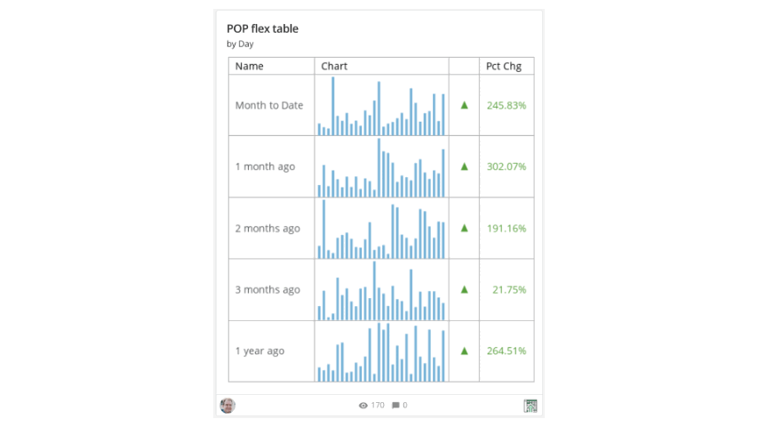
Period-Over-Period charts. We’ve added seven new period-over-period chart types to give you ultimate flexibility: Flex Table, Shape Gauge, Running Total, Multi-Value Gauge, Filled Gauge, Progress Bar, and Variance Only.
Custom Scatter Plot charts. You can now customize the shapes, sizes, colors, and data labels in Scatter Plot charts to make your charts fit your exact needs.

Domo transforms the way these companies manage business.


.png)