Connection Map: What It Is and When to Use One

A connection map draws lines between points to reveal relationships, routes, and flows across geography. This article explains what connection maps are, when they outperform alternatives like choropleths or network graphs, the data requirements for building one, and the visual pitfalls that can mislead your audience.
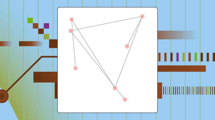
What is a connection map
Before you build one, here's what you should know:
- Use a connection map when: You want to see which points connect to which, identify hubs, or reveal routing patterns across geography.
- Choose a different chart when: The question is about volume at a single location, or you have more than 150 edges without filtering (this limit mainly applies to static maps; interactive maps can scale with good filters).
- Primary decision this chart supports: Identifying structural vulnerabilities, such as a single warehouse serving too many downstream locations.
- Best alternative for magnitude comparisons: Use a choropleth map instead.
Connection maps can make sparse routes look unimportant and dense clusters look critical even when the opposite is true. If lines are not weighted by volume, viewers will assume busy-looking areas are the most important.
If you're trying to explain "what connects to what," a connection map is your friend.
Lines between points on a map. That's it at the core. A connection map visualizes relationships, routes, or flows by drawing those lines, where each represents something concrete: a flight route, a shipment lane, a communication link between locations.
The map shows you structure rather than totals. Want to know how much shipped from each warehouse? A bar chart works better. Need to know which warehouses connect to each other and where your single points of failure hide? That's where connection mapping shines.
Teams sometimes confuse this with data lineage in governance contexts. Data teams also use "connection map" to mean a data lineage map (a visual map of how data moves from source systems to transformations to data sets and dashboards). Same nodes-and-edges idea, different canvas.
This article focuses on the visualization type for geographic and relational data.
When to use a connection map and when not to
A supply chain team once used a bar chart to show shipping volumes between warehouses. They saw the totals. Completely missed that three major routes funneled through a single hub. When that hub flooded, they lost two weeks of inventory.
A connection map would have revealed that bottleneck in seconds.
The same "see every connection" idea shows up in data work, too. Data engineers and analytic engineers run into the same problem when a single transformation step feeds a pile of downstream data sets. Totals look fine, then one upstream failure breaks half your dashboards.
Use a connection map when you have origin-destination data with geographic coordinates, when the question is about paths or structural dependencies, when you need to identify bottlenecks, or when you have fewer than 150 edges.
Choose another chart when the question is about volume at a single point, you have no geographic context, or connections are uniform and unweighted. If you still map it, plan for the line-density misconception (covered below) and label the encoding clearly.
| Your question | Best chart |
|---|---|
| Where are the hubs in my network? | Connection map |
| How much volume flows through each region? | Choropleth |
| Which categories connect to which? | Chord diagram |
| What's the topology of my org? | Network graph |
Data requirements for a connection map
Teams often attempt a connection map without geocoded coordinates and then spend hours troubleshooting why their lines don't appear. Industry research has repeatedly put the cost of poor data quality in the millions per year for many organizations, which is why validating your coordinates early saves rework downstream. Coordinates that default to zero are one of the fastest ways to break a connection map.
Your data should have these fields at minimum:
- Origin identifier: city, warehouse, or node name
- Origin latitude and longitude: geographic coordinates for the starting point
- Destination identifier: where the connection ends
- Destination latitude and longitude: coordinates for the endpoint
Nice-to-have fields include edge weight (volume, frequency, cost), edge direction, category or segment, and time dimension.
You need at least five origin-destination pairs to reveal any structure. Fewer than five? Rarely justifies a map over a simple table.
Sample data structure:
| origin | origin_lat | origin_lon | destination | dest_lat | dest_lon | volume |
|---|---|---|---|---|---|---|
| Chicago | 41.8781 | -87.6298 | Dallas | 32.7767 | -96.7970 | 1,200 |
| Dallas | 32.7767 | -96.7970 | Phoenix | 33.4484 | -112.0740 | 800 |
If coordinates are missing or defaulted to zero, your points will land in the Atlantic Ocean. Without coordinates, use a chord diagram or network graph instead.
If what you actually want is a connection map for data pipelines (a data lineage map), the "minimum fields" look different. You usually need:
- Source system or data set identifier
- Transformation step identifier (for example, an extract, transform, load (ETL) step)
- Destination data set, report, or dashboard identifier
- Refresh time or run timestamp
Then you can add weights like row volume, refresh frequency, failure rate, or downstream impact.
Why a connection map exists
Bar charts show magnitude. Choropleths show regional totals. Neither reveals which points connect or where paths converge.
That's the same pattern as the flooded-hub example earlier: Totals hide convergence.
This is also why data lineage maps exist inside data integration and governance programs. Information technology (IT) leaders need to know exactly where data comes from and where it goes, and data engineers need to see dependencies without digging through code or documentation.
You sacrifice precision on magnitude to gain clarity on structure. You can't read exact volumes from line thickness as easily as from bar height. But you can see at a glance which nodes are hubs, which routes are redundant, and which paths are isolated.
The mental model a connection map enforces
Think nodes and edges. A connection map forces you into that frame, a fundamentally different way of seeing from treating locations as independent data points with their own totals.
The implicit question: Where does the structure of relationships create risk or opportunity?
A node with many edges is a hub. Hubs concentrate risk. A node with only one edge is a leaf, isolated but also less critical to overall network function. A path with no alternative? Single point of failure.
In data pipelines, those same shapes show up as "one data set feeding everything" or "one transformation step nobody wants to touch." Analytic engineers use lineage-style connection maps to validate that each transformation step happened the way they expected, and to spot redundant steps that can be consolidated.
Without a connection map, teams often think of each location as independent.
How a connection map works and where it misleads
How to read this chart
Start by identifying the geographic extent and projection. Then locate nodes with many connections to spot potential hubs.
Follow lines to see which nodes connect. If lines are weighted, compare thickness to understand relative volume. Look for isolated nodes or single-path dependencies last.
Line density cues and relative volume
Viewers naturally assume areas with many overlapping lines are busier or more important. Only true if lines are weighted by volume.
Unweighted connection maps can make a hub with many low-volume routes look more critical than a direct route carrying most of the actual traffic. If volume matters, map it to line weight. If you can't, add a note clarifying that line count doesn't equal volume.
The same misunderstanding happens in pipeline lineage maps. A data set with lots of upstream connections can look "more important" even if it barely gets used downstream. If you have the metadata, weight edges by downstream consumption, refresh frequency, or failure impact so the connection map reflects operational reality, not just complexity.
Color encoding cues and category priority
Color can encode a category like product line or a continuous variable like cost. Viewers assume brighter or warmer colors are more important unless told otherwise.
Use a colorblind-safe palette. If color encodes priority, state it in the legend.
What a connection map optimizes for
Visibility of structure. That's what you're optimizing for here, highlighting which nodes connect, where paths converge, and where dependencies exist.
- Best at: Revealing hubs, bottlenecks, and network topology.
- Okay at: Showing relative volume if edges are weighted.
- Poor at: Precise magnitude comparisons and density hotspots without connections.
Efficient for questions about routing, redundancy, and structural risk. Inefficient for questions about totals or distributions.
Connection map variations that change decisions
Great-circle arcs and long-distance routes
Great-circle arcs curve across the map to represent the shortest path on a sphere. Use them for intercontinental routes where straight lines would misrepresent distance. Curved lines are harder to trace visually (which is a tradeoff you'll have to weigh based on your audience).
Flow map and relative volume
A flow map adds line weight to represent volume. Use it when the question isn't just which points connect but how much moves between them.
Chord diagram and many-to-many connections
A chord diagram arranges nodes in a circle and draws chords between them. Use it for many-to-many relationships where every node can connect to every other. It becomes unreadable with more than 20 to 30 nodes.
Connection map best practices for accurate interpretation
Mercator projections distort size and distance at high latitudes. A route from London to Tokyo appears longer than it is. For global connection maps, consider an equal-area projection like Robinson.
If you use line weight to encode volume, ensure the weight scale is perceptible. A twofold difference in volume should produce a visibly different line thickness. If all lines look the same, viewers will ignore weight and revert to counting lines.
Limit color categories to five or fewer.
When lines overlap, individual connections become invisible. Reduce overplotting by filtering to a subset, using transparency, or applying edge bundling. Edge bundling groups nearby lines into a single visual path.
The filtering advice applies even more when you're mapping data ecosystems that span hundreds or thousands of sources. If your connection map is meant to support auditing or troubleshooting, add filters for system, domain, environment (on-premises vs cloud), and time window so the map stays navigable.
Labels should be readable at the intended display size. If labels overlap, prioritize labeling hubs and remove labels from leaves.
Connection map examples and business use cases
Airline network and hub selection
A regional airline plots all routes on a connection map. The map reveals that one airport serves as a hub for most connections, while two other airports have only one or two routes each.
A bar chart of passenger volume by airport would show totals but miss the structural dependency. The connection map makes the hub visible, informing decisions about capacity investment.
Supply chain routes and risk diversification
Three suppliers all route through a single port. A manufacturer maps shipping lanes from suppliers to distribution centers and discovers this convergence that a table of supplier locations would never reveal.
With only 6 percent of companies having achieved full end-to-end supply chain visibility, many organizations miss these dependencies entirely. That statistic matters here because it explains why connection maps often surface risks that other reporting methods miss.
Data teams run a similar play when they map pipeline flows. A BI director troubleshooting a broken dashboard can trace the connection from the dashboard back through each data set and transformation step to find where the break actually started.
People map for account management
A software company maps customer headquarters to their assigned account managers. The map reveals that one account manager covers customers spread across four time zones, while another covers a dense cluster in a single metro area.
A list of customer counts per manager would miss the geographic dispersion. When evaluating the best tools for mapping person-to-person connections in corporations, ensure the platform supports geographic overlays.
How to explain a connection map in 30 seconds
Use this talk track when presenting to stakeholders:
- "This map shows which locations are connected by routes and relationships (and which points act as hubs)."
- "The key comparison is which nodes have the most connections, because those are hubs."
- "The main takeaway is that three routes all pass through Dallas, making it a single point of failure."
- "Don't conclude that thicker lines mean more volume unless the legend confirms it."
- "If we need to compare totals by region, we should use a choropleth instead."
How to create a connection map in Excel
Excel doesn't have a native connection map chart type. The closest approach uses 3D Maps, available in Excel 2016 and later.
Step 1: Prepare the data
Structure your data with columns for origin name, origin latitude, origin longitude, destination name, destination latitude, destination longitude, and optionally volume. Each row represents one connection.
Step 2: Insert the map base
Select your data range. Go to Insert, then 3D Map, then Open 3D Maps.
Step 3: Plot origins and destinations
In the Layer pane, add a new layer. Set Location to origin latitude and longitude. Set the visualization type to Bubble temporarily to confirm points appear correctly.
Step 4: Draw connection lines
3D Maps does not natively draw lines between points. You must create a second data set with intermediate points along each route, then plot as a line layer. Tedious? Yes. But there's no shortcut here.
Step 5: Validate and finalize
Check that all points appear on the map. Verify the legend matches your encoding.
For production-quality connection maps, Domo's Analyzer saves time and reduces manual rework.
If your "connection map" problem is really a pipeline problem, Domo's data lineage capabilities can help you trace dependencies from source systems through transformations to downstream data sets and dashboards. Paired with DomoStats, teams can monitor refresh patterns and use lineage to narrow down where breaks originate. Magic ETL provides a visual, drag-and-drop way to build and maintain DataFlows, including templates for repeatable patterns.
Limitations and alternatives to connection maps
A choropleth shades regions by a single variable like sales. Use it when the question is about magnitude at a location, not connections between locations.
A heatmap shows concentration of points without explicit connections. Use it when you care about where activity clusters, not which points link.
A network graph shows nodes and edges without geographic placement. Use it when geography is irrelevant, such as with org charts or system dependencies.
If the question is "where does this data set come from and what depends on it," you're in data lineage territory.
| Chart | Better at | Worse at |
|---|---|---|
| Connection map | Geographic routes, spatial hubs | Magnitude at a point |
| Choropleth | Regional magnitude | Connections between regions |
| Network graph | Topology, centrality | Geographic context |
How a connection map changes decisions
If one node connects to most others, you can decide to add redundancy before that hub becomes a bottleneck. If all routes pass through one location, you can diversify routing before a disruption occurs. According to McKinsey (via the World Economic Forum), major supply chain disruptions lasting more than a month now occur every 3.7 years on average, a frequency that makes proactive rerouting essential rather than optional.
If some connections carry more volume on a weighted map, you can allocate resources to high-traffic routes first.
After seeing a hub, teams sometimes overcorrect and invest in redundancy for every node, even low-risk ones. Use the map to prioritize, not to apply blanket changes. If you want to build an interactive connection map with the right filters, weights, and drilldowns (without doing a lot of manual Excel work), try free.


