Beeswarm Plot Chart: Definition, Examples & Best Practices

This guide covers what beeswarm plots are, when to use them instead of box plots or violin charts, and how to build them in Python, R, and Domo. You'll learn the data requirements, best practices for point sizing and transparency, and how to explain the chart to stakeholders in 30 seconds.
What is a beeswarm plot
Averages can hide variation. A beeswarm plot helps you see it.
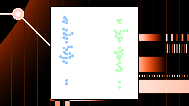
A beeswarm plot shows every individual data point along a single axis while nudging points sideways to prevent overlap. Each dot represents one observation, and the horizontal spread reveals where your data clusters or thins out.
Think of it like a crowd of people standing in line. Instead of stacking on top of each other, they spread out naturally while staying in their general position. The result shows you both the exact values and the density of your data at the same time.
Box plots compress everything into summary statistics. Violin plots smooth the data into curves. Beeswarm plots? You see the actual observations rather than an abstraction of them.
In BI work, that usually means fewer arguments about whether a median "counts." You can point to the dots. Executives, analysts, and even a sales rep checking their performance can all see where every data point actually lands.
Key takeaways for beeswarm plot decisions
Before you build one, check whether your data fits these conditions:
- Use this chart when: There are between 30 and 200 points per category and you want to see outliers, clusters, or gaps that summary statistics would hide.
- Avoid this chart when: The sample sizes exceed a few hundred per category, or when your audience is unfamiliar with the format and you have limited time to explain.
- Primary decision it supports: Identifying whether subgroups have meaningfully different distributions or whether apparent differences come from outliers.
- Best alternative if it fails: Violin plots for large samples; box plots when you want precise quartile comparisons.
Data requirements for beeswarm plots
Your data needs a specific shape. One categorical variable (the grouping axis) and one numeric variable (the value axis). That's the minimum.
The data also needs to stay granular. A beeswarm plot only works when you feed it row-level, nonaggregated observations. If your pipeline already rolled everything up to daily averages or department totals, the beeswarm has nothing to "swarm." This catches teams off guard more often than you'd expect. Check your transformation layer before blaming the chart.
A second categorical variable for color encoding helps when you want to compare subgroups within each category. A unique identifier lets you trace individual points back to source records if stakeholders ask about specific dots. (This comes up a lot in governed dashboards where people expect answers, not guesses.)
For the chart to be meaningful, you should have at least two categories to compare and at least 10 to 15 observations per category. Fewer than that, and the distribution shape becomes unreliable. More than 200 to 300 per category, and points start overlapping despite the packing algorithm.
Some boundary conditions will cause the chart to render but produce misleading results. Extreme skew where most points cluster at one end will let a few outliers dominate the visual. Categories with wildly different sample sizes will skew perception because the visual weight of larger categories dominates attention.
If you're a data engineer supporting this chart, the boring basics matter here: consistent category labels, clean numeric types, and predictable missing-value handling. Get those right once in the transformation layer, and analysts stop filing ad hoc "why does this dot look wrong" requests.
Why beeswarm plots exist
Box plots hide things. They compress your entire distribution into five numbers, which means multimodal patterns, gaps, and the actual shape of your data disappear. Violin plots show density but lose individual observations. Histograms work for single distributions but become cluttered when comparing groups.
The beeswarm emerged to solve a specific problem: How do you show every data point while still making density visible and comparisons across categories possible?
Picture a box plot showing two groups with identical medians and interquartile ranges. Looks like the same distribution, right? A beeswarm of that same data might reveal that one group is bimodal (two distinct clusters) while the other is uniform. That visibility changes the business decision entirely.
This is also why analysts reach for beeswarm plots when stakeholders distrust summary statistics. It turns "trust me" into "look at the distribution."
When to use a beeswarm plot and when not to
Sample sizes between 30 and 200 points per category hit the sweet spot. The decision should depend on understanding distribution shape rather than just central tendency. If outliers or multimodal patterns could change your conclusion, this chart earns its place.
Stakeholders who have expressed distrust of summary statistics often respond well to beeswarms. They can see the actual data rather than taking your word for what the median represents.
This is especially helpful in business reviews where averages mask the story: sales rep performance, campaign results, finance variance, or operational response times. You can answer questions like "Are we consistently good?" vs "Are we good because two people are carrying the number?"
But if sample sizes exceed a few hundred per category, points will overlap despite the packing algorithm. Viewers will see a blob rather than a distribution. If the audience is unfamiliar with the format and you have limited time to explain, stakeholders may misinterpret horizontal spread as meaningful variation when it's just algorithmic spacing.
When you need precise summary statistics communicated clearly, beeswarm plots make medians and quartiles harder to read than box plots. If the meeting is about "what's the median," use a box plot.
How a beeswarm plot works, and how it's commonly misread
The eye naturally notices the overall shape of the point cloud within each category first. Dense regions appear as thick horizontal bands. Sparse regions show gaps. The vertical position of each point is its actual value. The horizontal position is algorithmically determined and carries no meaning about the data itself.
That last part trips people up constantly.
Two points at the same vertical position but different horizontal positions have the exact same value. The horizontal spread exists only to prevent overlap. If you're putting this on an executive dashboard (or in front of a citizen data audience), assume someone will ask, "So what does left vs right mean?" Your labels, tooltip copy, and your 30-second explanation should be ready for that moment.
How to read this chart
Follow this sequence:
- Compare the vertical spread across categories to assess variability.
- Look for clusters, gaps, or multimodal patterns within each category.
- Identify outliers as isolated points far from the main mass.
- Compare the center of mass across categories for rough central tendency.
- Note the density (horizontal thickness) at different value ranges.
Clusters created by the packing algorithm can look like meaningful groupings. If points are packed tightly because there are many similar values, that's real. If they're spread because the algorithm needed space, that's not. Comparing precise values across categories is unreliable because the eye struggles to compare vertical positions when horizontal positions differ.
Beeswarm plot variations
Not all swarm-like charts behave the same way.
A strip plot offsets points randomly along the categorical axis. Faster to render, but allows overlap. Use it when you need a quick view and can tolerate some occlusion.
A swarm plot is identical to a beeswarm. The name differs by library, not by behavior. Seaborn's swarmplot uses a packing algorithm to prevent overlap.
A grouped beeswarm splits each primary category into sub-columns using a second categorical variable. Each sub-column gets its own swarm. Use this when comparing subgroups within categories, like treatment vs control across multiple sites. More than three subgroups per category becomes hard to read.
A beeswarm with box plot overlay superimposes a semi-transparent box plot to show summary statistics alongside the raw data. Use this when stakeholders want both. Reduce box plot opacity and use thin lines to avoid visual clutter.
Best practices for beeswarm plots
Point size should scale with sample size. Start with size three to five for data sets under 100 points per category. Reduce to two or three for larger sets. Large points create visual blobs that defeat the purpose.
Use transparency (alpha between 0.5 and 0.8) when overlap is unavoidable. Even with packing algorithms, dense regions can occlude.
Order categories meaningfully. Don't default to alphabetical. Order by median value, sample size, or business priority. Viewers waste time searching for the category they care about otherwise.
Use colorblind-safe palettes when encoding a second variable. With an estimated 300 million people worldwide affected by color blindness, avoiding red and green combinations is essential. This single choice determines whether a significant portion of your audience can interpret the chart at all.
Limit categories to seven or fewer. After that, the chart becomes a wall of point clouds with no clear comparison path.
If nontechnical stakeholders will interact with the chart, make the interpretation easy on them. Clear axis labels, descriptive category names, and tooltips that repeat the "horizontal position is just spacing" rule reduce confusion and repetitive follow-up questions.
Examples of beeswarm plot insights
- A support team compared median response times across regions and found them roughly equal. A beeswarm revealed something different: One region had bimodal response times. Most tickets resolved in under an hour, but a cluster took over 24 hours. The median hid a staffing gap during overnight shifts. A box plot would have shown a "normal" range without revealing the two distinct populations.
- An e-commerce team ran a pricing test and compared revenue per user. The violin plot showed similar distributions. A beeswarm showed that the treatment group had a cluster of high-value conversions that the control lacked, but also more zero-value sessions. Winners and losers, not a uniform lift.
- HR presented performance distributions to leadership using histograms. A beeswarm comparison across departments revealed that one department had no mid-range scores (only high and low performers). That suggested a calibration problem. Comparing multiple histograms side-by-side is visually cluttered; the beeswarm makes the comparison direct.
How to explain a beeswarm plot in 30 seconds
When presenting to executives unfamiliar with the format, use this structure:
- "This chart shows the actual distribution of [metric] across [categories]. Each dot is one [observation unit]."
- "The key comparison is how spread out or clustered the dots are within each group. That tells us whether we're consistent or all over the place."
- "The main takeaway is [specific insight]."
- "Do not conclude anything from the horizontal position of dots. That's just spacing to prevent overlap."
- "If we need to see summary statistics like medians, we should overlay a box plot or switch to that view."
Keep it under 30 seconds. If stakeholders want more detail, they'll ask.
How to create a beeswarm plot in Python
Seaborn's swarmplot function is the standard approach. According to the Stack Overflow Developer Survey, Python saw a seven percentage-point increase in adoption from 2024 to 2025. Many data teams already have the environment set up, so they can start building these charts with minimal additional setup. The function name differs from "beeswarm" but the behavior is identical.
Data should be in tidy format: one row per observation, with columns for the categorical variable, numeric variable, and optional grouping variable. Remove or handle missing values before plotting. Seaborn drops them silently, which causes confusion if counts don't match expectations.
import seaborn as sns import matplotlib.pyplot as plt sns.swarmplot(data=df, x="category", y="value", hue="subgroup") plt.show() Adjust the size parameter to control point diameter. Reduce this for larger data sets. Use the dodge parameter to separate hue groups into distinct swarms when subgroup comparison matters. Explicitly set the order parameter rather than accepting the alphabetical default.
After plotting, verify that the number of visible points matches your expected row count per category. If points seem missing, check for overlapping values at identical positions or NA handling. Using swarmplot on data sets with thousands of points per category will produce an unreadable blob. If you see a warning about overlapping points, switch to a violin plot or sample your data.
If you plan to share the chart broadly, think about where it will live. A notebook screenshot in a slide deck is fine for one meeting. A governed BI dashboard is how you stop getting the same ad hoc request every week.
How to create a beeswarm plot in R
The ggbeeswarm package extends ggplot2 with geom_beeswarm() for proper packing.
library(ggplot2) library(ggbeeswarm) ggplot(df, aes(x = category, y = value)) + geom_beeswarm() The cex parameter affects point size and spacing. Increase it to spread points further apart, decrease it for tighter packing. For a layered hybrid with a box plot:
ggplot(df, aes(x = category, y = value)) + geom_boxplot(outlier.shape = NA, alpha = 0.3) + geom_beeswarm(alpha = 0.6) Set outlier.shape = NA on the box plot to avoid double-plotting outliers.
Beeswarm plot for SHAP values in machine learning
SHAP (SHapley Additive exPlanations) beeswarm plots are a common visualization for feature importance in machine learning models. Each row is a feature, ordered by mean absolute SHAP value. Each dot is one observation. Horizontal position shows the SHAP value for that observation (positive pushes prediction higher, negative pushes it lower). Color encodes the feature's actual value (red for high, blue for low).
If high feature values (red dots) consistently appear on the right (positive SHAP), that feature has a positive relationship with the prediction. Scattered colors suggest a more complex or interaction-dependent relationship.
People often assume feature order equals feature importance for their specific use case. The ordering is by average impact across all observations; a feature ranked lower might be critical for a specific subgroup. SHAP values are also highly sensitive to upstream data engineering choices, so the same data set prepared differently can shift feature rankings.
Limitations of beeswarm plots and when to switch
Once you get past a few hundred points per category, even packing algorithms can't prevent visual clutter. Switch to violin plots or density plots for large samples.
Stakeholders unfamiliar with the format will ask about horizontal positioning, mistake algorithmic spread for meaningful variation, or simply tune out. If explanation time is limited, use a box plot with explicit outlier callouts.
The eye is poor at comparing vertical positions when horizontal positions differ. If the decision requires knowing "is Group A's median higher than Group B's," a box plot or table communicates this more reliably. I've seen teams spend twenty minutes debating a beeswarm when a simple table would have answered the question in two.
| Limitation | Alternative | Why it's better |
|---|---|---|
| Large sample size | Violin plot | Handles thousands of points |
| Unfamiliar audience | Box plot | Widely recognized |
| Precise comparison needed | Table | Exact values readable |
| Many categories | Small multiples | Reduces cognitive load |
Creating beeswarm plots in Domo
Many BI tools don't include a native beeswarm chart, so teams end up building workarounds or relying on custom visuals. Domo includes a Beeswarm Plot chart option, so you can build point-level distribution views directly in governed dashboards.
That matters for two reasons. First, analysts can share the full distribution story without sending people out to notebooks or external charting libraries. Second, BI managers and IT leaders get consistency and governance in one place, instead of trying to police a mix of one-off custom visuals across multiple tools.
If you do want code, Domo's data science environment still supports Python and R against live, governed data. Or, if you're a data engineer tightening up the data set first, Domo's Magic Transform can help you shape clean, row-level tables that beeswarm plots need.
Once the chart is on a dashboard, people can filter and drill into the dots they care about. If someone asks, "What am I looking at?" Domo's AI chat and natural language features can help people explore the pattern and get a plain-language explanation.
If you want to sanity-check your beeswarm setup (or steal a few best-practice dashboard tricks), compare notes with other data folks. Join the Domo community and swap examples, code, and "wait, what does that dot mean?" moments.


