Mit der automatisierten Datenfluss-Engine von Domo wurden Hunderte von Stunden manueller Prozesse bei der Vorhersage der Zuschauerzahlen von Spielen eingespart.
Schau dir das Video an

Parallel coordinates plots (PCP) let you compare individual records across five or more numeric variables at once, making them useful for spotting clusters, outliers, and multivariate patterns. This article explains what parallel coordinates plots are, when they work best, how to prepare your data, and how to build one in Excel or a BI platform.
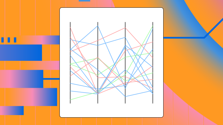
Picture every dimension of your data visible at once. No data science detour required. A parallel coordinates plot makes this vision possible by placing each variable on its own vertical axis, with lines threading through to represent individual records. You might also hear it called a parallel plot, parallel diagram, or PCP.
Standard charts put axes perpendicular to each other, which limits you to two or three dimensions. Parallel axes remove that limit. You can represent dozens of variables on a flat surface.
The structure follows a few rules:
This is not a line chart (no time axis), not a radar chart (axes are parallel, not radial), and not a slope graph (more than two axes). Alfred Inselberg developed this technique to help visualize multidimensional geometry, and it has since become a staple for exploratory data analysis.
Working with between five and 12 numeric variables? Or an individual record comparison? Is cluster detection or outlier identification your main goal? This chart earns its place for these questions. Interactive features like brushing, filtering, and axis reordering make it more useful than any other chart.
However, here's the scenario that trips up a lot of data analysts and BI specialists: Stakeholders want multi-variable comparisons now, but building a parallel coordinates plot from scratch (or exporting to a separate tool) turns into a time sink. That friction is where most good intentions die.
If you have fewer than four variables, you can safely skip it. A scatterplot matrix or grouped bar chart will be clearer for your stakeholders, and the parallel plot just adds visual noise. With more than a few hundred records and no transparency settings, overplotting turns everything into an unreadable blob. Standard parallel coordinates also assume continuous scales, so categorical data does not fit well here.
Arbitrary axis order creates another possible trap. The same data can look clustered or chaotic depending on which variables sit next to each other. Unnormalized data compresses low-variance variables into flat lines and hides their contribution.
For line-of-business executives (such as in finance, sales, or operations), the signal to consider a PCP is usually clearer: When you're staring at five separate key performance indicator (KPI) charts and still can't tell which segments have the best overall mix, a parallel coordinates plot can pull those trade-offs into one view. These plots exist to support the kind of multi-variable trade-off analysis many organizations struggle with.
Get the data into the right shape first. Axis order and interpretation come later.
A parallel coordinates plot works best when:
If you are a data engineer, this is where a lot of the repetitive work lives: reshaping, normalizing, validating, and revalidating every time someone wants a new axis in the plot.
An analyst sees many lines crossing between two axes and concludes those variables are negatively correlated. That interpretation only holds if the axes are adjacent and scaled consistently, because axis order changes everything.
Dense bundles catch your eye first, then isolated lines emerge as potential outliers. Note that crossings between adjacent axes suggest inverse rank order (not strict statistical correlation). Parallel lines between adjacent axes suggest positive rank association. A wide spread at a single axis indicates high variance on that variable.
Here's a reliable reading workflow for PCPs:
Crossings only indicate rank inversion between two adjacent axes. To assess actual correlation, you need those axes next to each other and properly scaled. Flat lines are not necessarily unimportant either. A flat line means low variance on that axis, which may be meaningful if all high performers share a similar value.
Three preprocessing decisions determine readability: scaling, axis ordering, and record sampling.
Normalize each axis** independently.** Use min-max scaling or z-score normalization so all axes share a comparable visual range. Without normalization, high-magnitude variables dominate visually and compress others into flat lines. One caution: if you normalize each axis independently, outliers on one variable can compress the rest of that axis's distribution, making moderate differences hard to see.
Treat normalization and metric definitions as governed logic, not a one-off spreadsheet trick, if you are feeding this plot from a shared dataset. It's a quiet win for IT and data leaders who want consistent numbers and fewer "which version is right?" conversations.
Order axes by correlation or domain logic. Place highly correlated variables adjacent to reveal parallel bundles. Put inversely correlated variables adjacent to reveal crossings. Arbitrary order makes patterns appear or disappear based on random placement. Running a correlation matrix and ordering by hierarchical clustering helps.
Reduce overplotting with transparency or sampling. For more than a few hundred records, set line opacity low (around 10 to 20 percent) or use stratified sampling. Dense regions otherwise become solid blocks that hide subgroup structure.
Use brushing and linking when available. Interactive selection of a range on one axis highlights corresponding lines across all axes. This is the move that helps analysts isolate a segment (top margin, low churn, high volume) without spinning up a brand-new chart for every question.
Handle categorical variables carefully. Standard parallel coordinates assume continuous scales. If you must include categories, use jittering or switch to parallel sets. Forcing categories onto a continuous axis creates misleading slopes.
Avoid plotting raw, unnormalized data. Don't use thick lines with high opacity on large datasets. Never present a single static axis order as definitive.
Several variants address overplotting directly.
Related charts serve different purposes:
Excel doesn't have a native parallel coordinates chart type. You need a workaround using a line chart with a categorical axis. This approach works for small datasets but becomes unwieldy once you have more than a dozen records or variables.
It also tends to create an "analytics escape hatch" problem for IT teams: once people start exporting data to build advanced visuals elsewhere, governance, security, and metric consistency get harder to enforce.
Set up rows as observations and columns as variables. Add a helper column for record ID. Normalize each variable column using a min-max formula like =(B2-MIN(B$2:B$20))/(MAX(B$2:B$20)-MIN(B$2:B$20)). Transpose the data so variables become rows and records become columns.
If you're a data engineer supporting multiple teams, this is the repetitive part. Each new axis request can mean another reshape, another validation pass, another handoff. You'll notice how quickly this becomes a bottleneck when stakeholders start asking for weekly refreshes.
Select the transposed, normalized data (excluding headers). Navigate to Insert, select Charts, choose Line, and click Line with Markers. Excel plots each column as a separate series. The horizontal axis shows variable names from row labels.
Set the vertical axis range to zero through one since data is normalized. Reduce line thickness and marker size. Apply low opacity if your Excel version supports it, or use muted colors. Add axis labels for variable names.
Check that all series span the full zero to one range appropriately. Confirm variable order matches your intended axis arrangement. Test by reordering variable rows to see if patterns change.
Excel has limitations here, as it doesn't have native support for axis reordering, brushing, or interactivity. Transparency control is also limited. The chart becomes cluttered once you have more than 10 records. No density or bundling options exist.
If you need interactivity, a BI platform with native parallel coordinates support handles this better. For more than a few dozen records, code-based tools like Python (whose adoption rose by seven percentage points in a single year, reflecting how many teams are outgrowing spreadsheet-based visualization) or dedicated visualization platforms tend to scale more cleanly.
Domo's visualization capabilities support interactive exploration of high-dimensional data, including filtering, drilling down, and sharing insights across teams. That matters for a parallel coordinates plot, because brushing a range on one axis and seeing every related line light up across the rest is often the whole point.
If you're a data analyst or BI specialist, this is the self-service path: go from raw data to an interactive parallel coordinates plot without exporting to Python or R.
If you're an IT or data leader, keeping advanced visuals like parallel coordinates plots inside Domo helps reduce tool sprawl and supports governance, security, and metric consistency.
If you're a data engineer, Domo's Magic ETL (also called Magic Transform can help normalize and reshape multi-variable datasets, and Domo connects to over 1,000 data sources so the chart stays current as inputs refresh.
See what it looks like to go from "too many KPIs" to one interactive view. Try Domo free and build a parallel coordinates plot with filtering, brushing, and axis reordering in minutes.


