Mit der automatisierten Datenfluss-Engine von Domo wurden Hunderte von Stunden manueller Prozesse bei der Vorhersage der Zuschauerzahlen von Spielen eingespart.
Schau dir das Video an

Filled gauge charts show progress toward a goal using a colored arc that fills from empty to full, making them ideal for quick status checks on single KPIs. This guide explains what filled gauges do well, where they fall short, and how to build one in Excel or a BI tool.
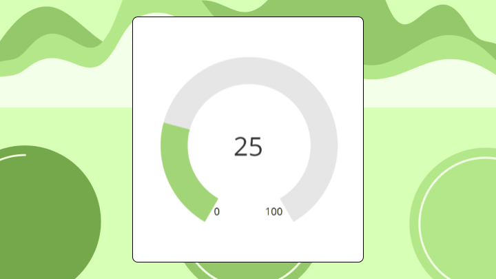
A filled gauge chart displays a single value as a colored arc or bar filling toward a maximum. It answers one question: How close is this metric to its target right now?
Here's what you need to know before choosing this chart:
Progress toward a goal, visualized as color filling an arc. That's the core idea. Unlike a speedometer chart that uses a needle pointing to a value, a filled gauge uses color to show how much of the target has been reached.
The components are straightforward. You have a current value, a minimum (usually zero), a maximum (your target or ceiling), and threshold bands that define your green, yellow, and red zones. When someone misconfigures those bands (setting overlapping ranges or leaving gaps between them), the whole chart becomes misleading.
People often use gauge chart and speedometer chart interchangeably. The distinction matters less than understanding what both do well and poorly.
Filled gauges shine when your audience needs a pass/fail read on a single metric. Service level agreement (SLA) compliance. Quota attainment. Budget burn rate. The target is fixed, everyone knows what it means, and the only question is "where do we stand?"
This is where filled gauges can save a BI analyst from the weekly "can you send me a quick snapshot?" cycle in a KPI dashboard. If the dashboard design is self-explanatory, people can get their status check without a new ticket.
Executive dashboards often line up several small gauges to show status across departments. This works when executives just need to know which areas need attention. Once they start asking why something is red, the gauge has done its job. They need to drill down elsewhere.
Line-of-business (LOB) managers (sales, marketing, finance, operations) tend to like gauges for another reason: They cut through dashboard overload. Instead of mentally doing the math from a raw number, they can answer if "are we on track?" in seconds and move on.
Operations teams pair gauges with threshold alerts. When a value crosses into the red zone and triggers a notification, the gauge confirms what the system already flagged.
But gauges fall apart in certain situations. Placing five gauges side by side and expecting people to compare them accurately? That's asking the eye to jump between arcs, which is much harder than scanning bar lengths. A grouped bar chart handles comparison better.
And if your metric dropped from 95 percent to 85 percent this week, a gauge sitting at 85 percent looks perfectly fine. It shows now, not then. A sparkline would reveal the drop.
Shifting targets break gauges entirely.
The term "gauge chart" covers several variants that behave differently.
The classic arc that fills clockwise, like a fuel gauge. The dial metaphor feels intuitive to most people. But arcs are harder to read precisely than straight lines, so skip this variant when exact values matter more than status zones.
A straight bar filling left to right. Easier to compare when you have multiple gauges stacked vertically because bar lengths are perceptually simpler than arc angles. You lose the dial metaphor, which may or may not matter to your audience.
A thermometer gauge (vertical fill) works similarly and shows up often in fundraising dashboards. The orientation aligns naturally with concepts of volume or rising totals.
Before you build (or trust) a filled gauge chart, get the data inputs nailed down. If these definitions drift across teams, you end up with the dreaded problem of "same KPI, different number."
At minimum, a filled gauge chart needs:
Two practical requirements make or break gauges in enterprise dashboards:
Your eye goes to the filled portion first. Then it checks the position against threshold bands. Then it looks for a numeric label. If that label is missing or too small, you start estimating based on arc proportion. That's where errors creep in.
The right way to interpret a gauge:
Angle bias trips people up. A 50 percent fill on a 180-degree arc looks half full. The same 50 percent on a 270-degree arc looks like less than half. The visual proportion depends on the arc's total sweep, which means two gauges showing identical values can appear dramatically different if their arc designs don't match.
Color reliance creates accessibility problems. If threshold bands are the only status indicator, up to 8 percent of men have color vision deficiency and may miss the signal. Always pair color with a numeric label.
And here's where gauges get dangerous: A gauge at 80 percent looks healthy until you learn the target was 95 percent. If the target marker is absent or unclear, the gauge tells you nothing useful.
Before trusting any gauge, confirm you know the min, max, and target. If any of those are unclear, you're looking at decoration.
Gauges are polarizing among data visualization practitioners. They consume significant space for a single number and can obscure more than they reveal.
A gauge shows one value. If that value depends on comparison to last period, breakdown by segment, or variance from forecast, the gauge forces viewers to hunt for context elsewhere. Teams make decisions on incomplete information because the gauge looked fine. I've seen this play out more times than I'd like to admit.
Arc-based encoding is less precise than length-based encoding. Cleveland and McGill's research confirmed position judgments are more accurate than angle judgments, a finding that explains why bar charts consistently outperform radial charts in accuracy tests. When precision matters (budget variance, inventory levels), a bullet chart reduces estimation error.
A single gauge takes the same space as a KPI card that could show the number, a sparkline trend, and a comparison to target. For dashboards with limited real estate, gauges may not earn their spot.
A filled gauge chart is only as trustworthy as the metric definition behind it. If one team calculates "revenue attainment" one way and another team calculates it differently, you can end up with conflicting gauges in different dashboards.
IT and data leaders usually care about this more than anyone (for good reason). Standardizing gauge configurations and metric definitions through centralized governance helps keep every gauge aligned to the same source of truth.
Excel doesn't have a native gauge chart type. You build one by formatting a doughnut chart with some tricks. This works for static reports but gets tedious for dashboards that refresh frequently.
This "workaround required" story isn't unique to Excel. Some BI tools also push teams toward custom builds or third-party visuals for filled gauge behavior, which can add configuration overhead and raise governance questions for system admins. If you want filled gauges across lots of dashboards, you'll feel that friction.
Your data needs three rows:
Set up the three rows. Use the formula =Max-Value for the Remaining row. The Invisible row creates the bottom half of the gauge.
Select all three values. Go to Insert, then Charts, then Doughnut. Excel creates a full doughnut.
Right-click the chart and select Format Data Series. Set the angle of the first slice to 270 degrees (this rotates the start point to the bottom). Set the Invisible slice fill to "No fill" so only the top half renders. Color the Value slice with your status color and the Remaining slice with neutral gray.
For threshold bands, add rows for your green, yellow, and red zones and overlay a second doughnut with lighter fills. For a target marker, insert a small shape and position it manually.
Confirm that Value + Remaining + Invisible equals twice your max. If the gauge looks wrong, check that the Invisible slice equals your max exactly.
Forgetting to set the Invisible slice to "No fill" gives you a full doughnut instead of a half-circle gauge.
Excel's workaround means some changes require manual adjustment, especially threshold band overlays and target markers. For dashboards that update automatically, BI tools with built-in filled gauge chart types (Domo includes these) remove that busywork, and reusable metrics can help keep the gauge consistent across every dashboard it appears in.
An IT ops team tracks uptime against a 99.5 percent SLA. Their gauge shows 99.2 percent, with the red zone starting at 99.0 percent. The visual proximity to red creates urgency that a table showing "99.2 percent" wouldn't.
A sales manager checks Q3 progress. The gauge shows 78 percent of quota with six weeks remaining. The team is behind pace. A bar chart would require comparing bar length to a target line. The gauge makes it one visual read.
A finance team monitors budget burn at 65 percent with two months left in the fiscal year. The yellow zone starts at 70 percent. They know instantly they have headroom, but not much.
Citizen analysts, like sales reps, store managers, and marketing coordinators, often use gauges in a more personal way. "Am I on pace?" "Is my region still green?" It's your number, your goal, your gauge. Just make sure the data stays current so they don't have to ask an analyst to validate it.
Use this structure when presenting to stakeholders:
Use this sample data to validate your build:
Confirm the value falls within the min-to-max range. Check that threshold bands have no gaps and no overlaps.
This gauge should show a 78 percent fill in the green zone, indicating on track but not yet at target.
One thing gauges hide well: volatility. If a value swings between 70 and 90 percent daily but you only see a snapshot at 80 percent, the gauge suggests stability that doesn't exist.
If a gauge isn't right for your situation, consider these options:
For executives, that first bullet can replace a five-slide status deck. For managers, it can turn a morning standup into "know your number, act on it." Analysts see fewer ad hoc questions because the dashboard answers the status question on sight.
Filled gauge charts answer one question well: Is this single metric on track right now? They fail when you need trend context, multi-value comparison, or precise reads.
Choose them for executive dashboards and operational monitoring where status is the only question. Reach for bullet charts or KPI cards when you need more.
Want a second set of eyes on your gauge setup (targets, thresholds, and what to pair it with for trend context)? Join the Domo community to swap dashboard best practices and get feedback from other data folks.


