Mit der automatisierten Datenfluss-Engine von Domo wurden Hunderte von Stunden manueller Prozesse bei der Vorhersage der Zuschauerzahlen von Spielen eingespart.
Schau dir das Video an
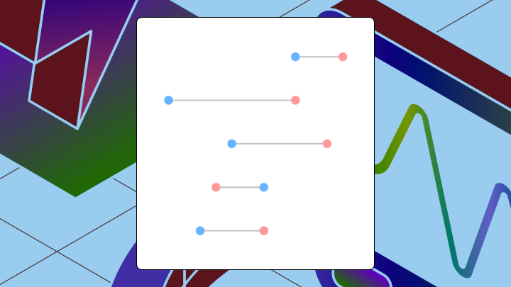

Cleveland dot plots rank categories using dots positioned along a horizontal axis, offering a cleaner alternative to bar charts when it's time to compare many items or detect small differences. This guide covers when to use them, how to read them correctly, and how to build them in Excel.
Categorical data. A single measure. Should you reach for a bar chart, a dot plot, or something else entirely?
If you're a data analyst or BI specialist trying to help nontechnical stakeholders trust what the data says, this is a great option when you want to cleanly show the data. A Cleveland dot plot lets you visualize ranked comparisons without the noise, which is especially useful when your dashboard is getting crowded.
The Cleveland dot plot shines in specific situations, like when:
Some contexts make this chart a poor fit. For instance, time-series data usually calls for a line chart because sequence and trend matter. Dot plots can make temporal patterns harder to read. And if you only have five or six categories, a bar chart works just fine, and your audience already knows how to read it. If it's the distance from zero that carries analytical meaning (profit vs loss, for example), bars make that distance explicit while dots would de-emphasize it.
And if your audience has never encountered a dot plot? A Gartner prediction reported by TechTarget estimated that adoption would remain limited in many organizations (around 30 percent). That unfamiliarity can slow down comprehension during a high-stakes presentation, since chart literacy varies widely across organizations. Sometimes the familiar choice is the right one.
Once you know a dot plot is the right call, here's what it is and how it works.
You're trying to show ranked performance across a bunch of categories. Do you go with the familiar bar chart, or pick something that communicates the ranking without the noise? That decision is part of analytical expertise. It's exactly where the Cleveland dot plot earns its keep.
A Cleveland dot plot displays values as dots positioned along a horizontal axis, with categories listed vertically. Each dot's horizontal position shows a quantitative value. And each dot's vertical position identifies the category. No bars, no shading. Just dots and their placement.
The simplicity of this representation is the whole point. While bars encode value through length extending from a baseline, dots encode value through position alone. When values are close together, your eye detects position differences more accurately than length differences. A bar chart with 20 categories becomes a wall of similar-looking rectangles. The same data in a dot plot stands out as a clear ranking.
Sorting matters here. When categories are arranged by value rather than alphabetically, the chart transforms from a lookup table into a ranking tool.
Cleveland dot plots are picky in a good way. They surface ranking and precision, not decoration.
At minimum, the data should have:
If you're building the dumbbell variant, the data will also need:
A few practical checks that save headaches later:
Your eye naturally scans vertically first, hunting for the highest and lowest dots. Then it shifts to horizontal comparison, gauging relative performance. This top-to-bottom scan followed by left-to-right comparison is exactly how the chart is designed to be read.
The correct sequence looks like this:
Misreads happen in predictable ways. Some viewers treat the chart as a scatter plot, assuming the vertical position encodes a second variable rather than just category labels. Others ignore the sort order and assume the top category is the best performer when it's actually just alphabetically first. Small visual offsets between dots might reflect noise rather than meaningful variation, and without confidence intervals, viewers sometimes draw conclusions the data doesn't support.
When the chart shows two dots per category (the dumbbell variant), the focus shifts from absolute position to the gap between dots. A wide gap signals change. A narrow gap signals stability. Viewers who focus on where each dot lands rather than the distance between them miss the insight entirely.
If you're building dashboards for executives, here's where you win: Research shows horizontal graphs improve reading efficiency. This means your executives can scan ranked performance across teams, regions, or products with less time and effort.
What kinds of comparisons does this chart make obvious that other charts would obscure?
A sales team comparing revenue across 20 regions gets immediate clarity from a sorted Cleveland dot plot. Leaders and laggards reveal themselves without effort. The same data in a bar chart becomes a wall of similar-looking rectangles where the ranking exists but takes work to extract.
A finance team comparing budget against actual spend across departments benefits from the dumbbell variant. Each category shows two dots connected by a line. The gap between dots reveals which departments overspent or underspent. A grouped bar chart would show the same data but require viewers to mentally calculate the difference between adjacent bars.
An HR team reviewing engagement scores across 15 survey questions can sort the dot plot by score and surface the highest and lowest scoring questions instantly. A horizontal bar chart would work, but the visual weight of all those bars distracts from the comparison.
For BI managers trying to keep dashboards consistent across the organization, these are also an opportunity to standardize. One approved pattern for ranked comparisons beats a dozen one-off workarounds scattered across reports.
Different types of dot plots serve different purposes:
Ranking a single measure? Use the Cleveland dot plot. Comparing two points per category? Dumbbell. Baseline matters? Lollipop.
Excel doesn't offer a native Cleveland dot plot. You'll build one by modifying a bar chart, and the workaround is straightforward once you know the steps.
You need two columns minimum. One holds category labels, the other holds the quantitative value. If comparing two points per category, add a third column.
Sort the data by value before inserting the chart. Excel won't do this automatically, and an unsorted dot plot loses its ranking power entirely. Teams often skip this step and wonder why their chart looks like a random-looking list of dots.
Select the data range. Navigate to Insert, click Charts, and choose Bar Chart. The bar chart approach preserves category labels on the axis without additional steps.
Right-click any bar and select Format Data Series. Reduce the Gap Width to provide spacing between categories. Change the bar fill to "No Fill" and add a marker. If the bars don't convert cleanly, check that you've selected the correct series and enabled marker options.
Excel plots categories from bottom to top by default. To display the highest value at the top, right-click the vertical axis, select Format Axis, and check "Categories in reverse order."
Set appropriate minimum and maximum values for the quantitative axis. You don't have to start at zero. Set the range to emphasize the data spread. Remove vertical gridlines to reduce visual clutter.
Confirm that the category with the highest value appears at the top. If categories appear alphabetical or unsorted, revisit your data preparation. Add data labels directly on or near each dot for presentations.
The finished chart should clearly reveal the ranking. If all dots cluster in a narrow band, adjust the axis range. If the ranking isn't immediately visible, the chart isn't doing its job.
Because Excel doesn't include a native Cleveland dot plot, you'll typically use a workaround. The bar-to-dot conversion can be finicky, and some formatting changes may reset parts of your work.
For dashboards that will refresh automatically, a BI provider like Domo will help teams build Cleveland dot plot-style comparisons in governed, shareable dashboards. That helps analysts publish consistent visuals without custom code, and it helps BI managers avoid a different Excel workaround in every department.
If you're an analytics engineer supporting self-service analytics, pairing clean datasets (from tools like Domo Magic Transform, plus no-code and structured query language (SQL) transforms) with a standardized dot plot pattern also cuts down on maintenance and "please rebuild this chart" requests.
Sort categories by value, not alphabetically. An unsorted dot plot forces viewers to scan every dot to find the highest and lowest. Use a consistent marker size because varying dot sizes implies a third variable even when none exists. Add subtle horizontal gridlines to help viewers trace from dot to axis. Label dots directly when presenting to eliminate tracing back to the axis.
Does a Cleveland dot plot have to start at zero? No. Unlike bar charts, these charts emphasize relative position, not distance from zero. A zero baseline can compress the data into a narrow band where differences disappear. If your analysis depends on showing how far values are from a reference point, consider a lollipop chart or bar chart instead.
Avoid vertical gridlines (they add noise without aiding comparison) and legends when direct labels work. Legends force viewers to map colors back to categories, which slows comprehension.
If your team publishes ranked comparisons across multiple dashboards, consistency is part of the styling story too. Standard axis ranges (when appropriate), standard sort rules, and reusable dashboard templates reduce the chance that two departments "tell" two different stories with the same KPI. You'll notice this problem most acutely during quarterly reviews when someone asks why the sales dashboard shows different rankings than the ops dashboard.
Three chart types could work when you have categorical data and a quantitative measure. Here's how they differ:
| Factor | Cleveland dot plot | Bar chart | Scatter plot |
|---|---|---|---|
| Best for | Ranking many categories; detecting small differences | Comparing fewer categories; showing magnitude from baseline | Showing relationship between two continuous variables |
| Encoding | Position on quantitative axis | Length from baseline | Position on two axes |
| Baseline requirement | No, axes can start anywhere | Yes, must include zero | No, axes can start anywhere |
| Category limit | Handles many categories cleanly | Gets cluttered beyond 10 to 15 | Not designed for categories |
Cleveland dot plots and scatter plots both use dots, but they answer different questions. A scatter plot asks how two variables are related. A Cleveland dot plot asks how categories rank on one measure.
Want to see how other data folks are using dot plots to keep rankings crystal-clear (and dashboards drama-free)? Join the Domo community to swap examples, get feedback, and pick up a few formatting shortcuts along the way.