Join the AI + Data Tour for hands-on training, real customer stories, and time with Domo product experts near you.
Register now

Business intelligence dashboards have come a long way. What started as static reporting tools have transformed into interactive platforms that connect live data, surface insights automatically, and deliver information wherever decisions happen. This article explains what BI dashboards are, breaks down the four main types, and walks through the features and design principles that separate effective dashboards from expensive distractions.
Here are the main points this article covers:
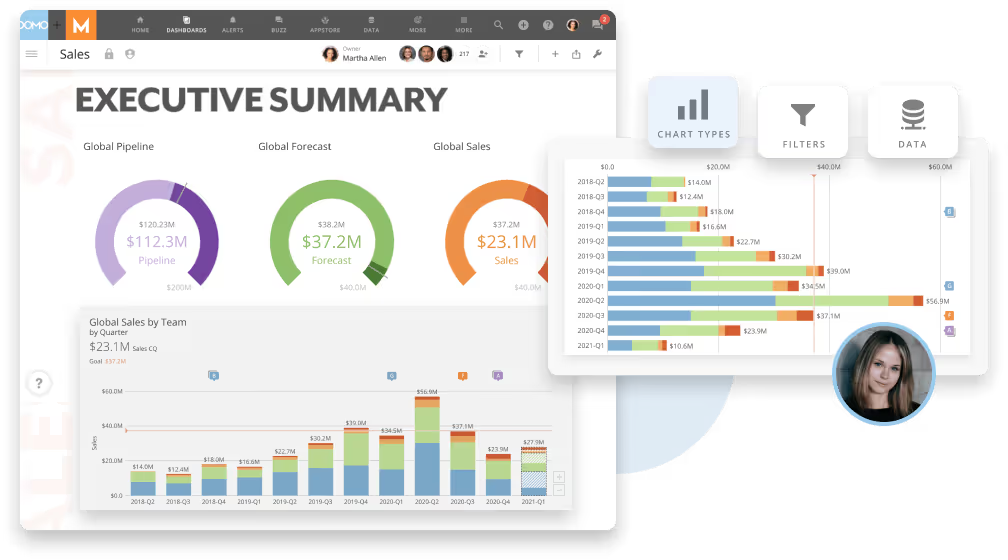
A business intelligence dashboard consolidates key metrics, KPIs, and data points from multiple sources onto a single screen. The purpose? Quicker analysis and decision-making. Unlike static spreadsheets or disconnected reports, a BI dashboard pulls live data from across your organization and presents it through interactive charts, graphs, and tables that update automatically.
That "single screen" concept matters because it helps people see the right information in one place. A well-designed dashboard presents the right information density for its audience: an executive dashboard might show five headline metrics with drill-through navigation to supporting details, while an operational dashboard might display dozens of real-time data points that a floor manager monitors throughout the day. The goal is surfacing what matters without requiring people to hunt through multiple systems or wait for someone to pull a report.
"Real-time" also means different things depending on the dashboard's purpose. Some dashboards refresh every few seconds to track live website traffic or call center queues. Others update hourly or daily because the underlying business processes don't change faster than that. The refresh cadence should match how quickly teams need to make decisions.
With companies collecting more data than ever before, the challenge is not access to information. It's translating that information into understanding. Data without context is noise. A business intelligence dashboard solves this by applying structure, visualization, and interactivity to raw data, turning numbers into narratives that teams can act on.
A dashboard is only as reliable as the data infrastructure behind it. Before any chart appears on screen, data flows through several foundational stages that determine whether the insights are trustworthy.
The process typically starts with data ingestion, which pulls information from source systems like customer relationship management (CRM) systems, enterprise resource planning (ERP) systems, marketing platforms, and databases. Next comes transformation (often called data wrangling) where teams clean, standardize, and structure raw data for analysis. This includes handling inconsistencies like different date formats, timezone conversions, currency normalization, and deduplication.
From there, data moves into a modeling layer where teams define relationships between datasets and apply business logic. Many organizations also implement a metrics layer (sometimes called a semantic layer) that establishes consistent definitions for KPIs across the company. When everyone agrees on what "revenue" or "active customer" means, dashboards become a source of truth rather than a source of debate.
Only after these upstream steps does visualization happen. The dashboard itself is just the delivery mechanism. Other delivery mechanisms include AI assistants, embedded analytics in applications, mobile alerts, and automated workflows. This stage often gets less attention than it should. The dashboard's job is making data accessible and actionable for the people who need it.
Business intelligence dashboards include several features that help companies extract value from their data. Understanding these capabilities helps you evaluate what to look for in a BI solution.
The foundation of any useful dashboard is its ability to connect to your actual data sources. Modern BI platforms integrate with cloud applications, on-premise databases, data warehouses, spreadsheets, and application programming interfaces (APIs). Without broad connectivity, you end up with partial views that miss critical context.
Connecting sources is only step one. Teams must also standardize data before it reaches the visualization layer. This means consistent date formats across systems, proper timezone handling, currency conversion where needed, and deduplication of records that appear in multiple sources. If this standardization does not happen, metrics will conflict across teams and the dashboard becomes a source of confusion rather than clarity. Teams frequently connect a new data source and immediately start building visualizations without validating that field definitions match existing datasets. The result? Dashboards showing conflicting numbers for the same metric.
Static charts tell you what happened. Interactive data visualization helps you understand why.
Drill-down capabilities let people click on a data point to see the underlying details. Filtering allows teams to slice data by region, time period, product line, or any relevant dimension. Cross-filtering connects multiple charts so selecting an element in one automatically updates the others.
These interactive features transform dashboards from passive displays into exploration tools. Instead of requesting a new report every time a question arises, people can investigate on their own and follow the data wherever it leads.
Dashboards can display data that updates continuously, giving teams visibility into what's happening right now rather than what happened last week. For operations teams monitoring production lines, customer service queues, or website performance, this immediacy is essential.
Automated alerts extend this capability by notifying people when metrics cross defined thresholds. Rather than watching a dashboard constantly, teams can set conditions that trigger notifications via email, mobile push, or messaging platforms. This shifts the model from passive monitoring to proactive response. Setting alert thresholds too aggressively leads to notification fatigue, where teams start ignoring alerts entirely because too many false positives flood their inbox.
Beyond showing current and historical data, many BI dashboards incorporate predictive capabilities. These tools analyze patterns in historical data to forecast future outcomes, whether that's projected revenue, expected inventory needs, or likely customer churn.
Forecasting accuracy depends on whether the underlying metrics are consistently defined and governed across data sources. A prediction built on conflicting definitions of "customer" or "sale" will not be reliable, no matter how sophisticated the algorithm.
Different roles need different information. A chief financial officer (CFO) tracking company-wide financial health has different priorities than a regional sales manager monitoring pipeline coverage. Customizable dashboards allow each person to see the metrics most relevant to their responsibilities.
Role-based access controls ensure people see only the data they can view. This personalization is not just about convenience. It is about focusing attention on what matters and maintaining appropriate data governance.
{{custom-cta-2}}
Not all dashboards serve the same purpose. Understanding the four main types helps you choose the right approach for different business needs.
Call center managers use them to track queue lengths and average handle times. E-commerce teams watch website traffic and conversion rates. Warehouse supervisors monitor inventory levels and shipping status. Operational dashboards focus on real-time monitoring of day-to-day activities.
For operational dashboards, "real-time" typically means data refreshing in under one minute. "Near-real-time" covers refresh windows of one to 15 minutes. The right cadence depends on how quickly conditions change and how fast you need to respond. A dashboard tracking social media mentions during a product launch needs faster updates than one monitoring weekly inventory replenishment.
Strategic dashboards give executives visibility into company-wide performance against long-term goals. They emphasize trends over time rather than moment-to-moment fluctuations. Typical metrics include revenue growth, market share, customer satisfaction scores, and progress toward annual objectives.
These dashboards typically refresh daily or weekly because the underlying business dynamics do not shift faster than that. They're best for C-suite and senior leadership reviewing company-wide performance, preparing board presentations, or making decisions about strategic direction.
Analytical dashboards support deep-dive investigation by data analysts and business analysts. They're designed for exploration rather than monitoring, with features that allow complex queries, comparisons across segments, and hypothesis testing.
The reliability of an analytical dashboard depends on whether KPI definitions are consistent across data sources. When analysts can trust that "customer lifetime value" means the same thing regardless of which dataset they're querying, they can focus on finding insights rather than reconciling conflicting numbers.
Tactical dashboards sit between operational and strategic. A marketing team might use one to track a product launch. A project manager might monitor milestones and resource allocation for a major implementation.
The decision flow for tactical dashboards typically follows a pattern: Monitor progress against a target. Explain any variance from expectations. Diagnose the root cause of that variance. Act on the findings. This framework helps teams move from observation to action rather than just watching numbers change.
The advantages of BI dashboards extend across the organization, from individual productivity to company-wide decision quality.
With a business intelligence dashboard, managers have access to data more quickly than ever before. Instead of waiting for someone to compile a report or digging through multiple systems, decision-makers can see current performance at a glance and drill into details when needed.
This speed matters when opportunities are time-sensitive. A sales leader deciding whether to pursue a large deal can instantly check pipeline coverage, team capacity, and historical win rates for similar opportunities. The ability to see company data clearly and concisely means decisions are based on evidence rather than intuition alone.
Having access to data from anywhere allows remote team members to quickly pull reports and gain insights into how their specific projects are performing without having to wait until they return to the office. This accessibility supports reaching key performance indicators regardless of where work happens.
Business intelligence dashboards allow employees to spend less time gathering data and building reports. Instead of manually pulling numbers from multiple systems and assembling them in spreadsheets, team members log into their account and immediately start monitoring everything from one place.
Consider a sales team that's not meeting its goals. Without a BI dashboard, managers might spend hours compiling data to understand where the team is falling behind. With a dashboard, they can pull reports instantly that show performance gaps and how they affect company revenue. This leaves employees with more time to focus on actually improving results rather than documenting them.
Data entry errors also decrease when dashboards pull directly from source systems. Manual data entry is time-consuming and error-prone. BI dashboards eliminate this annoyance by displaying data in an easy-to-read format that updates automatically.
Recurring tasks like publishing reports or checking inventory levels become quick and easy with automated reporting capabilities.
Business intelligence dashboards eliminate the issue of not being able to see what others are working on within your company. By providing every team member with access to relevant information for their projects, dashboards enable teams to work together more effectively.
Customizable views ensure each person sees a unique outlook into how their projects are doing. This personalization based on job responsibilities means a marketing analyst sees campaign metrics while a finance manager sees budget tracking. Everyone gets the information they need without wading through irrelevant data.
This shared visibility leads to increased productivity, stronger company morale, and ultimately, higher company profits. When teams operate from the same data, conversations shift from debating whose numbers are correct to discussing what actions to take.
Business intelligence dashboards make it possible for managers to make more accurate predictions about future revenue, demand, and resource needs by providing up-to-date information on how current projects are performing.
Without this information, a manager would likely make less accurate predictions about future success, which could be detrimental to the company's bottom line. Modern dashboards increasingly incorporate AI-assisted forecasting that identifies patterns humans might miss.
The accuracy of these predictions depends on whether underlying metrics are consistently defined and governed across data sources. A forecast built on certified datasets with clear metric definitions will be more reliable than one assembled from conflicting data sources with ambiguous calculations.
To measure whether your BI investment is paying off, track metrics like reduction in time spent on manual reporting, dashboard adoption rates across teams, and how often automated alerts lead to meaningful action.
Different teams use BI dashboards to track different metrics and make different decisions.
Sales dashboards track pipeline value, win rates, average deal size, sales cycle length, and quota attainment. When pipeline coverage drops below three times, the sales team should review lead generation activity and prospecting efforts. When win rates decline for a specific product line, it signals a need for additional training or competitive positioning work.
Marketing dashboards monitor campaign performance, cost per acquisition, marketing qualified leads, website traffic, and conversion rates by channel. If cost per acquisition rises above target thresholds, marketing should reallocate budget toward higher-performing channels or revisit targeting criteria.
Finance dashboards display cash flow, accounts receivable aging, budget variance, operating margins, and expense trends. When accounts receivable aging extends beyond normal ranges, finance should escalate collection efforts or review credit policies for new customers.
Operations dashboards track production output, defect rates, equipment uptime, order fulfillment time, and inventory turnover. If fulfillment times increase, operations should investigate bottlenecks in the warehouse or shipping process.
HR dashboards monitor headcount, turnover rates, time to hire, employee satisfaction scores, and training completion. When turnover spikes in a particular department, HR should conduct stay interviews and review management practices in that area.
Building an effective dashboard requires more than choosing the right charts. The best dashboards are designed around decisions, not just data display.
A decision-first information architecture follows four levels:
Beyond this framework, several practical dashboard design principles improve effectiveness:
Dashboards and reports serve different purposes. Understanding when to use each prevents confusion about what tool fits which situation.
Use a dashboard when you need ongoing visibility into changing metrics and the ability to explore data interactively. Use a report when you need a documented snapshot for a specific point in time, particularly for compliance, board presentations, or sharing with external stakeholders who don't have dashboard access.
Scorecards work well for executive weekly reviews where a small set of KPIs are compared against targets. KPI boards displayed on office monitors keep teams aligned around shared goals throughout the day.
Choosing the right BI platform depends on your organization's specific needs. Rather than comparing feature lists, consider which use-case archetype matches your situation.
Mid-market teams typically prioritize ease of use, fast time to value, and the ability for business people to build their own dashboards without heavy IT involvement. They need broad connectivity to common cloud applications and enough governance to maintain data quality without creating bottlenecks.
Regulated enterprises require strong row-level security, audit trails, and the ability to enforce consistent metric definitions across thousands of people. Governance capabilities matter more than self-service flexibility. Integration with existing identity management and compliance systems is often mandatory.
Product teams embedding analytics need APIs, white-labeling options, and the ability to deliver insights directly into customer-facing applications. Performance at scale and customization flexibility outweigh ease of use for casual business people.
Regardless of archetype, evaluate these criteria:
{{custom-cta-1}}
Artificial intelligence is changing how people interact with business intelligence. Dashboards are becoming more accessible. Insights are becoming more proactive.
Natural language queries allow people to ask questions in plain English rather than building complex filters or writing SQL. Instead of navigating through menus to find the right chart, someone can type "show me sales by region for Q3" and get an immediate answer.
Automated anomaly detection identifies unusual patterns without requiring someone to watch dashboards constantly. When a metric deviates significantly from expected ranges, the system surfaces it automatically rather than waiting for a human to notice.
Predictive insights go beyond showing what happened to suggest what's likely to happen next. AI models can forecast demand, predict churn risk, or identify opportunities based on patterns in historical data.
A common question in 2026 is: "Can ChatGPT create dashboards?" The answer is nuanced. General-purpose AI tools can suggest KPI definitions, generate structured query language (SQL) queries, recommend chart types, and even create mockups of dashboard layouts. But they require human validation and should not be connected directly to sensitive production data without governance guardrails. Treating AI-generated dashboard suggestions as final without reviewing the underlying logic is a recipe for metrics that look right but calculate incorrectly.
The responsible approach treats AI as an assistant that accelerates human work rather than a replacement for human judgment. Automated notifications and reports that alert people when data changes are one example of AI augmenting human attention rather than replacing it. The human sets the objectives and constraints; the AI handles the monitoring and surfaces what matters.
Business intelligence dashboards transform how organizations understand and act on their data. They consolidate scattered information into coherent views, reduce time spent on manual reporting, and enable decisions based on current evidence rather than outdated assumptions.
The path forward starts with clarity about what decisions you're trying to improve. A dashboard built around clear business questions will deliver more value than one assembled from every available metric. Start with a specific use case. Prove value. Expand from there.
A BI dashboard becomes "AI-ready" when the underlying data is clean, consistently defined, and governed (meaning anyone querying it gets the same answer to the same question). Governed data distribution means insights flow into the workflows people already use, whether that's a dashboard, a mobile alert, an embedded chart in another application, or an AI assistant answering questions in natural language.
Modern BI platforms like Domo unify data integration, governance, visualization, and AI capabilities so organizations can move from raw data to trusted insights to coordinated action. The technology exists to make every team data-driven. What remains is whether you're ready to use it.