AI + Data Tourに参加して、ハンズオントレーニングや実際の顧客事例を学び、お近くのDomo製品エキスパートと交流しましょう。
今すぐ登録
When evaluating workers’ compensation claims, our claims managers at National League of Cities (NLC) Mutual Insurance Company didn’t have an easy or visually engaging way to see where in the human body the most common and expensive injuries were occurring.
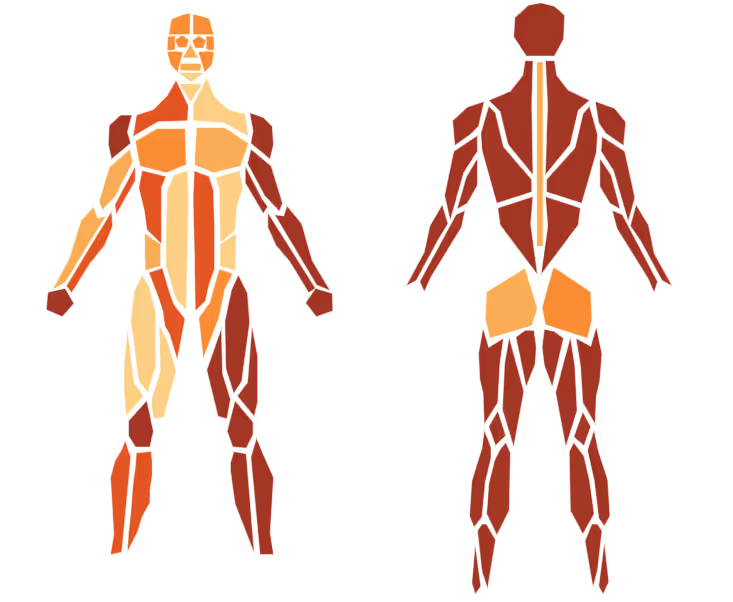
While there are a lot of great card types available in Domo, there isn’t one that contains the human body.
By using the custom chart feature, I was able to find an SVG file of the human body. I downloaded it and used Inkscape to create a few additional body parts and label each of them to match my claims dataset.
I then added the file as a custom chart to my Domo instance. I have been able to create several different cards that show the frequency, severity, and average cost of an injury to a particular body part.
We can also filter to a particular occupation or age range, which can further help claims handlers estimate the cost of a new claim.
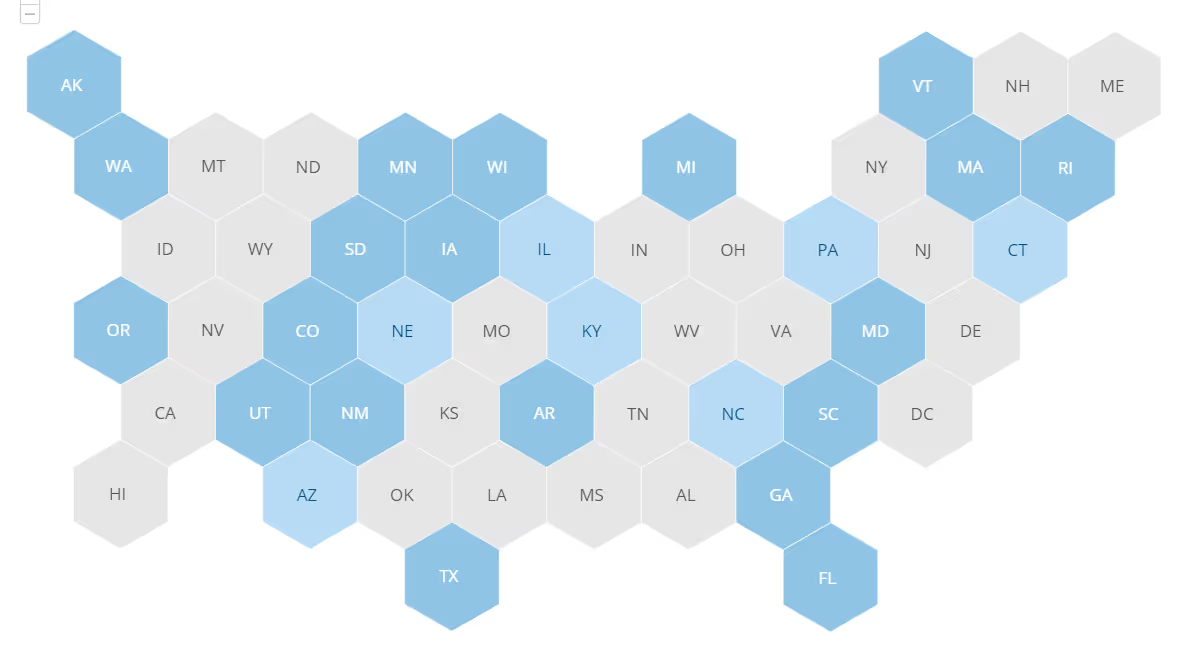
I have also created and included a hex map custom chart of the United States (top of this post) in order to show every state evenly. As I could not find an existing SVG file of the U.S. as a hex map, I created it from scratch using the shape tool in Inkscape.