Create even more visualizations with new chart types.

Check out the latest additions to our chart library:
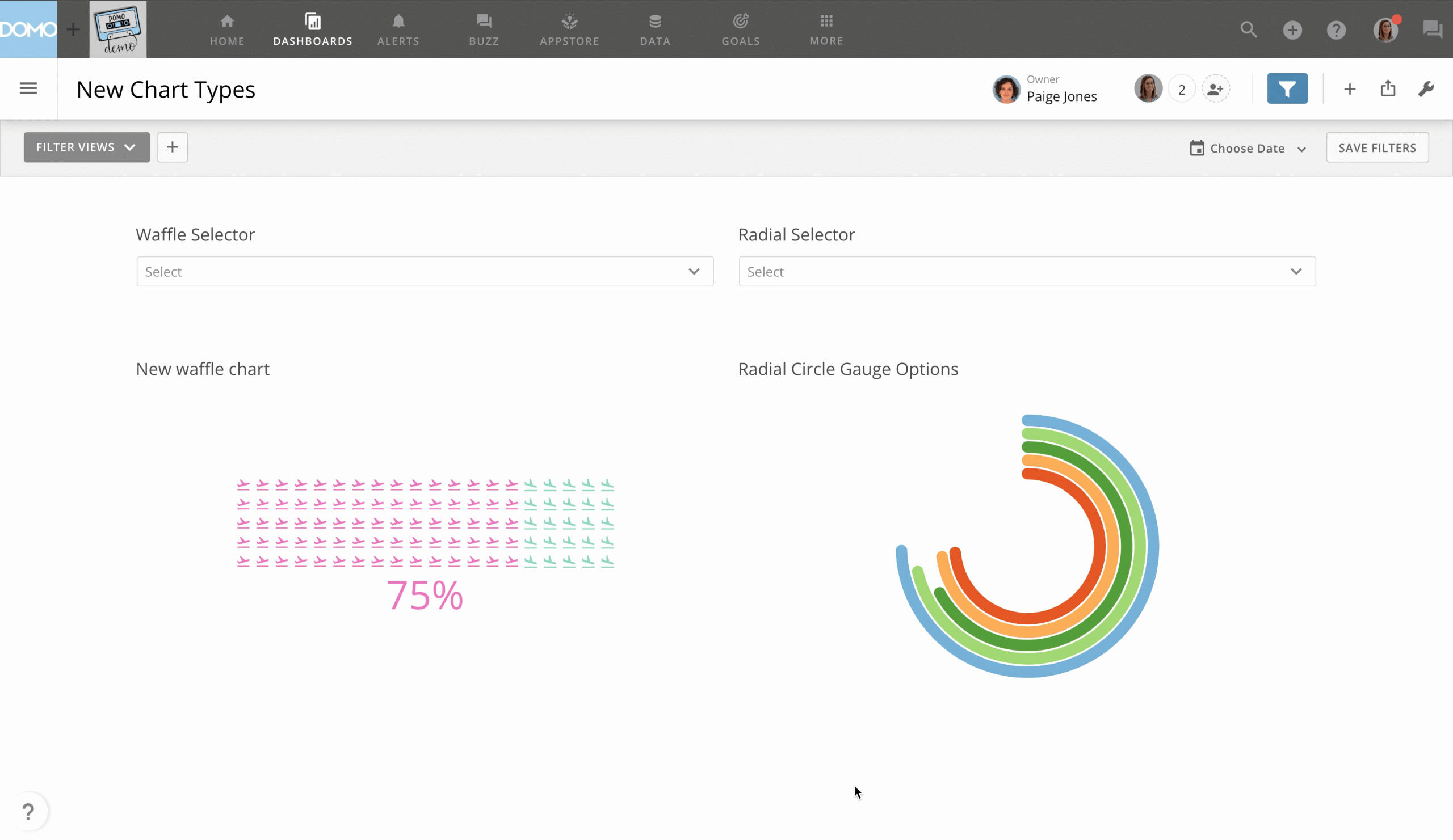
Dropdown control filter charts. This chart type allows you to pick from a large list while not taking up as much space as a radio control or checkbox control card.
Radial gauge and multi-radial gauge charts. With the new circular radial gauge and multi-radial gauge charts, you can easily discover small changes or differences in values—and they don’t take up too much space. These gauges have no x-axis and display data in the y-axis as a percentage of a "Target Value," which is, in general, the maximum value in that axis.
Waffle charts. Waffle charts provide easy-to-interpret comparisons quickly. They’re a useful alternative to pie charts that allow users to display parts of a whole or make relative comparisons. Customize these charts with color ranges, symbols, and optional max values.

Domo transforms the way these companies manage business.


.png)
.png)