Hai risparmiato centinaia di ore di processi manuali per la previsione del numero di visualizzazioni del gioco utilizzando il motore di flusso di dati automatizzato di Domo.
Guarda il video

Map charts are available to answer if a pattern exists more quickly than any table or bar chart can. And this guide will walk through the best time to use them, how they work, the data requirements, design mistakes to avoid, and step-by-step instructions for building them in Excel and Domo BI.
If you've ever sat in a territory review where everyone argues over a table, you already know why map charts exist.
A map chart colors or sizes geographic regions based on numeric values. Use it when location matters more than precision. When you need to spot regional clusters. When stakeholders want to see where something is happening rather than exactly how much.
A sales team once saw Texas dominating revenue on their map and immediately moved reps there. The dominance vanished when they normalized by customer count (the map had shown raw totals across regions with vastly different market sizes). That's a mistake I've seen play out in conference rooms more times than I can count.
Here's what you need to know before building one:
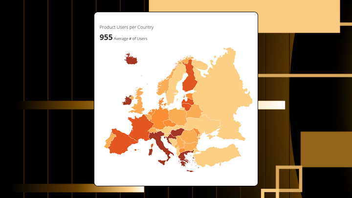
A map chart encodes a numeric value by coloring or sizing geographic regions. The geometry comes from boundary files like countries, states, or postal codes. Your metric determines the fill color or symbol size.
Four common types show up in BI tools. Filled maps (choropleths) use color intensity across predefined boundaries. Bubble maps place circles at locations sized by magnitude. Scatter maps plot individual latitude and longitude points without aggregation. Geographic heat maps use color gradients to show point density.
This isn't a navigation tool. The purpose is comparison across regions. The chart translates a location identifier into a polygon, then maps your metric to a visual property like color saturation.
In most BI tools, including Domo BI, map charts also stay interactive. People can click a region to drill down, filter the rest of a dashboard by location, and check tooltips for exact values.
Specific data structures need to be in place before this visualization becomes viable.
Must-have fields include a location identifier the tool recognizes (country name, state abbreviation, ISO (International Organization for Standardization) code, postal code) and a numeric metric to encode. Nice-to-have fields include a normalization denominator if comparing regions of different sizes and a category field for filtering.
If you report by sales territory (not a standard geography), you also need a territory mapping table so each account, store, or rep rolls up to the right boundary.
Five regions minimum. Fewer than that rarely justifies a map over a simple table.
Some boundary conditions make the chart technically render but untrustworthy. Sparse data where most regions are null leaves the map visually empty. Extreme outliers compress the color scale and flatten everything else to a single shade. Mixed geographic levels without clear hierarchy confuse the rendering.
If you lack a recognized location key, use a bar chart instead. Free-text addresses often don't geocode cleanly, which can leave regions unmapped or mapped incorrectly.
Location fields coming from multiple systems (customer relationship management (CRM), finance, operations) leave mismatches like "US" vs "United States" vs "USA." It's fast way to end up with blank regions. Gartner estimates that poor data quality costs organizations $12.9 million yearly on average. Inconsistent location fields are a common example of how data quality issues translate directly into visualization failures.
In Domo, Magic Transform is a practical fix for this since you can standardize country codes, state names, and region identifiers before the data powers a map chart.
A table answers what the value is for Region X. It fails when the question is where the clusters are.
Map charts exist because spatial proximity matters for certain decisions. If neighboring regions share a pattern, that suggests a cause worth investigating. A sorted bar chart hides adjacency. A map reveals it.
Maps sacrifice precision for pattern recognition. Readers cannot compare two regions as accurately as two bars. The chart answers where the problem is, not how big the difference is.
Use a map chart when the audience asks about location first and spatial context drives the decision. You need to identify clusters that share geographic proximity. The data covers enough regions to reveal a pattern. You can normalize the metric to account for size differences.
This is especially handy for:
Avoid a map chart when precise comparison matters more than location. A map makes it hard to see when one region is 12 percent higher than another. A bar chart makes it obvious.
Also avoid when regions vary dramatically in size and the metric isn't normalized. Large polygons dominate visually even when their rate is average. Stakeholders will over-invest in large regions and ignore small, high-performing ones.
If you choose a map anyway, expect executives to fixate on the largest colored region regardless of performance. Teams will miss small regions with outsized rates because the polygon is too small to notice. It's something most guides skip over.
The eye scans for the darkest or largest regions first. Viewers assume darker means more important. Spatial clusters draw attention. Small regions get ignored even when their values are high.
Misinterpretation happens in predictable ways:
To read this chart correctly, check the legend for bin boundaries and whether the metric is normalized. Identify the darkest and lightest regions, then verify values in a tooltip. Look for clusters of adjacent regions with similar shading. Confirm small regions aren't hiding high values by sorting the underlying data.
If the map is part of a dashboard, use interactivity on purpose. Drill from country to state to county, or from region to zip code, and confirm the pattern holds before you act.
The visual variable doing the heavy lifting in a filled map is color saturation. In a bubble map, it's area.
Map charts make spatial clusters easy to see. Regions sharing high or low values and geographic proximity stand out. Regional outliers become obvious. Coverage gaps appear clearly.
Precise value comparison? That's where these charts struggle. Two regions with similar shading may differ meaningfully, but the map can't show it. Viewers are unable to determine ranking without referring back to the legend. Change over time is hidden since a single map is a snapshot.
A filled map colors each boundary by a single metric. Best for comparing rates across administrative regions. Use when the metric is normalized. Avoid when displaying raw totals.
A bubble map places circles sized by metric. Best for showing absolute magnitude when precise location matters more than boundary. Use when you have coordinates and want to show concentration. Avoid when bubbles overlap heavily (overlapping bubbles obscure the very patterns you're trying to reveal).
A scatter map plots individual points without aggregation. Best for showing raw event locations. Use when each point represents a discrete event. Avoid when point density is high.
A geographic heat map uses color gradients to show density of points. Best for identifying concentration areas. Use when you have thousands of points. Avoid when you need to compare named regions.
Normalize the metric before mapping. Displaying raw totals makes large regions appear dominant regardless of rate. A high-population state will always have more customers in absolute terms.
Choose a color scale matching the data type. Sequential scales (light to dark) work for low to high metrics. Diverging scales work when there's a meaningful center like a target.
Set class breaks intentionally. Equal intervals spread the range evenly but can cluster most regions into one bin if distribution is skewed. Quantiles ensure each bin has the same number of regions but can exaggerate small differences. Teams will usually default to equal intervals without checking the distribution. Always preview your data's spread before committing to a method.
Use colorblind-safe palettes. Approximately one in 12 men have some form of color vision deficiency, which means in a room of 24 stakeholders, two people may struggle to interpret a red-green map. Blue-orange works better.
Provide a legend with explicit values. A legend showing only low to high forces viewers to guess.
A regional sales director sees a filled map of quota attainment. Three adjacent Midwest states show below-target performance while neighbors exceed target. The cluster suggests a coverage issue, not individual rep performance. A bar chart would show the same underperformers but hide their proximity.
A retail analyst maps customer density by zip code. A cluster of large bubbles appears in a suburban corridor with no current store. A table would surface the same data but require cross-referencing a separate map to see adjacency.
A public health team maps cases by county. The raw-total map shows large counties as hotspots. Normalized to per capita, rural counties with small populations but high rates become visible. The decision changes from sending resources to urban centers to investigating rural rates.
You need Excel 2016 or later, a recognized location column, and a numeric metric column.
Mixing geographic levels in the same column causes problems. Excel maps some correctly and drops others silently. I've seen analysts spend hours debugging this.
Excel supports only predefined boundaries. Custom territories require GeoJSON and a BI tool. For ongoing dashboards with live data, a platform like Domo eliminates manual refresh and supports drill-down.
If your stakeholders want the map to stay consistent across multiple dashboards, that usually means governed metrics (one definition of revenue, one definition of quota attainment) and reusable geography logic. In Domo BI, analysts can publish those definitions once, then managers and executives can explore by region without filing another request.
Validate your approach before sharing with stakeholders:
Run a sanity check by comparing the sum of tooltips to your source data total. If they differ, rows were excluded.
| State | Revenue | Population | Revenue per capita |
|---|---|---|---|
| CA | 5000000 | 39500000 | 0.127 |
| TX | 4200000 | 29000000 | 0.145 |
| FL | 3100000 | 21500000 | 0.144 |
| NY | 2900000 | 20200000 | 0.144 |
| IL | 1800000 | 12800000 | 0.141 |
With this data, Texas, Florida, New York, and Illinois should show similar shading since per capita values cluster around 0.14. California appears lighter despite highest raw revenue.
Precise comparison is difficult. Use a sorted bar chart when ranking matters.
Large regions dominate attention. Use a cartogram or table with conditional formatting when region size shouldn't influence perception.
Time trends are invisible. Use small multiples or a line chart when change over time matters.
Custom boundaries aren't supported in basic tools. Use a platform supporting GeoJSON when you need custom territories.
| Scenario | Map strength | Better alternative |
|---|---|---|
| Identify clusters | Strong | N/A |
| Rank precisely | Weak | Bar chart |
| Show change over time | Weak | Line chart |
| Custom territories | Weak | BI tool with custom maps |
Reallocating field resources becomes easier when a cluster of underperforming adjacent regions suggests a coverage gap. Prioritizing expansion markets becomes clearer when a heat map reveals underserved corridors.
Setting precise targets becomes harder because the map can't show exact percentage differences. Comparing non-adjacent regions requires mental effort the chart doesn't support.
Teams often see a geographic cluster and assume causation without verifying. The map shows correlation with location. It doesn't prove the cause is geographic. You'll notice this assumption creeping into territory reviews constantly, and it's rarely challenged.
If you treat the map as live operational monitoring, the decision loop tightens. On the Domo Platform, teams can tie alerts to a map chart metric so a regional manager gets notified when a territory drops below target, instead of waiting for the next weekly meeting.
A map chart answers where a pattern is faster than any alternative. It fails when the question requires precise differences or historical trends.
Confirm location is the primary dimension of comparison. Ensure the metric is normalized if regions vary in size. Verify stakeholders need spatial context to act.
For custom territories or real-time data, a platform like Domo removes spreadsheet constraints and adds governance controls. For teams in the field, Domo BI map charts are also mobile-ready, which matters when a store manager or field sales rep needs an answer while standing in the aisle or in a parking lot. If you want to swap static spreadsheets for interactive, governed maps with drill-down and alerts, try free.


