Hai risparmiato centinaia di ore di processi manuali per la previsione del numero di visualizzazioni del gioco utilizzando il motore di flusso di dati automatizzato di Domo.
Guarda il video
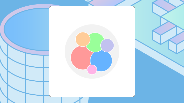

Circle packing charts turn complex hierarchies into scannable visuals where size shows quantity and nesting shows structure. This article explains what circle packing charts are, when they outperform treemaps and bar charts, how to prepare your data and build one, and the best practices that prevent stakeholders from misreading circle sizes.
A circle packing chart uses nested circles to display hierarchical data. Circle size shows quantity. Containment shows parent-child relationships. You see the structure of your data at a glance, but you sacrifice precise value comparison because human eyes struggle to accurately judge areas.
Here's what you need to know before choosing this chart type:
Picture a cluster of circles nested inside larger circles. The outer circle contains everything. Smaller circles sit inside it, and even smaller circles sit inside those.
Containment shows the hierarchy. A circle inside another belongs to that parent category. Size shows magnitude.
Four mechanics drive the visual encoding. Position packs circles to minimize empty space, but where a circle lands inside its parent means nothing. Area (not radius) encodes the quantitative value. Containment shows parent-child relationships. Color typically marks category or hierarchy level.
Unlike a bar chart, circle packing reveals nested structure. Unlike a treemap, it uses circular shapes that feel more organic but waste space in the corners. The packing algorithm leaves gaps between circles, reducing how much data you can fit compared to rectangular alternatives. It's a tradeoff that trips up more teams than you'd expect.
Do you want to go deeper than four levels? Or do you have more than 50 total nodes? While the chart will technically render, the labels become unreadable and the insight-to-noise ratio collapses.
Circle packing works when your data has clear parent-child relationships across two to four levels. It works when you want to show part-to-whole relationships where grouping matters as much as magnitude. It works when approximate size comparison is sufficient and stakeholders do not need to read exact values. Interactive dashboards with tooltips make it even more effective.
This is the "one chart that tells the whole story" moment. BI analysts often end up building nested tables or stacking multiple bar charts to explain something like revenue by region, product, and stock keeping unit (SKU). A circle packing chart can turn that multi-chart explanation into a single portfolio view that a sales, marketing, finance, or operations manager can scan in seconds.
Before you commit to this chart type, do a quick data sanity-check. Circle packing is picky about hierarchy, especially if you plan to reuse the chart across dashboards or embed it where the data scope changes per audience.
Start by confirming these basics:
Choose a different chart when you need precise value comparison across categories, when your hierarchy is flat (one level), or when space efficiency and easy labeling matter and you cannot provide interactive tooltips.
Teams often pick circle packing because it looks interesting. Then they discover stakeholders can't extract the insight they need. If the question is simply "which category is largest," a sorted bar chart answers faster and more accurately.
| Scenario | Best chart choice |
|---|---|
| Show hierarchy and relative size | Circle packing |
| Show hierarchy and precise values | Treemap with labels |
| Show hierarchy and flow or sequence | Sunburst |
| Compare values without hierarchy | Bar chart |
Before building, confirm your data has a clear parent-child structure and a single root node. If any row references a parent that doesn't exist, the chart fails or renders with orphaned circles floating in space.
Your dataset needs a specific structure. Each row requires an id, a parent reference, a value, and a label.
| id | parent | value | label |
|---|---|---|---|
| root | (empty) | (empty or sum) | All Categories |
| A | root | 100 | Category A |
| B | root | 250 | Category B |
| A1 | A | 40 | Subcategory A1 |
| A2 | A | 60 | Subcategory A2 |
Every row except root must reference an existing parent. Values should be non-negative. Many tools hide zero-value nodes or render them inconsistently, so give leaf nodes positive values when you want them to appear. Leaf nodes (those with no children) must have values. Only one root node should exist.
Before importing, run through validation:
Microsoft Excel does not include a native circle packing chart type. You can approximate it with macros or add-ins, but it can be fragile when the data updates.
Many platforms do not support circle packing natively. You may need an add-on or custom visual, which adds maintenance overhead when your data refreshes or dashboards evolve.
In a BI tool that supports circle packing charts directly, the process is more straightforward:
If you're building in Domo BI, this is also where you save future-you from repetitive build work. Set up the calculation once with reusable metrics, then apply the same circle packing configuration across dashboards so every team sees the hierarchy the same way.
Some tools default to encoding value as radius rather than area. Large values appear disproportionately dominant. Check your settings.
Your eye goes to the largest circles first. Your brain groups circles by containment automatically. This is the chart's strength. Also its trap.
Start with the outermost circle to understand the root of the hierarchy. Scan the largest nested circles to identify major branches. Compare sizes within the same parent, not across parents. Use tooltips or labels for exact values instead of guessing from area.
If you're building this for non-technical stakeholders (think line-of-business (LOB) managers and executives), plan for the questions they'll ask in the moment. "Why is that segment so big?" and "What changed since last month?" are basically guaranteed. Tooltips, drill paths, and quick filters turn the chart from a pretty picture into something they can actually act on.
Misreading happens in predictable ways:
Need to know which of two categories is larger? Hover for the exact value. Estimating from visual size alone will leave you off by 20 to 40 percent for mid-sized circles.
Labels that overlap or disappear make the chart useless for anyone who can't interact with it.
These rules prevent the most frequent interpretation problems:
Ensure sufficient color contrast between adjacent circles. Provide text alternatives for screen readers. Circle packing is inherently visual, and without tooltips or data tables, it excludes people who cannot perceive the visualization.
A product team wants to understand which feature categories drive the most engagement, broken down by customer segment.
They visualize feature usage with top-level circles for feature categories (onboarding, reporting, collaboration) and nested circles for customer segments (enterprise, mid-market, SMB). The chart immediately shows that reporting dominates overall, but within reporting, SMB people are a surprisingly large segment. A bar chart would show totals but hide the nested segment breakdown.
A finance team maps budget allocation with departments as parent circles and projects as children. The chart reveals that one department has many small projects consuming budget in aggregate, while another has one dominant project. A pie chart would flatten the hierarchy. A table would require mental math to see the pattern.
A sales analytics team breaks revenue into region, product line, and SKU. Instead of distributing the story across a nested table and three separate bar charts, they use one circle packing chart to show where the weight sits, then let stakeholders hover to read the exact numbers. This approach has cut meeting times in half when the alternative was walking executives through multiple slides.
A content team visualizes their library with topics as parents and formats (blog, video, whitepaper) as children. The chart shows that one topic has extensive blog coverage but almost no video content. A stacked bar chart would show the same data but make the gap less visually striking.
If circle packing is not working for your data or audience, don't force it. Pick the approach that fits your data visualization goal.
If stakeholders ask "which is bigger" more than "how is this structured," you'll want a different chart.
When your data lives across multiple sources and your hierarchy spans departments, building a circle packing chart in a spreadsheet becomes a manual refresh burden.
Domo connects to your data sources directly, so hierarchy updates flow into your visualization automatically. The platform supports interactive circle packing with drill-down, tooltips, and embedded sharing. Stakeholders can explore the hierarchy without exporting static images.
If you're building for different audiences, this is where Domo tends to shine:
Ready to turn messy hierarchies into something your stakeholders can actually explore (without guessing at circle sizes)? Try free and build an interactive circle packing chart with tooltips, drill-down, and governed sharing in minutes.