Hai risparmiato centinaia di ore di processi manuali per la previsione del numero di visualizzazioni del gioco utilizzando il motore di flusso di dati automatizzato di Domo.
Visualizing cumulative and trending data with area charts
Area charts are a powerful tool in the world of data visualization, offering a unique way to see how values develop over time. By filling the space between a line and an axis, they emphasize volume and magnitude, making them ideal for showcasing trends, contributions, and cumulative totals. They help us answer questions like, “How has our total revenue grown month-over-month?” or “Which product line contributed the most to sales each quarter?”
This guide will provide a complete overview of area charts. You will learn what they are, the different types available, and when to use each one effectively. We will also cover common pitfalls to avoid, step-by-step instructions on how to build your own, and best practices for creating clear, insightful visualizations.
What is an area chart?
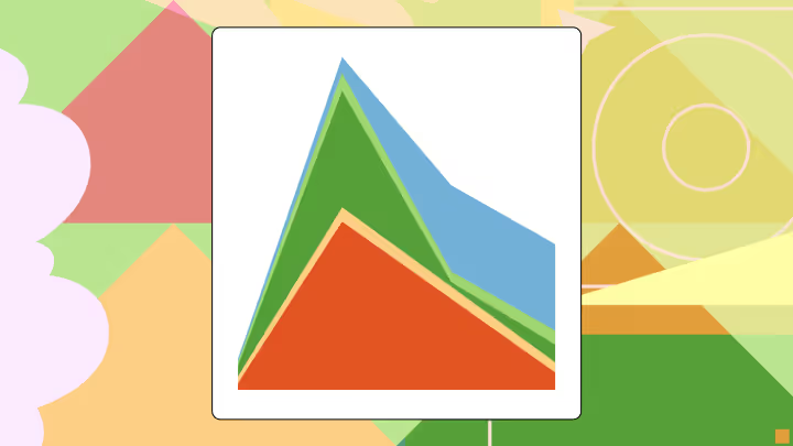
An area chart is a type of graph that visually displays quantitative data. It’s based on the line chart, with the area between the axis and the line filled in with color, texture, or shading. This filled area is the chart’s most distinct feature, drawing the eye to the volume of data and emphasizing the change in magnitude over a continuous dimension, which is typically time.
Think of it as a line chart with an added layer of information. While a line chart is excellent for showing the rate of change between data points, an area chart excels at highlighting the cumulative total and its progression. The shaded region makes the trend’s volume feel tangible.
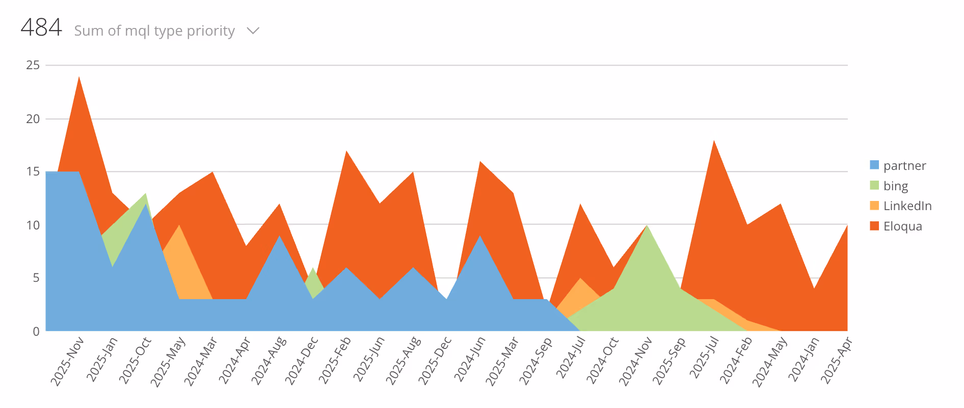
Area chart showing monthly MQL volume by channel
How an area chart differs from line and bar charts
Area, line, and bar charts—although related—serve different primary purposes.
Area chart vs line chart: A line chart connects individual data points, making it perfect for comparing the trends of multiple series or showing precise changes over time. An area chart also shows a trend over time, but the filled area emphasizes the volume or magnitude of that trend. It’s less about the individual data points and more about the overall story of accumulation or contribution.
Area chart vs bar chart: Bar charts are used to compare distinct categories. Each bar represents a discrete category, and its length is proportional to the value. Area charts, conversely, are used for continuous data, showing how a value or set of values changes over a continuous interval like time. A stacked bar chart can show part-to-whole relationships for discrete categories, similar to how a stacked area chart does for continuous data.
Anatomy of an area chart
To understand how to read and build one, it's helpful to know its core components:
X-axis (horizontal): This axis represents a continuous variable, most commonly time (e.g., days, months, years).
Y-axis (vertical): This axis represents the quantitative value being measured (e.g., sales, website visitors, temperature). It should almost always start at zero to avoid misleading the viewer.
Data series: Each line on the chart represents a different category or data series. In a standard area chart, these can overlap. In a stacked area chart, they are placed on top of one another.
Shaded area: This is the colored region below the line of a data series. Its size visually represents the magnitude or volume of that series.
Legend: A key that identifies which color or pattern corresponds to which data series, which is essential for charts with multiple categories.
Types and variants of area charts
Area charts come in a few key variations, each suited for different analytical goals. Choosing the right type is crucial for communicating your message clearly.
1. Standard area chart (also called overlapping)
The standard area chart places multiple data series on the same axes, starting from a common baseline (usually zero). The series are plotted with a degree of transparency so that series in the background remain visible.
When to use: This type is best for comparing the volume and trend of two or three different, independent series over time. For example, comparing the website traffic from two different marketing campaigns.
Caution: With more than three series, the overlapping colors can become cluttered and difficult to read, a problem known as occlusion.
2. Stacked area chart
In a stacked area chart, each data series begins where the previous series ends. The chart shows the total of all plotted series, and the colored segments visualize the contribution of each part to that whole. The top line of the chart represents the cumulative total.
When to use: Use a stacked area chart to show how a total value is divided into parts and how that composition changes over time. It’s ideal for visualizing part-to-whole relationships. For instance, you could show total company revenue broken down by product line over several years.
Caution: It can be difficult to accurately read the values of the upper series, as they don't start from a flat baseline. Their primary value is in showing the general trend of each part's contribution.
3. 100% Stacked Area Chart
This variant is similar to the stacked area chart, but the y-axis shows percentages instead of absolute values. The total area of the chart is always equal to 100 percent, and each colored segment represents the percentage contribution of that category to the whole at each point in time.
When to use: This chart is ideal when you want to show the changing proportion of parts over time, regardless of the total. An example is visualizing the market share percentage of several competitors over the last five years.
Caution: This chart completely removes any sense of the total value. A category could have a growing percentage but a shrinking absolute value if the total is declining, a nuance that this chart would hide.
Use cases and benefits of area charts
Area charts are most effective when used to tell a specific type of data story. Their primary strength lies in visualizing volume and part-to-whole relationships over a continuous axis.
Typical use cases:
Tracking time-series data: The most common use is to show how a quantitative value changes over time. Examples include monthly sales figures, annual website traffic, or daily stock prices.
Illustrating part-to-whole relationships: Stacked and 100% stacked area charts are excellent for showing how the composition of a total changes. You can track revenue by region, budget allocation by department, or energy consumption by source.
Highlighting cumulative trends: The shaded area naturally draws attention to the cumulative effect or total volume. This is useful for showing total donations raised over a fundraising campaign or the total number of users acquired over a year.
Benefits:
Area charts emphasize volume: The filled area makes trends in quantity easy to see and feel.
They show part-to-whole clearly: Stacked versions are intuitive for showing composition.
These charts are useful for storytelling: Area charts can create a simple, dramatic visual narrative about growth or decline.
Limitations:
Occlusion: In standard area charts, series can overlap and obscure each other.
Reading difficulty: In stacked charts, interpreting the exact values of upper-level series is challenging because they don't have a stable baseline.
Not for discrete categories: Area charts are unsuitable for comparing non-continuous categories, where a bar chart would be more appropriate.
Common pitfalls and how to avoid them
While powerful, area charts can easily become misleading if not designed carefully. Here are some common mistakes and how to steer clear of them.
Pitfall 1: Using a non-zero baseline: Starting the y-axis at a value other than zero distorts the perception of volume. The shaded area becomes unrepresentative of the actual magnitude, exaggerating changes.
How to avoid: Always start your y-axis at zero. If you need to show subtle changes in values that are far from zero, a line chart is a better choice.
Pitfall 2: Too many data series: Adding too many categories to an area chart, especially a standard or stacked one, results in a cluttered mess of colors that is impossible to interpret.
How to avoid: Limit your area chart to a few (two-to-five) series. If you have more categories, consider grouping smaller ones into an “Other” category or choosing a different chart type, like a line chart.
Pitfall 3: Poor color and transparency choices: Opaque colors in a standard area chart will completely hide the data behind them. In a stacked chart, similar colors can make it hard to distinguish between layers.
How to avoid: In standard area charts, use transparency to ensure all series are visible. In all area charts, use a distinct and accessible color palette. Place darker, more prominent colors at the bottom of a stacked chart and lighter ones on top to create visual stability.
Pitfall 4: Misleading ordering in stacked charts: The order in which you stack your series matters. A highly volatile series placed at the bottom can create a “bumpy” baseline for all other series, making their trends harder to read.
How to avoid: Place the most stable or largest series at the bottom of a stacked area chart to create a smoother foundation for the others.
How to build an area chart: A step-by-step guide
Creating an area chart is straightforward with modern spreadsheet software or business intelligence (BI) tools. Here’s a general process.
Step 1: Prepare your data
Your data needs to be structured correctly. For most tools, this means having your continuous variable (such as dates) in the first column and your quantitative values for each series in the subsequent columns.
For a standard area chart, your table might look like this:
Month
Campaign A Visitors
Campaign B Visitors
Jan-25
1,200
950
Feb-25
1,500
1,100
Mar-25
1,450
1,600
For a stacked area chart, the structure is the same, but the values represent parts of a whole:
Quarter
Product A Sales
Product B Sales
Product C Sales
Q1 2025
$50,000
$30,000
$20,000
Q2 2025
$55,000
$35,000
$25,000
Q3 2025
$60,000
$45,000
$22,000
Step 2: Choose your tool and create the chart
In Excel or Google Sheets:
Select your entire data range, including headers.
Go to the Insert menu and find the Chart option.
Choose the Area Chart type. Excel and Sheets typically will offer you options for a standard Area, Stacked Area, and 100% Stacked Area chart.
Select the one that fits your goal. The tool will generate a default chart.
In a BI tool (such as Domo):
Connect to your data source.
Drag your continuous dimension (e.g., “Date”) to the Columns shelf or x-axis.
Drag your measure (e.g., “Sales”) to the Rows shelf or y-axis. This will likely create a line chart by default.
Drag your categorical dimension (e.g., “Product Line”) to the Color or Legend mark. This will create multiple lines.
In the Marks card or visualization type menu, change the chart type from “Automatic” or “Line” to “Area.”
To create a stacked area chart, you may need to select a specific option like “Stacked” or the tool may default to it when you use the color mark.
Step 3: Customize and refine
Your initial chart is just the beginning. Refinement is key to making it effective.
Colors and transparency: Adjust the colors to be distinct and meaningful. If using a standard area chart, set the transparency of each layer to around 50-70 percent.
Axes and labels: Ensure your y-axis starts at zero. Give your axes clear, concise titles. Add a main title to the chart that explains what it shows.
Legend and ordering: Position the legend where it doesn’t obstruct the data. For stacked charts, consider ordering the layers logically (e.g., largest contributor at the bottom).
Tooltips and annotations: If your chart is digital, configure tooltips to show precise values when a user hovers over a point. Use annotations to call out significant events or insights directly on the chart (e.g., “New feature launched”).
Comparison with related chart types
Choosing the right chart is about understanding the strengths of each.
Area vs line chart: Choose a line chart when you need to compare the trends of multiple series with precision, especially if the lines cross. Choose an area chart when you want to emphasize the volume or cumulative total of one or more series.
Area vs stacked bar chart: Choose a stacked bar chart when you are comparing part-to-whole compositions across discrete categories (e.g., comparing departmental budgets for three different, separate years). Choose a stacked area chart when showing how that composition changes continuously over time (e.g., tracking the monthly breakdown of a support team's ticket types over a single year).
Design tips and best practices
Design determines how insightful and useful your area chart will be. Consider these design suggestions for creating clear and compelling visualizations:
Start the y-axis at zero. This is the golden rule for area charts to ensure visual accuracy.
Use transparent overlays for standard area charts. This prevents occlusion and keeps all data visible.
Order stacked layers logically. Place the largest or least volatile series at the bottom to create a stable base.
Limit the number of categories. Avoid visual clutter by keeping your series count low (ideally under 5).
Choose a sensible color scheme. Use distinct colors that are easy to differentiate. For sequential or part-to-whole data, a gradient of a single hue can work well.
Label directly when possible. If you only have two or three series, placing labels directly on the areas can be clearer than using a separate legend.
Enhance it with interactivity. For digital dashboards, use tooltips to provide details on demand and allow users to filter or highlight specific series.
Key takeaways from Domo’s guide to area charts
All in all, the area chart is a simple yet effective visualization for telling stories about volume, trends, and composition over time. By understanding its different forms—standard, stacked, and 100% stacked—you can choose the perfect format to convey your message.
Remember the key takeaways:
Area charts emphasize volume and cumulative totals over a continuous period.
Use stacked area charts for showing part-to-whole relationships as they evolve.
Always start your Y-axis at zero and avoid cluttering your chart with too many series.
By following these guidelines, you can build area charts that are not only visually appealing but also clear, accurate, and insightful.
This site uses cookies and similar technologies to analyze site traffic, personalize content, understand your interactions with Domo’s marketing communications, and display ads about our products on other sites and apps. Learn more.