Ad Hoc Reporting: Definition, Benefits, and How It Works


Ad hoc reporting puts report-building power directly in the hands of business people, enabling faster decisions, reducing information technology (IT) bottlenecks, and breaking down departmental silos. This article covers the definition and mechanics of ad hoc reporting, compares it to traditional canned reports, walks through practical examples across sales, marketing, operations, and finance, and outlines what to look for when choosing the right tool.
Key takeaways
Here are the main points to keep in mind:
- Ad hoc reporting lets business people create custom reports on demand without waiting for IT or data teams
- Unlike canned reports, ad hoc reports answer specific, time-sensitive questions as they arise
- Key benefits include faster decision-making, reduced IT bottlenecks, and cross-departmental collaboration
- Effective ad hoc reporting requires governed data, intuitive tools, and accessible cloud-based platforms
- Challenges like data inconsistency and metric drift can be mitigated with proper governance and a shared semantic layer
What is ad hoc reporting?
The term "ad hoc" comes from Latin, meaning "for this purpose." That etymology tells you everything. You're building a report for a particular need rather than relying on pre-scheduled, standardized outputs.
Traditional reporting works differently. Teams define dashboards and metrics in advance and update them on a fixed schedule. Ad hoc reporting flips that model entirely. It puts the power directly in the hands of business people. When a sales director needs to understand why pipeline dropped in a specific region, or a marketing manager wants to compare two campaigns launched last week, they can pull the data themselves. No ticket submitted to IT. No waiting days or weeks for an answer.
This capability has become essential as businesses face questions that existing dashboards simply do not answer. A company might track millions of data points across thousands of dashboards, but new problems crop up that all of that pre-built reporting cannot solve. Adhoc reporting fills that gap by letting employees create data analytics much faster with modern cloud-based BI tools, often without the advanced technical expertise that older systems required.
How ad hoc reporting works
The workflow follows a straightforward sequence that any person on the business team can learn:
- Identify the business question you need to answer
- Locate the relevant data source, such as customer relationship management (CRM), enterprise resource planning (ERP), a marketing platform, or a data warehouse
- Apply filters and dimensions to narrow the data to what's relevant
- Build the visualization that best represents the answer
- Validate results against a known source of truth to confirm accuracy
- Share or save the report for stakeholders or future reference
Data freshness matters more than most people realize when working with ad hoc reports. Live data connects directly to the source and updates in real time or near-real time. Refreshed data updates on a schedule, hourly or daily. Cached data represents a static snapshot taken at a specific point in time. A common mistake is assuming all data in a BI tool is current. Always check the refresh timestamp before drawing conclusions or sharing results with stakeholders.
Ad hoc reporting vs ad hoc analysis
People often use these terms interchangeably. They shouldn't be.
Ad hoc reporting focuses on creating a specific report or visualization to answer a defined question. The output is typically a chart, table, or dashboard that people can share with others. Ad hoc analysis goes deeper. It involves exploring data to discover patterns, test hypotheses, or investigate anomalies without a predetermined output in mind. An analyst might start with a question but follow the data wherever it leads, pivoting their approach as new insights emerge.
Think of it this way: ad hoc reporting answers "What happened?" while ad hoc analysis explores "Why did it happen?"
{{custom-cta-1}}
Ad hoc reporting vs canned reporting
Canned reports (also called static or standard reports) are pre-built reports that run on a set schedule and deliver the same metrics in the same format every time. The weekly sales summary that lands in your inbox every Monday. The monthly financial dashboard that updates on the first of each month.
By contrast, people create ad hoc reports on demand to answer specific questions that canned reports do not address.
Neither approach is inherently better.
Choose canned reporting when you need consistent, repeatable metrics that multiple stakeholders rely on for ongoing decisions, when compliance or audit requirements demand version control, or when people ask the same question on a predictable schedule.
Choose ad hoc reporting when you need to investigate something unexpected, when the question is too specific or time-sensitive for existing reports to answer, or when you're exploring a hypothesis before deciding whether to formalize it into a recurring report. One caution: if you find yourself recreating the same ad hoc report repeatedly, that's a signal to formalize it into a canned report.
Benefits of ad hoc reporting
Choosing a BI tool that supports adhoc reporting offers advantages that compound across the organization.
Faster, data-driven decisions
Instead of requests for data analytics bouncing around departments for weeks, the employee who needs a new visualization can create it themselves. This shrinks the workflow for new analytics from weeks to hours. Sometimes minutes.
When it's easy for employees to create their own visualizations, businesses gain insight and implement solutions much faster. The ability to quickly analyze new data is crucial for companies that can't afford slow reaction times.
Empowering your workforce means giving your people the information they need to act quickly. When data sits in a raw format, it can be uninterpretable. Training decision-makers to build their own visualizations creates culture shifts resulting in higher performance. Employees get answers as fast as they need them. Deadlines are met. Customers are satisfied. This aligns with the principle that data-led decision making creates both opportunity and competitive advantage.
Empowering non-technical teams
Data experts should not be the only people accessing your BI tool. With tools that make adhoc reporting simple, anyone can interact with data, use it to drive decisions, and draw fresh insights.
When everyone in an organization understands data, creating new reports becomes a shared capability rather than a bottleneck. Teams can understand, interpret, and analyze data together to create actionable insights. This helps the entire organization work more cohesively, rather than concentrating all the answers with IT or business analysts.
With adhoc reporting, everyone in your company can make smart decisions based on data analytics.
Breaking down departmental silos
When different departments are working with different types of data but want to share insights based on that data, they need a way to communicate without any technical difficulties. With BI-enabled adhoc reporting, employees can spend less time explaining metrics and more time increasing revenue.
Departments need to work together cohesively. A decision in one department has an impact on the entire company. Eliminating silos (not only at the department or team level but also at a company level) is crucial in building a competitive advantage.
Reducing IT and analyst workload
When everyone can use your BI tool to analyze their own data, they don't need to reach out to the experts for help as much. Employees don't have to funnel every mundane BI task through the analytics team. This gives your data experts the time they need to work on complex projects where their subject matter expertise and insight are actually necessary.
The old adage rings true: when all you have is a hammer, everything looks like a nail. Ad hoc reporting helps you recognize when you need a screwdriver, and whether that screwdriver should be a phillips, flathead, or hex. It adds many new tools to your toolbox.
With a fresh set of eyes, teams find new ways to use data, look at it in different contexts, and start asking new questions. Spotting new opportunities before they arise. Identifying problems before they metastasize.
Ad hoc reporting examples
Concrete examples make the value of ad hoc reporting tangible. Each scenario below follows a consistent structure: the question being asked, the data and filters needed, the key metrics to display, the recommended visualization, how to interpret results, and what action to take next.
Sales and revenue reporting
A sales manager notices that Q3 pipeline in the Northeast region dropped significantly compared to Q2 and needs to understand why before the quarterly business review.
- Question: Why did Q3 pipeline drop in the Northeast region?
- Data needed: CRM opportunity data, marketing campaign data
- Filters: Region equals Northeast, date range equals Q3
- Key metrics: Pipeline value, stage conversion rate, lead source attribution
- Visualization: Bar chart by sales stage with prior-quarter comparison
- Interpretation: Identify which stage shows the largest drop-off and whether the issue is lead volume, conversion rate, or deal size
- Next action: Share findings with the sales director and flag specific stages for pipeline review meeting
Marketing campaign analysis
A marketing director launched two campaigns last week and wants to know which one is driving more qualified leads before deciding how to allocate the remaining budget.
- Question: Which of the two campaigns launched last week is driving more qualified leads?
- Data needed: Campaign performance data, CRM lead data
- Filters: Campaign launch date equals last seven days, lead status equals Marketing Qualified
- Key metrics: Impressions, click-through rate, cost per lead, lead quality score
- Visualization: Side-by-side bar chart comparing both campaigns across each metric
- Interpretation: Identify which campaign has a lower cost per qualified lead and higher quality scores
- Next action: Reallocate remaining budget toward the higher-performing campaign and document learnings for future campaign planning
Operations and supply chain
An operations lead notices an uptick in customer complaints about shipping delays and needs to identify which warehouse locations are causing the bottleneck.
- Question: Which warehouse locations are causing the most shipping delays this month?
- Data needed: Order fulfillment data, carrier performance data
- Filters: Ship date versus promised date variance, current month
- Key metrics: Average delay by location, delay rate percentage, carrier on-time percentage
- Visualization: Heat map or ranked bar chart by warehouse location
- Interpretation: Pinpoint the one to two locations with the highest delay rates and identify whether the issue is warehouse processing time or carrier performance
- Next action: Escalate findings to the logistics team for root-cause review and corrective action
Finance and HR reporting
Finance and HR teams face their own time-sensitive questions that existing reports rarely anticipate.
A finance analyst preparing for monthly close discovers a variance between actuals and forecast for a specific cost center that needs explanation before the books can close.
- Question: What's driving the variance between actuals and forecast for cost center 4200?
- Data needed: General ledger data, budget data
- Filters: Cost center equals 4200, current month
- Key metrics: Actual spend, forecasted spend, variance amount, variance percentage by expense category
- Visualization: Waterfall chart showing contribution of each expense category to total variance
- Interpretation: Identify the two to three expense categories driving the largest variance and determine whether they represent timing differences or true budget misses
- Next action: Document findings for the close meeting and flag any categories requiring journal entries or forecast adjustments
An HR manager preparing a retention initiative needs to identify which departments have the highest voluntary turnover to focus resources effectively.
- Question: Which departments have the highest voluntary turnover rate over the past six months?
- Data needed: Human resources information system (HRIS) termination data, headcount data
- Filters: Termination type equals voluntary, date range equals last six months
- Key metrics: Voluntary turnover rate by department, average tenure of departing employees, exit interview themes
- Visualization: Ranked bar chart by department with company average benchmark line
- Interpretation: Identify departments significantly above the company average and note any patterns in tenure or exit interview feedback
- Next action: Share findings with department heads and HR leadership to inform targeted retention programs
Challenges of ad hoc reporting
Ad hoc reporting delivers significant value, but it comes with risks that organizations need to manage proactively.
Data inconsistency tops the list. When multiple people create their own reports from the same data sources, they may apply different filters, date ranges, or calculation methods. Two reports answering the same question can produce different numbers. Trust erodes fast when that happens.
Metric drift compounds this problem. Different teams may use different definitions for the same key performance indicator (KPI). "Revenue" might mean bookings in one report and recognized revenue in another. "Active users" might include trial accounts in one dashboard and exclude them in another. Without a shared KPI dictionary or semantic layer that standardizes definitions, teams end up arguing about whose number is right instead of acting on insights.
Over-reliance on ad hoc methods can also create problems. If every question spawns a new one-off report, organizations end up with hundreds of undocumented visualizations that no one maintains. Reports become outdated. Logic gets duplicated. Institutional knowledge lives only in the heads of the people who built them.
Data governance gaps emerge when ad hoc capabilities outpace controls. Without proper access management, people might query sensitive data they shouldn't see or share reports containing confidential information.
Each of these challenges has a solution. A governed semantic layer with certified metrics addresses inconsistency and drift. Clear policies about when to formalize ad hoc reports into maintained dashboards prevent proliferation. Role-based access controls and audit logging close governance gaps.
How to implement ad hoc reporting
Successful ad hoc reporting requires more than just buying a BI tool.
Start by assessing data architecture readiness. Is your data centralized in a warehouse, lakehouse, or governed data mart? Or does it still live in disconnected spreadsheets and departmental databases? Ad hoc reporting works best when people can access a single source of truth rather than hunting across multiple systems.
Establish a semantic layer or data model that defines metrics consistently. When a sales rep and a finance analyst both pull "revenue," they should get the same number. This layer sits between raw data and the people using the reports, translating business terms into the correct database queries and ensuring everyone works from the same definitions. This step matters because it keeps definitions consistent across teams. The semantic layer is not optional. It's foundational.
Determine your data refresh cadence based on the questions your teams need to answer. Real-time data matters for operational decisions like inventory management or fraud detection. Daily refreshes work fine for most business reporting. Understanding these requirements helps you balance infrastructure costs against business needs.
Set up access and permissions before opening self-service capabilities broadly. Define which roles can query which datasets. Implement row-level security so that regional managers see only their region's data. Enforce these controls at the data layer, not just in the BI tool's interface.
Finally, plan for training and adoption. Even intuitive tools require some orientation. Help people understand not just how to build reports, but how to validate their results and when to escalate questions to data experts.
What to look for in an ad hoc reporting tool
Not all BI tools have the same quality of ad hoc reporting capabilities. Even though the industry has trended towards self-service reporting recently, many tools are still too complicated for the average employee. At a glance, some tools seem to have decent adhoc reporting capabilities, but when you dig deeper, they lack features that make them less useful than initially thought.
Here are the qualities that separate effective adhoc reporting tools from the rest.
Intuitive, no-code interface
This is the bare minimum. If an adhoc tool isn't easy to use, then there's very little advantage over traditional reporting tools.
Not only does this mean it should be easy for non-data professionals to use, but it also means it should have an intuitive user interface (UI). If the UI design of your adhoc reporting tool is confusing, you'll never get the adoption you need to gain the full benefit of your business intelligence solution.
Look for drag-and-drop interfaces that let people build visualizations by selecting fields rather than writing code. Visual query builders that translate clicks into database queries make data accessible to people who don't know structured query language (SQL). Natural language query capabilities take this further, letting people ask questions in plain English and receive relevant visualizations.
Employees shouldn't have to spend weeks learning how to use a new BI tool. Managers shouldn't have to spend their time training development teams. If an adhoc reporting tool is simple and intuitive, employees will naturally jump in and start using it.
Cloud-based accessibility
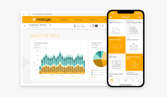
Cloud-based business intelligence software is much better for this kind of work than on-premises software. Adhoc tools need to work fast, and employees need to be able to work with them from anywhere. If something happens on a weekend or during a holiday, cloud-based BI tools allow access at any time directly from a laptop, phone, or tablet.
Flexibility is a major strength of cloud-based BI tools. They can be used from anywhere and in some cases even provide a mobile-native view for any report or dashboard.
Broad data connectivity
It should be easy for employees to collect the data they need to create their analytics. This means it should be simple to connect any data source you depend on for insights and action. Furthermore, once your data is connected, your adhoc BI solution should have extract, transform, and load (ETL) capabilities that will allow you to quickly normalize and transform your data with ease.
Look for platforms with extensive pre-built connectors. Access to 1,000+ pre-built integrations to cloud systems such as Salesforce, Adobe Analytics, and others means less time building custom connections and more time answering business questions. This breadth of connectivity matters because ad hoc questions often require combining data from multiple sources. If even one source is missing, the report becomes incomplete or impossible to build.
Employees needing ad hoc capabilities from their BI tools should be able to accomplish anything a data specialist using traditional BI reporting tools can do. Do not think of ad hoc tools as lesser versions of the tools data professionals use; they should be fully featured.
Dependability is another advantage of cloud-based BI. The system architecture of modern BI can assure its people that their data will be accessible at any time from any device. Additionally, a cloud-based architecture allows for extremely fast query response times even when analyzing large datasets.
Governance and security
Enterprise buyers need ad hoc capabilities that don't compromise data security or create compliance risks.
Role-based access control limits which people can query which datasets, enforcing least-privilege access so people see only what they need for their role. Enforce row-level security and column-level security at the data layer, not just the UI layer, so permissions can't be bypassed by exporting data or using application programming interface (API) access.
A governed semantic layer or certified dataset model routes ad hoc queries through validated, curated data rather than raw production tables. This protects data integrity, prevents performance issues on production systems, and ensures business people work from clean, validated data.
Audit logging records who accessed what data and when, supporting both internal governance and regulatory compliance requirements. Export and sharing controls prevent sensitive data from being downloaded or distributed outside approved channels.
These controls should not feel like obstacles to business people. The best tools make governance invisible during normal use while maintaining a complete audit trail for administrators. That balance between freedom and control? It's harder to achieve than most vendors admit.
{{custom-cta-2}}
Ad hoc reporting drives faster business outcomes
Ad hoc reporting transforms how organizations respond to business questions. Instead of waiting days or weeks for IT to build custom reports, business people can answer their own questions in hours. Or minutes.
The core value is straightforward: ad hoc reporting lets anyone create custom reports on demand to answer specific, time-sensitive questions without technical expertise. The benefits compound across the organization through faster decisions, empowered teams, and reduced bottlenecks on data experts.
Making this work at scale requires one essential foundation: certified data with appropriate access controls. When ad hoc queries route through a governed semantic layer with standardized metric definitions, organizations get the speed of self-service with the reliability of managed reporting.
Domo is unified by design, modular by adoption, teams can start with one product and expand while reusing the same data, logic, and governance. The platform works across three layers: Foundation, which makes data AI-ready; Activation, which turns governed data into action through agents and apps; and Distribution, which delivers outcomes into the workflows people already use.