What Is an Analytics Dashboard? Types & Examples

An analytics dashboard pulls your most important metrics into one place, tracks key performance indicators (KPIs) in real time, and tells the story through charts, graphs, and tables. This article covers the three primary dashboard types (operational, strategic, and tactical), explains who uses them and why, and provides a practical framework for building dashboards that actually drive action across your organization.
Key takeaways
Here are the main points to keep in mind:
- An analytics dashboard consolidates metrics from multiple sources into one visual workspace for quicker, data-driven decisions
- The three main dashboard types (operational, strategic, tactical) serve different audiences and refresh at different cadences
- Effective dashboards focus on five to 15 key performance indicators (KPIs) maximum, with clear benchmarks and interactive drill-down capabilities
- Every role benefits from dashboards, from executives tracking company-wide performance to frontline teams monitoring daily operations
- AI-powered analytics and predictive capabilities are transforming dashboards from reporting tools into decision engines
What is an analytics dashboard?
Think of it as your data command center. An analytics dashboard consolidates your most important metrics into one clear, real-time view. It pulls data from multiple sources, tracks KPIs, and presents the story through intuitive visualizations like charts, graphs, and tables.
Dashboards help people act. They reduce complexity. They help teams spot trends. And they make it easier to respond to what is happening now. Whether it's an executive monitoring company-wide performance or a frontline team managing daily operations, dashboards deliver the right data to the right people quickly.
These data visualizations play a vital role in helping everyone within an organization, regardless of their data expertise, grasp the insights hidden in the numbers. They simplify complex relationships, making it easier for non-technical people to understand the story the data is telling.
A single visualization can be valuable. But visualizations truly shine when combined into comprehensive dashboards. Dashboards provide a centralized view of key insights, offering managers and employees critical advantages that elevate their data analysis and decision-making processes.
A dashboard provides a comprehensive view of a topic. A single data visualization offers only one perspective (useful, but inherently limited). Dashboards bring multiple visualizations together, enabling people to analyze a topic from various angles in one unified view.
They also simplify real-time data comparisons. By grouping related visualizations, dashboards make it easier to connect the dots. People can instantly see relationships between data sets and gain insights on the fly, without jumping between tools or sources.
Perhaps most importantly, dashboards uncover hidden connections in data. When people struggle to compare different analytics, they often rely on familiar metrics, missing opportunities to discover new patterns. Dashboards break down those barriers, enabling exploration of unexpected relationships and insights that might otherwise go unnoticed. Explore how dashboards make this possible with period-over-period comparisons.
How dashboards differ from reports
Here's where teams often trip up. Dashboards and reports serve different purposes, and choosing the wrong format can slow down decision-making. A dashboard is interactive, refreshes automatically, and supports ongoing monitoring. A report is static, captures a point-in-time snapshot, and provides detailed documentation for audits, compliance, or stakeholder distribution.
Use a dashboard when you need to monitor performance continuously and explore data interactively. Use a report when you need a documented record that stakeholders can review offline or archive for compliance purposes. The mistake most teams make? Building a dashboard when they actually need a report (or vice versa), then wondering why adoption stalls.
Benefits of analytics dashboards
Analytics dashboards turn raw data into meaningful insights, empowering businesses to track key performance indicators (KPIs) and make more informed, data-driven decisions. Here's how they can benefit your organization.
Smarter decision-making
Dashboards simplify complex data through clear visualizations. Spotting trends, patterns, and anomalies at a glance becomes natural rather than laborious. This enables quicker, more accurate decisions at every level of the organization.
Streamlined data access
By combining data from multiple sources into a single, centralized view, dashboards eliminate the need for manual data retrieval and analysis. Time saved. Efficiency boosted. Teams always have the information they need.
Real-time insights
Many dashboards offer real-time updates, allowing businesses to track performance metrics as they happen. Teams can respond swiftly to changes in sales, marketing campaigns, operations, and other critical areas.
Improved collaboration
Dashboards foster collaboration by providing a shared view of key business metrics. Teams can easily share insights, align their strategies, and work more cohesively toward common goals.
3 types of analytics dashboards
Not all dashboards serve the same purpose. The three primary types (operational, strategic, and tactical) each address different audiences, track different metrics, and refresh at different cadences.
Operational dashboards
Built for real-time monitoring. Frontline teams and operations managers use them to track metrics that can change by the hour or minute: order volume, support ticket queues, system uptime, production output.
These dashboards typically pull from transactional systems, customer relationship management (CRM) platforms, and monitoring tools. They refresh in real-time or at least hourly to ensure the data reflects current conditions. The layout prioritizes status indicators, alerts, and current-period actuals against targets (anything that helps people spot issues and respond immediately).
An effective operational dashboard answers questions like: Are today's targets on track? Is anything broken right now? Where does the team need to intervene?
Strategic dashboards
Strategic dashboards serve executives and senior leaders who need visibility into long-term performance and company-wide trends. These dashboards track high-level KPIs such as revenue vs plan, gross margin, customer acquisition cost, and net promoter score.
Data typically flows from enterprise resource planning (ERP) systems, CRM platforms, and financial systems. Because strategic decisions do not require minute-by-minute updates, these dashboards refresh weekly or monthly. The layout emphasizes trend lines, period-over-period comparisons, and variance to target. Visuals that reveal whether the business is on track toward its goals.
Strategic dashboards answer questions like: Are we pacing to hit quarterly revenue? How does this year compare to last?
Tactical dashboards
Tactical dashboards sit between operational and strategic. Department managers and project leads use them to monitor team performance, track progress toward initiatives, and identify areas that need attention.
Common KPIs include campaign performance, sprint velocity, pipeline coverage, and budget utilization. Data sources often include project management tools, marketing platforms, and CRM systems. Tactical dashboards typically refresh daily or weekly, providing a balanced view of ongoing operations and short-term initiatives.
The layout prioritizes progress-to-goal indicators and drill-down capability to underlying activity. Tactical dashboards answer questions like: Is this campaign on track? Where is the team falling behind?
The 4 types of analytics explained
Dashboards can support four distinct types of analytics, each answering a different question about your data.
Descriptive analytics answers "what happened?" by summarizing historical data through KPIs, totals, and trend charts. Most dashboards start here.
Diagnostic analytics answers "why did it happen?" by enabling root cause analysis through filters, drilldowns, and comparative views. When a metric drops, diagnostic capabilities help you find the source.
Predictive analytics answers "what will happen?" by projecting future outcomes based on historical patterns. Dashboards incorporate this through forecast lines, trend projections, and confidence intervals.
Prescriptive analytics answers "what should we do?" by recommending actions based on data. Advanced dashboards may include scenario modeling or recommendation widgets that suggest next steps.
Most organizations progress through these analytics types as their data maturity grows.
Who uses analytics dashboards
Analytics dashboards aren't just for analysts or executives. They're for everyone who relies on data to make decisions. With modern, self-service BI tools, teams across the organization can access, explore, and even build dashboards without technical expertise. Whether checking metrics throughout the day or reviewing progress weekly, dashboards help each role stay aligned and informed.
Executives
Executives rely on executive dashboards to see the big picture. These strategic views surface high-level KPIs (revenue growth, profitability, customer trends) that guide long-term planning. With real-time visibility into company performance, leaders can make quicker, data-driven decisions and adjust strategies on the fly.
Managers and department leads
Department leaders rely on dashboards to monitor team performance, track progress toward goals, and identify areas that need attention. These tactical dashboards typically update daily or weekly, providing a balanced view of both ongoing operations and short-term initiatives.
Frontline teams
Frontline employees benefit from dashboards that help them act in the moment. Real-time operational dashboards show metrics that can change by the hour, such as sales volume, response times, or production output. Many organizations provide view-only access so employees can focus on their tasks while still engaging with the data that matters most.
Data analysts and BI teams
Analysts use dashboards to explore deeper insights. They build custom dashboards, test hypotheses, and connect multiple data sources to uncover trends and anomalies. Their work ensures every team across the business is supported with accurate, contextual data.
Marketing and sales teams
Marketing and sales professionals depend on dashboards to measure campaign performance, pipeline velocity, and customer engagement. Marketing dashboards consolidate metrics from multiple platforms, while sales dashboards track opportunities, forecasts, and team leaderboards in real time. Teams review these dashboards frequently to adapt tactics and optimize results.
HR, finance, and operations
Dashboards empower business support teams to stay agile and transparent. HR dashboards monitor workforce health and retention. Finance dashboards track budgets, expenses, and profitability. Operations dashboards monitor logistics, supply chains, and process efficiency, helping these teams catch issues before they escalate.
A dashboard for every role
In a data-driven organization, most employees use more than one dashboard. Some teams build their own dashboards to dive deeper, while others simply need access to view and interact with existing ones. Together, these connected views create a shared understanding across the organization.
Analytics dashboard examples by function
Analytics dashboards come in many forms, each built to serve a specific audience or goal. Here's how different teams use dashboards to turn data into action.
Business and financial dashboards
These dashboards help leaders and teams monitor overall business performance and stay aligned on strategy.
Executives use strategic dashboards to track high-level KPIs like revenue growth, customer churn, or market share. These dashboards focus on long-term trends and strategic decision-making, often updated daily, weekly, or monthly.
Teams use operational dashboards to monitor workflows across logistics, customer support, and other critical functions in real time. They refresh frequently to track day-to-day performance, alert teams to issues, and keep operations running smoothly.
Finance leaders use financial dashboards to monitor budgets, expenses, and profit margins. They offer real-time visibility into cash flow and help spot early signs of overspending or performance gaps. A financial dashboard is only as reliable as the data feeding it, which means source systems like ERP and accounting platforms need consistent metric definitions and regular reconciliation to maintain trust.
Marketing and digital dashboards
Marketing and digital teams rely on dashboards to measure performance across campaigns, channels, and customer touchpoints.
Digital marketing dashboards consolidate paid, owned, and earned media to show spend, engagement, and ROI in one place. Ideal for optimizing creative and budget allocation.
Web analytics dashboards track site performance, traffic sources, behavior, and conversions to identify opportunities for improvement and drive higher conversion rates.
E-commerce dashboards visualize the entire customer journey from sessions to purchases. These dashboards track metrics like cart abandonment, order value, and refund rates, helping teams forecast demand and optimize the buying experience.
Social media dashboards aggregate engagement data from all platforms to show follower growth, impressions, clicks, and post-level performance.
Product and technical dashboards
Product analytics dashboards highlight how customers interact with your product, showing active people using the product, feature adoption, session length, and retention. They're key to improving product experiences and supporting product-led growth.
IT and DevOps dashboards monitor uptime, incidents, and response times to ensure system reliability.
People and support dashboards
Dashboards aren't just for numbers. They're for people. HR and support teams use them to improve experience and performance.
HR dashboards track hiring metrics, turnover rates, employee engagement, and diversity, equity, and inclusion (DEI) progress to help build healthier, more productive workplaces.
Customer support dashboards monitor support tickets, response times, and satisfaction scores. These dashboards help teams stay responsive and maintain high-quality service across every channel.
Bringing it all together
Each type of dashboard delivers value in its own way, but together, they create a connected data ecosystem. From executives to frontline teams, dashboards give everyone the clarity they need to make quicker, more informed, and more confident decisions.
Key features of an effective analytics dashboard
An effective analytics dashboard is more than just a collection of charts. It's a dynamic tool that empowers decision-making through real-time monitoring, data integration, and interactive features. By allowing people to drill down into specific metrics, apply filters, and customize layouts or KPIs, these dashboards provide a tailored experience that meets the unique needs of any role. The ability to consolidate data from various sources (CRM systems, social media platforms, business intelligence tools) ensures a unified view of performance metrics, making it easier to identify trends and take action quickly.
Interactive drill-downs and filters
Effective dashboards allow people to engage with data by clicking on charts, drilling down for deeper insights, and applying filters to focus on specific metrics. Interactivity lets people explore root causes without waiting for analyst support, reducing time-to-insight and enabling quicker responses to emerging issues.
Customization and personalization
Dashboards with flexible customization options are more relevant for various roles and functions. Role-based views, saved filters, and flexible layout options ensure each person sees the data most relevant to their work.
Data integration across sources
By integrating information from sources like CRM platforms, social media analytics, and business intelligence tools, dashboards offer a unified and comprehensive view of performance metrics.
Data flows from source systems through connectors or extract, transform, load (ETL) or extract, load, transform (ELT) processes into a centralized model before surfacing in the dashboard. A semantic or metrics layer ensures consistent KPI definitions across sources. This is the mechanism that prevents the "different numbers in different dashboards" problem that practitioners frequently encounter. Without this consistency, people lose trust in the data and revert to manual spreadsheets.
Data freshness and refresh cadence
How often your dashboard updates matters as much as what it displays.
Operational dashboards typically require near-real-time data or hourly refreshes to support immediate action. Strategic dashboards can tolerate daily or weekly refreshes since the decisions they inform don't change by the minute. Tactical dashboards usually fall somewhere in between, with daily refreshes being most common.
Mismatched refresh cadence is a common source of distrust. When dashboard numbers don't match what people see in the source system, they question the data's accuracy. Setting clear freshness expectations within the dashboard itself (such as a "last updated" timestamp) is a simple but effective trust-building practice.
How to create an analytics dashboard (step-by-step)
Use this quick workflow to go from idea to a dashboard that people actually use.
Define the audience and objectives
Decide who the dashboard is for and what decisions it must inform. Write three to five questions it should answer (for example: "Are we pacing to monthly revenue?" or "Which channel is driving the lowest cost per conversion?").
Choose the right KPIs
Select a small, focused set of KPIs aligned to those questions. Prioritize five to 15 metrics maximum, mixing leading and lagging indicators. Add benchmarks or targets so performance is immediately clear.
Start by identifying your north-star metric, the single outcome this dashboard should influence. Then select the input metrics (leading indicators) that drive it. For example, if your north-star is monthly revenue, input metrics might include pipeline value, conversion rate, and average deal size.
Document each KPI with a clear definition: what the metric measures, how it's calculated, what data source it pulls from, and what caveats apply. This documentation prevents the "why don't the numbers match?" conversations that derail dashboard adoption.
A worked example: conversion rate by channel might be defined as "completed purchases divided by unique sessions, attributed to the last-touch channel, excluding internal traffic, calculated daily." The caveats matter. Different attribution models produce different numbers, and stakeholders need to understand the methodology to trust the results.
KPIs can be categorized as either lagging or leading indicators. Lagging indicators measure past performance, such as customer returns reflecting quality control. Leading indicators provide insights into potential future outcomes, such as pipeline coverage predicting quarterly revenue.
The most important KPIs typically take center stage on dashboards. Benchmarks also play a key role. These are historical KPIs used as reference points to compare current performance. For example, a dashboard might show current quarterly revenue alongside last quarter's to highlight trends and progress.
Connect and prepare your data
Identify sources such as CRM systems, web analytics tools, ad platforms, and finance databases, then bring them together. Standardize definitions, remove duplicates, and ensure consistent refresh schedules so people trust the numbers.
Before connecting data to your dashboard, audit and clean your source data. Inconsistent or incomplete data at the source level will surface as confusing or misleading metrics in the dashboard.
Consider running a parallel validation during initial setup: run the new automated dashboard alongside existing manual reports for a period to verify accuracy. This catches discrepancies before people encounter them.
A simple data quality check pattern: verify that totals in the dashboard reconcile to the source system. If your dashboard shows 1,000 orders but your order management system shows 1,050, investigate before launching.
Design for clarity and action
Place the most important KPIs at the top-left, supported by diagnostic charts underneath. Use the right chart for the job (trend equals line, composition equals stacked bar, comparison equals column). Limit colors and avoid clutter. Every pixel should earn its spot.
Lead with the question the dashboard answers. If executives need to know whether revenue is on track, the revenue vs target indicator belongs above the fold, not buried below three other charts.
Annotate targets and benchmarks directly on charts so context is visible without drilling down. Use consistent time grains across all visuals on the same dashboard. Mixing daily and monthly data on the same view confuses people.
Common design mistakes to avoid: too many KPIs competing for attention, inconsistent color coding across charts, missing benchmark lines that leave people guessing whether performance is good or bad, and dual-axis charts that frequently mislead readers about the relationship between metrics.
Add interactivity and automation
Include filters, drilldowns, and period-over-period toggles so people can explore data without leaving the dashboard. Schedule refreshes, set threshold alerts for key KPIs, and auto-share snapshots or summaries with stakeholders on a regular cadence.
Test, iterate, and govern
Pilot with a small group, gather feedback, and refine. Document KPI definitions and data owners to keep things consistent as adoption grows.
Establish access controls and role-based permissions. Determine who can view vs edit vs share the dashboard. Set a review cadence: daily for operational dashboards, weekly for tactical, monthly for strategic.
Create a simple feedback loop where stakeholders can flag data questions or request changes. A shared channel or annotation feature works well for this.
Overcoming common dashboard challenges
Data accuracy and trust
Challenge: Conflicting numbers and unclear definitions erode confidence.
Fix: Publish KPI definitions, owners, and refresh cadences. Use a single, governed data source and run automated data quality checks.
Metric definition conflicts
Challenge: Different teams calculate the same KPI differently, leading to conflicting numbers and eroded trust.
Fix: Establish a documented metric dictionary and a single governed data model as the source of truth. When everyone uses the same definitions, the "the numbers don't match" problem disappears.
KPI sprawl
Challenge: Too many charts make it hard to see the story.
Fix: Limit dashboards to five to 15 key visuals. Move deep-dive charts behind drilldowns and ensure each metric ties to a decision or action.
One-size-fits-none layouts
Challenge: Different roles need different views of the data.
Fix: Start with a core layout, then create role-based views or saved filters for executives, managers, and frontline people.
Dashboard adoption
Challenge: Stakeholders revert to spreadsheets or old reports.
Fix: Embed dashboards where work happens, schedule digest emails, and set alerts on KPI thresholds so the dashboard pushes value to people.
Dashboard abandonment after launch
Challenge: Initial enthusiasm fades and people stop checking the dashboard.
Fix: Assign a named dashboard owner, schedule a recurring review cadence, and set threshold-based alerts so the dashboard surfaces to people when something needs attention rather than requiring them to check it proactively.
Performance and maintenance
Challenge: Slow loads and stale data hurt credibility.
Fix: Optimize queries, cache heavy calculations, and align refresh frequency with decision cycles. Review and prune low-use widgets quarterly.
Future of analytics dashboards
Staying ahead in the rapidly evolving world of technology means understanding the trends shaping the future of analytics dashboards.
AI-powered insights and automation
The integration of machine learning and AI is transforming dashboards by predicting trends and offering tailored recommendations. Modern AI capabilities include automated anomaly detection that flags unusual patterns before people notice them, variance explanations that identify why metrics changed, forecasting that projects future performance, and natural language querying that lets people ask questions in plain English.
These AI-driven features (part of a broader shift toward agentic analytics) make data analysis more proactive, efficient, and insightful than ever before. However, AI-generated insights require governance guardrails to remain trustworthy. Clear documentation of how recommendations are generated, approval workflows for automated actions, and audit trails that let people verify the underlying logic. You'll notice most vendors gloss over this governance piece, but it's where implementations succeed or fail.
Voice-activated dashboards
As voice technology continues to advance, analytics dashboards may soon integrate with voice assistants. This innovation will allow for hands-free data access and interaction, enhancing convenience.
Predictive analytics
Dashboards are increasingly adopting predictive analytics, enabling businesses to forecast outcomes based on historical data. This shift will help organizations make more informed, data-driven decisions with greater confidence.
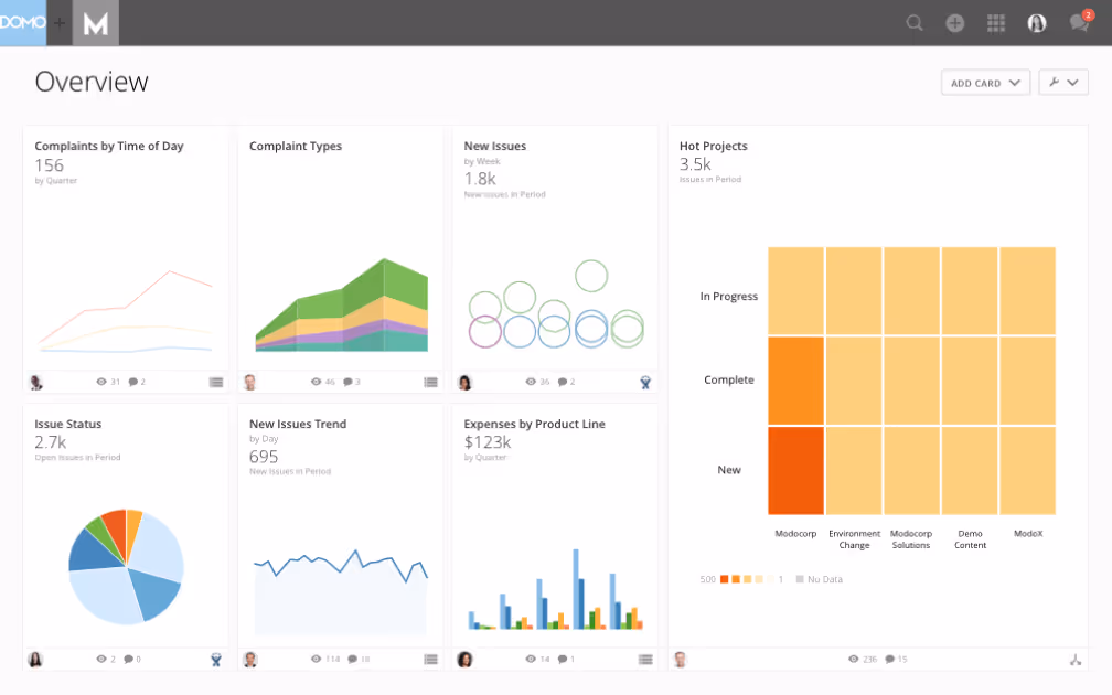
See analytics dashboards in action
Analytics dashboards turn complex data into clear, actionable insights that drive more informed decisions across your business. Whether you're tracking company-wide KPIs, optimizing campaigns, or uncovering real-time trends, Domo makes it simple to bring all your data together in one place.
Ready to experience it for yourself
Watch a demo or try Domo free to see how fast and intuitive modern analytics can be.
Frequently asked questions
What is an analytics dashboard?
What are the 3 types of dashboards?
What makes a good analytics dashboard?
What are the key components of a dashboard?
How do you choose the right KPIs for your dashboard?


Domo transforms the way these companies manage business.

