Data Visualization vs Data Analytics: A Clear Comparison

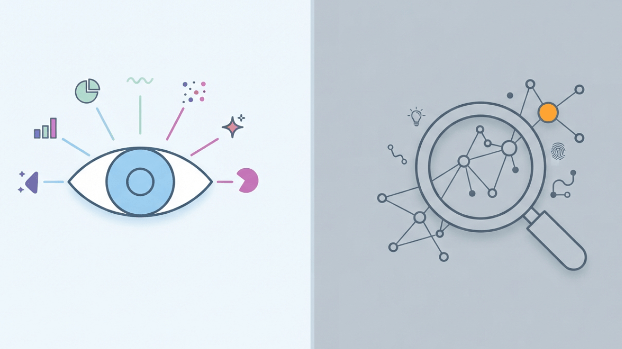
Both data visualization and data analytics are closely related, but they're used for different reasons. Visualization helps people quickly see trends, patterns, and changes in data, while analytics goes deeper to explain why those patterns occur and what may happen next. Understanding the difference can help teams choose the right approach and use both more effectively to turn data into better decisions.
Key takeaways
Data visualization and data analytics answer different questions. Visualization shows you what's happening right now by turning numbers into charts, dashboards, and graphs. Analytics digs deeper to explain why something happened and what might happen next.
- Visualization communicates: It translates raw data into visual formats so stakeholders can monitor key performance indicators (KPIs), spot anomalies, and understand trends without reading spreadsheets.
- Analytics investigates: It applies statistical and computational methods to identify root causes, build forecasts, and recommend specific actions.
- Different audiences: Teams needing fast, broad distribution lean toward visualization. Teams with complex questions and high data literacy lean toward analytics.
- Sequential, not competing: Analytics often produces the metrics that visualization displays. Visualization can surface anomalies that trigger deeper analytics.
- Unified platforms exist: Tools like Domo combine both capabilities so insights move from discovery to action without switching between disconnected systems.
TL;DR: Visualization makes data visible. Analytics makes data meaningful. Most organizations need both working together.
What is data analytics?
Data analytics is the systematic use of statistical, algorithmic, and computational techniques to extract meaning from data. The US Bureau of Labor Statistics projects 34 percent job growth by 2034 in this field. That projection signals how central analytics has become to business strategy, not just IT departments.
This is more than opening a spreadsheet and scanning for a specific number.
People often confuse analytics with analysis. Analysis is typically a one-time, human-driven investigation to answer a single question. Analytics creates the data pipelines and models that let you answer that same question reliably, over and over, without manual intervention.
Here is a quick test: If an analyst has to manually pull, clean, and join data every time someone asks the same question, that's analysis. If the answer updates automatically when new data arrives, that's analytics.
The discipline breaks into four categories based on the complexity of the question you're trying to answer:
- Descriptive analytics: Summarizes historical data. Example: monthly revenue totals or quarterly website traffic.
- Diagnostic analytics: Identifies root causes. Example: why customer churn spiked in a specific region last quarter.
- Predictive analytics: Forecasts future outcomes. Example: anticipated inventory demand for the upcoming holiday season.
- Prescriptive analytics: Recommends specific actions. Example: optimal pricing tiers to maximize profit margins.
Teams jump straight to predictive or prescriptive analytics before their descriptive and diagnostic foundations are solid. That's where many analytics initiatives fall apart. Your forecasts are only as reliable as the historical patterns feeding them.
What's data visualization?
Charts, maps, dashboards. Data visualization encodes data into these visual forms so patterns become visible without requiring you to parse raw numbers.
This works because of something called preattentive processing. Your brain registers visual cues like color, size, and position before conscious thought kicks in. A red downward-trending line grabs attention faster than a negative number buried in row 47 of a financial table. Much faster. The difference isn't marginal; it's the difference between noticing a problem and missing it entirely.
When decisions need to happen within minutes of a metric changing, visualization must connect to streaming or frequently refreshed data sources for real-time business intelligence. Static exports fall short for operational monitoring or live campaign tracking.
A quick validation check: watch what people do immediately after opening a dashboard. If they export the view to a spreadsheet to figure out what's actually going on, the visualization needs work.
Common types of data visualization
Matching the visual format to the business question prevents confusion. Choosing the wrong chart type often obscures the very insight the data is trying to reveal.
- Trend over time: Line charts connect data points chronologically, showing how metrics like daily active users grow or shrink.
- Part-to-whole composition: Pie charts or stacked bar charts illustrate how segments contribute to a total, like regional sales by product category.
- Comparison across categories: Bar charts compare distinct groups side-by-side, revealing which marketing channel generated the most leads.
- Distribution shape: Histograms or box plots show how data points spread across a range, helping you spot typical values and outliers.
- Correlation between variables: Scatter plots map two metrics against each other to reveal potential relationships.
- Geographic patterns: Choropleth or point maps overlay data onto physical locations, exposing regional performance gaps.
Dual-axis charts deserve special caution. They visually imply correlation between two metrics where none may exist, and stakeholders often assume the relationship is causal when it's purely coincidental.
Data visualization vs data analytics comparison
People use these terms interchangeably. They shouldn't.
Visualization makes data visible. Analytics makes data meaningful. They represent distinct phases of the data lifecycle with different goals, tools, and audiences.
Analytics produces the metrics. Visualization displays them. And visualization surfaces the anomalies that send analysts back to investigate.
When to prioritize visualization
Some situations call for clear visual communication over deep statistical modeling.
Prioritize visualization when stakeholders need daily or hourly status updates and lack time to interpret raw data. When the audience spans multiple roles or skill levels, a shared visual view keeps everyone aligned. If the primary goal is monitoring and exception alerting rather than causal investigation, dashboards do the heavy lifting. And when embedding analytics into customer-facing portals, simplicity matters more than statistical depth.
When to prioritize analytics
Why did this happen? What will happen next?
If those are the questions driving your work, you need analytics, not dashboards. Invest in analytics when decisions require statistical confidence before acting. When data volumes or complexity exceed what visual inspection can handle, you need models. When reproducibility matters (when the same question will be asked repeatedly) analytics ensures consistent methodology.
Which option should you choose?
The right focus depends on where your team hits friction.
Choose visualization if you have accurate, clean data but struggle to communicate it to non-technical stakeholders. Choose analytics if you know your top-line metrics but can't explain why they're changing or forecast what happens next quarter. Consider a unified approach if your team wastes hours moving data between modeling environments and dashboarding tools just to publish a single certified metric.
Common tools for visualization and analytics
Many platforms now span both disciplines. Gartner identifies platform convergence as a top 2026 trend. Even so, most tools still fall into three buckets based on where they started.
Visualization-first tools like Tableau, Power BI, and Looker offer strong dashboard design but remain lighter on embedded statistical modeling. Tableau provides excellent visual exploration, though complex data transformations often require additional preparation tools.
Analytics-first tools like Python, R, and Jupyter provide powerful modeling environments. They struggle with governed, secure distribution to everyday business people. That gap between "I built a great model" and "the sales team actually uses it" is wider than most data scientists expect.
Unified data products like Domo connect data ingestion, transformation, analytics, and visualization with governance running across the entire stack. McKinsey found that 70 percent of top performers surveyed had experienced difficulties integrating data into AI models. Teams scaling both capabilities together inevitably hit a wall without a semantic layer, role-based access, and lineage tracking.
How Domo unifies data visualization and analytics
Data teams face a frustrating choice. Visualization tools distribute insights broadly but lack analytical depth. Analytics environments enable deep investigation but struggle with governed distribution.
Domo collapses that tradeoff.
The platform is unified by design and modular by adoption. You can start solving a specific problem today (maybe just data integration or BI) and expand later without fracturing your architecture.
The Foundation layer transforms and governs information so it's ready for AI and analytics. Both simple visualizations and advanced predictive models pull from the same certified truth.
The Activation layer enables analytics through AI agents and applications that operate directly on governed data. These agents work with bounded autonomy: humans set objectives and constraints, machines execute and coordinate. No siloed notebooks. No ungoverned experimentation.
The Distribution layer delivers outcomes into the workflows people already use. Mobile apps, embedded customer portals, conversational AI assistants. Insights reach the point of decision without friction.
Role-based access, certified metrics, and data lineage carry through from initial ingestion to visualization and AI agents. Teams scale without fragmenting definitions or compromising security.
If you're ready to stop bouncing between tools and bring analytics and dashboards together on one governed source of truth, watch a demo and see how Domo takes insights from "interesting" to "actually in action."
Frequently asked questions
Is data visualization considered part of data analytics?
Can a single platform handle both visualization and analytics?
Should a small team invest in visualization or analytics first?
How does data visualization differ from traditional reporting?
Do data analysts need to learn visualization skills?


Domo transforms the way these companies manage business.