Guide to Dashboard Reporting: Benefits, Types, and Best Practices
A well-designed reporting dashboard pulls data from multiple sources, updates on a defined schedule, and displays metrics visually so teams can monitor performance and spot trends quickly. This guide breaks down the four main dashboard types, explains how dashboard reporting differs from traditional reports, and walks through the essential components and best practices for building dashboards that actually drive decisions. Whether you're a data engineer building pipelines or a business leader trying to get everyone on the same page, you'll find practical guidance for making dashboards work.
Key takeaways
Here are the big ideas to keep in mind as you build (or fix) dashboard reporting across teams:
- A reporting dashboard consolidates data from multiple sources into visual displays that help teams monitor key performance indicators (KPIs) and make decisions more quickly
- The four main types of dashboards (analytical, strategic, operational, tactical) serve different audiences and business needs
- Effective dashboard reporting requires clear purpose, relevant metrics, and clean visual design
- Modern dashboard tools enable real-time data updates, interactivity, and cross-functional collaboration
What is a reporting dashboard?
A reporting dashboard is a visual interface that displays metrics from different data sources in one centralized location. These data sources may include sales reports, marketing analytics, customer service records, and more.
Aggregating this information used to be genuinely difficult. Consolidating all the data needed for an intelligent dashboard that benefits the business? Even harder.
A reporting dashboard will typically display the most important metrics for your business, though not necessarily in real-time. You can build dashboards in Microsoft Excel or other tools. They offer insight into how performance is trending and identify when there are opportunities for improving results.
Data appears either with text or in graph form. This makes it easy to identify trends over time.
For a dashboard to qualify as a true reporting dashboard, it should meet three core characteristics:
- Pulls data from multiple sources into a unified view
- Updates on a defined schedule (real-time, daily, or weekly depending on use case)
- Displays metrics visually through charts, graphs, or scorecards
Dashboards differ from scorecards. While both display KPIs, scorecards typically focus on tracking progress against specific targets with color-coded status indicators, whereas dashboards provide broader operational visibility with interactive exploration capabilities. Confusing the two leads to dashboards cluttered with target-tracking elements that obscure the operational insights they're meant to surface.
How dashboard reporting works
Dashboard reporting consolidates data from various sources into one visual platform. This platform pulls in key performance indicators (KPIs) and business metrics and displays them through charts, graphs, scorecards, and other visual elements. With real-time or near real-time updates, you get an always-on snapshot of your business's health.
The architecture behind dashboard reporting typically follows three layers. First, data sources connect via integrations or connectors, pulling information from customer relationship management (CRM) platforms, marketing platforms, financial systems, and other tools. Second, a centralized data layer standardizes and normalizes metrics so they can be compared accurately. Third, a visualization layer displays KPIs in formats that make trends easy to spot.
If you're an IT leader, data leader, or data engineer, this is where reliability can make or break adoption. Automated data pipelines and strong governance (like role-based access and row-level security) help keep dashboards accurate, compliant, and consistently available as more teams depend on them.
Whether you're tracking revenue, monitoring campaign performance, or managing project milestones, dashboards make it easy to scan your most critical data quickly and take action when needed. Many tools also include interactive features (filters, drill-down views) so people can explore data from different angles and uncover hidden trends.
Some platforms also add AI chat right inside the reporting dashboard, so a manager can ask a follow-up question in plain language (for example: "Why did conversion drop in the Northeast?") and get a quick, contextual answer without waiting on a BI analyst. AI doesn't need to feel like a riddle wrapped in a mystery.
What separates a good dashboard from a great one? The ability to answer not just "what happened" but "why it happened." Consider a scenario where revenue drops 15 percent in a given month. A well-designed dashboard lets you move from that high-level metric to segmentation by region, then decompose by product line, and finally drill through to the underlying transaction data. This analytical path transforms a dashboard from a passive display into an active decision-making tool.
Dashboard reporting vs traditional reports
A business intelligence solution is software that consolidates data into one cohesive platform. Although BI solutions may have dashboards, they are not the same thing.
Business intelligence solutions are typically built with an end goal in mind, whether it is increasing sales or identifying marketing opportunities. These solutions can automate tasks and provide one centralized location for all of your business data. Dashboard reporting gathers data and compares metrics over time; their purpose is to be informative. Then, a BI solution can take those dashboards and consolidate data in order to provide an "at a glance" view of your business and include more analytics and specific goal-related suggestions. BI includes dashboards and analytics; the best BI tools also provide real-time data delivered immediately to the dashboard.
The following table clarifies when to use each format:
Use a dashboard when you need ongoing monitoring of operational metrics. Use a report when you need a historical snapshot for stakeholders or compliance purposes. Use a scorecard when you need to track progress against specific strategic targets.
Real-time dashboards vs static reports
Dashboard reporting updates in real-time, so you're always seeing the latest changes. Static reporting? A single, unchanging report that captures a snapshot in time. Static reports might look like a real-time dashboard (they both have numbers, graphs, charts, and other visualizations) but unlike dashboard reporting, static reports are not interactive. The report was generated once and is designed to stay that way.
Data freshness actually falls into three distinct categories, each with different tradeoffs:
- Real-time (sub-minute latency): Best for fraud detection, stock trading, or any scenario where seconds matter. Higher infrastructure cost and complexity.
- Near-real-time (minutes to hourly): Suitable for marketing campaign monitoring, customer support queues, or sales pipeline tracking. Balances freshness with cost.
- Batch (daily or scheduled): Appropriate for financial reporting, monthly business reviews, or strategic planning. Lower cost, but insights may lag behind events.
Over-refreshing wastes resources and adds unnecessary complexity. Under-refreshing means acting on stale data. Match your refresh cadence to the decisions your dashboard supports, not to what is technically possible.
4 main types of reporting dashboards
Dashboards are not one-size-fits-all. Different types serve different goals. Some are built for deep-dive analysis, while others are more useful for tracking performance at a glance. Depending on your role, your company, and the projects you're managing, you might rely on one or more of these four dashboard types.
The following comparison table maps each type to its intended use:
Analytical dashboards
These dashboards help people interpret large volumes of data. They gather information from multiple sources and compile it into simplified, visual formats that make trends easier to spot. Analytical dashboards lean heavily on historical data, making them ideal for uncovering patterns, correlations, and insights that can inform future strategy.
A daily to weekly refresh cadence works best here. Data analysts and BI teams are the primary audience, people who need to explore data deeply. Expect high interactivity with drill-down and filtering capabilities. Example KPIs include cohort retention rate, funnel conversion by segment, and customer lifetime value trends.
Strategic dashboards
Built for the executive team and other senior leaders, strategic dashboards deliver a high-level view of how the business is tracking against its long-term goals. They consolidate company-wide metrics and help leadership stay focused on big-picture performance. Think revenue growth, customer churn, or market share.
These typically refresh weekly to monthly. Executives and senior leadership need to scan performance quickly without drilling into details. Interaction level is low by design. Example KPIs include revenue vs target, gross margin, headcount vs plan, and net promoter score.
Operational dashboards
All about the here and now. Often used by BI teams, these dashboards focus on short-term performance and are typically packed with real-time data. They're great for running "what-if" scenarios, monitoring KPIs throughout the day, and reacting quickly to changes on the ground.
Operational dashboards require real-time to near-real-time refresh cadences. Operations managers and frontline teams are the primary audience, people who need to respond immediately to changing conditions. Alerting and filtering are key features. Example KPIs include order fulfillment rate, support ticket queue depth, system uptime, and inventory levels.
Tactical dashboards
Somewhere between strategic and analytical. Tactical dashboards are geared toward middle managers who need to execute plans and drive day-to-day results. They provide department-level insights, helpful for HR teams, IT managers, project leads, and marketers looking to stay aligned with company objectives while managing tactical tasks.
Daily to near-real-time refresh cadences work best. Team leads, campaign managers, and department managers are the primary audience.
Benefits of dashboard reporting
Dashboard reporting offers a range of strategic and operational advantages that help teams work more effectively and make more informed decisions. Here are some of the biggest benefits:
- You get more value from your data. Dashboards make it easier to surface the metrics that matter most. By centralizing essential KPIs and enabling visual comparisons across different data sets, dashboards help you identify trends, monitor performance, and put results into the right context.
- Team members work more cohesively. Because dashboards update in real time, everyone (from the C-suite to individual contributors) is working from the same set of insights. This shared visibility improves alignment, fosters clearer communication, and keeps everyone moving toward the same goals.
- You get stakeholder buy-in sooner and more often. Dashboards are great for making your case. When you can show executive teams or stakeholders a clean, compelling visualization of your data, it's easier to get approval, secure budget, or drive momentum behind a new initiative.
- You catch problems earlier. Dashboards can be configured to flag metrics that fall outside expected ranges, giving you a heads-up before small issues become big problems. This early detection can help you course-correct quickly and reduce risk.
- You improve cross-functional collaboration. Dashboards are built to be shared. Whether you're syncing with marketing, finance, or operations, having a unified data view ensures everyone is on the same page and making decisions based on the same information.
- You stay on track toward long-term goals. Dashboards aren't just for reporting on what's already happened. They're powerful tools for continuous performance tracking. You can see, in real time, how you're progressing against benchmarks and adjust strategy as needed.
- You reduce dependency on analysts. For business managers and citizen data people, dashboards provide self-service access to insights without waiting for analyst-generated reports. This frees up analytical resources for deeper work while empowering teams to answer their own questions.
Essential components of a reporting dashboard
A reporting dashboard offers a few core features that are critical to your business intelligence success. Whether you're monitoring KPIs or keeping tabs on performance trends, these elements help ensure your dashboard delivers real value.
Beyond visual elements, a dashboard is only as reliable as the data governance layer behind it. The components below include both the visible features people interact with and the underlying structures that make those visuals trustworthy.
Key performance indicators and metrics
When designing your reporting dashboard, include the metrics that reflect the health of your company. These key performance indicators (KPIs) should be automatically updated so you can monitor progress in real time and make adjustments as needed.
Selecting the right KPIs requires more than listing metrics that sound important. Consider the difference between leading indicators (which predict future outcomes) and lagging indicators (which measure past results). A driver tree can help map relationships. For example, revenue equals leads multiplied by conversion rate multiplied by average deal size multiplied by retention. This framework helps you identify which metrics actually drive the outcomes you care about.
Each KPI on a dashboard should have a documented definition, an agreed formula, and a designated data source. This prevents the "which number is right?" problem that erodes trust in dashboards.
If your organization supports a semantic layer (sometimes called a metrics layer), you can define KPIs once and reuse them across multiple reporting dashboards. That's a big deal for BI analysts maintaining lots of dashboards, because it reduces repetitive rebuild work and keeps calculations consistent when definitions change.
Data visualization and interactivity
Data is presented using a range of data visualization techniques, from text summaries to charts and graphs, which makes it easy to identify trends over time. Modern dashboards do not stop at static visuals. They include interactive elements like filters, time-range selectors, and drill-down capabilities so you can explore your data from multiple angles. This makes it easier to spot anomalies, uncover patterns, and get to the "why" behind the numbers.
Three common interaction patterns serve different purposes:
- Filters narrow the data set (use when you want to focus on a specific segment, like a region or time period)
- Drill-down moves from summary to detail within the same metric (use when you want to understand what's driving a number)
- Drill-through navigates from a dashboard to an underlying report or data source (use when you need to verify data or investigate anomalies)
KPI governance and metric definitions
Two dashboards showing "revenue" that display different numbers. Every organization faces this problem. It happens when metric definitions aren't standardized, ownership isn't clear, or data sources aren't aligned.
A practical governance framework includes four elements:
- Metric dictionary: What each KPI measures and how it is calculated, documented in a central location
- Metric ownership: Who is responsible for maintaining the definition and resolving discrepancies
- Data lineage: Where the metric's source data originates and how it flows to the dashboard
- Freshness indicators: How current the data is, displayed visibly on the dashboard
When metric definitions are centralized and governed, stakeholders stop asking "which number is right?" and start trusting what they see.
An at-a-glance view of business performance
Rather than digging through multiple reports, a reporting dashboard presents metrics in a single, centralized location. You'll be able to easily identify areas for improvement and drill down into the data as needed, adjusting your focus as your business evolves.
Instant access to company information
All relevant data should be consolidated on one platform for quick access and manipulation. Most dashboards let you filter, sort, and export data at any time depending on what questions you need answered.
Multi-device accessibility
Performance tracking shouldn't be limited to your desk. Most dashboards are now optimized for desktop, tablet, and mobile use, so you can access real-time updates whether you're in a meeting, on the road, or working remotely.
Dashboard reporting examples by industry
Different industries rely on dashboards to answer different questions. The following examples show how reporting dashboards support decision-making in specific contexts.
SaaS
A software-as-a-service (SaaS) executive dashboard might track monthly recurring revenue (MRR), churn rate, expansion revenue, and customer acquisition cost. The business question this answers: "Is our retention improving enough to hit net revenue retention targets?" When churn spikes, the dashboard enables drill-down by customer segment or cohort to identify which accounts are at risk.
Ecommerce
An ecommerce operations dashboard might display conversion rate, average order value, cart abandonment rate, and inventory turnover. The business question: "Are we converting traffic efficiently, and do we have the inventory to fulfill demand?" Real-time visibility into cart abandonment helps marketing teams trigger recovery campaigns before customers are lost.
Healthcare
A healthcare administration dashboard might track patient wait times, bed occupancy rates, readmission rates, and staff utilization. The business question: "Are we delivering care efficiently while maintaining quality outcomes?" Monitoring readmission rates helps identify process improvements that reduce costs and improve patient outcomes.
Retail
A retail management dashboard might show sales per square foot, inventory days on hand, foot traffic, and labor cost as a percentage of sales. The business question: "Are our stores operating profitably, and where should we invest or cut back?"
Dashboard reporting examples by job function
Beyond industry, dashboards serve different purposes depending on the role of the person using them.
Marketing
A marketing manager uses a dashboard to answer: "Which campaigns are driving qualified leads, and where should I shift budget?" Key metrics include cost per lead, marketing qualified leads (MQLs), campaign conversion rates, and channel attribution. The dashboard helps identify underperforming campaigns before budget is wasted.
Sales
A sales manager uses a dashboard to answer: "Which reps are behind on quota, and what deals are at risk this quarter?" Key metrics include pipeline coverage, win rate, average deal size, and sales cycle length. The dashboard surfaces reps who need coaching and deals that need attention before the quarter closes.
Finance
A finance leader uses a dashboard to answer: "Are we on track to hit our financial targets, and where are we over or under budget?" Key metrics include revenue vs forecast, operating expenses by department, cash flow, and accounts receivable aging. And honestly, this is where most finance teams discover the dashboard either saves them hours of manual work or creates a whole new set of reconciliation headaches. There's rarely an in-between.
Operations
An operations manager uses a dashboard to answer: "Are we meeting service levels, and where are bottlenecks forming?" Key metrics include order fulfillment time, defect rate, capacity utilization, and on-time delivery percentage.
How to create a dashboard report
Building an effective dashboard requires more than selecting charts and connecting data sources. The following steps provide a repeatable framework from requirements through rollout.
- Define the audience and decisions. Start by identifying who will use the dashboard and what decisions it needs to support. A dashboard for executives requires different metrics and refresh cadences than one for frontline managers. Skipping this step is the most common reason dashboards get built and then ignored.
- Document your KPI dictionary. Before connecting any data, define each metric clearly. Document the formula, the data source, the owner responsible for accuracy, and the business context. This step prevents the "which number is right?" problem later.
- Map and connect data sources. Identify where each metric's source data lives and how it will flow to the dashboard. This includes CRMs, marketing platforms, financial systems, and any other tools that contain relevant data.
- Normalize and standardize data. Data from different sources often uses different formats, naming conventions, or time zones. Standardize these before building visualizations to ensure accurate comparisons.
- Design the layout with a decision-first hierarchy. Structure the dashboard so the most important outcomes appear at the top, key drivers in the middle, and diagnostic detail at the bottom. This layout supports the natural analytical flow from "what happened" to "why."
- Build and validate against source-of-record data. After building the dashboard, validate that the numbers match the source systems. Discrepancies at this stage are easier to fix than after rollout.
- Test with actual people before rollout. Have intended people interact with the dashboard and provide feedback. Do they understand what they're seeing? Can they answer their questions? Adjust based on their input.
Once the dashboard works, make it part of the daily routine: set alerts for key thresholds, make mobile access easy, and give teams a self-service way to explore (or ask) follow-up questions without starting a new ticket thread.
Dashboard reporting tools and software
Selecting the right dashboard tool depends on your organization's needs, technical capabilities, and scale. Rather than recommending specific vendors, consider evaluating tools against these criteria:
- Data source connectors: Does the tool connect to the systems where your data lives? Consider both breadth (number of connectors) and depth (quality of integration).
- Semantic or metric layer: Can you define KPIs once and reuse them consistently across dashboards? This prevents metric sprawl and inconsistent definitions.
- Governance and access controls: Does the tool support row-level security, role-based access, and audit logging? This matters for compliance and data protection.
- Self-service capabilities: Can business people build and modify dashboards without IT involvement? This affects adoption and time-to-insight.
- Mobile accessibility: Can people access dashboards on phones and tablets? This matters for teams that are not always at their desks.
- Embedding options: Can you embed dashboards in other applications or deliver them to external people? This extends the value of your investment.
- Automated alerting: Can the tool notify people when metrics cross thresholds? This enables proactive response rather than reactive discovery.
If your company needs formal compliance coverage for dashboard delivery, check for support aligned to frameworks and regulations like Service Organization Control 2 (SOC 2), the General Data Protection Regulation (GDPR), and the Health Insurance Portability and Accountability Act (HIPAA), especially when sensitive customer or patient data is involved.
Domo's platform addresses these needs across different use cases. Domo BI provides interactive dashboards and self-service analytics for internal teams. Domo Apps extends dashboards into workflow-enabled applications for people who need to act on data, not just view it. Domo Embed delivers dashboards to external people or customers inside existing products.
Domo BI for internal dashboard reporting
Domo BI focuses on giving teams interactive, mobile-ready reporting dashboards with built-in self-service.
Here are a few capabilities teams often look for here:
- AI Chat (DomoGPT): Ask questions of dashboard data in plain language and get contextual answers
- Automated alerts: Monitor metrics and notify people when thresholds are crossed
- Integrations: Connect reporting dashboards to systems of record like Salesforce and cloud data warehouses
- App Studio: Build custom dashboard experiences with a low-code approach
Domo Apps for turning dashboard insights into action
Domo Apps is what you reach for when a reporting dashboard answer needs to trigger a next step (not just a discussion).
Common patterns include:
- Dashboard-to-app conversion: Turn an existing reporting dashboard into an interactive app without rebuilding from scratch
- No-code builder: Let business teams create role-specific apps with drag-and-drop components
- AI App Builder (App Catalyst): Describe what you want in natural language and generate a starting framework
- Domo Workflows: Kick off a process when a dashboard alert fires (for example, creating a task or routing an approval)
Domo Embed for external and embedded dashboard reporting
If you need to deliver reporting dashboards where your customers already are (inside your product or portal) embedded analytics matters.
Domo Embed supports scenarios like:
- Authenticated embed options: Publish public dashboards when appropriate, or keep dashboards login-protected inside customer portals
- Programmatic filtering (pfilters): Automatically scope embedded reporting dashboards to the right account or context
- Dynamic dataset switching: Use one dashboard template while personalizing data for different customer tenants
- Brand Kit: Match colors, fonts, and logos for a white-labeled look
- Self-service embedded analytics: Let customers build their own dashboard views, set alerts, and create custom calculations (including Beast Mode)
Dashboard reporting and business intelligence
A business intelligence solution is software that consolidates data into one cohesive platform. Although BI solutions may have dashboards, they are not the same thing.
Business intelligence solutions are typically built with an end goal in mind, whether it is increasing sales or identifying marketing opportunities. These solutions can automate tasks and provide one centralized location for all of your business data.
For IT leaders and data leaders evaluating BI platforms, the relationship between dashboards and BI matters for governance and scalability. A unified BI approach offers several advantages over fragmented reporting tools:
- Consistent metric definitions enforced at the platform level
- Automated data pipelines that reduce manual intervention
- Self-service access that reduces IT bottlenecks
- Centralized governance that prevents tool sprawl
A key architectural concept is the semantic layer (sometimes called a metrics layer). Organizations can define KPIs once and reuse them consistently across all dashboards, eliminating the "which number is right?" problem. When a sales leader and a finance leader both look at "revenue," they see the same number calculated the same way.
Best practices for effective dashboard reporting
Dashboards can hold a lot of data. How do you know which metrics to include? Here are best practices for creating a reporting dashboard so you actually know what to do with the data you see on your screen.
- Know what you're trying to accomplish. Think about the purpose of the dashboard, what you're trying to measure, and who else will be seeing it. Once you have the data, what do you want to do with it? What do you want it to tell you? This will help guide you and give you purpose as you create your reporting dashboard.
- Simplify ruthlessly. Only include metrics that are important to your purpose; do not include anything extra. Visuals can get overwhelming quickly with lots of colors, a variety of different types of charts, and lots of comparisons. If you have too much information, consider separating the data into different dashboards. Remember, dashboards are designed to be high-level. Templates can be useful for helping you design a dashboard that's clean, easy to understand, and only includes relevant KPIs.
- Use a decision-first layout. Structure your dashboard with outcomes vs targets at the top, key drivers in the middle, and diagnostic detail at the bottom. This hierarchy supports the natural flow of analysis and helps people find what they need quickly.
- Apply the five-second scan test. A viewer should be able to identify the most important insight within five seconds of opening the dashboard. If they can't, the layout needs work.
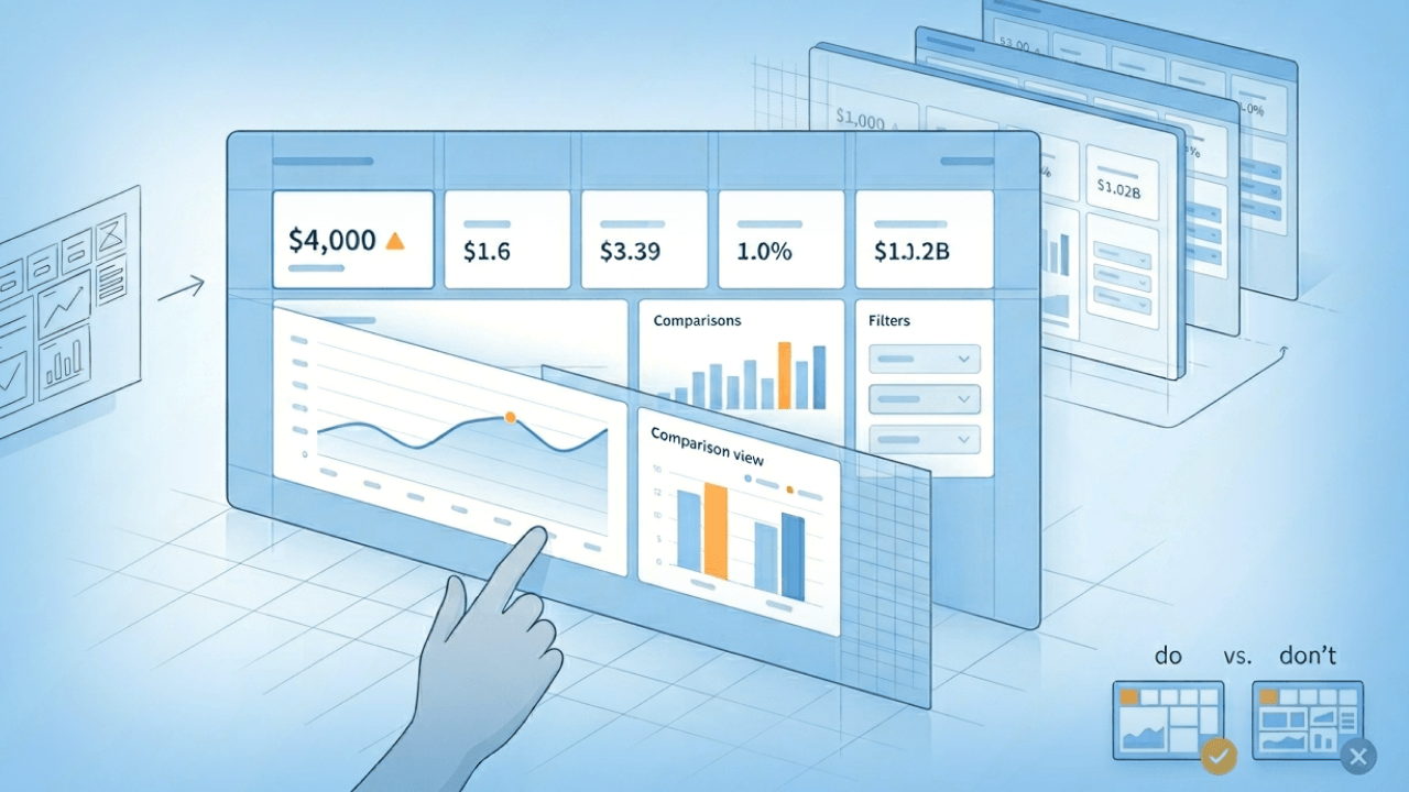
- Be careful with comparisons. To make sure you're truly comparing apples to apples, use the same type of charts and the same time frames for each data set. The data you include in your dashboard comparisons should include information from the same sources and categories too.
- Document metric definitions visibly. Every KPI displayed on a dashboard should have a visible or accessible definition so viewers can trust what they are seeing. This can be a tooltip, a linked glossary, or a documentation panel. You'll notice that teams who skip this step spend an outsized amount of time in meetings debating whose numbers are correct.
- Show data freshness. Display when the data was last updated so people know whether they're looking at current information or stale data. This simple addition builds trust and prevents decisions based on outdated metrics.
- Plan access and sharing upfront. Decide who should see what, then enforce it with role-based access and row-level security so teams can share dashboards confidently without creating data exposure risk.
Frequently asked questions
What is a reporting dashboard?
What are the 4 types of dashboards?
What makes a good dashboard report?
How do you create a dashboard report?
What is the difference between a dashboard and a report?


Domo transforms the way these companies manage business.

