Se ahorraron cientos de horas de procesos manuales al predecir la audiencia de juegos al usar el motor de flujo de datos automatizado de Domo.
Ver el vídeo

A lot of visualizations are built on averages, but strip plots are built to show your raw data points. As we’ll show, it’s what makes them ideal when you’re comparing how data is spread across groups, identifying outliers, and revealing clusters that you might easily miss on a box plot or bar chart. In this guide, we’ll covers when to use them and how to interpret them correctly, then mention some alternatives that will work better when your data set grows too large.
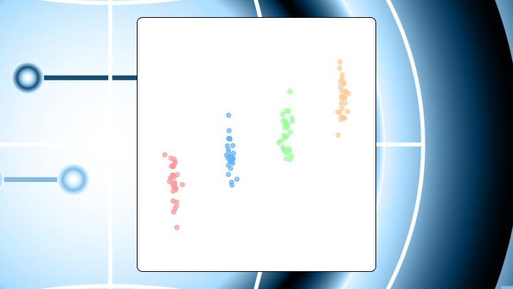
A strip plot is a chart that shows individual data points along a single numeric axis, grouped by category. You see actual observations rather than just an average or summary.
Before you build one, review these guidelines:
One dot per observation. Nothing more.
A strip plot places one dot per observation along a numeric axis, with dots organized into lanes by category. If you're plotting customer satisfaction scores by region, each dot represents one customer's score. The vertical position shows the value. The horizontal position within each lane? That's just random spacing to keep dots from stacking on top of each other.
In BI dashboards that default to aggregates, strip plots should feel like a breath of fresh air. You get to see all of your individual data points, not just the average, which makes it harder for a single mean to hide a handful of outliers.
Some people call this a jitter plot. Same thing, different name. The term strip chart also appears in some software, though that can mean something else entirely in manufacturing contexts.
Unlike a box plot, there's no median line or quartile box. Unlike a scatter plot, one axis is categorical rather than continuous. You're looking at raw data, not aggregates.
The random horizontal displacement (jitter) prevents dots from piling up, but it carries no information about your data. Wider horizontal spread in one category doesn't mean more variability. It just means the software spread the dots out more. This distinction trips up even experienced analysts when they're presenting to stakeholders who haven't seen the chart type before.
Two things: You need a numeric variable to measure and a categorical variable to group by.
Your data should include:
At minimum, you need two categories with at least a handful of observations each. While a single category with one value technically renders, it won't tell you anything.
Optional fields that improve the visualization:
Strip plots also depend on row-level data staying row-level. If an upstream pipeline pre-aggregates (for example, one row per region with an average score), you can't recover the individual observations later, no matter what chart you pick. It's a common "gotcha" when teams inherit data sets from other departments. Always verify the grain of your data before committing to a strip plot.
If you lack a categorical variable entirely, use a histogram instead.
If you plan to share strip plots with broader teams, think about data access early. Gartner projects that 90 percent of analytics consumers will become content creators by 2026. That shift means more people building and viewing point-level charts, and more opportunities for misinterpretation if governance isn't in place. Because a strip plot can expose individual-level records, many BI teams pair it with role-based access controls so only authorized people see point-level detail.
A dashboard designer once added strip plots for every metric in a weekly report. Once the data set grew past a few hundred rows per category, the charts became unreadable blobs. The team switched back to box plots within a week.
Strip plots shine under specific conditions. Sample sizes per category should stay manageable so individual points remain distinguishable. You want to spot outliers, clusters, or gaps that summary statistics would hide. Stakeholders want to see the actual data rather than trust an aggregate. You're comparing distributions across two to five groups.
This is where strip plots help analysts tell a more defensible story to executives. An average might look fine while the distribution tells a completely different story, especially when operational risk lives in the tails.
But be aware that certain scenarios make this chart fail. When point counts exceed what transparency and jitter can manage, you'll see a solid band and conclude groups are similar when they may not be. More than six categories clutters the chart and slows comparison. If your audience expects a quick summary like a median or range, they may misread visual noise as meaningful variation.
Your eye tends to drift to the densest clusters first. It then scans for outliers at the extremes.
This automatic reading order explains why strip plots do so well at surfacing anomalies but might mislead when density differences are subtle.
Read the chart in this sequence:
Horizontal spread from jitter isn't variance. A category with fewer points may appear tighter simply because there are fewer observations, not because the distribution is actually narrower.
If you're presenting this to nontechnical stakeholders, spell out what a dot represents in one sentence (one ticket, one order, one customer, one batch). A short annotation in the dashboard next to the chart often prevents the "are these averages?" question before it starts.
Run a quick sanity check: Mentally draw a box plot over each category. If the strip plot's central mass aligns with where you'd expect the box, your reading is on track.
Teams frequently assume wider horizontal spread means more variability. It doesn't.
Jitter is random displacement applied equally across all points. Start with a jitter width of about 0.2 to 0.4 of the category spacing. If points still overlap heavily, increase transparency before increasing jitter further. And because jitter introduces randomness, two renders of the same data may look slightly different. In code-based tools, set a random seed if reproducibility matters for your reporting workflow.
Adding a subgroup variable lets you color-code points by a second category. This doubles the visual complexity, so use it only when the subgroup distinction is central to your question.
When you apply color grouping, points from different subgroups may overlap within the same category lane. Dodging shifts subgroups slightly apart horizontally so they form separate mini-lanes. If your primary categories already number four or more, adding hue with dodge can make the chart too cluttered. Consider small multiples instead.
A chart with 200 points per category looks fine at full opacity. At 500 points, the center becomes a solid blob.
Reducing transparency reveals the density gradient underneath. Adjust alpha based on sample size: under 50 points per group, alpha around 0.7 to 0.8 works. For 50 to 200 points, try 0.4 to 0.5. Over 200 points, you'll need 0.2 to 0.3 (though at that point you should question whether a strip plot is still the right choice).
When a strip plot stops working, several alternatives can fill the gap. Your choice depends on what you're trying to preserve: individual observations, distribution shape, or summary metrics.
| Chart type | Best when | Limitation |
|---|---|---|
| Swarm plot | You want non-overlapping points | Slower to render at high volume |
| Box plot | You need median and quartiles at a glance | Hides multimodality |
| Violin plot | Distribution shape matters most | Smoothing can imply density where data is sparse |
| Scatter plot | Both axes are continuous | Not appropriate when one axis is categorical |
A swarm plot uses an algorithm to pack points so they don't overlap, rather than relying on random jitter. The result roughly mirrors the distribution's density.
Swarm plots eliminate overlap but require more horizontal space per category and become slow to render as point counts grow. Choose a swarm plot when showing every point matters and you have moderate sample sizes.
When stakeholders require quick answers rather than exploratory detail, a box plot delivers. It compresses the distribution into five summary statistics and flags outliers explicitly.
Violin plots add distribution shape via kernel density estimation, which helps surface multimodality that a box plot would hide. The smoothing can imply density in sparse regions, though. And the shape can be unfamiliar to nontechnical audiences.
A useful pattern: Overlay a strip plot on top of a box or violin plot to get both the summary and the raw data. This overlay approach is also a practical way to build confidence with executives. Pair a familiar summary (the box or violin) with the dots that prove it, so people get context and detail in one view.
Both axes continuous? Exploring a relationship between two variables? Use a scatter plot. One axis categorical and you're comparing distributions across groups? That's strip plot territory.
Excel doesn't have a native strip plot, so you'll build one using a scatter plot with helper columns.
This workaround is manageable for small data sets but becomes tedious for ongoing reporting. It also tends to kick off the tool-switching tax. Analysts export to Excel for jitter, then someone asks for the same view in a governed dashboard, then the team repeats the process in R or Python. If your organization cares about consistent formatting, access controls, and one source of truth, that back-and-forth adds friction.
Set up your data with these columns:
Follow these steps:
One thing usually trips people up: The RAND function recalculates every time you edit the sheet, so your points shift around. Copy Column D and use Paste Special → Values to freeze the jitter.
Excel doesn't provide built-in strip plot controls like jitter, hue grouping, or dodging, so you end up recreating those behaviors by hand with helper columns and multiple series. For dashboards that update regularly, a BI tool like Domo can keep the strip plot-style view inside a governed environment, so people can explore point-level distributions without exporting data just to get the chart.
The value of a strip plot isn't in what it summarizes. It's in what it exposes.
Customer support response times by tier: A software as a service (SaaS) company tracks first-response time across Basic, Pro, and Enterprise tiers. A bar chart of averages shows all three around four hours. The strip plot reveals Enterprise has a tight cluster under two hours with a few outliers near eight, while Basic spreads from 1 to 12 hours. Similar averages, completely different experiences.
This is the kind of chart that helps a BI specialist answer the executive question behind the question: Are we actually consistent, or does the average just make us feel consistent?
Test scores by classroom: A school district compares scores across five classrooms. One classroom shows a bimodal distribution with clusters at 60 and 85, suggesting two distinct student groups. A box plot would show a wide range but miss the two peaks entirely.
Manufacturing defects by shift: A factory tracks defect counts per batch across three shifts. The night shift has a handful of extreme outliers while day and evening cluster tightly. A bar chart of totals would blame the night shift overall. The strip plot pinpoints specific batches.
This example also has a data engineering angle. If your pipeline collapses batches into shift-level totals upstream, the strip plot can't point to specific batches later. You need the row-level records preserved from ingestion through transformation.
Strip plots aren't summary charts. Treating them as such leads to misinterpretation.
Strip plots trade summary clarity for raw visibility. They work best when you need to see every data point, spot outliers, or compare distributions across a small number of groups. When point counts climb or stakeholders want quick answers, switch to a box plot or violin plot.
If your current tools make strip plots tedious to build or update, a platform with native support for distribution charts can save time and reduce manual errors. And if you're sharing point-level charts broadly, pairing strip plots with governance controls (like role-based access controls) helps teams distribute what they've learned without accidentally distributing sensitive records.
Want to see how other analysts handle jitter, overlays, and "too-many-points" problems? Swap notes and get practical examples when you join the Domo community.


