Se ahorraron cientos de horas de procesos manuales al predecir la audiencia de juegos al usar el motor de flujo de datos automatizado de Domo.
Ver el vídeo

Sparkline charts answer one question well: What's the trend? This article explains what sparklines are, walks through the three main variants and when each works best, and covers the data requirements, Excel build steps, and formatting choices that separate helpful trend indicators from misleading ones.
Use these takeaways to decide if a sparkline is the right fit for your table or dashboard.
A sparkline chart is tiny. The data has to do a lot of work.
You need a single metric measured across a consistent sequence, usually time. That sequence requires clear order (left to right), consistent intervals (daily, weekly, monthly), and one data type. Mixing data types will produce a sparkline that technically renders but communicates nothing useful. Revenue figures alongside percentage changes? The chart will draw itself, sure. But you will have created visual noise masquerading as insight.
Here is something teams discover the hard way: if you're showing sparklines across multiple KPIs or teams, align on metric definitions first. When each group calculates "revenue," "pipeline," or "tickets resolved" differently, a consistent axis doesn't save you. It just makes the inconsistency easier to spot.
Edward Tufte gave us the name. A sparkline chart is a tiny visualization designed to fit inside a single cell or alongside text, showing the general shape of a trend without axes, labels, or gridlines. Tufte described sparklines as "data-intense, design-simple, word-sized graphics."
These microcharts differ from other spreadsheet features you might already know. A trendline overlays a calculated regression on existing charts. A data bar shows magnitude as a horizontal fill. Sparklines do something else entirely: they show change over a sequence.
Position along the vertical axis encodes value. Left-to-right position encodes sequence. The slope signals direction. Some variants add markers to highlight high, low, first, or last points.
What's the trend? That's the question sparklines answer. They don't tell you the exact value at any specific point. Treating them as if they do leads to overconfident interpretations; it's a mistake often found in dashboard reviews.
BI analysts like sparklines for KPI tables. Non-technical stakeholders (think sales reps, store managers, and customer success managers) tend to trust them quickly. Forrester reports only 20 percent of business people can self-serve their own BI needs. Sparklines help the other 80 percent see the trend, not just the number.
Most tools offer three core sparkline types. Your choice depends on what you're measuring and what pattern you consider most important.
Line sparklines work best for time series where slope and shape matter more than individual values. Daily active users, stock prices, website sessions, temperature over weeks. Column sparklines make individual period values more visible: monthly revenue, marketing leads, sales pipeline created, call volume. Each bar's height carries meaning.
Win/loss sparklines reduce everything to binary. Did you hit the target or not? Use these for compliance checks, SLA (service-level agreement) tracking, or streak tracking where magnitude doesn't matter. But don't use win/loss sparklines when near-misses matter as much as hits. They flatten meaningful nuance into false equivalence.
Structure your data correctly before building. You need a row or column of sequential numeric values, typically time-ordered. Consistent intervals and no mixed data types will save you headaches later.
If your data has gaps, decide upfront how to handle them. Should blanks display as gaps in the line, as zeros, or should adjacent points connect? Excel's Hidden & Empty Cells setting controls this.
If you're a BI analyst who gets repeated "trend snapshot" requests, setting up a simple template is usually worth the time. One consistent sparkline chart pattern in your KPI table can cut down on the rebuild cycle.
By default, Excel scales each sparkline's axis independently. A sparkline showing values from 100 to 105 looks identical to one showing 100 to 500.
For accurate comparisons across rows, you need to change this. Select any sparkline in the group. Go to the Sparkline tab and click Axis. Under Vertical Axis Minimum Value and Maximum Value, select Same for All Sparklines. Now a steep slope in one row means the same proportional change as a steep slope in another.
Most teams skip this step entirely. Then they wonder why their dashboards generate more questions than answers.
A few issues come up repeatedly:
After building, confirm the sparkline's high point aligns with your data's maximum value. If it doesn't, your data range might include unexpected cells. Excel sparklines don't support tooltips, clickable data points, or dynamic resizing. For dashboards needing interactivity or automatic refresh, BI tools handle this with less manual work.
Formatting choices change what viewers notice. They are not decorative.
Adding markers for high, low, first, and last points helps viewers anchor the trend. Without markers, a sparkline shows direction but lacks reference points. Enable markers when peaks and valleys matter, or when the first or last value carries special meaning.
If your data crosses zero, use a distinct color for negative segments. Without this, viewers may miss that the trend dipped below baseline. In Excel, go to the Sparkline tab, select Marker Color, then Negative Points.
Axis pinning is the most consequential decision. When sparklines in a table each use their own axis range, a five percent change and a 50 percent change look identical. For any dashboard where rows should be compared, pin the axis minimum and maximum to the same values across all sparklines. Some sparklines will look nearly flat after you do this. That's accurate, not a problem.
Thicker lines are easier to see in small cells but obscure detail in volatile data. Use thinner lines when data has many points or frequent direction changes. And if you're marking high, low, first, last, and negative points all at once? You've defeated the purpose. Pick one or two that matter most.
Sparklines work great when they don't try to replace numbers, but rather, work to complement them.
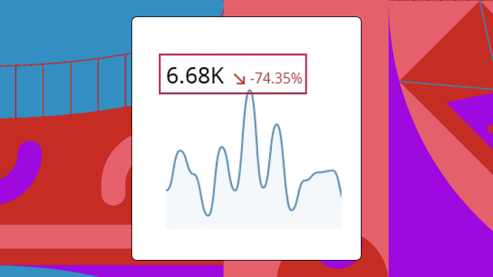
A cell showing Revenue: $1.2M with a sparkline beside it tells a richer story than either element alone. An effective pattern combines current value, change indicator, and sparkline. Viewers get the number, the direction, and the historical context in one glance.
If your table shows performance across regions, products, or teams, set consistent axis rules so the visual comparison means something. This is also where BI managers and IT leaders can make life easier (by standardizing the sparkline chart pattern across dashboards, instead of having every team invent its own).
A sparkline showing five years of daily data will be unreadable. Match the time range to the decision. Weekly data for operational dashboards. Monthly for strategic reviews. Between seven and 30 points typically works. Fewer looks sparse. More becomes noise.
Missing data can appear as gaps, zeros, or interpolated connections. Each implies something different:
Choose based on what's true, not what looks cleanest.
If someone needs the exact value on March 15, they need a different chart. Position sparklines in the rightmost column of data tables or inline immediately after the metric they describe.
Sparklines solve a specific problem: showing trend in minimal space.
Use a standard line chart when you need labeled axes and precise value reading. Use small multiples when you need full chart context (axes, labels, gridlines) but still want to compare across categories. This works when the audience needs both pattern and precision.
Use data bars when you only care about relative magnitude, not trend over time. The comparison is between current values, not historical patterns. Use a table with conditional formatting when exact numbers are the primary need. Color-coding suffices for status indication, and sparklines would add visual noise without adding insight.
The core question: does your audience need to see the shape of change over time, or to predict future changes?
Sparklines in spreadsheets work for static reports. Dashboards that refresh automatically, pull from live data sources, and scale across teams need something different.
Domo's visualization tools include sparkline chart support within tables and cards, with axis controls, formatting options, and automatic data refresh built in. Analysts can also reuse the same sparkline chart configuration across dashboards, which helps keep trend signals consistent and cuts down on repetitive rebuild work.
For IT and data leaders, that consistency is a governance win. When your organization defines KPIs in a shared semantic layer and publishes reusable components, everyone sees trends the same way across sales, marketing, finance, and operations.
Building embedded analytics? Domo Everywhere supports embedding sparkline chart experiences into external apps through APIs and low-code tools, including options for white-labeled delivery, multi-tenant deployment, row-level security, and programmatic filtering.
Want to turn those "quick trend" asks into auto-refreshing, consistent sparklines your whole organization can trust? Try free and build a KPI table that tells the trend story at a glance.


