Se ahorraron cientos de horas de procesos manuales al predecir la audiencia de juegos al usar el motor de flujo de datos automatizado de Domo.
Ver el vídeo

Outliers charts help you catch unusual values, validate data quality, and decide whether to investigate or exclude specific data points before acting on summary metrics. This article explains the detection methods behind these visualizations, walks through when they work best, and shows you how to build them in tools like Excel and Domo.
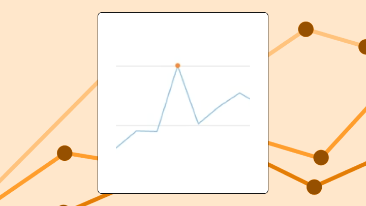
An outliers chart flags data points falling outside expected boundaries. You calculate statistical thresholds from your data, and the chart visually separates normal values from exceptions.
Here's when this chart earns its place:
Individual data points, calculated boundaries, and a visual distinction between what's inside and what's outside. That's the core.
The chart might render as a scatter plot with reference bands, a box plot with points outside the whiskers, or a time series with shaded control limits. What sets it apart from simpler visualizations? The boundaries come from the data itself. The chart encodes both your values and a statistical judgment about what "normal" looks like.
Different roles use these charts differently. A data analyst might use one to triage anomalies before a stakeholder meeting. A line-of-business executive might see it embedded in a dashboard as a quick "do we have a problem?" check. It wouldn't be unusual for a BI manager to care less about the dots and more about whether every team is using the same threshold logic.
You need a numeric measure column (the values you're testing) and a dimension or timestamp column (to position each point). Category columns help if you want separate thresholds per group. A label or ID column makes it easier to identify specific outliers for follow-up.
At least 20 data points per group. Fewer than that, and your thresholds become unstable.
If your outliers chart will be reused across teams, treat the inputs as a governance problem, not just a charting problem. If one team calculates revenue differently, your thresholds will look inconsistent even when the data is fine.
Some data conditions will let the chart render but produce misleading results: highly skewed distributions where the median and mean diverge significantly, data with natural bimodal clusters, and time series with strong seasonality where what counts as an outlier depends entirely on context.
Not sure about your distribution shape? Start with a histogram first.
Standard bar and line charts average away anomalies. A single extreme value can shift a mean dramatically, but the chart shows only the result.
Outliers charts exist because aggregates lie when the underlying data contains exceptions. According to Gartner, those exceptions are expensive, with poor data quality costing organizations $12.9 million per year on average. That figure matters here because a single undetected outlier (a duplicate transaction, a broken sensor reading) can cascade into flawed reports and misallocated resources. You gain visibility into individual exceptions, but you lose the simplicity of a single summary number.
The McKinsey Global Institute found poor-quality data can lead to a 20 percent decrease in productivity. This underscores why catching anomalies early pays off in operational efficiency. For operational dashboards where average performance drives decisions, this visibility matters. For executive summaries where detail creates noise, it might not.
There is a less glamorous reason too: nobody wants to manually scan thousands of rows to find the one weird transaction, the one broken pipeline output, or the one day a KPI went sideways. An outliers chart gives you a consistent way to surface what matters instantly.
Your eye naturally goes to points outside the boundary lines first. That's by design.
Viewers make three comparisons when scanning: distance from the boundary (how extreme is the outlier?), clustering of outliers (random or grouped?), and position along the horizontal axis (when did they occur?).
Misinterpretation happens when people assume all flagged points are errors. Some are legitimate high or low values. People also ignore points just inside the boundary, even though a value sitting right on the edge may still warrant review. And not all outliers carry equal weight.
To read the chart correctly, follow this order:
A global outlier is extreme relative to the entire dataset. If you're looking at monthly revenue across all regions, a single month with 10 times the typical value is a global outlier. Easiest to spot. Most likely to distort your aggregates.
Normal in one context, extreme in another. A massive spike in website traffic on Black Friday is expected. That same spike on a random Tuesday in March? Suspicious.
Time series and segmented data need contextual detection methods. Failing to account for context is one of the most common mistakes teams make. They flag seasonal peaks as anomalies simply because they didn't segment by time period.
Mild outliers fall just outside standard boundaries. Extreme outliers sit far outside them. The distinction matters because extreme outliers are more likely to indicate data errors or exceptional events.
This is the most common outlier formula. Calculate the 25th percentile (Q1) and 75th percentile (Q3). Find the difference between them to get the interquartile range (IQR). Multiply that range by 1.5, subtract it from Q1 for your lower fence, then add it to Q3 for your upper fence. Any value outside these fences gets flagged.
Works well for roughly symmetric distributions. On highly skewed data, it can over-flag values that are rare but expected.
A standard test involves calculating how many standard deviations a value is from the mean. Values beyond two or three standard deviations get flagged. The modified version uses median and median absolute deviation instead, making it resistant to existing anomalies.
Use this for large datasets needing a quick threshold.
This method works for time series with potential multiple anomalies. It tests iteratively, removing the most extreme value and recalculating until no more anomalies are found.
Use it for detecting multiple outliers without masking effects. It requires specifying a maximum number of expected anomalies upfront, which can be tricky if you don't know what you're looking for.
Use this chart when you need to validate data quality before building reports. When your metric has a stable baseline and deviations are meaningful. When you're monitoring for process breakdowns or fraud indicators.
Data engineers validating pipeline outputs find this particularly useful. If a transformation suddenly creates negative quantities, duplicate spikes, or impossible timestamps, an outliers chart can surface that before the data lands in downstream dashboards and turns into a Monday morning escalation.
Avoid it when your data is inherently variable with no stable baseline, or when the setup conditions in the data requirements section aren't met (for example, too few points or unsegmented multimodal data). Use a scatter plot if you need to show relationships between variables rather than single-variable deviation.
If you use it in the wrong conditions, expect false positives in skewed distributions and missed outliers in seasonal data without contextual adjustments.
Scatter plots don't have built-in anomaly detection. You build the logic yourself.
Calculate your threshold in your data preparation layer. Create a flag column that assigns a one if the value exceeds the threshold, zero otherwise. Plot two series on the same scatter (one for normal points and one for outliers). Style the outlier series with a distinct color and larger point size.
If your tool supports it, add horizontal or vertical reference lines at the threshold values.
Once you have it, don't keep it trapped in an analyst-only view. Publishing the outliers chart alongside the KPI it protects gives non-technical stakeholders a self-serve way to spot and explore anomalies without filing a ticket.
In Domo, Beast Mode calculations handle the flag column, and conditional formatting styles outliers automatically. You can also put the outliers chart directly into the same dashboard as your other KPIs, so the "something's off" moment happens in context.
The default visualization for distribution analysis in most tools. The box shows the middle 50 percent of your data. Whiskers extend to the most extreme points within a calculated range. Points outside the whiskers appear individually.
This chart shows distribution shape, spread, central tendency, and individual anomalies. What it hides: the actual number of data points (a box with 10 values looks identical to one with 10,000), clusters or gaps within the distribution, and time sequence context entirely.
Use it when comparing distributions across multiple categories. If you need to see individual points within the normal range, use a strip plot.
If you have alerting available in your BI workflow, consider notifying the right people when a new extreme outlier appears (a manager for performance dips, an engineer for pipeline anomalies, an exec for KPI risk).
A finance team reviews daily transaction totals. A bar chart shows a slight uptick in March. The outliers chart? It reveals three individual transactions flagged as extreme anomalies. The uptick is entirely driven by these three transactions. A bar chart hides this because it aggregates the values.
An operations team tracks server response times. A line chart shows the average is stable. A scatter plot with reference lines reveals a cluster of extreme anomalies every Tuesday at 3 pm, suggesting a scheduled process is causing timeouts.
A sales manager reviews representative performance using a box plot by region. One region has no anomalies. Another has three reps flagged as extreme high performers and two as extreme low performers. The variance in performance is the story, not the median.
A data engineering team checks a dataset right after a pipeline change. The outliers chart flags a handful of impossible negative values that only appear after the new transformation step. Quick visual QA.
Create a table with an ID column, a Value column, and a Category column.
Sum the outlier flags as a validation check. The count should match the number of points visually outside your reference lines.
Excel doesn't natively support conditional point formatting in scatter charts. You either manually format points or create separate series. This becomes tedious for ongoing monitoring. If you're refreshing this chart regularly, a BI platform automates the calculation and formatting.
Threshold sensitivity is a limitation. Changing your multiplier from 1.5 to 2 can halve the number of flagged points. Document your threshold choice and stick with it across related dashboards. The math assumes a single underlying distribution, so multimodal data can produce misleading flags. For time series with trends or seasonality, static thresholds can trigger false positives during normal peaks and miss genuine anomalies during low periods.
Here are a few common alternatives and when they may fit better:
| Chart type | What it does better | What outliers chart does better |
|---|---|---|
| Box plot | Shows distribution shape and quartiles | Can show time sequence and individual labels |
| Scatter with reference lines | Shows relationships between two variables | Focuses on single-variable deviation |
| Control chart | Handles time series with moving thresholds | Simpler for static datasets |
| Histogram | Shows full distribution shape | Flags specific points for follow-up |
Easier decision: whether to investigate specific transactions or events before acting on aggregate metrics. The chart gives you a shortlist.
Harder decision: whether a flagged point is an error, fraud, or legitimate exception. The chart surfaces candidates. Context determines action.
Teams often overcorrect by excluding all flagged points from analysis. Some outliers are the most important data points you have. Sometimes, teams throw out their best-performing months because the numbers "looked wrong" statistically. That's a failure of interpretation, not the chart.
If an outliers chart sits directly in the dashboard, a line of business manager can spot what's off in their team's numbers without waiting on a data request. An executive can act on KPI deviations without a delay.
Outliers charts earn their place when you need to catch what doesn't belong before it distorts your analysis. They provide value for data validation, operational monitoring, and any context where a single extreme value can change a decision.
Avoid them when your data lacks a stable baseline, when you have too few points for stable thresholds, or when explaining the math outweighs the benefit.
Before building one, know your detection method, your threshold, and your plan for what happens when anomalies appear. If the outliers chart is going to be shared widely, decide who owns the threshold logic so teams don't end up with conflicting outlier definitions.
The chart surfaces exceptions. Your process determines what to do with them. If you want to compare threshold approaches, swap Beast Mode tips, or see how other teams turn anomalies into alerts, join the Domo community.


