Se ahorraron cientos de horas de procesos manuales al predecir la audiencia de juegos al usar el motor de flujo de datos automatizado de Domo.
Ver el vídeo
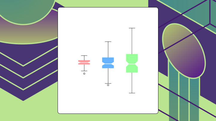

A notched box plot extends the classic box plot by adding a narrowing cut around the median that represents a 95 percent confidence interval. This article covers what the notch means, when to add one, how to read it correctly, and the missteps that can lead analysts to the wrong conclusion.
If you only remember a few things, remember these:
Picture a standard box plot with a narrowing cut into the box on either side of the median line. That narrowing (the notch) represents an approximate confidence interval around the median.
You already know what a box plot shows. The box spans from Q1 to Q3, which is the interquartile range, or IQR. The line inside marks the median. Whiskers extend outward, and outliers appear as individual points.
The notch adds something new. It tells you how confident you can be about where the median actually sits. The standard formula is median ± 1.58 × IQR / √n, which corresponds roughly to a 95 percent confidence level.
Here is where people get confused. The IQR shows spread, how dispersed the middle 50 percent of your data is. The notch shows uncertainty, how precisely you have pinpointed the median. These are different things. Mixing them up leads to bad interpretations. A wide IQR with a narrow notch means your data varies a lot, but you've still nailed down the median with confidence. A narrow IQR with a wide notch? The opposite.
John Tukey introduced this visual in the 1970s during his work on exploratory data analysis. It remains useful for quick visual inference when you're comparing groups, especially when a simple average would hide what's going on.
Should you add notches to your box plot, or will they just add clutter?
Add notches when you're comparing medians across two or more groups, each group has at least 15 observations, and the distributions are roughly symmetric. Skip them when you're exploring a single distribution, when sample sizes are small or unequal, or when your audience has never seen a notched box plot before.
This comes up a lot for data analysts and BI specialists who need to explain performance differences to stakeholders. It also shows up more when data literacy is low. For example, poor data literacy ranks among the top 5 barriers to analytics success. That ranking matters because it explains why visual confidence indicators (like notches) often communicate more effectively than statistical footnotes buried in appendices. A notched box plot can act like a confidence indicator in the chart itself, which beats a slide full of footnotes.
The notch formula assumes certain conditions. When those conditions break, the notch misleads. With fewer than 10 observations, the notch can extend beyond the box itself. It looks odd and signals that the interval is not reliable.
| Situation | Recommendation |
|---|---|
| Comparing medians, n ≥ 15, symmetric data | Add notches |
| Exploring shape of a single variable | Standard box plot or histogram |
| Small samples (n < 10) | Dot plot or strip plot |
| Need formal inference | Estimation plot or statistical test |
| Audience unfamiliar with notches | Standard box plot with annotation |
A product team once compared conversion rates across three app variants using notched box plots with fewer than 10 observations per group. The notches overlapped, so they concluded no difference existed. A follow-up test suited to proportions (for example, a two-proportion test or a permutation test) found a statistically significant gap they had dismissed. They shipped a weaker variant than they needed to.
If you want notched box plots to hold up in a dashboard review (or an executive asks you to defend the decision), the chart needs the right inputs. This is also where data engineers get pulled in, because the visualization is only as clean as the pipeline feeding it.
At minimum, make sure each group you're plotting has:
If your BI environment has a semantic layer or reusable metrics, use it. You want one approved definition of "conversion rate" or "session duration," not five slightly different ones floating around different teams.
On the data preparation side, it helps when your transformation layer can handle quartiles, sample size aggregations, and outlier flags without a pile of custom scripts. For example, in Domo, data engineers often use Magic Transform to standardize these calculations. It supports both SQL (Structured Query Language) and no-code workflows, so analysts can build notched box plots on governed datasets instead of exported files.
Many people assume that if two notches overlap, the medians are statistically indistinguishable. Not quite right.
Overlapping notches mean you lack strong visual evidence of a difference. Non-overlapping notches provide evidence that medians differ at roughly the 95 percent confidence level. One is a lack of evidence for a difference. The other is evidence for a difference. And honestly, that distinction trips up a lot of analysts.
Start by locating the medians, the horizontal lines inside each box. These are the values you're comparing.
Check the notches next. Do they overlap between groups? If not, you have visual evidence of a median difference.
Then assess the box heights. The IQR tells you about spread. A tall box means high variability in the middle 50 percent.
Look at whisker lengths. Asymmetric whiskers suggest skew. If one whisker is much longer than the other, the distribution isn't symmetric, and the notch becomes less reliable.
Finally, count outliers. Points beyond the whiskers may indicate heavy tails or data quality issues.
Here are the interpretations that cause the most trouble in reviews.
Not every box plot needs notches. Not every distribution comparison needs a box plot at all.
The classic box plot shows distribution shape through the median, spread, and outliers. It doesn't encode uncertainty about the median.
If you're asking whether these medians are different, add notches. If you're asking what this distribution looks like, skip them.
Variable width box plots encode sample size into the box width. Wider boxes mean more observations. This helps when comparing groups with very different sample sizes because it reminds viewers that narrow boxes are less reliable.
Letter value plots show additional quantiles beyond the quartiles. They're useful for large datasets where the standard box plot hides too much detail in the tails.
If your main question isn't "are the medians different," one of these charts will usually communicate better.
| Variant | Best for | Limitation |
|---|---|---|
| Classic box plot | Exploring distribution shape | No inference about median |
| Notched box plot | Comparing medians across groups | Requires n ≥ 15, rough symmetry |
| Variable width box plot | Comparing groups with unequal n | Adds visual complexity |
| Violin plot | Showing full distribution shape | Can overwhelm with detail |
| Estimation plot | Formal inference on effect sizes | Requires more statistical setup |
A notched box plot only works if your audience can interpret it correctly, and poorly designed visualizations can mislead interpretation and hinder decision-making. Most reporting failures come from missing labels, unstated methods, or visual clutter.
Label axes with units, not just generic terms like "value" or "group." State the sample size for each group, either in the caption or on the plot. Note the whisker rule you used. The 1.5 × IQR rule is common but not universal.
Rolling this up into an executive dashboard (finance, sales, ops, take your pick)? Don't assume everyone remembers what a notch means. A one-sentence caption often saves you from five minutes of meeting detours.
If notches extend beyond the box, acknowledge this in the caption rather than hiding it. Order groups meaningfully by median, by sample size, or by a logical sequence like time or geography.
Avoid plotting more than five or six groups on a single axis. The comparison becomes unreadable. And if you're presenting to an audience unfamiliar with notches, either explain the notation or switch to a standard box plot.
If you're supporting teams at scale, consistency becomes the whole game. IT and data leaders usually care less about the chart style and more about whether every team is pulling from the same governed dataset, with the same metric definition, so notches mean the same thing everywhere.
Here's a caption template you can copy:
"Box plots show median (center line), interquartile range (box), and 1.5 × IQR whiskers. Notches represent approximate 95 percent confidence intervals around the median (±1.58 × IQR / √n). Sample sizes: Group A (n = 24), Group B (n = 31). Non-overlapping notches suggest medians differ."
A retail analytics team compares average order values across three regions. East has 45 observations with a median of 72 and an IQR of 31. Central has 38 observations with a median of 61 and an IQR of 26. West has 52 observations with a median of 78 and an IQR of 31.
Using the formula median ± 1.58 × IQR / √n, the team calculates notch bounds. Central's upper bound is 67.7. West's lower bound is 71.2. These don't overlap. The team has visual evidence that West's median order value exceeds Central's.
A bar chart showing means wouldn't convey this uncertainty. The notched box plot shows both the median difference and the confidence around that difference.
Now consider a product team comparing session duration across two app versions. Both groups have exactly 12 observations. The notches overlap substantially.
Does this mean the medians are equal? No. With only 12 observations, the notch formula produces wide intervals. The team shouldn't conclude there's no difference. They should gather more data or run a formal test.
Excel's built-in box and whisker chart doesn't support true notches. You can approximate the visual by adding error bars or overlaying shapes, but the result requires manual calculation and isn't dynamically linked to your data.
For a one-off analysis, here's how to build an approximation.
The bigger issue isn't the one-time annoyance. It is the workflow. Exporting data to separate statistical tools, manually rebuilding charts, and pasting screenshots back into decks is how tool sprawl and "shadow analytics" quietly happen. Teams often spend more time maintaining workarounds than actually analyzing the data.
Start by building a small summary table for each group.
Next, build the chart and double-check Excel's calculations.
Excel's box and whisker chart works for exploratory analysis but lacks native notch support and dynamic updating. For dashboards or repeated reporting, having notched box plots available directly in your BI platform (for example, Domo BI) can save time and reduce mistakes, because the chart stays connected to the governed dataset and approved metric definitions.
Notched box plots are a heuristic, not a statistical test. Treat them as a screening tool that flags potential differences for follow-up.
As covered earlier, the notch gets shaky with small n and with heavy skew. When either shows up, switch to a chart that shows the full distribution or run a formal test.
Non-overlapping notches suggest a difference at roughly the 95 percent level, but this isn't equivalent to a t-test or Wilcoxon test. For high-stakes decisions, run a formal test.
And then there's the audience problem. Many stakeholders have never seen a notched box plot, and only 4 percent of organizations rate data literacy as "excellent". That statistic underscores why chart choice matters as much as chart accuracy: if your audience can't read the visual, the insight never lands. If you spend more time explaining the notation than discussing the data, you've chosen the wrong visualization.
If you do have the chart in an interactive dashboard, you can meet people halfway with guided exploration. An executive might not care about the formula. They just want to ask, "Is Region West actually different?" and drill into what's driving the distribution.
| Chart | What it does better |
|---|---|
| Violin plot | Shows full distribution shape, including bimodality |
| Estimation plot | Provides formal confidence intervals and effect sizes |
| Strip plot | Shows every data point for small samples |
| Standard box plot | Simpler for unfamiliar audiences |
If you're building these comparisons into dashboards (and want a sanity check on when notches help vs hurt), swap notes with other practitioners. Join the Domo community and see how teams are standardizing metrics, sample-size rules, and distribution visuals.


