Se ahorraron cientos de horas de procesos manuales al predecir la audiencia de juegos al usar el motor de flujo de datos automatizado de Domo.
Ver el vídeo
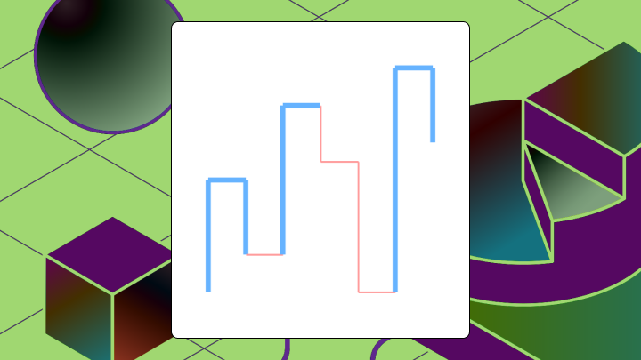

A Kagi chart entirely ignores the time element. It draws vertical lines that change direction only when price reverses by a set amount. This guide covers how the chart works, when to use it over candlesticks or Renko charts, and how to avoid the most frequent configuration errors that lead to false signals.
Use these takeaways to decide whether a Kagi chart fits the question you're trying to answer:
Want to cut through the noise and stop arguing over whether a trend really changed on Tuesday or just had a weird day. Using a Kagi chart is a great place to start.
This tool for visualizing price ignores the time dimension completely. Instead of plotting a new bar every hour or day, it draws vertical lines that change direction only when price reverses by a specific amount you choose in advance. Japanese rice merchants developed this technique in the 1870s because they wanted to see supply and demand patterns without getting distracted by daily noise. The same logic applies now, whether you're looking at a stock, a crypto pair, an exchange rate, or even a finance dashboard metric like revenue per day.
Two visual elements do the heavy lifting:
That thickness flip is what you actually care about. A direction change just tells you price moved. A thickness change? That tells you the price exceeded the level you were keeping an eye on.
Before you touch reversal settings or start reading "shoulders" and "waists," make sure the data is actually fit for a Kagi chart. A Kagi chart can look confident while still reflecting messy inputs. According to the 1-10-100 rule, bad data costs escalate to 100x the initial expenses by the time they reach the decision-making stage. That escalation matters here because a single bad data point can trigger a false reversal that cascades into misleading trend signals.
At minimum, you should have:
If you're charting market data, also sanity-check:
And if you're building this into BI workflows (dashboards for finance leaders, recurring stakeholder reporting, or self-service trend monitoring), consistency becomes the whole game.
That usually means:
In Domo, this may be unglamorous, but it's what makes the chart trustworthy at scale. Domo's Data Integration layer can keep the pipeline current across many sources, and Magic Transform (SQL-based and no-code) can standardize the fields and calculations that feed the Kagi chart logic.
Charting platforms usually build these automatically. But understanding the logic helps you catch configuration errors and interpret edge cases, especially when analysts have to recreate Kagi chart setups across multiple dashboards.
Four rules drive the algorithm:
Here's how that plays out with sample data:
| Day | Close | Reversal Amount | Kagi Action |
|---|---|---|---|
| 1 | 100 | 2 | Start vertical line |
| 2 | 103 | 2 | Extend line up |
| 3 | 104 | 2 | Extend line up |
| 4 | 101 | 2 | Reverse down (drop exceeds 2) |
| 5 | 102 | 2 | Ignore (rise less than 2) |
| 6 | 98 | 2 | Extend line down |
| 7 | 105 | 2 | Reverse up, line becomes thick |
Different platforms may use close price vs high/low as the source. If your chart looks different across tools, check that setting first. Supporting multiple teams? Standardize this choice. Otherwise, one dashboard will "see" a reversal that another dashboard never draws.
Three approaches exist for setting the reversal threshold:
| Method | Best for | Risk |
|---|---|---|
| Absolute | Stable, low-volatility assets | Whipsaw during volatility spikes |
| Percentage | Assets with wide price ranges | Ignores intraday volatility |
| ATR-based | Volatile or trending assets | When you're recomputing ATR over time, earlier thresholds can change and the chart can look different |
For a single asset over a consistent time horizon, start with percentage. If volatility varies significantly, ATR-based thresholds produce more consistent signals.
Building Kagi charts as a recurring deliverable? Treat the reversal method and settings like a saved configuration. Analysts tend to get pulled into repeat requests for "the same chart, but for a different region or product line."
Direction changes happen whenever price reverses by the reversal amount. Frequent. Often inconclusive. Treat them as alerts, not actions.
Thickness changes happen when price breaks a prior swing level. A shift from thin to thick means price exceeded the last swing high. A shift from thick to thin means price broke below the last swing low. These are your confirmation signals.
The reading order matters:
Where interpretation fails: treating every direction change as a trade signal. In choppy markets, this leads to overtrading and transaction costs eating your returns. Wait for thickness confirmation.
Another failure mode is assuming a long yang run means the trend continues indefinitely. You might hold through a major reversal because no thickness change has occurred yet. Use shoulders and waists as trailing stop references, not just thickness.
Presenting this to finance stakeholders? This is the part that tends to click visually. You're not asking them to interpret a dozen candles. You're giving them a clean "did we break the last meaningful level?" signal they can spot in seconds.
Kagi charts work in trending markets where price moves directionally for extended periods. Range-bound conditions? They fail. Price oscillates without breaking prior swing levels, and the chart just churns.
You'll get good results when:
Avoid this chart when the asset is mean-reverting. The chart will generate repeated false thickness flips. Also avoid it when you need precise entry timing (the lag inherent in reversal confirmation will cost you favorable prices).
Use it in the wrong environment anyway? Expect specific problems. In choppy markets, frequent whipsaw as the chart flips direction without confirming trends. In low-volatility ranges, long periods of inactivity followed by signals that arrive late.
In reporting and dashboarding, Kagi charts also shine when you want to reduce the back-and-forth. Instead of being asked, "Can you pull a trend view for this KPI?" every week, you can publish a consistent Kagi view that answers the reversal question upfront.
| Chart Type | Time-based | Trigger | Best for |
|---|---|---|---|
| Candlestick | Yes | Fixed time intervals | Intraday timing, pattern recognition |
| Kagi | No | Reversal amount | Trend confirmation, noise filtering |
| Renko | No | Fixed brick size | Trend direction, support/resistance |
| Point and Figure | No | Box size plus reversal count | Long-term analysis, price targets |
Candlesticks show every price movement within a time period, including noise. Kagi strips time away and shows only moves exceeding the reversal threshold. Use candlesticks when timing matters. Use Kagi when trend clarity matters.
Both Kagi and Renko ignore time. Renko uses fixed-size bricks while Kagi uses a reversal threshold. Renko produces cleaner visuals but can mask how far price actually moved within a brick. Kagi preserves move magnitude but looks messier. I've seen analysts assume these charts are interchangeable. They are not. They answer different questions, so switching between them mid-analysis can lead to conflicting signals.
Point and figure charts require a multi-box reversal to change columns, making them slower to react than Kagi. They're better for identifying long-term support and calculating price targets.
Excel doesn't include a native Kagi chart type. You'll need to construct one by hand using a line chart and conditional logic. This works for learning and one-off analysis but becomes tedious for ongoing use, especially when stakeholders want the same Kagi logic repeated across multiple dashboards.
Your data structure should have these columns:
| Date | Close | Direction | Line Value | Thickness |
Follow these steps:
Validation check: count the number of direction changes. If the count seems unusually high relative to the price range, your reversal amount is too small.
Excel can't dynamically change line thickness within a single series. You may need to split yang and yin segments into separate series or use different colors.
For ongoing analysis with live data, it helps to move out of spreadsheet assembly mode. In Domo, teams can standardize the calculations and metric definitions behind a Kagi-style view, then reuse that logic across dashboards so stakeholders see the same trend signal everywhere.
Kagi charts filter time-based noise to reveal trend structure. They also introduce constraints that make them unsuitable for certain decisions.
There's also an operational limitation that shows up in organizations: inconsistent implementations. If one team uses close prices with a 2 percent reversal and another team uses high/low with an ATR-based setting, you can end up with conflicting "trend reversal" calls for the same metric. You'll notice this problem frequently surfaces when Kagi charts graduate from personal analysis tools to executive dashboards.
According to Gartner, nearly 60 percent of organizations don't even measure the financial cost of poor data quality. For Kagi charts specifically, reversal thresholds and source field definitions often drift between teams without anyone noticing until conflicting signals surface. Centralized metric definitions and a semantic layer help keep Kagi chart inputs and thresholds consistent across departments.Switch to alternatives under specific conditions. Use candlesticks when you need precise timing. Use Renko when you want simpler trend visuals. Use point and figure when analyzing long-term support.
Kagi charts reward patience. They filter the noise that makes candlestick charts exhausting to watch. They confirm trends only after price has already moved. That works for swing traders and analysts who prioritize clarity over speed.
Before using one, decide on your reversal method. ATR-based adapts to volatility. Percentage scales with price. Absolute is simplest but least flexible. Watch for thickness changes, not just direction changes. A shift from yin to yang (or vice versa) signals that price broke a meaningful level.
If the market is range-bound or you need precise entry timing, choose a different chart type. Kagi charts aren't wrong in those contexts. They're designed for a different question.
Want to compare reversal settings, sanity-check signals, or see how other teams are using Kagi charts for KPI trend monitoring without reinventing the wheel? Join the Domo community and swap notes with data folks who've already fought the whipsaw.