Candlestick charts are one of the most powerful tools for visualizing financial data. For anyone analyzing stocks, cryptocurrencies, or commodities, they offer a rich, detailed view of price action that goes far beyond a simple line chart. These charts pack an incredible amount of information into a single shape, revealing the story of market sentiment over a specific period.
This guide will walk you through everything you need to know about candlestick charts. You’ll learn what they are, how to read them, and the best practices for creating them. We’ll explore common and advanced patterns that can signal market trends and discuss their limitations. By the end, you’ll understand why these charts are essential for technical analysis and how to use them effectively.
What is a candlestick chart?
A candlestick chart is a type of financial chart used to display the price movement of an asset over time. Each “candlestick” represents a specific time interval, such as one minute, one hour, one day, or one week, and shows four key pieces of information for that period: the open, high, low, and close prices (OHLC).
What sets candlestick charts apart from other chart types is their ability to visually present the relationship between the opening and closing prices. This relationship forms the “body” of the candlestick, which instantly tells you whether the price went up or down during the period in question. This visual design makes it easier to spot trends, patterns, and potential shifts in market momentum.
How do candlesticks differ from other charts?
While other charts can display price data, candlesticks provide more depth and context at a glance.
Line chart: A line chart is the simplest form, connecting a series of closing prices over time. It’s great for seeing the general trend but hides the price volatility during each period. You miss the open, high, and low prices completely. A line chart is like reading the last sentence of a chapter, you know the outcome but you miss the entire plot.
Bar chart (or OHLC chart): A bar chart shows the same four data points as a candlestick. It consists of a vertical line representing the high-low range, with small horizontal lines on the left for the open price and on the right for the close price. While functional, it’s less visually intuitive than a candlestick chart for quickly identifying bullish or bearish sentiment.
Candlestick chart: By using a colored or filled body, a candlestick chart makes the price direction instantly clear. The body immediately draws the eye, allowing traders and analysts to quickly absorb the market’s story. It combines the data of a bar chart with a more readable, engaging visualization of market sentiment.
When (and why) to use a candlestick chart
Candlestick charts are the go-to choice in scenarios where you need to analyze price volatility and market sentiment for any asset with open, high, low, and close data.
They’re ideal for analyzing:
Stocks: Tracking daily or intraday price movements of publicly traded companies.
Cryptocurrencies: Visualizing the highly volatile price action of assets like Bitcoin or Ethereum.
Commodities: Monitoring the prices of gold, oil, wheat, and other raw materials.
Forex (Foreign Exchange): Analyzing the exchange rates between different currencies.
Advantages of candlestick charts
Candlesticks shine over other charts for several key reasons:
Visual clarity: The color-coded bodies make it easy to instantly identify whether a period was positive (price up) or negative (price down). A screen full of green and red candles tells a story of market activity that a simple line chart can’t.
Trend and momentum detection: A series of long, bullish (up) candles indicates strong buying pressure and an uptrend. Conversely, a series of bearish (down) candles signals selling pressure and a downtrend. The size of the candle body reflects the momentum.
Intraday insight: Unlike a line chart that only shows the close, a candlestick reveals the entire price journey within a period. The wicks show how high and low the price went before settling at its close, offering clues about volatility and price rejection.
When candlesticks are not ideal
Despite their strengths, candlestick charts aren’t always the best tool. They can be less effective in situations with:
Extreme noise: On very short timeframes (like one-second charts), price data can be erratic, leading to a confusing series of candles with little predictive value.
Low-volume data: For assets that trade infrequently, the open, high, low, and close may be very close or identical. This results in small, uninformative candles and large gaps between them.
Simple trend analysis: If your only goal is to show the long-term trend to an audience unfamiliar with financial charts, a simple line chart might be more effective and less intimidating.
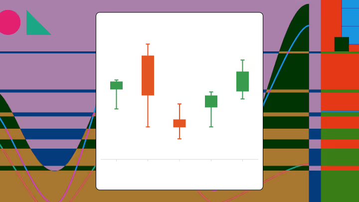
How to read a candlestick chart: the mechanics
Understanding a candlestick chart begins with learning its anatomy. Each candle is a snapshot of price action, and its shape tells a unique story.
The core components of a candlestick
Every single candlestick is made up of a body and, usually, two wicks (also called shadows). These parts represent the four essential data points for the sample time period.
Open: The price at the beginning of the time interval.
Close: The price at the end of the time interval.
High: The highest price reached during the time interval.
Low: The lowest price reached during the time interval.
The relationship between these four prices determines the candle’s shape and color.
The body: The wide, rectangular part of the candlestick represents the range between the open and close prices. Its color and size are critical.
The wicks (or shadows): The thin lines extending above and below the body are the wicks. The upper wick shows the high, and the lower wick shows the low. Long wicks suggest significant price fluctuation during the period.
Bullish vs bearish candles
The core of reading a candlestick is distinguishing between bullish and bearish candles.
Bullish candle (up): This forms when the closing price is higher than the opening price. It means buyers were in control during that period, pushing the price up. Bullish candles are traditionally colored green or are hollow (white).
Bearish candle (down): This forms when the closing price is lower than the opening price. It means sellers were in control, driving the price down. Bearish candles are traditionally colored red or are filled (black).
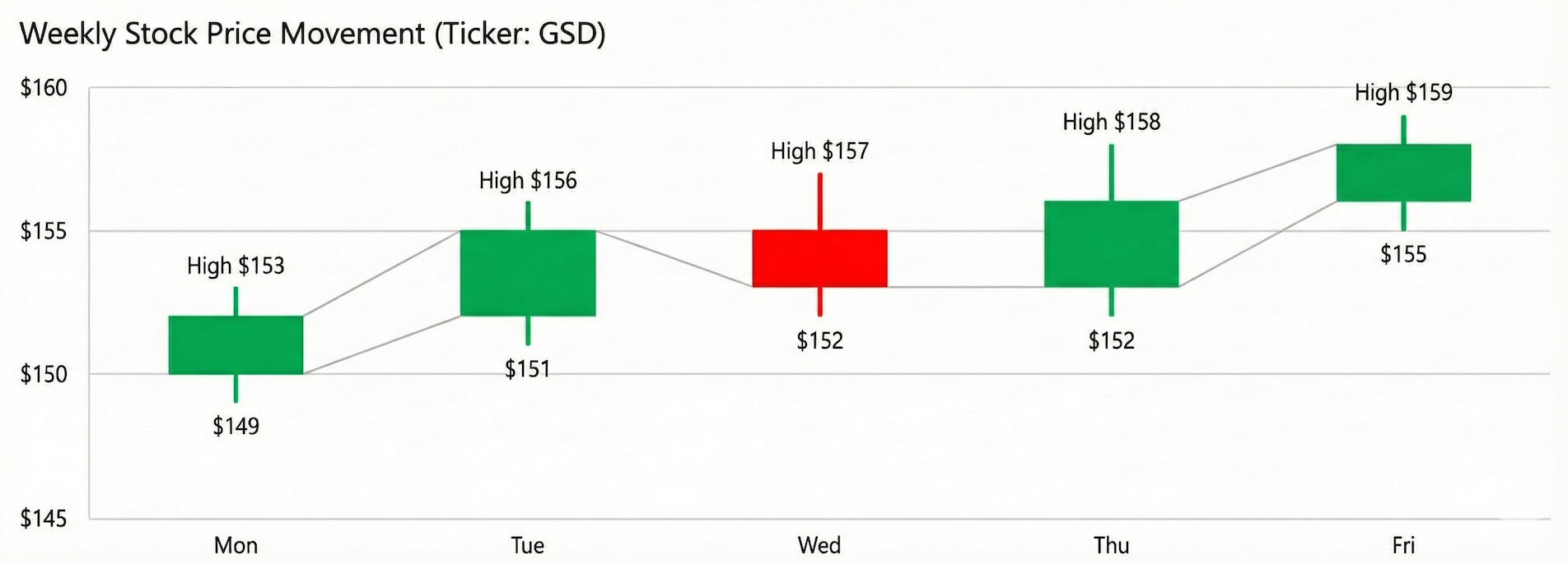
Let’s say you’re looking at a daily candle for a stock. If it opens at $100 and closes at $105, it’s a bullish candle. If it opens at $105 and closes at $100, it’s a bearish candle.
How time intervals change the story
The timeframe you choose for your chart drastically affects your interpretation.
Daily chart: Each candle represents one full day of trading. This is useful for analyzing medium-term trends.
Weekly chart: Each candle represents a full week. This smooths out daily noise and is excellent for identifying long-term trends.
Intraday chart (e.g., 1-hour, 15-minute, 1-minute): Each candle represents a shorter period within a single day. These are used by day traders to analyze short-term movements and volatility.
A strong uptrend on a daily chart might contain several smaller downtrends on a 15-minute chart. Context is key, a single bearish candle on a daily chart may not be significant if the weekly trend remains strongly bullish.
Visualizing volatility
Volatility is the degree of variation in an asset’s price. Candlestick charts make it easy to see.
Long candles: A long body with small wicks indicates strong, sustained momentum in one direction.
Short candles: A small body suggests little price movement and consolidation.
Long wicks: Long wicks relative to the body indicate that prices moved significantly during the period but were rejected, and the price closed far from its high or low. This signals indecision and a potential battle between buyers and sellers.
Types and variants of candlestick charts
While the standard candlestick is most common, a few variations offer different perspectives on price data.
Standard candlesticks: These are the classic charts we’ve discussed, using filled or hollow bodies (or color) to distinguish between bullish and bearish periods. They’re the industry standard for technical analysis.
Hollow vs filled candles: This is a classic color scheme. A hollow (white) candle is bullish (close > open), while a filled (black) candle is bearish (close < open). Modern platforms typically default to green for bullish and red for bearish, as these colors are more intuitive.
Heikin-Ashi charts: Heikin-Ashi means “average bar” in Japanese. These charts use a modified formula based on averaged price data to create candles. The goal is to smooth out market noise and make trends easier to identify. Heikin-Ashi candles don’t show the true open and close prices, so they’re best used for trend analysis rather than for spotting exact price levels.
OHLC charts: As mentioned earlier, these are the predecessors to candlestick charts. They display the same OHLC data but use lines instead of bodies. They’re less visually immediate but are still preferred by some traditional analysts.
Interpreting patterns and telling a story
Candlestick patterns are specific sequences of candles that can signal potential reversals or continuations of a trend. They provide a visual narrative of the struggle between buyers (bulls) and sellers (bears).
Here’s what’s important to remember: No single pattern is 100 percent accurate. They should be used as part of a broader analysis strategy, not as standalone trading signals.
Major reversal patterns
These patterns suggest that the current trend may be losing momentum and could be about to change direction.
Hammer and Hanging Man: The Hammer appears after a downtrend. It has a small body at the top and a long lower wick. It suggests that sellers pushed the price down, but buyers stepped in and drove it back up to close near the open. It’s a potential bullish reversal signal. The Hanging Man looks identical but appears after an uptrend, signaling a potential bearish reversal.
Shooting Star and Inverted Hammer: The Shooting Star appears after an uptrend. It has a small body at the bottom and a long upper wick. It indicates that buyers pushed the price up, but sellers took control and forced it back down. It’s a potential bearish reversal signal. The Inverted Hammer has the same shape but appears after a downtrend, suggesting a potential bullish reversal.
Engulfing patterns: A powerful two-candle pattern. A bullish Engulfing pattern occurs when a large bullish candle completely “engulfs” the body of the previous smaller bearish candle. A bearish Engulfing pattern is the opposite, with a large bearish candle engulfing the prior bullish one.
Major continuation patterns
These patterns suggest that the current trend is likely to continue after a brief pause.
Doji: A Doji is a candle with a very small or non-existent body, meaning the open and close prices are nearly identical. It represents indecision in the market. While often seen at turning points, a Doji within a strong trend can simply mean a temporary pause before the trend resumes.
Inside candles (or Harami): An inside candle is a small candle that forms entirely within the range of the previous, larger candle. It signals a decrease in volatility and consolidation. Traders watch for the price to “break out” above or below the range of the larger candle to signal the next move.
Rising and Falling Three Methods: These are five-candle patterns. The Rising Three Methods occurs in an uptrend, where a long bullish candle is followed by three small bearish candles that stay within its range, and then a final long bullish candle that closes above the first. It shows that sellers tried to reverse the trend but failed. The Falling Three Methods is the bearish equivalent.
Advanced multi-candle patterns
Morning Star and Evening Star: These are three-candle reversal patterns. The Morning Star (bullish) appears after a downtrend and consists of a large bearish candle, followed by a small-bodied candle (or Doji) that gaps lower, and then a large bullish candle that recovers at least half of the first candle’s body. The Evening Star (bearish) is the opposite and appears after an uptrend.
Three White Soldiers: Three consecutive long, bullish candles that close progressively higher. This strongly suggests a new or continuing uptrend.
Three Black Crows: Three consecutive long, bearish candles that close progressively lower. This confirms a strong downtrend.
Design best practices and common pitfalls
A poorly designed chart can be more misleading than helpful. Follow these practices to keep your candlestick charts clear, readable, and accurate.
Use a consistent color strategy: The most important rule is consistency. Choose one color for bullish (up) candles and another for bearish (down) candles and stick with them. Green for up and red for down is the universal standard and the easiest for most people to understand.
Avoid chart overload: It’s tempting to add dozens of technical indicators, trendlines, and oscillators to your chart. However, this often leads to “analysis paralysis.” Start with a clean chart and only add indicators that provide distinct, valuable information. A volume chart below the main price chart is a common and useful addition.
Make sure wicks and bodies are readable: The candles should be large enough to clearly distinguish the body from the wicks. If your chart is too compressed, you’ll lose the valuable information conveyed by their shapes. Adjust the zoom level so the recent price action is clearly visible.
Maintain consistent time intervals: Don’t mix different time intervals on the same chart. A chart should represent a consistent period (e.g., all daily candles or all 1-hour candles) to be meaningful.
Avoid misleading axes: Make sure your price axis (y-axis) isn’t truncated or manipulated in a way that exaggerates price movements. The axis should start from a logical baseline, though not necessarily zero, to keep movements in proper perspective.
Keep volatility in context: When analyzing a specific candle, always look at the surrounding candles. A long bearish candle after a series of small, indecisive candles tells a different story than a long bearish candle that occurs after a powerful uptrend.
How to create a candlestick chart
Most trading platforms and charting software make creating a candlestick chart simple. Here’s a step-by-step guide, with a focus on how you might do it in a tool like Excel.
Format your data: You need your data in four columns: Open, High, Low, and Close. You'll also need a column for the Date or Time. The order of the columns is important for most charting tools.
Select your data: In Excel, highlight all your data, including the headers (Date, Open, High, Low, Close).
Insert the chart: Go to the “Insert” tab. In the “Charts” section, look for the “Waterfall, Funnel, Stock, Surface, or Radar chart” icon. From the dropdown menu, select “Stock” and then choose the “Open-High-Low-Close” option. Excel will automatically generate a candlestick chart.
Customize the chart:
Colors: Excel may default to a basic color scheme. You can format the data series to set “up bars” (bullish) to green and “down bars” (bearish) to red for better readability.
Axis labels: Keep your axes clearly labeled (“Price” for the y-axis and “Date” for the x-axis).
Time range: You can filter your source data to display a specific time range on the chart.
Add volume bars (optional): If you have volume data, you can add it as a secondary chart. In Excel, you can create a “Volume-Open-High-Low-Close” chart, which combines a column chart for volume at the bottom with the candlestick chart on top.
Limitations and when to use an alternative
Candlestick charts are incredibly useful, but they have limitations. It’s crucial to know when they might be misleading.
Small time intervals: On tick charts or 1-second charts, the data can be too noisy, creating erratic patterns with little meaning.
Sparse data sets: For assets that trade rarely, you may see large gaps between candles, making trend analysis difficult.
Data without intraday variation: If your data only has a single price point per day, a line chart is the only option. Candlesticks require OHLC data.
Unfamiliar audiences: If you’re presenting to an audience that has never seen a candlestick chart, the information density can be overwhelming. In such cases, a simpler chart may communicate your point more effectively.
Alternatives to consider
Line chart: Best for showing a clean, long-term trend to a general audience.
OHLC chart: For analysts who prefer a more minimalist look but still need the four key price points.
Area chart: A line chart with the area below it filled in, useful for emphasizing the magnitude of a trend.
Conclusion and key takeaways
Candlestick charts provide an unparalleled view of market dynamics. By encoding the open, high, low, and close prices into an intuitive visual format, they allow analysts to quickly assess sentiment, momentum, and potential changes in trend.
Here are the key takeaways:
A candlestick’s body shows the open-to-close range, while its wicks show the high-low range.
Color instantly tells you if the price went up (bullish) or down (bearish) in that period.
Patterns like the Hammer, Engulfing, and Doji can signal shifts in market sentiment but should be used with other indicators for confirmation.
Always use clean, well-designed charts and choose a timeframe that matches your analysis goals.
By mastering the art of reading these charts, you can achieve a deeper understanding of market behavior. For those looking to build powerful, interactive financial visualizations, consider using a modern business intelligence platform. Tools like Domo allow you to connect to live data sources and create dynamic, shareable candlestick charts that bring your financial analysis to life.
Este sitio web utiliza cookies y tecnologías similares para analizar la actividad de los usuarios en la página web, personalizar su contenido, comprender sus interacciones con las comunicaciones de marketing de Domo y mostrar anuncios sobre nuestros productos en otros sitios y aplicaciones. Más información.