Se ahorraron cientos de horas de procesos manuales al predecir la audiencia de juegos al usar el motor de flujo de datos automatizado de Domo.
Ver el vídeo
Choosing a visual reporting tool means weighing trade-offs between ease of use, data connectivity, governance controls, and AI capabilities. This guide breaks down nine top platforms for 2026, compares their strengths and limitations, and provides a framework for matching tools to your team's technical skills and business requirements.
Here are the main points to keep in mind:
Visual reporting tools turn business insights loose from the disparate source systems where they have been trapped. These tools improve on the standard charts and graphs of Microsoft Excel and display data in more sophisticated, visually appealing ways through interactive dashboards, geographical maps, heat maps, dials and gauges, pie charts, and more.
The purpose? Enable people (regardless of their technical skill) to make sound decisions backed by data. Visual reporting helps people understand what is happening in the business without spending hours interpreting spreadsheets or complex data charts.
Consider someone seeking to understand a recent security incident. Raw event logs or spreadsheet data won't tell the story. Visual reporting tools make sense of that data by highlighting security gaps in building access codes or errors. Security managers can then take action more quickly, reducing the likelihood of additional vulnerabilities.
Visual reporting is the practice of presenting data through graphical formats (charts, dashboards, maps, and other visual elements) rather than raw numbers or text-heavy tables. A visual reporting tool is software that ingests data from various sources and organizes it into these graphical representations, making information more digestible and actionable.
These tools occupy a specific space in the data ecosystem. Understanding where they fit helps you choose the right solution:
The distinction matters. Choosing a tool designed for developers when you need accessibility for business people (or vice versa) leads to adoption problems and wasted investment.
Data without context is just noise.
Visual reporting tools provide that context by translating numbers into patterns, trends, and anomalies that the human brain can process quickly. The business case comes down to a few core benefits:
The visual reporting landscape includes several distinct categories, each suited to different organizational needs and technical environments.
Full-featured BI platforms like Domo, Tableau, Power BI, and Qlik offer comprehensive analytics capabilities that extend past basic visualization. These platforms distinguish themselves through semantic layer support (centralized metric definitions that ensure KPIs mean the same thing across every dashboard) along with certified dataset workflows and role-based access controls.
Enterprise BI platforms are the right choice when you need governed self-service: the ability for people on business teams to build their own dashboards within guardrails that IT or data teams set centrally.
Tools like Funnel and Adverity focus specifically on marketing data, with pre-built connectors to advertising platforms, social media, and marketing automation systems. These tools excel at aggregating campaign performance data and calculating marketing-specific metrics like return on ad spend and customer acquisition cost.
Choose marketing-focused tools when your primary need is consolidating data from dozens of marketing platforms rather than building enterprise-wide analytics infrastructure.
Simpler tools like Grow and Zoho Analytics serve organizations that need solid visualization capabilities without the complexity of a full BI platform. Faster implementation. Lower costs. Gentler learning curves.
They're the right fit for small to mid-sized businesses, teams with limited technical resources, or use cases where a full BI platform would be overkill.
With a myriad of visual reporting tools on the market, it can be difficult for organizations to know which tool will fulfill their unique needs. The following features separate capable tools from inadequate ones:
The most important feature of any visual reporting tool is its ability to connect to your data sources. Look for platforms that support your existing databases, cloud applications, spreadsheets, and business systems.
Beyond connector count, consider the integration architecture pattern that fits your environment:
And honestly, this is where teams trip up most often. They choose direct-query connections for the "real-time" appeal without accounting for the load this places on production databases. If your source systems are not built to handle concurrent dashboard queries, you'll end up with slow dashboards and frustrated database administrators.
Visualizing data is the core function of these tools. The more visualization options the platform offers, the more equipped you'll be to communicate different types of insights. Look for platforms that support a range of data visualization techniques such as data maps, pie charts, line graphs, Venn diagrams, heat maps, and gauges.
Interactive dashboards are particularly valuable. They enable people to view data from multiple perspectives, drill into details, and explore questions that arise during analysis.
AI capabilities have moved from nice-to-have to essential. Leading platforms now offer automated insights that surface anomalies and trends without manual analysis, natural language queries that let people ask questions in plain English, and predictive analytics that forecast future outcomes based on historical patterns.
However, AI-generated insights are only as reliable as the metric definitions they draw from. A tool without a governed semantic layer can produce plausible-sounding but inaccurate AI answers. If "revenue" is defined differently across departments, an AI answering "What drove the revenue spike in Q3?" might pull from the wrong definition entirely.
When evaluating AI features, ask these questions:
Platforms that are difficult to use or require significant technical skill to operate are less likely to be adopted by employees. Look for platforms that feature drag-and-drop reporting tools, as this enables anyone to create data reports with ease. The goal is self-service reporting: people on business teams should be able to answer their own questions without submitting tickets to the data team.
Governance determines whether your visual reporting investment creates a single source of truth or a sprawl of conflicting dashboards. Here are the core governance mechanisms to evaluate:
For smaller organizations, a minimum viable governance approach might include one person responsible for metric definitions, a documented list of approved data sources, and basic role-based access controls.
Team members should be able to communicate and collaborate with each other on data reports. Additionally, they should be able to share information, assign tasks, and resolve issues within the platform. Look for features like commenting, scheduled report distribution, and the ability to embed dashboards in other applications.
Whether you're new to data visualization or an experienced analyst, these platforms offer a range of tools that simplify complex data and encourage action. Below is a list of the top contenders in the field.
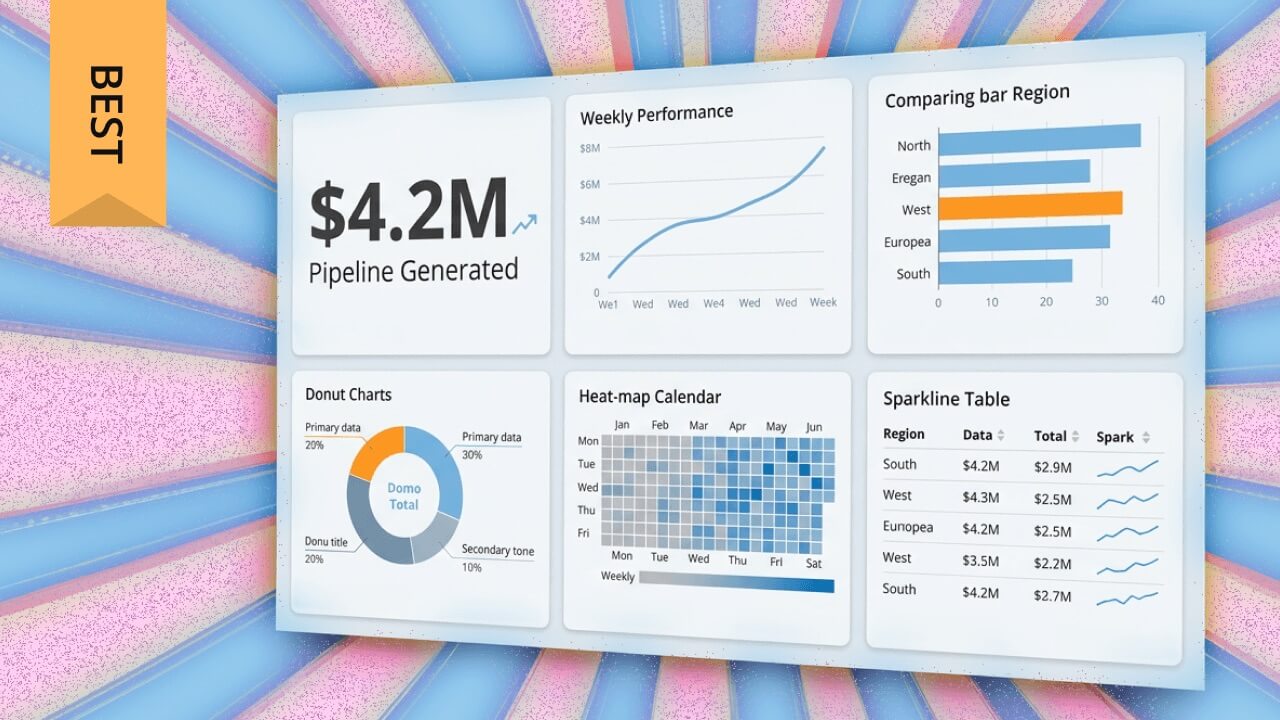
Domo has secured a position as a leading platform in data analytics, BI, and intelligent applications. The cloud-based software features a friendly interface that democratizes data and enables employees, no matter their technical background, to create stunning data visualizations. Using the arsenal of visual reporting tools, people can quickly create interactive dashboards, insightful reports, and more to drive decision-making and bolster business performance.
What sets Domo apart is its unified platform approach: data integration, visualization, AI-powered analysis, and governance controls all operate within one governed environment. This eliminates the tool sprawl and inconsistent metrics that plague organizations using separate solutions for each layer of their data stack.
The platform contains over 150 chart types where people can create live visualizations in minutes via drag-and-drop tools. With more than 1,000 pre-built connectors, Domo integrates with virtually any data source. AI agents and conversational analytics help surface insights automatically, while enterprise-grade governance ensures those insights are trustworthy.
Best for: Organizations seeking a unified platform that combines data integration, visualization, AI, and governance without requiring multiple tools.
Zoho Analytics is a cloud-based business intelligence platform that emphasizes visual reporting. The platform's interactive dashboards and reports enable people to easily explore and analyze data. Additionally, Zoho Analytics connects to numerous databases, cloud applications, spreadsheets, and social media sources.
The friendly interface makes it easy for people to access data and create stunning data dashboards. Zoho also connects to a myriad of data sources and centralizes it on the platform. People can then use drag-and-drop tools to build reports or dashboards.
Best for: Small to mid-sized businesses seeking affordable, accessible analytics without enterprise complexity.
Tableau is among the most popular business intelligence and data analytics tools. The solution enables people to collect data from multiple disparate sources and create collective datasets that can be shared with other people. The platform features a variety of data visualizations, from basic pie charts to detailed geospatial maps.
One of the key features of Tableau is the ability to create a narrative around data sets. People can map out data sources and create custom dashboards or reports to make data more accessible and digestible. The platform offers a number of visualization types, so people can pick the models that best meet their needs.
Best for: Advanced analysts and data teams focused on complex visualization and data storytelling.
Want a comparison of Domo and Tableau? Check out this article.
Microsoft has simple data visualization capabilities across its suite of business applications, but the real data visualization powerhouse is Power BI. As a BI platform, Power BI has many tools to help people transform raw data into meaningful insights and interactive reports. Power BI allows people to visualize data through customizable dashboards, providing both an at-a-glance and in-depth view into KPIs.
Power BI supports integration with a multitude of data sources, especially other Microsoft products. The platform's friendly interface and drag-and-drop functionality make it easy to create comprehensible visualizations and reports.
Where Power BI particularly shines is governance for Microsoft-centric organizations. Its shared semantic models allow data teams to define metrics once and publish them as certified datasets that people on business teams can build on without redefining calculations.
Best for: Organizations heavily invested in the Microsoft ecosystem seeking governed self-service analytics.
See how Domo and Power BI compare.
Qlik is an advanced data analytics and business intelligence platform tailored for data-driven decision-making. It was an early adopter of AI, integrating it into tools like Qlik Answers to help people quickly dive into the insights within their data. As people explore their data, Qlik provides a wide variety of data visualization options to help drive insights home. Qlik's visualization options give people a comprehensive view into key metrics, trends, and business performance. Qlik integrates relatively easily with a variety of data sources and can help data analysts present and share critical data points in an intuitive, organized manner.
Qlik touts its AI capabilities integrated throughout the end-to-end data management platform, with AI supporting ingestion and analysis. It has the capability to connect with over 100 data sources, including Structured Query Language (SQL) databases, cloud services like Amazon Web Services (AWS) and Google Cloud, and a variety of customer relationship management (CRM) systems. Qlik's associative data model enables people to explore data freely and discover relationships between data across different sources.
For governance, Qlik's Master Items library allows data teams to define approved dimensions and measures centrally, so people building dashboards always draw from governed, consistently defined metrics.
Pros:
Best for: Organizations prioritizing flexible data exploration and associative analysis across multiple data sources.
Check out this article on how Domo and Qlik fare in a head-to-head comparison.
Adverity is an end-to-end marketing solution that enables marketers to improve business performance with data-based decision making. The platform integrates and extracts data from various sources and garners it into clean, detailed reports. Adaptable templates and built-in dashboards enable people to share reports across the enterprise.
An advantage to using Adverity is the ability to choose between a no-code or low-code approach to data manipulation features.
Best for: Marketing teams needing to consolidate data from multiple advertising and marketing platforms.
Funnel is a marketing data platform designed specifically for marketers. The platform tracks marketing data and metrics across tools; it also creates comprehensive data dashboards. Dashboards provide an in-depth look into KPIs, ROI for advertising spend, and more. Funnel integrates with a number of popular marketing platforms, including Google Analytics and Moz, and combines data into an organized, insightful report.
Funnel has the ability to integrate with more than 500 marketing tools, including Google Data Studio, Google Ads, Google Search Console, and a number of other search engine optimization (SEO) tools. The platform's visual reporting tools automatically assemble the data into detailed reports regarding overall marketing performance. The platform also boasts a large learning center, enabling people to find answers to common questions.
Best for: Marketing teams needing to aggregate data from hundreds of marketing platforms into unified reports.
SAP Analytics Cloud enables people to discover, visualize, and use data to improve business intelligence. The platform's visual reporting tools offer powerful predictive analytics and design features that enable people to create complex analytical applications.
One of SAP's most notable features is its AI-powered suggestions. The platform enables people to quickly organize data and create plans based on AI predictions. This puts more data into decision-making processes, allowing people to more effectively address business needs. SAP Analytics Cloud also features customizable built-in templates for organizing business data in real time.
Best for: Organizations already using SAP systems seeking integrated analytics and predictive planning capabilities.
One of the few no-code visual reporting tools on the market, Grow enables people to delve deep into data without help from software engineers, IT, or SQL. Grow integrates with a number of sources, including spreadsheets, ad platforms, CRMs, social media, and more, and enables people to create easy-to-understand reports via drag-and-drop tools.
A highlight of the Grow platform is the ability to view multiple dashboards in a single location. This enables people to quickly make sense of various metrics, which strengthens decision-making. The wide training library provides an abundance of resources on how to maximize the platform's capabilities.
Pros:
Cons:
Best for: Small to mid-sized businesses seeking no-code analytics without technical dependencies.
The following table provides a quick comparison of the tools covered in this guide:
Feature and pricing information verified as of January 2026. Contact vendors for current pricing and capabilities.
Being aware of the rich landscape of visual reporting tools is critical for organizations wanting to enhance decision-making through data visualizations. Choosing the right tools for your business depends on your organization's specific goals and requirements.
Start by honestly assessing who will build and maintain dashboards. If your team includes data analysts comfortable with complex tools, platforms like Tableau or Qlik offer powerful capabilities. If people on business teams need to create their own reports without technical support, prioritize no-code tools like Grow or friendly platforms like Domo and Zoho Analytics.
A practical rule: if your team has fewer than 10 analysts and no dedicated data engineer, prioritize tools with strong out-of-the-box connectors and drag-and-drop interfaces over platforms that require significant configuration.
Map out every data source you need to connect. CRM, marketing platforms, databases, spreadsheets, cloud applications. Then verify that your shortlisted tools support those connections natively.
Consider your data volume and freshness requirements. If you need real-time dashboards, look for tools with live connection capabilities. If you're working with large datasets (over 1 TB) or need complex transformations, a warehouse-first approach may fit your needs more closely than tools that extract data into their own storage.
Organizations with compliance requirements (System and Organization Controls 2 (SOC 2), Health Insurance Portability and Accountability Act (HIPAA), General Data Protection Regulation (GDPR)) should evaluate governance controls before visualization features. Here's the question that actually matters: can people on business teams build their own dashboards within guardrails that IT or data teams set centrally?
Governed self-service is the difference between giving everyone a blank canvas (which leads to conflicting metrics and ungoverned data sprawl) and giving everyone a canvas with approved data sources, pre-defined metrics, and access controls already in place. Look for tools that offer semantic layers, certified datasets, and row-level security if governance is a priority.
Top visual reporting platforms such as Domo and Tableau feature easy-to-use data visualization tools that connect to data sources and empower people to transform data into actionable reports.
Knowing what your organization needs will ensure you select a platform that enhances data exploration and reporting. Domo stands out as that interface. With its friendly interface, customizable dashboards, vast library of data connectors, and AI-powered tools, Domo enables people to access, analyze, and report on data in a secure platform.
Domo transforms the way these companies manage business.


