Se ahorraron cientos de horas de procesos manuales al predecir la audiencia de juegos al usar el motor de flujo de datos automatizado de Domo.
Ver el vídeo

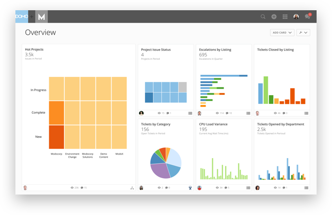
The humble graph remains one of the most essential parts of any business intelligence (BI) dashboard. The data it conveys should be accurate, visually appealing, and easy to understand.
Yet far too many dashboards feature uninspired, formulaic graphs that provide little to no value for the viewer. The graph should be an integral part of your BI dashboard design, not just an afterthought.
A good graph does not need to have high production value or be animated; rather it should display information clearly without any unnecessary bells and whistles. This guide will help you create better graphs for your BI dashboard by covering factors such as choosing the right metric, choosing the right graph type, and what to consider when designing your graphs.

Sometimes, the wrong graph type is chosen to effectively convey what needs to be seen.
For example, if you need to compare actual values against the budget or forecasted values, using a line graph will not effectively highlight differences between all of your data points. Instead, it may make more sense to use a bar or column graph since those will allow you to easily identify which data points are outliers.
Another common mistake is trying to convey too much information with a single graph. Instead, a dashboard should be created that features multiple graphs that each provide a specific set of insights.
For example, if you need to analyze the sales revenue for each region over time, it may be better to create a column chart that shows revenue by month (vertical axis), and by region (horizontal axis).
Even if you’re using the right graph type, too much information can cause data overload.
As an example, a pie chart is often used to show the breakdown of a single metric. In this situation, however, it’s typically more effective to use a line graph instead because you’ll get a better understanding of the changes in data points over time.
Finally, the most glaring issue with many BI dashboard graphs is that they don’t actually contain any relevant data. Again, this all comes back to choosing the right metric for your graph.
If you use a good metric (such as daily sales), but then present it against an annual timeline (which only has 365 days in it) then no insights will be drawn from it.
Knowing how to utilize graphs in your business intelligence software and reports will help you create better dashboards that provide real value to the viewer. Let’s take a look at some tips you can use to maximize the usefulness of your graphs.
The first step to designing better graphs involves selecting the right metrics to measure, which is why choosing the right metric is one of the key considerations when building a BI dashboard graph.
Some metrics are only suited to certain types of data, so if you want to compare actuals against your budget or forecast, you’ll need to choose a metric that measures them in the same way (e.g., the percentage difference between actual and target).
Other metrics may be more general in nature, making them suitable for use across different metrics types.
Regardless of what type of metric you choose, make sure it’s relevant to your dataset, otherwise it will be difficult to draw any meaningful insights from your dashboard.
When you choose the right metric, it will make it easier to create relevant charts and graphs for your BI dashboard. However, it’s still important to consider what other information needs to be conveyed through your dashboards.
For example, if you need to analyze revenue data by region, it may be better to show the actual revenue in a column chart and use a line graph to highlight any changes over time.
This will allow you to easily identify when a change in a region is due to an increase or decrease in sales, rather than being affected by other factors such as inflation or discounts.
In most cases, it’s best to use the simplest graph that provides all the information you need. If your dashboard is cluttered with complex graphs, it can make it more difficult for viewers to see what’s relevant and what isn’t.
A good rule of thumb is to avoid using any graph type unless there’s no other way to convey the information you want. It may be better to include additional text or visuals rather than use a graph that doesn’t provide the right amount of information.
When you want viewers to be able to draw their own conclusions, an interactive dashboard can help them do so.
For example, if you’re using multiple charts on your dashboards then you may want to include buttons that allow users to toggle between them. This can help viewers identify which correlations and anomalies they need to look into further, rather than having to go through every single one of them until they find the right ones.
When you’re comparing multiple metrics against each other, it’s important to use the right comparison type. If you want to compare actuals against a target, then you’ll need to use a line graph with markers that show where both metrics start and end.
This will allow viewers to quickly see how close either one is to its goal or if there have been any significant differences between them over time.
However, if you’re comparing actuals against a forecast then a bar or column chart may be better suited for this purpose. This will allow viewers to compare the forecasts with what was actually achieved and identify any potential problems before they become major issues down the line.
Choosing the right colors can make it easier for viewers to understand your graphs. For example, if you’re using different colors to represent positive and negative values then it’s important that the two colors are clearly distinct from each other.
If they aren’t then you’ll only be able to tell the difference between them once you’ve looked at the numbers next to your graph, which isn’t ideal if you need to quickly get a sense of the data.
When you include text in a graph, it can be difficult to read unless there’s sufficient contrast between the color of the text and the background. To ensure this doesn’t become an issue, outline or highlight your text so it stands out from the rest of the graph. This will make it easier to read.
When you have multiple graphs on your dashboard, the viewer may find it difficult to understand which colors represent which data unless they can easily see them all together in a legend.
It’s best practice to create a new section for this purpose, usually next to the graphs themselves. This will make it easier for viewers to quickly glance at your legend before they start looking at your data.
Dashboards are unique in that users can view several different metrics on a single page, so you may want to include filters so viewers can change what data is displayed without having to switch between different pages.
For example, if you have a product dashboard then viewers may want to filter by type of product or brand rather than having to go through each individual one.
Different types of data require different types of graphs, so it’s important for a designer to understand what options are available and which one is the most appropriate to use.
For example, if you’re looking at actual values against targets then a line graph with markers may be best because it will allow viewers to see exactly where your data started and finished.
This will make it easier for them to identify any significant changes in performance based on what happens during those periods of time.

Use dashboard graphs wisely to provide viewers with insights into their data quickly and easily.
Remember that you need to be able to effectively present any correlations or anomalies before the viewer has to look at every single graph individually, which isn’t practical if there are a lot of them on your dashboard.
When you know how to best present your data, you can give viewers the ability to quickly draw their own insights into any changes or similarities they see which may help them make better business decisions.
Domo transforms the way these companies manage business.


