Se ahorraron cientos de horas de procesos manuales al predecir la audiencia de juegos al usar el motor de flujo de datos automatizado de Domo.
Ver el vídeo

Creating a business analysis report requires five key steps: defining your business question, gathering quality data, structuring your findings, visualizing results, and delivering actionable recommendations. This guide covers each step in detail, along with templates for different report types, a quality checklist, and practical examples you can apply immediately. Whether you're building a performance snapshot for executives or a diagnostic deep dive for your operations team, you'll learn how to produce reports that drive decisions rather than collect dust.
Here are the main points to keep in mind:
A specific business question. That's what every business analysis report exists to answer. Unlike a financial report tracking transactions or a project status report monitoring progress, a business analysis report informs a decision.
That decision might be whether to enter a new market, why conversion rates dropped last quarter, or which vendor to select for a major contract. The report gathers relevant data, applies appropriate analysis methods, and presents findings in a way that helps stakeholders act.
Different business questions call for different report types. A status report tracks ongoing performance against targets. A feasibility report evaluates whether a proposed initiative is viable. A root-cause analysis investigates why something went wrong. Understanding which type you need before you start writing saves time and produces sharper results.
There are a variety of software packages available for business or personal use. Reporting tools provide you with more tools and features for manipulating data and formatting your reports.
Vendors offer software in both desktop and cloud-based options, which you can access from anywhere. Additionally, reporting tools can integrate with other software programs that your business uses on a daily basis, such as Salesforce or QuickBooks.
Businesses can create a wide range of reports to analyze key points in an organization and make informed decisions accordingly. This information includes revenue and expenses, profit margins, or customer trends.
Well-governed reports also build stakeholder trust by making data sources and assumptions transparent. When readers can see where the numbers came from and what assumptions underpin the analysis, they are more likely to act on the recommendations.
Analytical reporting delivers value that extends past the report itself:
Every business analysis report should include these foundational elements:
A diagnostic deep dive is typically requested by operations or product teams investigating a performance drop. They need to understand root causes before they can fix anything. An opportunity brief is more common in strategy or finance contexts, where the question is which initiative deserves investment. A performance snapshot (often delivered as an executive dashboard) keeps leadership informed without requiring them to dig into details, while a forecast helps finance and leadership plan for multiple possible futures.
Matching your report type to the decision at hand ensures you include the right sections and evidence.
Creating a business analysis report follows a predictable sequence. Each step builds on the previous one, and skipping steps usually means going back to fill gaps later.
Naming the artifact at each step helps you know when you're ready to move forward. Each step produces a specific artifact, from a problem statement in step one to a versioned report with feedback log in step five.
Most reports fail not because the analysis is wrong. They fail because they answer the wrong question or present findings to the wrong audience in the wrong format. The preparation phase determines whether your report will be useful or just another document that sits unread.
A clear business question is the foundation of every effective report. Vague questions produce vague reports.
Compare these two questions:
The second question specifies the metric (paid search conversion rate), the time period (Q3 vs Q2), the magnitude of change (12 percent decline), and the decision it will inform (Q4 strategy). That specificity separates a report that drives action from one that generates shrugs.
The artifact this step produces is a written problem statement. You know this step is complete when your problem statement can be answered with a specific data point or decision.
Different audiences need different levels of detail. Writing one report and hoping it works for everyone usually means it works for no one.
Consider these role-based format variants:
The metrics you choose should connect directly to your business question. Including every available metric dilutes focus and makes the report harder to act on.
When selecting KPIs, define the metric grain precisely. Is "revenue" gross or net? Daily average or monthly total? Does "churn rate" include voluntary cancellations only, or also involuntary (failed payments)? Document these definitions in the report itself so readers interpret the numbers correctly. Skipping this step is one of the fastest ways to undermine stakeholder trust. When two reports define "churn" differently, people stop believing either one.
First, you need to gather the data required for your report and put it in a workbook. For this example, consider the following data:
This information is only an example. You can include any number of rows and columns for your data analysis. The size of your table will depend on the kind of report you are trying to create.
For example, if you want to track sales revenue by region over time, there should be multiple column headings for Region 1-3 with one column heading per year (i.e., 2014, 2015, 2016).
The artifact this step produces is a baseline metrics log that records each data point, its source, the date it was pulled, and any known limitations. Before moving to formatting, run these data quality checks:
The modern business world is a world of big data. Depending on the goals of your report, the sources of your data can vary. For example, if you need to conduct a market analysis on your industry or a competitor, there are articles and research papers that you can use for data sources.
On the other hand, a simple financial report may only require information from internal management systems such as Salesforce or QuickBooks. These days, many people save their personal files on popular cloud-based storage services such as Google Drive and Dropbox.
One benefit of using reports for data development is the ability to connect to real-time databases that keep your information up-to-date. This option is great for organizations that need to monitor sales figures, manage projects, or conduct research studies.
For example, if you want information on the number of people currently subscribed to your email list, you can use an external database such as a customer relationship management (CRM) system which connects directly with your report.
When data lives in multiple disconnected systems, totals can conflict and stakeholders lose trust in the numbers. Pulling from a centralized, governed data source (where definitions are consistent and access is controlled) produces more credible reports than assembling data from scattered spreadsheets and exports.
The data in your report should be easy to read and understand. A well-designed report will present information that helps decision-makers visualize key points and statistics.
First, format your table so that all of your data is in one place, organized by country (Canada, Mexico, and the United States).
Next, calculate the annual revenue for each country. You can use aggregation functions such as 'SUM' or 'COUNT' for this.
As part of responsible formatting practice, document your data lineage and maintain version control. When a report is updated, log the previous version and the reason for the change. Even informally. This creates an audit trail that helps stakeholders understand how the analysis evolved.
Now that your data is easy to read, you can use your BI tool to calculate important figures such as averages, percentages, and growth rates. You'll need the following values to complete this step:
First, create a formula that calculates the percentage of growth for each country. Most software tools have a calculated field option that allows you to type in formulas similar to the ones you would traditionally use in Excel.
Here's a concrete example. To calculate percentage change between two periods:
Percentage Change = ((New Value - Old Value) / Old Value) × 100
If Canada's revenue grew from $5,000 to $6,000:
Percentage Change = (($6,000 - $5,000) / $5,000) × 100 = 20 percent
This tells you Canada's revenue increased by 20 percent. You can apply this same formula across all countries to create a comparison view.
Calculated fields let you derive new metrics from your raw data. Common calculations include:
Document your formulas so others can verify and replicate your calculations.
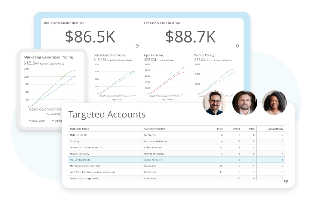
Formatting your report with charts and graphs is an easy way to visualize important data.
To this point, you've organized your data into one table that calculates values for you. By adding charts, you can highlight important numbers and make it easier for decision-makers to understand what the data is saying.
There are a variety of data visualization techniques you can utilize, each with its own unique purpose. Add a bar chart to visually display the percentage growth of each country and make it easier for readers to see which countries are performing well. At a quick glance, your readers can now understand which countries are growing more quickly by comparing the length of the bars.
To finish up the report, you can also add a second chart that displays each country's annual revenue over time with a line graph. This type of visual does a great job of depicting changes over time.
Once you have created your charts, organize them in a way that makes them visually appealing and easy to interpret at a glance. Try placing the most important charts at the top of the page, with the original report underneath to be used as supplemental information.
When a report will be shared digitally or via a BI tool, adding drill-down capability or audience-specific filters significantly improves how different stakeholders engage with the same underlying data.
Now that your report is complete, it's time to share it with colleagues or clients.
Treat reports as living documents. Update them as your business uses them so they can grow and evolve. Share with interested stakeholders, even if you feel it is not perfect. You can edit your report and add more information such as headings and changing the formatting of different elements. Modern reporting tools are very versatile and can provide many opportunities for tailoring your reports towards the needs of your audience.
When distributing your report, consider two practical questions:
Automated distribution options (scheduled email delivery, threshold-based alerts, or integration with communication tools like Slack) can help ensure stakeholders see updates without requiring manual follow-up.
A strong executive summary lets busy stakeholders understand your findings and recommendations without reading the full report. Use this structure:
Each field has minimum viable content requirements. The Recommendations field must include the specific action, the expected outcome, and the decision required from the reader. The Risks and assumptions field must list at least one assumption that, if proven wrong, would change the recommendation.
These practices separate reports that drive action from reports that get filed and forgotten:
Before you distribute your report, run through this quality checklist:
If you can answer yes to all ten questions, your report is ready to share.
At this point, you are prepared to try out a reporting tool and start building your first report. With some simple practice and advanced formulas, you can begin to build high-quality business intelligence reports and dashboards for nearly any business.
The difference between a report that sits in someone's inbox and a report that changes how a company operates comes down to clarity, structure, and actionable recommendations. Define your question precisely. Gather the right data. Present findings visually and end with specific recommendations that have owners and timelines. The goal is completeness without padding. Include everything stakeholders need to make a decision, and nothing they don't.
A structured document that uses data to evaluate performance or a specific business question, then recommends actions.
Purpose, 3–5 key findings (quantified), ranked recommendations with owners/ETAs, and known risks/assumptions.
Bars for ranking, lines for trends, waterfalls for change, funnels for conversion, and tables for precise values.
Domo transforms the way these companies manage business.


