Se ahorraron cientos de horas de procesos manuales al predecir la audiencia de juegos al usar el motor de flujo de datos automatizado de Domo.
Ver el vídeo
Dashboards deliver real-time visual snapshots for quick monitoring. Reports provide detailed historical analysis for compliance and deep exploration. Different tools, different jobs. This article covers the four types of dashboards (operational, strategic, analytical, and tactical), compares when each tool fits best, and offers practical tips for building dashboards that people actually use. Whether you need at-a-glance key performance indicator (KPI) tracking or comprehensive audit documentation, understanding these differences will sharpen your BI strategy.
Here are the main points to remember:
Reports and dashboards both play a central role in achieving the goals of business intelligence (BI) by transforming raw data into meaningful insights that support quick, informed decisions. BI is all about helping organizations understand their performance, identify trends, and uncover opportunities or risks.
One way to think about the difference is through how people consume each tool. You pull up dashboards when you need them. People log in to explore live data on their own schedule. Teams send reports on a schedule via email or PDF at regular intervals. This push vs pull distinction shapes when each tool fits best.
Reports and dashboards serve as the visual and analytical interface that connects people to this data, offering clarity, context, and direction. They enable decision-makers at all levels to access relevant insights through real-time business intelligence without needing to dig through spreadsheets or wait on analysts.
Together, they help organizations monitor key performance indicators (KPIs), track progress toward goals, and align teams around a shared understanding of business performance. The most effective BI strategies pair a scheduled KPI summary report with a linked live dashboard for deeper investigation. This hybrid approach gives stakeholders the routine updates they expect while providing a path to explore root causes when something looks off.
A report, in the context of data and business intelligence, is a structured presentation of data that organizes information in a clear, concise format to support analysis and decision-making. Reports typically compile data from various sources and display it in tables, charts, or written summaries. People often filter or group reports by specific parameters like time period, department, or geography. They can be static or support dynamic reporting, depending on whether they are generated at a fixed point in time or continuously updated with live data.
What sets reports apart is their design for reproducibility and auditability. Teams timestamp reports, make them traceable, and use them to support narrative commentary and methodology documentation. When someone needs to reference the same data weeks or months later (or when compliance requires a formal record of how numbers were calculated), reports deliver that level of rigor.
Reports translate raw data into digestible, actionable information tailored to the needs of different people. Executives might use high-level summary reports to monitor strategic KPIs, while analysts or managers might rely on detailed operational reports to guide daily decisions.
Whether used for financial analysis, sales tracking, customer behavior, or process efficiency, reports serve as a critical communication tool.
A dashboard is a visual interface that displays key metrics, trends, and performance indicators in a consolidated, easy-to-read format. For businesses serious about business intelligence, dashboards pull data from various sources and present it through charts, graphs, and tables to help people monitor real-time performance, track progress toward goals, and make informed decisions quickly.
You might hear dashboards called by other names depending on the organization or tool. Common synonyms include KPI board, metrics overview, executive summary view, or command center. A scorecard is a related but distinct artifact. Scorecards track performance against predefined targets using traffic-light indicators, while dashboards display live metrics that may or may not have explicit targets attached. Confusing the two can lead to mismatched expectations. If stakeholders expect target comparisons but receive a dashboard without thresholds, they won't know whether the numbers are good or bad.
Dashboards are often interactive, allowing people to filter, drill down, or explore specific data points for deeper insights. They're designed to provide a high-level overview of critical information at a glance, making them a powerful tool for executives, managers, and teams.
There are four main types of dashboards, each serving different purposes: operational, strategic, analytical, and tactical.
Not all dashboards serve the same purpose. The four main types each address different business needs, audiences, and time horizons. Choosing the right type ensures your dashboard delivers value rather than becoming another ignored tab.
Here's a quick reference for how each type differs:
Operational dashboards track real-time activities and day-to-day metrics that require immediate attention. Think of an IT team monitoring server uptime, a call center tracking queue volume, or a warehouse watching order fulfillment rates.
These dashboards refresh frequently (often every few minutes) relying on real-time data because the people using them need to act fast. Teams often pair operational dashboards with automated alerts that trigger when a metric crosses a threshold. If server uptime drops below 99.9 percent or call queue wait time exceeds three minutes, the dashboard can push a notification to Slack or email so someone can respond immediately.
Strategic dashboards give executives and senior leaders visibility into long-term performance against organizational goals. These dashboards focus on high-level KPIs like revenue growth, market share, customer acquisition cost, and profitability trends.
Because strategic decisions do not change by the hour, these dashboards typically refresh daily or weekly. The audience cares about trajectory and patterns over time rather than minute-by-minute fluctuations. A CEO reviewing quarterly performance or a board preparing for an investor meeting would rely on a strategic dashboard.
Analytical dashboards help people understand why something happened. Not just what happened. They're designed for exploration, allowing analysts to dig into data, test hypotheses, and identify root causes behind trends.
These dashboards support more complex interactions. People might filter by region, then drill down from a summary metric to see performance by product line, then drill through to a detailed transaction report. If conversion rates dropped last month, an analytical dashboard helps the marketing team identify which campaign, channel, or audience segment drove the decline.
The key interaction patterns include filters (narrow data by dimension), drill-down (move from summary to detail within the same visualization), and drill-through (click from one view to a linked report or separate dashboard page). A practical example: filter by region, then drill through to an account-level report showing individual transactions.
Tactical dashboards sit between operational and strategic. They focus on short-term team performance over days or weeks. A sales manager tracking weekly quota progress, a product team monitoring sprint velocity, or a support lead reviewing daily ticket resolution rates would all use tactical dashboards.
These dashboards refresh daily and help managers make adjustments before small problems become big ones.
Reports and dashboards are both vital tools in business intelligence, but they serve different purposes and cater to different people's needs. While reports are often more detailed and data-heavy, dashboards provide a high-level, visual snapshot of performance. And honestly, this is where most organizations get tripped up. They pick one tool when they needed the other, then wonder why nobody's using it.
Here's a comparison of key differences between reports and dashboards:
To make these differences concrete, consider how interactivity works in practice. With a dashboard, you might click a KPI tile showing revenue by region, then drill through to see the underlying account list. With a report, you receive a static PDF in your inbox that captures revenue by region as of a specific date, with written commentary explaining the numbers.
The delivery model difference matters for how teams work. Dashboards require people to log in and explore, which works well for data-literate teams who want to investigate on their own schedule. Reports arrive automatically, making them a good fit for busy stakeholders who need consistent updates without remembering to check a tool.
Auditability becomes critical in regulated environments. If a board member asks how revenue was calculated six months ago, a report provides a frozen snapshot with methodology notes.
Reports and dashboards are both essential tools in business intelligence, designed to help organizations understand and act on their data. While they serve slightly different purposes, they share several common features that support data-driven decision-making. Both provide access to structured data, enable performance tracking, and aim to translate raw information into meaningful insights that support data-driven decision-making.
More specifically, both BI dashboards and reports share these qualities:
You should use a dashboard instead of a report when you need a real-time, visual overview of key metrics to support quick monitoring and decision-making. Dashboards are ideal for situations where speed, clarity, and ongoing performance tracking matter more than deep, granular analysis.
A simple two-question test can help you decide. First, do you need to interact with the data, filter it, or drill into it? If yes, lean toward a dashboard. Second, does the audience need a frozen, time-stamped snapshot they can reference later? If yes, lean toward a report.
Use a dashboard when:
Dashboards are especially valuable in scenarios where real-time visibility, quick decision-making, and performance monitoring are essential. Unlike reports (which are typically more detailed and historical), dashboards provide a visual snapshot of key metrics that can be acted on immediately.
Here are several use cases where a dashboard is more useful than a report:
Sales managers use dashboards to monitor daily performance for different teams, regions, or products. With real-time data on deals closed, pipeline status, and quotas, they can quickly identify trends, spot underperformance, and adjust strategies on the fly.
Marketing teams rely on dashboards to keep an eye on website traffic, bounce rates, and conversion metrics throughout the day. This instant feedback helps them react quickly to campaign performance, user behavior, or technical issues like page errors or slow load times.
IT operations teams use dashboards to monitor server uptime, CPU usage, and application availability in real time. These dashboards alert teams to outages or anomalies so they can take immediate action.
Support teams benefit from dashboards that show ticket volume, resolution time, and customer satisfaction scores. Managers can see if there's a sudden spike in issues or delays in responses and reallocate resources as needed.
On the factory floor, dashboards display production line performance, defect rates, and equipment status. Real-time visuals help operators and supervisors make adjustments instantly to avoid costly delays or quality issues.
Marketing teams use dashboards to track real-time performance metrics like click-through rates, conversions, and ad spend across channels. This immediate visibility allows teams to make quick adjustments, allocate budgets more effectively, and optimize campaigns while they're still running.
You should use a report instead of a dashboard when you need to analyze detailed data, document historical trends, or share structured information for audits, reviews, or decision-making that requires deeper context. Reports are ideal when accuracy, completeness, and formality matter more than speed or real-time visibility.
In some situations, a report is not just preferred. It is required. Regulated industries like finance, healthcare, and legal need data that is reproducible and timestamped for compliance purposes. Board or investor reporting typically expects a frozen snapshot with methodology notes explaining how numbers were calculated. Any situation where the audience needs to reference the same data weeks or months later, without it having changed, calls for a report rather than a dashboard.
Use a report when:
Reports are particularly useful when you need a deep dive into data, require formal documentation, or need to share comprehensive insights with specific audiences. While dashboards excel at offering quick, visual overviews, reports provide the detailed context and structure needed for analysis, auditing, and long-term planning.
Below are several use cases where a report is more effective than a dashboard.
Executives and department leaders evaluating team performance over a full quarter need more than a snapshot. Historical data, trend analysis, detailed comparisons. A report offers structured narratives, tables, and performance breakdowns that support strategic review and future planning.
Organizations in regulated industries must document processes, transactions, and system activities for compliance purposes. Reports provide a formal, traceable format for storing and sharing this information, helping teams meet legal, regulatory, and audit requirements.
Finance teams often rely on reports to compare budgets against actuals, assess spending for different departments, and project future financial performance. These reports typically include detailed line items, variance explanations, and supporting data that go beyond the high-level summaries found in dashboards.
A report that compiles survey responses, feedback trends, and support ticket analysis gives customer experience teams the depth needed to understand underlying issues. This level of insight is essential for creating action plans, preparing presentations, and communicating findings to leadership.
When assessing operational performance (supply chain metrics, HR workflows, or service delivery timelines) teams benefit from reports that offer in-depth analysis. These reports can include multiple layers of data, segmented by variables like region, team, or time frame.
When presenting to board members or investors, detailed reports provide the transparency and structure needed to support strategic discussions. These reports often include financial summaries, operational performance, and long-term projections.
Creating dashboards that people actually use requires more than connecting data to charts. The best dashboards follow design principles that make information clear, actionable, and easy to scan. You'll notice that most of these come down to restraint, not complexity.
Here are practices that separate effective dashboards from cluttered ones:
One common anti-pattern is loading a dashboard with 20 or more KPIs because every stakeholder requested their favorite metric. The fix is to create role-specific views. An executive dashboard shows five to seven strategic KPIs. A manager dashboard shows eight to 10 operational metrics. An analyst view provides the full detail with all available drill-downs.
Dashboards and reports are both essential tools in the business intelligence toolbox. They simply serve different purposes. Dashboards shine when you need real-time, high-level insights to monitor performance and make fast decisions. They provide a visual representation of key metrics, allowing teams to assess situations at a glance. Reports are ideal for detailed analysis, historical documentation, and structured communication. They offer in-depth information that supports decision-making processes based on past data and trends.
You might also hear the term reporting dashboard, which describes a hybrid format that uses dashboard layout for periodic reporting. A reporting dashboard combines the visual clarity of a single-page KPI view with the scheduled delivery of a traditional report. This format works well for executive updates where stakeholders want a snapshot of key metrics without needing to log in and explore. When compliance documentation, methodology notes, or audit trails are required, a full report remains the right choice.
Understanding the strengths of each tool will help you apply the right one for the right task. The most successful organizations use dashboards and reports together to support a full range of BI needs.
From executive overviews to compliance documentation, both tools help translate data into decisions. By knowing when to use each, you can maximize the value of your data and empower every stakeholder with the information they need, when they need it.
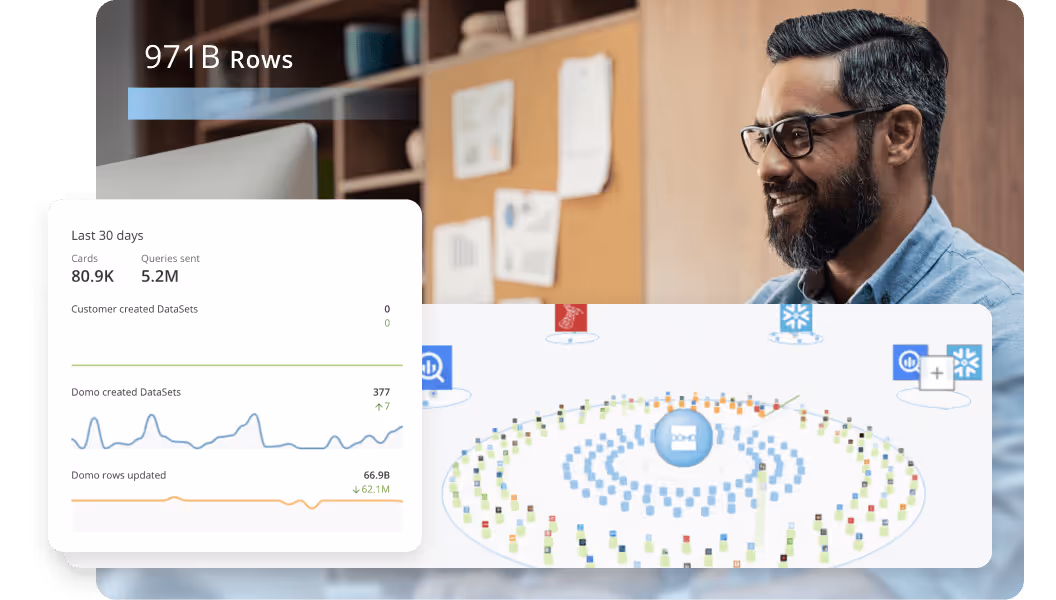
Domo supports both dashboards and reports in a single platform designed for speed, scale, and simplicity. Whether you're monitoring KPIs in real time, analyzing trends across departments, or distributing scheduled reports to leadership, Domo gives you the tools to keep analytics accessible, secure, and up to date.
With powerful visualizations, customizable reports, and data integration that actually works, Domo helps teams find insights quickly and make informed decisions at every level.Choosing the right tool starts with understanding your needs, and Domo makes it easy to build both.
Ready to bring all your dashboards, reports, and data together in one place? Explore how Domo can power your business intelligence strategy.
Domo transforms the way these companies manage business.