Únete al tour de IA y datos para recibir formación práctica, conocer historias reales de clientes y pasar tiempo con los expertos en productos de Domo cerca de ti.
Regístrate ahora
The gap between seeing data and knowing what to do with it is where good decisions stall. Mike Tong, senior solution engineer at Domo, built a set of tools that help close that gap, and he demoed them in a July 2026 livestream.
Mike started with the smallest possible first step, one that any team can copy without a huge project or a new roadmap. This guide walks through that step in detail. By the end, you will know how to build a single AI summary card that reads a dashboard, flags the metrics that matter, and recommends what to do next.
When Mike talks with customers about automated decisioning and agents, he often gets a blank stare and a polite "that's cool." When he shows a summary card instead, the response changes fast.
"Most customers say, 'Yes, let's get started with this.'" Mike said.
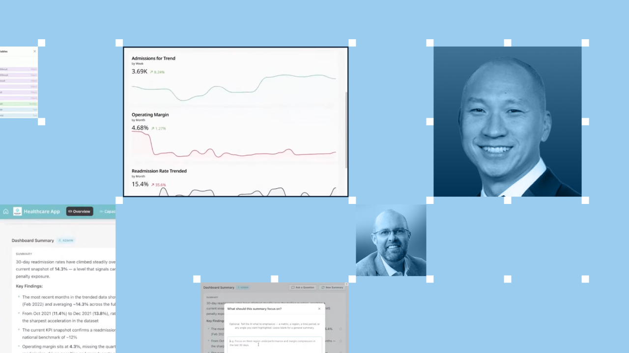
The card does three things the moment someone lands on a dashboard. It summarizes what the dashboard shows. It calls out the specific KPIs running over or under expectations, measured against the quarterly objectives the team has set. Then it recommends the next best actions.
So, people no longer stare at a blank chat box hoping they guess the right question. Instead, they start from a short briefing and ask smarter follow-ups from there.
To try this, start with a dashboard people already open and already care about. In the demo, Mike used a healthcare dashboard tracking readmission rates, but the same card adapts to sales, operations, finance, or any other view.
Before writing anything, get clear on who reads the dashboard and what decision they are trying to make. An executive scanning quarterly performance needs a different summary than a shift manager checking today's numbers. Naming that audience shapes every choice that follows.
The prompt is where you tell the AI what to pay attention to. Keep it specific, and tie it to goals people already track.
A strong prompt for a summary card usually covers three things:
Because the prompt lives on the back end, you can adjust it quickly and reuse the same card across different dashboards.
Domo is an AI orchestration and data platform, not a model provider, so the choice of model stays yours. On the back end, you select the large language model (LLM) you want the card to use, whether it is hosted by Domo or a model you already prefer.
That flexibility is helpful as your needs change. A team can swap models without rebuilding the card or touching the dashboard people see.
A summary is only as good as the context behind it, and this is where AI readiness comes in. Feed the card unstructured context alongside your governed data: internal procedures, knowledge-base articles, or reference material like medical codes.
"Once they get a bad answer back, it makes it really hard for them to be able to trust whether it's the data or AI," Mike said.
Giving the AI a data dictionary and supporting documents keeps answers accurate and specific, so people act on them instead of second-guessing them.
You don't need the summary to regenerate for every person who opens the dashboard. Set the initial summary to refresh only when the underlying data refreshes on the back end.
That single choice keeps the briefing current while holding down AI usage costs, since the card is not rerunning the same work for each viewer.
Once the summary is in place, it becomes a launchpad for exploration. If readmission rates are climbing, a reader can ask for a fresh summary focused on last quarter and get one generated on the spot. The summary gives people a starting point, so their follow-up questions get sharper instead of starting from zero.
This also plays well on mobile, where pinching and drilling into charts on a phone gets tedious. A short, readable summary that calls out what matters travels better in someone's pocket.
The summary card is a first step, not the finish line. The same governed context that powers a briefing can later trigger workflows, notify stakeholders, and support agentic solutions, with humans setting the objectives and staying in control the whole way. As Mike put it, data is power if you put it to action.
This walkthrough focused on building the card, but the livestream covered more. Mike also shared the story of a restaurant and hospitality chain running close to 150 franchises that wanted cashiers with lower average sales to get targeted upsell training, plus a deeper look at why getting data AI ready is the foundation everything else rests on.
If you are figuring out where AI fits into the way your team already works, the full conversation is the natural next step.






.jpeg)