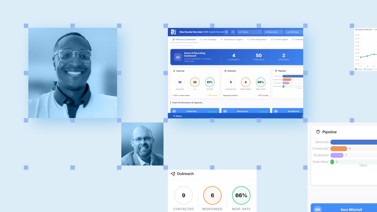
Únete al tour de IA y datos para recibir formación práctica, conocer historias reales de clientes y pasar tiempo con los expertos en productos de Domo cerca de ti.
Regístrate ahora
The week began with analyzing the profit of protein shakes.
In early March 2020, Ben Schein, then Domo’s VP of Data Curiosity, was onsite at Life Time Fitness, helping the company’s BI team work out the costs of goods for its shake bar. It’s the kind of unglamorous, uncelebrated but load-bearing analytics that BI is built from.
But by Friday, the plan had shifted from shakes to shutdowns and planning the fitness franchise’s abrupt closure due to the COVID pandemic.
Schein drove home certain of two things: The pandemic would be long. And, behind the fear and uncertainty lurked a data problem. Schein didn’t shy away from data problems. He had a reputation for wrangling unruly tables and spreadsheets into instruments of success. But now with a public health crisis of unknown severity, the stakes were no longer margins but mortality. He knew he needed a special team.
"We just started talking about, 'What are we learning? Where is this going? What can we do to analyze and communicate it better?'" said Chris Willis, Domo's Chief Design Officer.
Willis had spent his early career in the newsrooms of The Detroit News and The Dallas Morning News, and he brought a journalist's infographic discipline to the question of how to visualize COVID data clearly, but without sensationalizing it. Schein’s side of the table brought the data chops, and a working knowledge of how far the Domo platform could be stretched.
In the early days of the pandemic, accurate COVID data barely existed in any usable form. The American public health system wasn’t designed to capture and standardize data nationwide, and it showed.
“The world wasn’t ready to manage a pandemic at this scale,” said Laura Qualey, then an in-house Domo consultant contributing to the working group. “The infrastructure for reporting was just not there.”
Building data infrastructure was what Domo’s technology and people did best, though typically for businesses. But, the team thought, “data is data,” and they quickly wrote custom data integrations to pull together critical information scattered across media outlets and the public health websites of counties, cities, and countries. The Johns Hopkins University of Medicine, in particular, provided a strong data foundation for the Domo team to build on.
By March 8, the COVID tracker dashboard, updating in real time with interactive metrics, was live. Five days later, the US government declared a national emergency, and states began to shut down. By April 4, the tracker was getting 60,000 visitors a week.
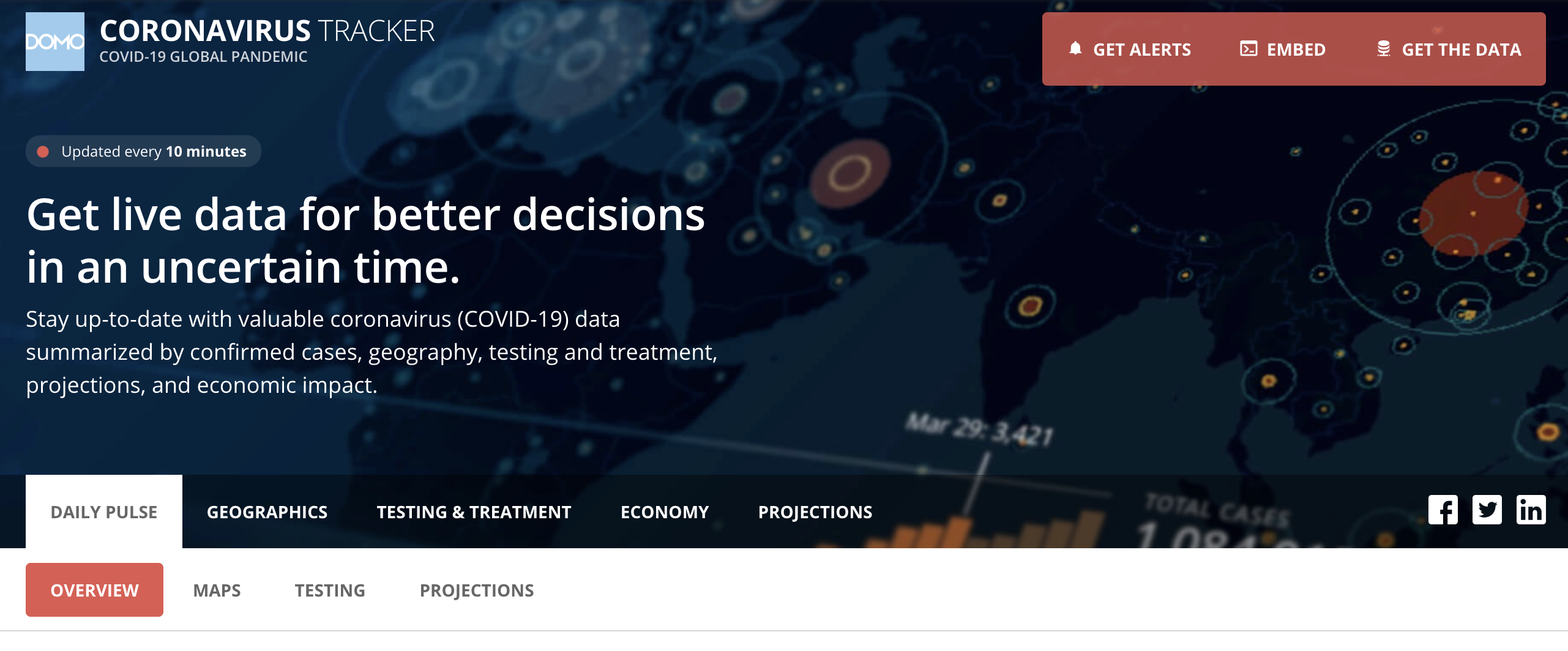
The tracker worked, but at first it was fragile. As Qualey put it, “Ben and I would be on the phone late at night troubleshooting a dataset that’s not running because the CDC changed a schema.”
But the world was watching closely. “We quickly found ourselves as one of the top resources in the world,” Willis said. If the tracker lagged its five- or 15-minute refresh, the calls, texts, and emails came in from around the globe.
That kind of attention can go to a team’s head. As a hedge against hubris, they renamed their group text “Armchair Epidemiologists,” meant to serve as a standing reminder of their place.
“We were constantly surprised how much attention the tracker was getting but also had to remind ourselves that we were just filling a data vacuum because we could…not because we were experts,” Willis said.
To do what Willis imagined, Devin LuBean and his team had to build things that didn’t exist. They needed multiple pro-code apps to talk to each other; they pushed the limits of what browsers themselves allowed. The workarounds didn’t stay workarounds for long.
“The Domo Bricks project, which became one of our most popular card types for several years, was a direct result of what we did with the COVID tracker,” said LuBean, who was then senior director of user experience. “And in a way, App Studio would not exist if we hadn’t been pushing the limits for the tracker. I don’t think it would have been greenlit as a project if we hadn't done so much bleeding-edge work.”
The tracker became the pitch for his product team, too. “You see this tracker? It’s powered by Domo, but we couldn’t build it with Domo tools," LuBean remembered telling executives. "We need a tool that will allow us to build something like this. Our customers need that."
As the pandemic unfolded, the team kept layering: PPE inventory, vaccination rollouts, shopping trends. They built a data connector so Domo customers could put COVID numbers next to their own business metrics and a campaign app that pushed localized reports to a person’s specific location. Over 700 Domo customer accounts, including Life Time Fitness, began using the COVID tracker data to better navigate the pandemic. Utah and Iowa even commissioned custom work.
In 2021, the tracker won a Webby, an award The New York Times has called “the internet’s highest honor.” In its lifetime, the tracker was visited 3.37 million times by almost 600,000 people.
At the same time, the tracker had become an excellent way to show Domo’s value. Schein’s team began pulling on that thread.
The idea that emerged was simple: Visualizing data the public actually cares about is both a public good and a useful way to show what Domo’s product can do. The Domo on Data blog was born.
On July 22, 2021, Jace McLean, then director of data insights, published the inaugural post “Welcome to Domo on Data”:
“Here at Domo we eat, sleep and breathe data. Combine a robust platform, large amounts of data through our connector library, the power to analyze it and some curious data nerds and you have Domo on Data.”
With it launched an Olympic Medal Tracker, built on a Kaggle dataset running from Athens 1896 through Rio 2016. This tracker was a simple interactive dashboard with filters for country, event, and year. Compared to the COVID tracker, the effort was modest, and mercifully less dire. Yet, it remains among the 10 most-visited posts the program ever published.
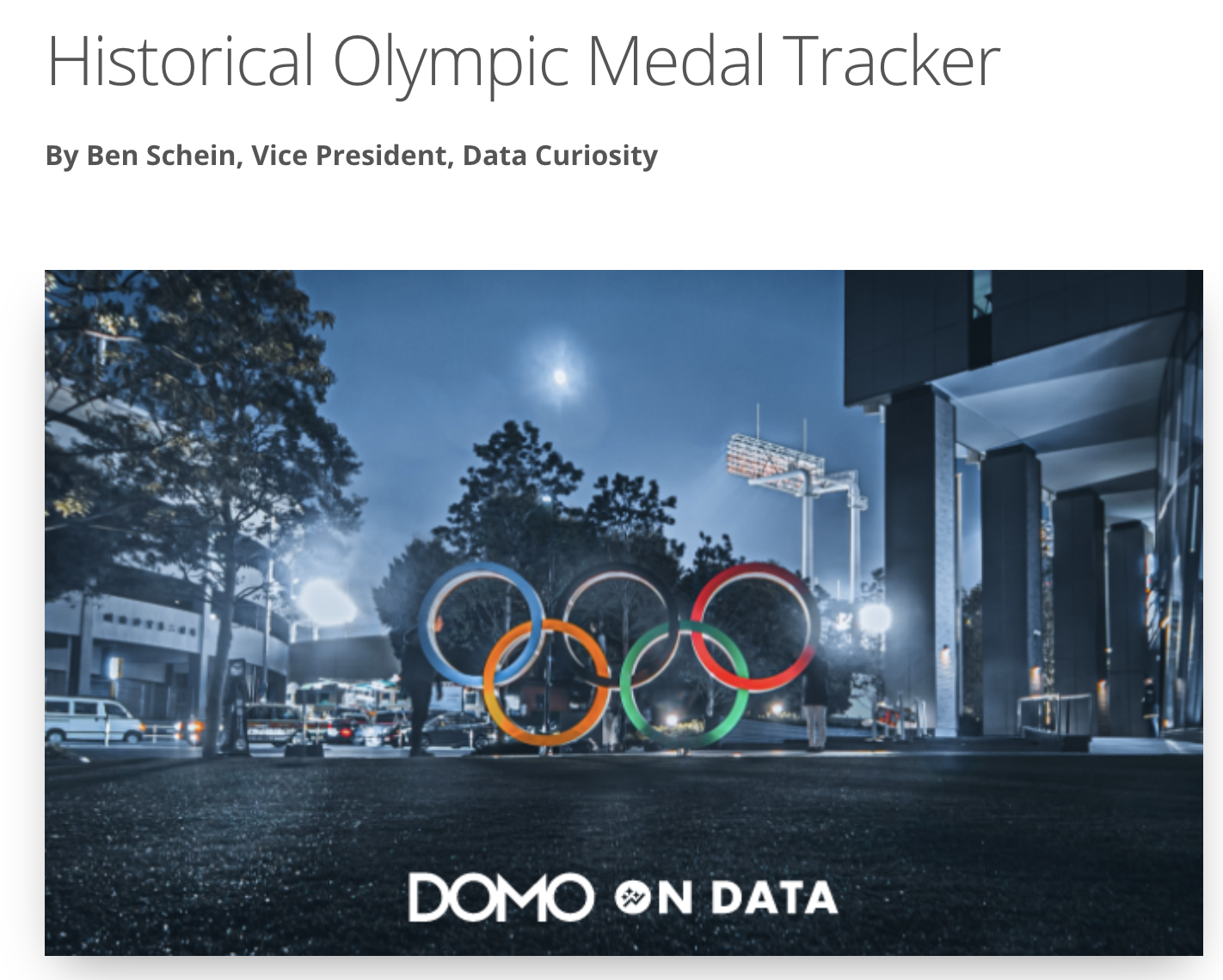
It also set the pattern for Domo on Data: Self-professed data nerds from across the company, visualizing whatever the world happened to be watching, with unique storytelling, as a way of showing what a powerful platform could do.
Over five years, Domo on Data published 80 data blogs spanning sports, the economy, entertainment, holidays, and the weather.
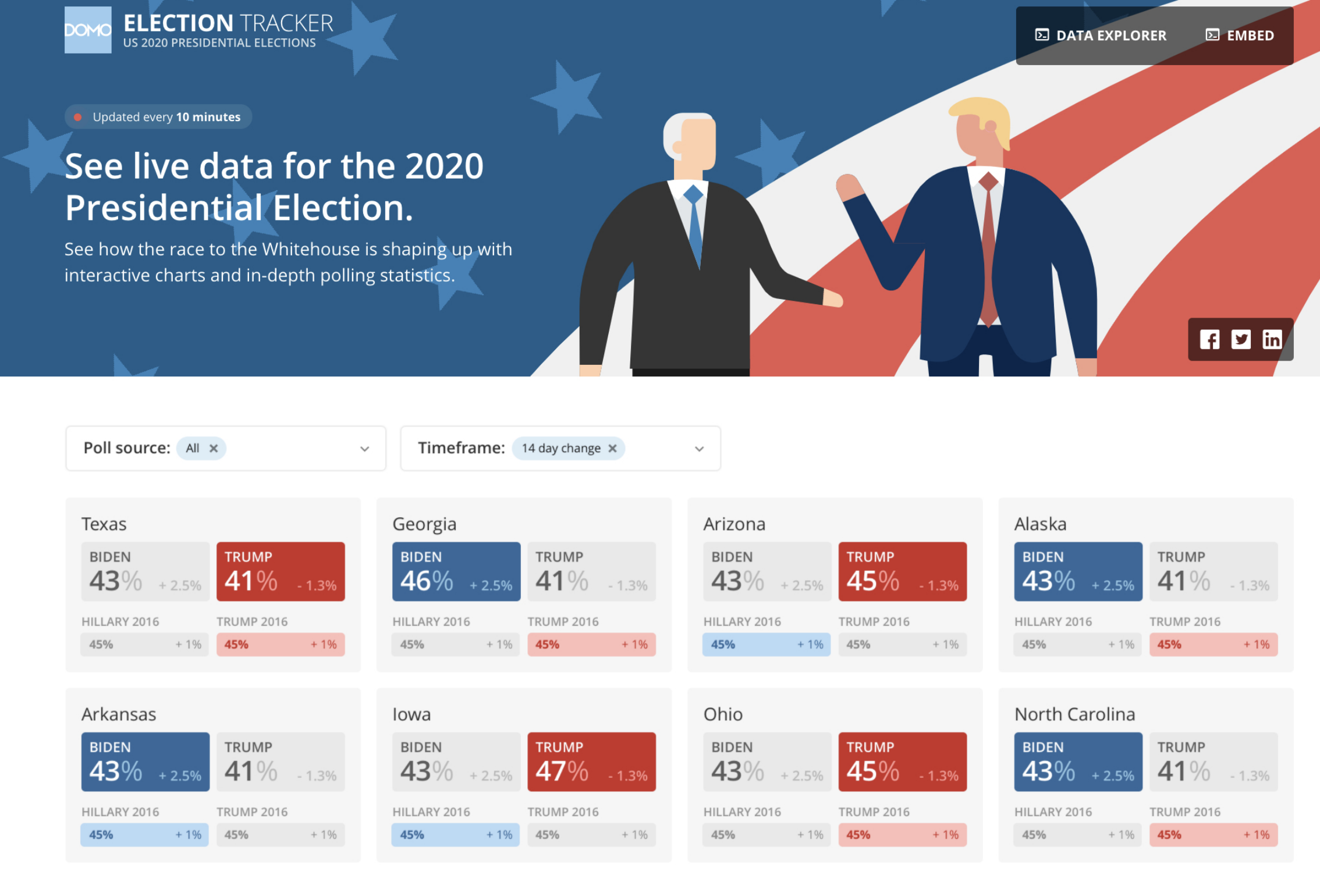
Everybody pitched in. Dan Hendriksen, then a general manager at Domo, wrote a Federal Reserve data connector so Schein could chart unemployment. LuBean built a custom app to publish US election data; in it, you can see the beginnings of today’s App Components.
“We realized small data is interesting, too,” said Schein, and coverage drifted, happily, from the weighty issues like elections and inflation towards Halloween costumes and Fat Bear Week, March Madness and the US Open, Stranger Things, and Wordle.
One of the most-visited posts in Domo on Data's history concerned Taylor Swift's first appearance at a Kansas City Chiefs game, where her now-husband, Travis Kelce, played tight end.
These posts drew close to 60,000 unique visitors, fellow data nerds, to Domo.com during Domo on Data’s five-year lifespan.
The program is ending in part because it worked. What Domo on Data did by hand in 2020 (find a dataset, prep it, join it to another, turn the result into an interactive app) is now something App Catalyst in Domo and Claude or other AI tools can do for anyone with a subscription.
And it’s a new chapter for Domo, which expects to be acquired by Progress Software soon. Our resident data nerds will serve the community better now by teaching and enabling rather than by publishing stories anyone can now assemble.
But Domo on Data left its marks. It pushed the product forward (apps and embedded technology in particular), and it changed how Schein and his team talked and thought about Domo.
“I often like to say we should be looking at ourselves in six months and be saying, ‘What idiots!’” said Schein. “I want us to always be working to be better and take the past success we've had and build on it.”
So, wherever you’re reading, raise a glass to Domo on Data. To the team who, in the first terrifying weeks of COVID, made sure the world could trust the numbers. To the team who carried the work forward and smuggled a few moments of delight into the sometimes-dire, sometimes-dull workdays of this decade’s first half.
Here’s to whatever comes next. May it be just as worth the late nights.







.jpeg)