You built the dashboards. You trained the users. They still send messages asking what the numbers mean. The problem was never the data. It was the last mile between a chart and an insight.
The Dashboard Insights AI Agent was created because a premium home goods retailer's analytics team had reached a breaking point. They had invested heavily in building comprehensive dashboards across their business intelligence platform. The dashboards were well-designed. The data was accurate. The visualizations were clear to anyone with analytics training. And yet the analytics team spent a significant portion of their time doing two things that had nothing to do with actual analysis: training users on how to interpret the dashboards, and fielding requests for specific data pulls that the dashboards already contained but that users could not find or interpret on their own. The bottleneck was not data availability. It was data comprehension at the point of consumption.
Benefits
This agent eliminates the comprehension gap between well-built dashboards and the business users who need insights from them but lack the training to extract those insights independently.
- Zero-training dashboard consumption: Business users see the key takeaways from any dashboard without needing to understand chart types, metric definitions, or analytical frameworks, because the agent translates the data into plain-language bullet points
- Analytics team liberation: The hours previously spent training users and answering interpretation questions are eliminated, freeing analysts for the investigative and strategic work that actually requires their expertise
- Consistent insight quality: Every dashboard consumer receives the same set of key takeaways regardless of their analytical sophistication, eliminating the variance in interpretation that occurs when different users draw different conclusions from the same visualization
- Increased dashboard adoption: Users who previously avoided dashboards because they found them overwhelming or confusing now engage with them regularly because the insight card removes the barrier to understanding
- Faster decision-making: Instead of scheduling a meeting with the analytics team to understand what a dashboard is telling them, business leaders can read 3-5 bullet points and act immediately
- Context-aware interpretation: The agent accounts for the dashboard's data dictionary and layout structure when generating insights, producing takeaways that reference the specific metrics and dimensions the dashboard was designed to communicate
Problem Addressed
There is a fundamental disconnect in how organizations think about data democratization. The assumption is that if you build good dashboards and make them accessible, people will use them to make better decisions. In practice, the investment in dashboard development creates a capability that only a fraction of the intended audience can fully utilize. The analytics team builds dashboards designed for people who think in metrics, dimensions, and variance ranges. The business users who are supposed to consume those dashboards think in questions: Are we on track this month? What should I worry about? Where should I focus my team? The translation between what the dashboard shows and what the business user needs to know happens either in the user's head, unreliably, or through a conversation with an analyst, expensively.
The cost of this disconnect is distributed and largely invisible. Every time a user opens a dashboard, spends two minutes trying to interpret it, gives up, and sends a message to the analytics team, the organization pays twice: the user does not get the insight when they need it, and the analyst loses focus to answer a question the dashboard was supposed to answer. Multiply this across hundreds of dashboard consumers and dozens of dashboards, and the analytics team becomes a help desk for data comprehension rather than a strategic function driving business intelligence. The solution is not better dashboards or more training. It is an intelligent layer that reads the dashboard the way an analyst would and communicates the takeaways the way a business user needs to receive them.
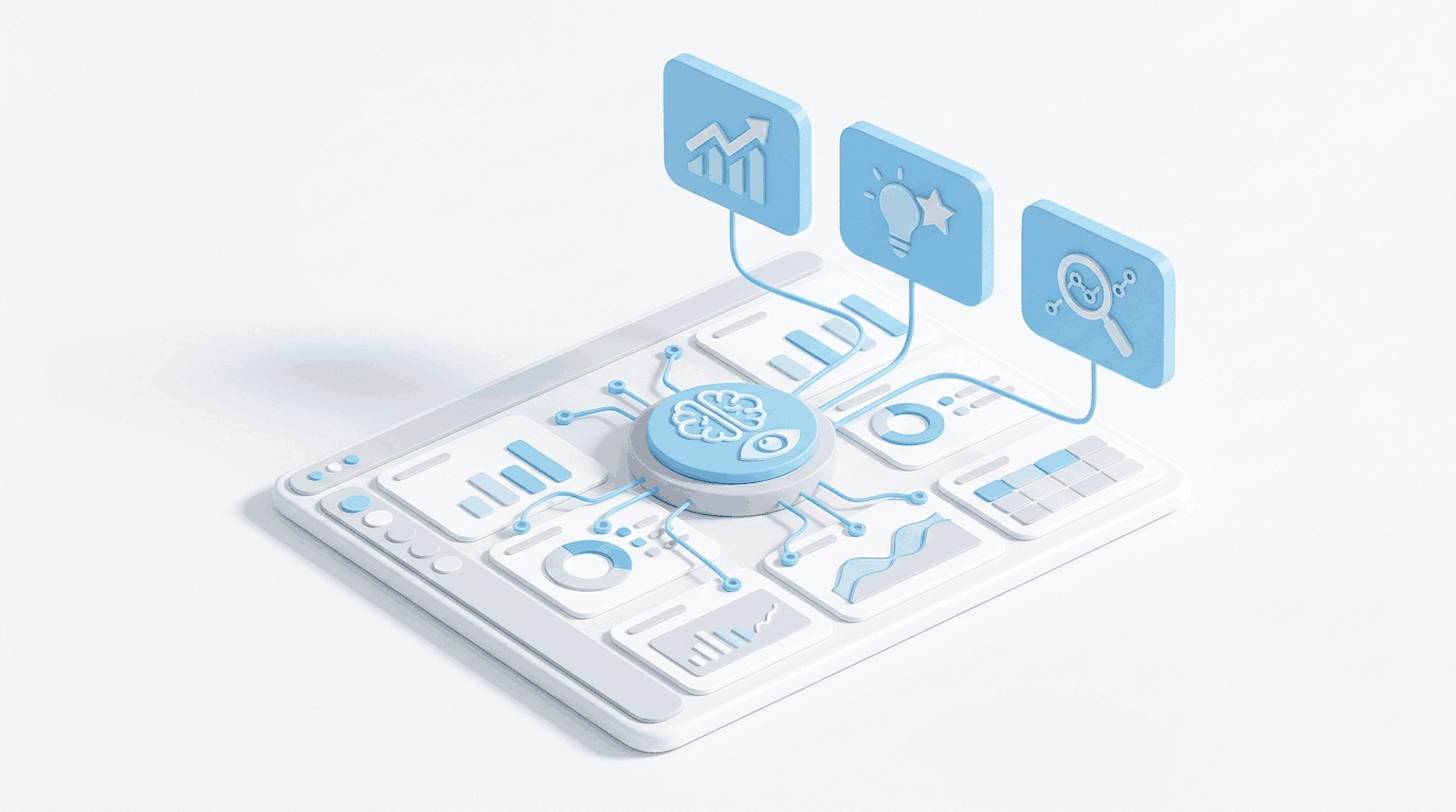
What the Agent Does
The agent operates as an interpretive intelligence layer that sits directly on dashboard pages, analyzing the underlying data in context and producing consumable insight summaries:
- Dashboard context analysis: Reads the dashboard's data dictionary, layout structure, metric definitions, and dimensional hierarchy to understand what the dashboard was designed to communicate and what constitutes a meaningful finding
- Automated data interpretation: Analyzes the current data across all visualizations on the page, identifying the trends, anomalies, comparisons, and status indicators that an experienced analyst would highlight when walking a colleague through the dashboard
- Key takeaway generation: Produces 3-5 plain-language bullet points that communicate the most important insights from the current data, prioritized by business impact and relevance to the dashboard's intended purpose
- Insight card rendering: Displays the generated takeaways as a card positioned prominently on the dashboard page, ensuring users see the interpretation before diving into the underlying visualizations
- Dynamic refresh: Updates the insight summary as the underlying data changes, so the takeaways always reflect the current state rather than becoming stale descriptions of data the user cannot see anymore
- Contextual metric referencing: Each takeaway bullet references the specific metrics, time periods, and comparisons that support the insight, providing enough context for users who want to verify the finding in the underlying charts
Standout Features
- Layout-aware intelligence: The agent does not just analyze data in isolation. It reads the dashboard's structural context, understanding which metrics are grouped together, what comparisons the layout implies, and which visualizations are designed to be read in sequence
- Business language output: Takeaways are written in the language business users speak, not in the language analysts think. Revenue is 8% below target this month, driven primarily by the West region rather than technical analytical jargon that requires additional interpretation
- Anomaly prioritization: When multiple insights compete for the 3-5 takeaway slots, the agent prioritizes anomalies, exceptions, and action-requiring items over confirmatory observations, ensuring users see what needs attention rather than what is running as expected
- Zero-integration deployment: The insight card sits on top of existing dashboards without requiring any modification to the underlying data models, visualizations, or page structures, making deployment a configuration step rather than a rebuild
Who This Agent Is For
This agent is built for organizations that have invested in dashboard infrastructure but find that the gap between data availability and data comprehension is undermining the return on that investment.
- Analytics teams that spend more time explaining dashboards than building new analytical capabilities and need to redirect their capacity toward strategic work
- Business leaders who need to understand performance status quickly from dashboards without scheduling time with an analyst to walk them through the data
- Operations managers across distributed organizations who access dashboards daily but lack the analytical training to consistently identify the most important signals
- Organizations with large dashboard consumer populations where the ratio of users to analysts makes one-on-one data interpretation unsustainable
Ideal for: Retail enterprises, financial services firms, healthcare systems, manufacturing organizations, and any company with a large non-technical dashboard audience where the analytics team has become a bottleneck for data comprehension rather than a driver of data strategy.