This release includes several enhancements to charts in Domo that make it easier for you to deliver clear, effective visual analytics customized to your specific needs.
- Dynamic story widths. With a new “auto-width” option for stories, you can automatically expand your Domo Story to fit the size of whatever window you are using to view Domo. This means more columns can be visible in your tables, busy charts are easier to consume, and all that space at the edges of your dashboard can be put to use.
- Divergent colors. Quickly create and display range distributions by combining multiple color themes. You can pick any starting color and any ending color. In addition, you can pick the number of ranges to use. Divergent colors also provides you control of your midpoint. You can select the midpoint value and color; or, exclude the midpoint. Divergent colors add this flexibility to maps, calendars and heatmaps.
- New custom import types. In addition to SVG custom maps, Domo now supports the following additional custom map import types:
- KML: A file format used to display geographic data in an Earth browser such as Google Earth.
- GeoJSON: a file format used to display geographic data in an Earth browser such as Google Earth.
- TopoJSON: An extension of GeoJSON that encodes geospatial topology and that typically provides smaller file sizes.
- Refined Trellis charts. You can now select the number of values you want displayed in each category on your Trellis chart; for example, showing the top two sales performers per region. This option is available in the chart properties.
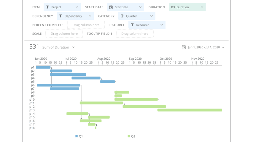
- Dependency Gantt chart. The new Dependency Gantt chart provides more options to simplify date calculations and show more relationships in projects, including calculating end dates from dependency and duration data, showing dependency data relationships, displaying milestones, and more. This new Gantt chart doesn't replace our current Gantt charts. To take advantage of these new Gantt chart features, select the Dependency Gantt chart type in Analyzer.
- Week view in calendar charts. Now you can see your calendar data in a weekly format. Choose a calendar card and select the week view to easily browse your data week-by-week or to see weekly data patterns. The automatic color banding gives you helpful visual clues for easy analysis.
- Color ranges in progress bar charts. Now you can customize your progress bar charts to draw attention to the important changes in your data with our new support for color ranges in your progress bar charts.


.png)