Vous avez économisé des centaines d'heures de processus manuels lors de la prévision de l'audience d'un jeu à l'aide du moteur de flux de données automatisé de Domo.
Regardez la vidéo
Domo customers are always looking for new ways to visualize, analyze, and draw insights from their data. To meet those needs, Domo has developed three new chart types, making it easier than ever to present your data in intuitive and actionable ways:
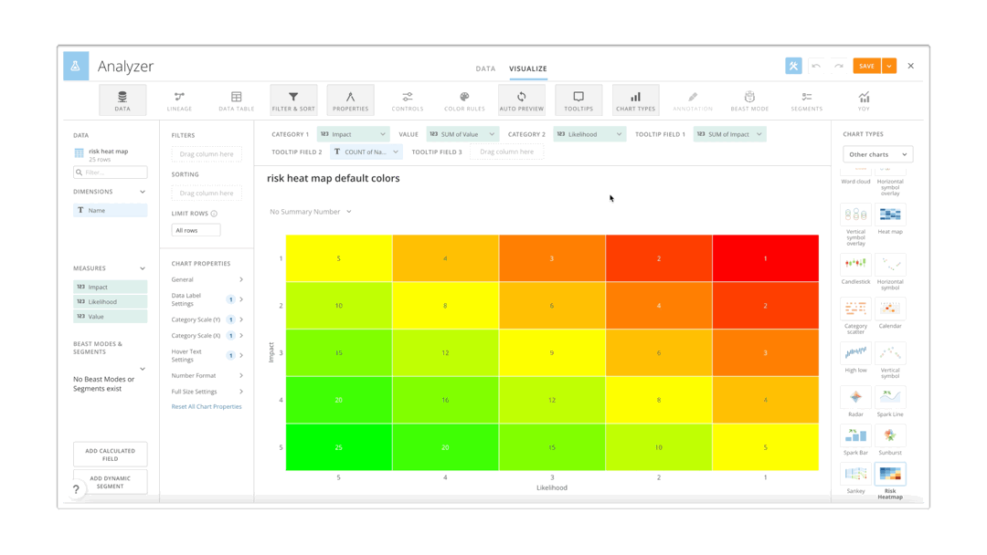
Risk Heat Map
Customers can now see the results of a risk assessment process in a concise and visually clear way with the new Risk Heat Map Chart. This makes it clear to see the likelihood and potential impacts of identified risks, allowing users to make more informed and strategic decisions based on their data.
Bump Chart
With the new Bump Chart, users can see changes in rank over time. This allows them to focus on the change in rank more than the numeric changes in values, making it easier to track trends and see the whole picture.
Facet Bar Chart
The Facet Bar Chart makes it easy to break down relative performance by facet. Users can choose a horizontal or a vertical view to compare data with many variables. In the example above, a stacked bar chart is broken down to make it easy to see how each segment is performing in each state. Facet Bar Charts can be found in Analyzer as subsets of Vertica and Horizontal Bar charts.

Domo transforms the way these companies manage business.


.png)