Vous avez économisé des centaines d'heures de processus manuels lors de la prévision de l'audience d'un jeu à l'aide du moteur de flux de données automatisé de Domo.
Regardez la vidéo

If your X values aren't evenly spaced, a standard line chart can quietly mislead you. An XY line chart keeps the spacing proportional to the numbers, so the timeline (or scale) stays honest. This article explains the difference, walks through data requirements and Excel setup, and covers styling best practices to help you choose the right chart for your data.
An XY line chart is picky in a good way. If the data isn't clean and consistently defined, the chart can look right while subtly telling the wrong story.
Before you build, make sure the dataset meets these basics:
This is where governed datasets and a semantic layer help in practice. When your metric logic is defined once (and reused everywhere), your XY line chart trend stays consistent across dashboards and teams.
If your X values are uneven (or truly numeric, like dosage or deal size), an XY line chart keeps the spacing honest.
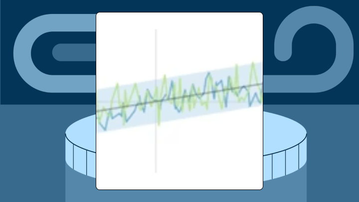
An XY line chart plots data points using two numeric axes and connects them with lines. Both the horizontal (X) and vertical (Y) axes represent continuous values. The chart spaces points proportionally based on their actual numeric positions, not their order in a spreadsheet.
Here's the key difference: a standard line chart treats the X-axis as categorical, so points are evenly spaced no matter what the values are. An XY line chart preserves the true distance between values. Data points at X = 1, X = 2, and X = 10? The gap between the second and third points will appear much larger than the gap between the first two. That visual honesty changes everything about how viewers interpret your trend.
In Excel, you will find this chart type under the Scatter menu as "Scatter with Straight Lines." The name trips people up because it lives with scatter plots rather than line charts, but the connected lines distinguish it from a pure scatter plot.
You need this chart when your X values are numeric and unevenly spaced. The proportional spacing tells the true story of your data.
Several scenarios call specifically for this visualization:
If your X values are dates at regular intervals (daily, weekly, monthly), a standard line chart works fine. Simpler. Avoids unnecessary axis scaling complexity.
Connecting points with lines implies continuity. If your data represents independent observations with no meaningful sequence, those lines will mislead viewers. A scatter plot without lines handles correlation analysis better when order doesn't matter.
Viewers naturally assume the slope between two points represents a rate of change. They make this assumption even when intermediate values were never measured. Large gaps in your data can create false impressions of smooth transitions that never occurred. And honestly, this is the part most visualization guides skip over entirely.
Sometimes your data structure requires a different approach:
Excel's standard Line Chart option treats your first column as categories. To get true XY behavior, you need the Scatter chart type.
Arrange your data with X values in the first column and Y values in the second. For multiple series, add additional Y columns. Your X values must be formatted as numbers or dates, not text. Text formatting forces Excel to treat them as categories, which defeats the entire purpose.
If you're pulling data from multiple source systems, do a quick sanity check that each column uses the same units and definition (seconds vs milliseconds, dollars vs thousands, and so on). Otherwise you get a confident-looking line that's confidently wrong. Poor data quality is expensive. Gartner estimates it costs organizations $12.9 million per year, which is a good reason to spend a few minutes validating chart inputs.
Excel plots your X values proportionally along the horizontal axis.
Right-click the X-axis and select Format Axis. Adjust the bounds if the default range compresses your data. For data spanning several orders of magnitude, a logarithmic scale might help. Only if your audience understands log interpretation, though.
Hover over a few data points to confirm the X and Y values match your source. If the X-axis shows 1, 2, 3, 4 instead of your actual values, Excel interpreted your X column as categories. Reformat the column as Number and reinsert using the Scatter chart type.
One issue catches people off guard: lines connecting points in a chaotic zigzag pattern. This happens when your data isn't sorted by the X column. Sort from smallest to largest before charting.
Excel works for basic analysis, but scatter charts still take manual setup for things like smoothing choices, consistent formatting, and dual-axis layouts.
Thicker lines improve visibility in presentations but obscure detail when points cluster. Markers help viewers locate exact data points but add noise with dense data. For datasets exceeding a few dozen points, consider hiding markers or reducing their size.
A logarithmic scale compresses large ranges but requires viewers to interpret multiplicative differences. Use log scales only when your audience is comfortable with them and when data spans multiple orders of magnitude. Linear scales are the safer default.
Applying a log scale to data that includes zero or negative values produces errors or misleading results (logarithms of non-positive numbers are undefined). I've seen dashboards go live with this problem more times than I'd like to admit.
In BI tools, tooltips surface exact values on hover. Static exports (PDF, PNG) lose this context. Add data labels selectively or include a reference table alongside the chart for printed reports.
If stakeholders are asking for "the same chart, but filtered to my region, and also last quarter," interactivity matters. Filters, drill-down, and mobile-ready dashboards reduce the cycle of rebuilding charts for every new question.
A monitoring system records response times whenever a threshold is breached. Breaches cluster during a deployment window. An XY line chart shows the cluster compressed into a short span on the X-axis, making the incident obvious. A standard line chart would space points evenly, hiding that most events happened within minutes.
A researcher tests drug concentrations at 0.1, 0.5, 1, 5, and 10 mg/mL. The XY line chart positions these proportionally, showing the response curve flattens above 1 mg/mL. A standard line chart would suggest equal jumps between each dosage, misrepresenting the relationship.
A sales team plots close rate against deal value, ranging from $5K to $500K. The XY line chart reveals close rates drop sharply above $100K. A bar chart grouped by arbitrary buckets would require choosing bucket boundaries, potentially hiding the threshold. You'll notice this is the kind of insight that gets buried when someone insists on simplifying the visualization.
Using a standard line chart for numeric X values produces a chart that renders but spaces everything wrong. The fix: use Scatter with Lines in Excel or specify a numeric X-axis in your charting tool.
Connecting points when sequence is meaningless creates false implications. Lines suggest continuity. If your data represents independent observations, use a scatter plot without lines.
Large gaps can still imply interpolation. If you have gaps, break the line or emphasize markers so people can see what was actually measured.
Overloading with multiple series turns your chart into a tangled mess. More than four or five lines becomes difficult to read. Split into small multiples or use interactive filtering to isolate comparisons.
Metric drift is sneakier. If "conversion rate" is calculated one way in a marketing dashboard and a different way in an executive readout, people stop trusting the trend line. Then they stop trusting the dashboard.
The XY line chart assumes sequence matters. For purely correlational analysis, the lines add noise. A scatter plot without lines lets viewers focus on clustering and outliers.
When X values are categorical or uniformly spaced, proportional spacing adds no value and may confuse viewers expecting equal intervals.
Extreme outliers can break the visualization by forcing the axis scale to compress everything else. If one point sits far outside the normal range, meaningful variations in your primary cluster flatten into a nearly straight line. There's no elegant solution here, just tradeoffs between excluding outliers (which feels dishonest) and including them (which obscures the rest of your data).
Excel is great for quick, one-off charts, but manual formatting and static exports can slow teams down when dashboards need to refresh or scale across departments. Domo connects to your data sources, updates charts automatically, and lets stakeholders interact with visualizations without waiting for an analyst to rebuild the file.
If your day includes "can you resend that chart with the latest data?" or "why does Finance's trend not match Sales' trend?", this is where a governed BI workflow starts paying off. Forrester found that nearly a third of analysts spend over 40 percent of their time just vetting and validating data. That's time spent on data prep rather than analysis, and it compounds quickly when XY line charts need to stay accurate across multiple dashboards.
In Domo BI, people can build XY line charts in Analyzer and publish them as interactive, mobile-ready dashboard cards.
For teams that are tired of rebuilding the same chart, Domo's semantic layer helps you define metrics once and reuse them across dashboards (with centralized governance and role-based access controls, so self-service doesn't turn into metric chaos).
On the data side, Magic Transform (Magic ETL) helps you clean, join, and aggregate the dataset feeding your XY line chart, then run that transformation on a schedule so the chart reflects consistent logic over time. And when the question is "can I see this trend by region, product, or time range?", Domo's AI-assisted chat and natural language querying can help people explore without turning every request into a ticket.
Need to put trend charts in front of customers or partners, not just internal teams? With Domo Embed, you can embed interactive XY line charts into external portals with permission controls, so each audience sees only the data they should.
Ready to stop babysitting spreadsheets and ship XY line charts that stay accurate as your data changes? Try free.


