Vous avez économisé des centaines d'heures de processus manuels lors de la prévision de l'audience d'un jeu à l'aide du moteur de flux de données automatisé de Domo.
Regardez la vidéo

Overlay bar charts compare exactly two values per category by layering one bar in front of another, making gaps between actuals and targets instantly visible. This article explains the data requirements, walks through Excel's workaround for creating them, and shows practical examples from sales, inventory, and finance teams.
An overlay bar chart places two bar series on the same axis, with one bar rendered in front of the other. The result? You instantly see the gap between two related values for each category.
Here's when this chart works and when it doesn't:
Overlay bar charts look simple. The data has to behave, though, and that's where things get interesting.
Research in Harvard Business Review found "only 3 percent of companies' data meets basic quality standards." It's an important number because overlay bar charts pull from two series that often live in different systems. Mismatched data is where most of these charts go sideways.
Before you build anything, make sure these basics are true:
This is also why teams that care about governance (think IT and data leaders) push for a semantic layer and governed metrics. Poor data quality costs organizations $12.9 million per year on average. That's money lost to bad decisions, rework, and eroded trust in reporting.
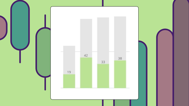
The background bar represents one value, often a benchmark, target, or prior period. It's typically wider or lighter in color. The foreground bar represents the comparison value, like an actual, current, or measured metric. This bar is usually narrower or darker.
The difference between them is exactly what the chart reveals.
People use the terms overlapping bar chart and overlay bar chart interchangeably. You can orient the chart horizontally as a bar or vertically as a column. The logic stays the same either way.
| Chart type | Best for | Limitation |
|---|---|---|
| Overlay bar chart | Gap between two values per category | Fails with three or more series |
| Stacked bar chart | Part-to-whole composition | Hard to compare individual segments |
| Grouped bar chart | Side-by-side comparison of multiple series | Uses more horizontal space |
| Bullet chart | Single metric vs target with qualitative ranges | Requires additional context bands |
Two related values per category. Same unit of measurement. And the insight you need is how one compares to the other (not their absolute magnitudes).
A few conditions must be true:
This chart works well for actual vs budget by department, this quarter vs last quarter by product line, or current inventory vs reorder threshold by stock keeping unit (SKU).
Analysts and BI specialists like overlay bar charts for a simple reason: research published on the Social Science Research Network (SSRN) confirms "high-quality visualizations reduce cognitive load." Dual-metric visibility in one view means stakeholders don't have to toggle between charts or tabs to see variance. That matters more than most people realize when you're presenting to executives who have seven minutes and twelve opinions.
If you have more than two series, nearly identical values, or mismatched units, the overlay becomes hard to interpret. Use the limitations section below to choose a better chart for those cases.
Excel doesn't have a native overlay bar chart type. You create one by manipulating a clustered bar chart using the series overlap setting.
Your data needs one column for category labels, one column for the background series (target, budget, or prior year), and one column for the foreground series (actual, current, or measured value).
| Category | Target | Actual |
|---|---|---|
| North | 120 | 95 |
| South | 100 | 110 |
| East | 80 | 75 |
| West | 90 | 92 |
If your two value columns use different units, stop here. Reconsider your chart choice.
If your target and actuals live in different tables (or different files), you also need a clean join key and matching time periods before Excel even gets a vote.
Excel renders two bars side by side for each category.
One series should now appear in front of the other.
The series listed first plots in the background. The series listed second plots in front. If your actual values are larger than target values in some categories, those actual bars will cover the target bars entirely. This is expected behavior. The chart is showing that actual exceeded target. This is the part that trips people up most often. They assume the chart is broken when it's working exactly as designed.
Look at each category. Can you see both bars?
You can't independently control bar widths for each series without using a secondary axis workaround. This introduces axis sync problems.
If your data updates frequently, you must manually adjust formatting each time. Conditional formatting (like coloring bars red when actual falls below target) requires helper columns.
If you're blending multiple sources, say, a quota table from a customer relationship management (CRM) system and actuals from an enterprise resource planning (ERP) system, the hardest part is usually upstream. Data engineers often have to align schemas, match time grains, and keep refresh schedules in sync so the chart doesn't quietly drift out of date.
For dashboards that refresh automatically, a BI platform like Domo handles overlay bar charts natively with built-in formatting rules. In Domo BI, teams can also standardize the definitions feeding the chart through a semantic layer and reusable metrics, so the "actual vs target" math stays consistent wherever it appears.
Sales performance vs quota by region: Sales leaders monitor which regions hit quota and which fell short. The gap between the actual bar and the quota bar shows shortfall or surplus at a glance. Regions where actual exceeds quota have the foreground bar extending past the background bar. A stacked bar would show totals but not the gap. A grouped bar would require mentally calculating the difference.
This is also a classic sales operations dashboard pattern. People want forecast vs actual revenue by region in one chart so they can spot underperforming territories without extra slides.
Current inventory vs reorder threshold by SKU: An operations team monitors stock levels against minimum thresholds. SKUs where the current bar is shorter than the threshold bar need immediate attention. A line chart would show trends over time but not the threshold comparison. A table would require scanning numbers rather than seeing the gap visually.
In practice, teams often want this view on mobile during standups or floor walks. That's when an interactive, mobile-ready overlay bar chart beats a static screenshot.
This year vs last year revenue by product line: A finance team reviews year-over-year performance. Products where this year's bar is shorter than last year's bar are declining.
Overlay bar charts work for exactly one type of comparison. The gap between two values per category. That's it. Outside that narrow use case, they mislead or clutter.
Three or more series? Bars stack and occlude each other. The viewer can't distinguish which bar belongs to which series. Use a grouped bar chart instead.
When values are too similar, the foreground bar hides the background bar. The viewer sees only one bar and assumes no gap exists. Use a grouped bar chart or add data labels showing the difference.
Placing revenue in dollars and units sold as a count on the same axis creates false equivalence. Use a dual-axis chart with extreme caution, or separate the metrics into two charts.
If the question is what share of the total each segment represents, use a stacked bar chart. If the question is which category is largest, use a simple bar chart sorted by value.
And if the problem is that two departments can build two different "budget" definitions? You don't need a different chart type. You need governed metric definitions (the kind that stop the boardroom debate over whose numbers are right). This exact argument derails quarterly reviews more often than it should.
If you build overlay bar charts repeatedly, Excel's manual formatting becomes a time sink. Updating them with new data or sharing them across teams requires constant manual intervention.
Domo BI handles overlay bar charts natively with no secondary axis workarounds. You get automatic data refresh from connected sources. You can apply conditional formatting rules without helper columns. Role-based access ensures the right people see the right data without emailing spreadsheets.
A few Domo pieces tend to matter as teams scale this chart across dashboards:
If you want these overlay bar charts to show up outside your BI workspace, Domo Embed lets you place interactive dashboards (including overlay bar charts) directly in a customer portal or website with permissions that control what each person can see.
And if you're tired of chasing people for status updates, Domo Apps can schedule report delivery and trigger alerts when the gap between the two overlaid metrics crosses a threshold.
Low-code App Studio also gives teams a way to put overlay bar charts inside custom, data-driven apps without writing code. Handy when you want the chart to live where work actually happens.
If you're ready to ditch the Excel series-overlap gymnastics and build always-up-to-date actual-vs-target overlays with governed metrics and automated alerts, Try free and see how fast your variance stories snap into focus.


