Vous avez économisé des centaines d'heures de processus manuels lors de la prévision de l'audience d'un jeu à l'aide du moteur de flux de données automatisé de Domo.
Regardez la vidéo

A nested bar chart overlays two bars from the same baseline to show how a subset compares to its total. In this guide, we'll go over when to use nested bars, how to build them in Excel, and which alternatives work better when your data doesn't fit the format.
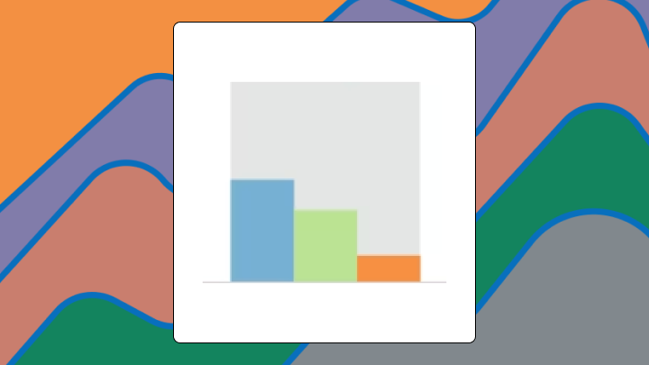
A nested bar chart places a narrower bar inside a wider one, letting you compare a subset against its whole without switching between charts. Both bars share the same baseline. The outer bar shows a total or benchmark, while the inner bar shows a subset or actual value.
This format works best when you need to spot gaps quickly. A product team once used nested bars to show actual versus target revenue by region. Several regions nearly hit their targets, so the inner bars were barely visible. Leadership misread three regions as underperforming when they were actually within two percent of goal. That's the kind of mistake that can derail a quarterly review.
If you build dashboards for other people (maybe your an analyst or BI specialist), this is also the chart that can save you from the "can you break this down one more level?" spiral. One chart. One follow-up question answered. No tab-hopping required.
Here's what you need to know before choosing this chart:
Two bars. One inside the other. Both starting at zero.
A nested bar chart overlays a narrower bar on top of a wider bar for each category. The outer bar represents a total or benchmark. The inner bar represents a subset or actual value.
Unlike a stacked bar chart, segments don't sit end-to-end. They overlap from a common origin. Some tools call this an overlapping bar chart or a bullet chart variant. The core mechanic stays the same: two bars, one inside the other, aligned at the baseline.
In many BI platforms, including Domo, you'll also hear people use nested bar chart to describe a hierarchical view. Revenue by region with an inner bar for a product line inside each region. The idea is the same even when the labels change.
If your data lacks a clear total-and-subset relationship, the chart will mislead before you finish building it.
You need three columns at minimum:
At least three categories make the chart meaningful. Fewer than three, and a simple table works better. The inner value must logically relate to the outer value as a subset (not just any two metrics that happen to share a category).
Inner values routinely exceeding outer values? The visual breaks. Inner and outer values nearly identical across most categories? The chart adds nothing. Use a side-by-side bar chart when values are independent. Use a stacked bar chart when showing composition of more than two segments.
Trying to show hierarchy (region and product line, channel and sub-channel)? Get your grouping rules straight before you chart anything. Analysts get tripped up here when the same metric is defined differently across dashboards. A semantic layer with reusable metrics and consistent definitions solves a lot of that confusion, and Gartner calls a metrics layer essential for modern BI platforms. It keeps executives from seeing two "Revenue" numbers that disagree.
Upstream, data engineers usually feel this first. If the source data arrives flat or inconsistent, you end up doing extra transformation work just to create clean category and subcategory fields. No-code transformation tools like Domo's Magic Transform can help reshape and aggregate the dataset once, then reuse it across dashboards.
Showing actual versus target in a clustered bar graph forces the eye to jump back and forth. Showing it in a stacked bar chart buries the comparison at different vertical positions. Neither makes the gap immediately obvious.
A nested bar chart anchors both values at the same baseline and layers them. The visual gap between inner and outer bar becomes the insight. You see shortfall or surplus without mental math.
This only works when one value is a logical subset of the other. If the two values are unrelated (like revenue and headcount), the overlap is meaningless. Viewers will try to interpret a relationship that doesn't exist.
The chart can also help with the problem of gleaning hierarchy at aglance. If a sales manager wants revenue by region and also wants to see which product category is dragging a region down, a nested view can surface that second layer without another slide.
Specific conditions get the highest signal from this visualization.
Use this chart when you have exactly two related values per category. The inner value should always be less than or equal to the outer value. Stakeholders need to see the gap at a glance. Categories should number between three and 10.
Avoid this chart when inner values frequently exceed outer values. Viewers will assume a data error. Avoid it when inner and outer values are nearly identical across most categories (the chart looks like a single bar and adds no insight). Avoid it when you need to compare more than two segments per category. Overlapping three or more bars creates visual noise.
If you choose it anyway, expect questions about why some bars overflow. Expect misreads where viewers assume the inner bar is always the good value. Expect requests to switch to a grouped or stacked view after the first presentation.
For line-of-business (LOB) managers (sales, marketing, finance, operations) and executives, the win is speed. A Forrester Consulting study found "82 percent of decision-makers surveyed now expect basic data literacy from employees in every department."
The outer bar sets the scale. The inner bar draws attention because of color contrast or saturation difference. Viewers naturally compare the width of the gap between inner and outer edges.
Read the outer bar as the benchmark or total first. Then read the inner bar as the subset or actual. Assess the gap. A large gap signals shortfall or surplus depending on context. Compare gaps across categories to identify outliers.
Teams will often skip the label check. Viewers often assume the inner bar is always the actual value and the outer is the target without checking labels. When inner and outer values are close, viewers may not notice the outer bar at all. Color choice matters. If the inner bar is darker, it draws more attention than the outer bar, which can flip perceived importance.
If your nested bar is showing a hierarchy (like region with product category inside), people will also assume the inner bar is the driver. Sometimes it is. Sometimes it's just the biggest subcategory. Clear labels and consistent metric definitions save you from a meeting that turns into a detective story.
Consistent gap direction (all shortfalls or all surpluses) suggests a systemic pattern. One or two outliers with large gaps warrant investigation.
Different scenarios call for slight adjustments to the standard layout.
A horizontal nested bar chart rotates the chart 90 degrees. Use this when category labels are long and would crowd a vertical axis. Horizontal orientation is less familiar to some audiences, so add a brief annotation.
A bullet chart adds a qualitative scale (poor, satisfactory, good) shown as background shading behind the bars. Use this when stakeholders need context bands, not just a single benchmark. Additional visual layers increase cognitive load.
A 100% nested bar chart normalizes outer bars to the same length, showing inner bars as a percentage of the total. Use this when absolute values vary widely and you want to compare proportions. Absolute magnitude gets hidden, so viewers may miss that one category's total is 10 times another's.
| Variant | Best for | Risk |
|---|---|---|
| Horizontal nested | Long category labels | Less familiar layout |
| Bullet chart | Context bands | Higher cognitive load |
| 100% nested | Proportion comparison | Hides absolute magnitude |
If you're publishing nested bars inside a governed BI environment, lock down metric definitions and access rules. Role-based access controls help when the nested breakdown includes sensitive finance or compensation data.
A talent acquisition team tracks open roles (outer bar) versus filled roles (inner bar) by department. The nested view immediately shows which departments have the largest gaps. A clustered bar graph would require viewers to mentally subtract.
A finance team presents quarterly budget (outer) versus actual spend (inner) for 10 projects. The nested chart highlights the two projects with significant underspend and the one project that exceeded budget. A table would require scanning rows.
An operations team monitors warehouse capacity (outer) versus current utilization (inner). The nested view flags the warehouse nearing capacity and the underutilized sites. A pie chart wouldn't support multi-category comparison.
Need a hierarchy story? A sales analyst can chart revenue by region with product category nested inside each region. Marketing teams do the same thing with campaign spend by channel and sub-channel, which makes budget imbalances jump out without another chart on the slide.
Excel doesn't have a native nested bar chart type. You build it by overlapping two bar series.
Your data needs three columns: category, outer value, and inner value.
After building, confirm that the inner bar is fully contained within the outer bar for all categories. If any inner bar extends beyond the outer, check your data.
Setting Series Overlap to less than 100% creates a side-by-side appearance rather than a nested one. Excel doesn't support more than two overlapping series cleanly. A third series will layer unpredictably.
For dashboards with frequent updates, a BI tool with a native Nested Bar Chart (like Domo BI) reduces manual formatting, keeps charts mobile-ready, and helps teams reuse the same certified metrics across multiple dashboards.
This chart type only supports two values per category. Three or more nested layers become unreadable. It requires a logical subset relationship. Independent metrics shouldn't be nested. When inner and outer values are close, the chart adds no insight. It isn't suitable for time series data.
| Scenario | Better chart | Why |
|---|---|---|
| Comparing unrelated metrics | Clustered bar graph | Side-by-side bars don't imply a subset relationship. |
| More than two segments | Stacked bar chart | Segments stack end-to-end. |
| Proportions across different totals | 100% stacked bar chart | Normalizes to same length. |
| Change over time | Line chart | Time series data benefits from continuous flow. |
If you're a BI or IT manager, there's another limitation you'll feel in practice: workarounds multiply. When teams don't have a standard nested bar option inside the governed platform, they end up maintaining one-off chart hacks.
Identifying which categories have the largest shortfall or surplus becomes easier. You can prioritize resources faster.
Comparing absolute values across categories becomes harder when the focus is on the gap. Viewers may overlook that one category's total is much larger than another's.
After seeing several categories with small gaps, teams may conclude everything is fine without investigating whether the targets themselves were set too low. The chart shows the gap, not the cause. You'll notice this problem surfaces most often in organizations where target-setting happens in a separate process from performance review.
In interactive dashboards, nested bars also change the next step people take. Managers can drill into the sub-category that's driving the gap, then ask a follow-up question in plain language using AI chat or natural language query, without sending another ticket to the analytics team.
And when nested bars live inside a data app, they can trigger action. McKinsey projects that by 2030 data will "be embedded...in decision points that drive automated actions (with sufficient human oversight)." In Domo Apps (built with App Studio), teams can already set alerts or workflow triggers when a nested segment crosses a threshold, like inventory falling below a reorder point or spend passing a budget cap.
A nested bar chart earns its place when you need to show a subset against its whole for multiple categories at once. The visual gap between inner and outer bars is the insight. If your data has more than two segments, if values are independent, or if the gap is negligible across most categories, switch to a grouped or stacked view.
Before publishing, confirm that labels clarify the relationship and colors are accessible. If the chart doesn't answer a question your audience is actually asking, a simpler table will serve better. Want a second set of eyes (and a few battle-tested dashboard tips) to make your nested bars easier to read and harder to misinterpret? Join the Domo community.


