Your Stories will look even cleaner and have more impact with these updates:
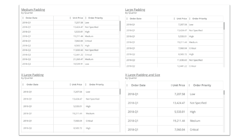
- Table charts. You can now add custom padding to your table cells.
- Single-value charts. Find additional bold font options for more impact.
- Lat/Long Map charts. Emphasize larger numbers with larger visual bubbles.
- Mega Tables. Use dynamic row paging to reduce lag in loading time, and override row display limits while still maintaining responsiveness. You can also now use copy/paste commands in Mega Tables.
- Map charts. Find new border options and max/min value scales.
- Radial gauge charts. Get more flexibility by setting the gauge width, major and minor ticks, degrees of display, needle look, and more.
For all charts, you can also now create a customized message to replace “No data for filtered range” when a chart doesn’t contain any data.


.avif)


